

When plotting figures with matplotlib, it’s important to ensure that a legend is included so that readers are able to distinguish the data displayed over the y-axis. A legend is typically included as a box in the plotted graph, and it can be used as a dictionary that maps colors or shapes to specific data entries.
In this article, we’ll showcase how you can place the legend of a figure outside of the plot area in matplotlib. This is typically required when the figure contains too much information, even in the four corners. In such cases, placing the legend outside the plot area could eventually make your graph much more readable.
2 Steps to Placing a Legend Outside of a Plot in Matplotlib Explained
- Shrink the width of the plot so that the legend fits the figure.
- Use the
bbox_to_anchorargument, which offers control for manual legend placement.
We’ll also showcase review other approaches, including:
- Placing the legend outside the plot and in any required location.
- Slightly pushing the legend outside of a plot.
- Changing the shape of a legend being placed outside of a plot, such as horizontally.
How to Create a Matplotlib Plot
First, let’s create an example plot that we will be using throughout this tutorial in order to demonstrate a few concepts and understand how the legend can be positioned in several different places outside of the plot area.
import numpy as np
import matplotlib.pyplot as plt

# Create some sample data
data = np.arange(20)

# Create a matplotlib figure
fig, ax = plt.subplots()

# Create multiple plots
for i in range(7):
    ax.plot(data, i * data, label=f'y={i}x')

# Set title and labels
ax.set_title('Example plot')
ax.set_xlabel('x')
ax.set_ylabel('y')

# Add a legend
ax.legend()

# Visualize the final plot
plt.show()
The output figure of the above code snipped is shared below:
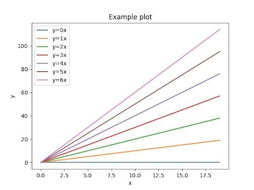
Note that by default, matplotlib places the legend of figures at the best possible position depending on the data being visualized.
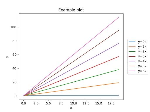
Placing the Legend Outside of the Plot in Matplotlib
In order to place the legend outside of the plot, let’s say at the center of the right side, we need to do two things.
First, we need to shrink the width of the plot so that the legend fits the figure. Then, we can use the bbox_to_anchor argument that offers a degree of control for manual legend placement. This argument can be used for 2-tuple or 4-tuple of floats and allows for arbitrary placement for the box, according to the matplotlib documentation.
import numpy as np
import matplotlib.pyplot as plt

# Create some sample data
data = np.arange(20)

# Create a matplotlib figure
fig, ax = plt.subplots()

# Create multiple plots
for i in range(7):
    ax.plot(data, i * data, label=f'y={i}x')

# Set title and labels
ax.set_title('Example plot')
ax.set_xlabel('x')
ax.set_ylabel('y')

# Add a legend
pos = ax.get_position()
ax.set_position([pos.x0, pos.y0, pos.width * 0.9, pos.height])
ax.legend(loc='center right', bbox_to_anchor=(1.25, 0.5))

# Visualize the final plot
plt.show()
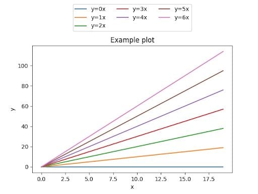
Change the Shape of a Legend Placed Outside the Plot in Matplotlib
Let’s suppose that we want to place the legend outside of the plot, but this time at the top position. It would make much more sense to change the shape of the legend so that it’s visualized horizontally rather than vertically, so that more area can be consumed by the actual plot.
Once again, we would have to shrink the height of the plot this time in order to give some space for the legend to be placed at the top area of the figure. Then, we could place the legend at the desired location, and also change the number of columns so that it can be visualized horizontally.
import numpy as np
import matplotlib.pyplot as plt

# Create some sample data
data = np.arange(20)

# Create a matplotlib figure
fig, ax = plt.subplots()

# Create multiple plots
for i in range(7):
    ax.plot(data, i * data, label=f'y={i}x')

# Set title and labels
ax.set_title('Example plot')
ax.set_xlabel('x')
ax.set_ylabel('y')

# Add a legend
pos = ax.get_position()
ax.set_position([pos.x0, pos.y0, pos.width, pos.height * 0.85])
ax.legend(
    loc='upper center',
    bbox_to_anchor=(0.5, 1.35),
    ncol=3,
)

# Visualize the final plot
plt.show()
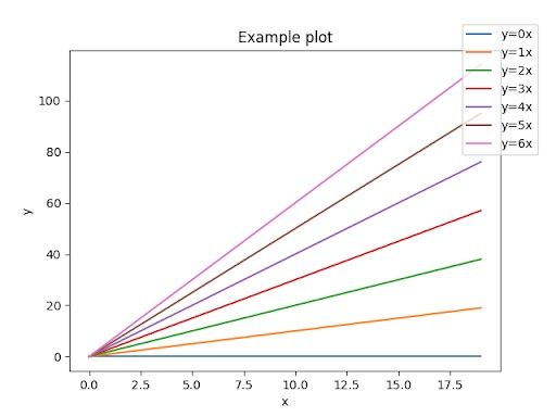
Shift the Legend Outside of the Plot in Matplotlib
Another possibility is to slightly push the legend outside of the plot in a way that the half falls within the plot itself. This is probably the easiest way as we simply need to position the legend in conjunction with the loc, using the bbox_to_anchor argument.
import numpy as np
import matplotlib.pyplot as plt

# Create some sample data
data = np.arange(20)

# Create a matplotlib figure
fig, ax = plt.subplots()

# Create multiple plots
for i in range(7):
    ax.plot(data, i * data, label=f'y={i}x')

# Set title and labels
ax.set_title('Example plot')
ax.set_xlabel('x')
ax.set_ylabel('y')

# Add a legend
ax.legend(loc='upper right', bbox_to_anchor=(1.1, 1.1))

# Visualize the final plot
plt.show()
Tips for Placing a Legend Outside the Plot in Matplotlib
In today’s short tutorial we discussed the importance of including legends in graphs. Additionally, we showcased how you can place legends outside of the plot in matplotlib and Python.
It’s important to remember that by placing the legends outside of the figures, you can make your plots much more readable, especially when they are overloaded with too much information or there contains lines or additional information already in the four corners of the plot area.


