Without clear communication, all the data science in the world is just math. Getting better at communicating your results is vital to having an impact as a data scientist and if a picture is worth a thousand words, high-quality plots are worth a lot.
Since you’re probably doing most of your data analysis in Python these days, you probably also want to learn how to create plots in the same environment. Right now you might be analyzing the data in one tool, storing it in a .csv file, opening it elsewhere and creating plots using a different tool altogether.
With this tutorial, you’ll be able to create and save those plots using the Python package Matplotlib, a flexible, freely available package designed to help you create plots. Here’s how to get started.
How to Generate Subplots in Python’s Matplotlib
- Import a data set
- Create the plot object
- Add the data
- Add descriptive information
- Reduce the data set
- Add visual style
1. Import a Data Set
Before we can start plotting, we need a data set. In this tutorial, we’ll create plots representing laboratory data collected during experiments studying the performance of residential heat pump water heaters. This is a real-world example. Scientists perform experiments on these products on a regular basis, and the data set replicates tests I’ve personally performed. I previously introduced the concepts in the introduction to a detailed data analysis tutorial, and have made the data set available online for those who wish to follow along.
To plot the data, we need to import it. If you’ve downloaded the data set and stored it in the same working directory as your script you can import it using the pandas.read_csv() function by solely calling the file name. Your code should appear as follows:
import pandas as pd
data = pd.read_csv('COP_HPWH_f_Tamb&Tavg.csv', index_col = 0)
And that’s it. The data set is now saved in the variable data and the index of the DataFrame is set to the first column, which stores the date and time of each measurement.
One thing that’s important to know is the date/time data used as the index is currently read as a string, not as a date/time object. For many purposes, this doesn’t matter, but Matplotlib makes axis formatting choices differently if you’re working with a string versus a date/time object. To avoid a headache later, you’ll want to convert the index to a date/time index. You can do this with the pandas.to_datetime() function:
data.index = pd.to_datetime(data.index)And we’re all done! The DataFrame is now ready for plotting.
If you aren’t familiar with the data set, you might want to see what’s in it before continuing. You can do this outside of Python by opening the .csv file with Excel or OpenOffice. Within Python, you can either print the DataFrame or use IPython’s display function for a more user-friendly view. Those options are as follows:
# Viewing the dataframe by printing

print(data)

# Viewing the dataframe using IPython.display

from IPython.display import display
display(data)
Once you’re satisfied that you understand what’s in the DataFrame, we’re ready to start plotting.
2. Create the Plot Object
The first step in plotting with subplots is creating the subplot object. This creates a variable representing the plot that you can then edit as desired to make the image you want. To create a subplot object we need to call Matplotlib’s .subplot() function and define the required parameters. While there are several options for parameters, the most important are as follows:
Nrows
This states the number of rows that will be in the subplot figure. It’s the number of plots that you want to have lined up vertically. So if you state three there will be a top row, a middle row and a bottom row. Note that this defaults to one, so if you don’t enter a value you’ll get a plot with one row.
Ncols
This is the same as nrows, but for columns. If you state three your plot will have a left-most column, a center column and a right-most column. Combining these two parameters means that your image will have nrows * ncols plots. This also defaults to one, so if you don’t enter a value you’ll get a plot with one column.
Figsize
This states the size of the desired image (all plots within this size) as a tuple (width, height) in inches. If you want a 12-inch by four-inch image, you’d enter figsize = (12, 4). To make things easier, programmers often enter this as a function of nrows and ncols. For instance, if I know that I want two rows, three columns and each plot to be five inches by three inches, I could enter figsize = (2 * 5, 3 * 3).
Sharex
This parameter states whether or not all plots share the same x-axis, and whether or not the image should show the x-axis labels only on the axis of the bottom plot. I personally do not use this feature often as I find plots much easier to read if the axis labels are on each, but some people have different preferences.
Sharey
The same as sharex, except applied to the y-axis.
Constrained_layout
Setting this parameter to true has a similar effect to applying tight_layout() to a single plot image. It cleans up the figure, reducing noise and avoiding text overlapping. One key difference is that tight_layout() does not adjust suptitle (i.e. “supertitle,” I’ll describe what that is in a bit) while constrained_layout does, which can be very important when working with subplots.
The other important thing to remember when creating subplots is that, since you have multiple plots, you need to be able to state which plot you’re editing when you work. To enable this, .subplots() returns both a figure and an index describing the individual plots. Since we need to be able to store both of those outputs, we assign them to two separate variable names.
When you put all of this together, you can create a subplot image with the following example command.
fig, axs = plt.subplots(4, 1, figsize = (12, 3 * 4), constrained_layout = True)This code will return two separate objects. One, which we’ve saved to fig, is a subplot image containing multiple plots. The second, which we’ve saved to axs, is an index of the different plots that we can reference to edit each individually. The created image will have four rows and one column of plots as specified by 4, 1. It will be 12 inches wide by three times four (12) inches tall, yielding four rows of plots which are each three inches tall. And it has constrained_layout set to true, which helps keep the plot looking nice.
This plot isn’t very interesting at this point, but it has the structure we need to create the plots we want. It should look like this:

3. Add the Data
The basic way to add data to a subplot is to call Matplotlib’s .plot() command on the desired plot for each data set you want to run. The basic syntax for that is:
axs[row, column].plot(x, y, parameters)The axs feature represents a grid of plots with a specified number of rows and columns. When creating axs we specified four rows and one column. To plot data in a specific subplot we need to specify the row and column coordinates of the target subplot. The above code does so using the variables row and column.
Since our example only has one column, the value for column will always be zero (and we can simply neglect to code in column, since Matplotlib already knows it’s going to be zero). Because we have four plots in our image, row will be between zero and three. Then we can set the x and y data as needed while specifying the desired plotting parameters (which I’ll describe below).
A Side Note on Dictionaries . . .
One handy trick when you’re working with subplots is to create a dictionary to store the data. Then, instead of hard coding many, many lines of .plot() commands, you can iterate through the dictionary, have the plotting command gather the information it needs from there and do it all with a single command.
To create the dictionary you need to think about what you want to plot. In this example, we want to create four plots from the sample data set. They’ll be:
-
A plot showing the control parameters during the test —These will include the temperature of water entering a water heater, the air temperature surrounding the heater and the temperature of water leaving the water heater.
-
A plot showing the temperature of water at each different height in the tank — In the example data set we have eight different measurements at eight different heights in the tank, so we’ll want to plot eight lines in the second plot.
-
A third plot showing the water flow rate during the test — This data should show a high flow rate before and after the test, and no flow at all during the test.
-
And finally, the electric power during the test — This plot should show no electric power consumption before and after the test, then a gradually increasing value during the test.
To create these four plots we need to structure a dictionary in a manner that:
- Splits the data into four sets for the four plots.
- Provides the columns to reference when plotting the data.
We can make our lives even easier by making the dictionary pass y-axis labels and legend labels for the data sets. I’ll do that in the example, then explain how it works later.
A dictionary that meets the requirements specified above for our sample data set is as follows.
columns = {
          'Temperature (deg F)': {
                    'T_In (deg F)': 'Inlet',
                    'T_Out (deg F)': 'Outlet',
                    'T_Amb (deg F)': 'Ambient'
                   },
          'Water Temperature (deg F)': {
                     'T1 (deg F)': 'T1',
                     'T2 (deg F)': 'T2',
                     'T3 (deg F)': 'T3',
                     'T4 (deg F)': 'T4',
                     'T5 (deg F)': 'T5',
                     'T6 (deg F)': 'T6',
                     'T7 (deg F)': 'T7',
                     'T8 (deg F)': 'T8',
          },
          'Flow Rate (gal/min)': {
                    'Flow Rate (gal/min)': 'Flow Rate'
                   },
          'Electric Power (W)': {
                     'P_Elec (W)': 'Electric Power'
                    }
         }
This is a nested dictionary, with each key referring to another dictionary. The four dictionaries it contains each provide keys for a separate plot. The first key, Temperature (deg F) contains the information we need to plot the test parameters in each test, all of which are temperatures measured in degrees Fahrenheit. The second provides water temperatures at eight depths, all of which are measured in degrees Fahrenheit, and so on.
With this information, we can now write code to iterate through the dictionary and plot each of those data series on the correct plot. To start with, we need to iterate through each key in the dictionary.
for key in columns.keys():Within that for loop we need to iterate through each key within the nested dictionary. Since each key in the nested dictionary represents a different parameter, I’ll use the term parameter instead (this also makes the code easier to read by avoiding multiple for loops referencing key). Our code then appears as follows:
for key in columns.keys():

   for parameter in columns[key].keys():
That code will now loop through each of the keys in the top-level dictionary (Temperature (deg F), Water Temperature (deg F), etc.), then loop through the dictionaries contained within it (T_In (deg F), T_Out (deg F), etc). If you want to see how it works you could add print statements reporting key and parameter, then run the code.
That for loop structure enables iterating through the code to plot every data set specified in the dictionary. The only step that’s necessary is adding the .plot() statement to do so. If we do, our code is:
for key in columns.keys():

   for parameter in columns[key].keys():

       axs[row].plot(data[parameter])
Now, there’s a problem here that some of you may have spotted. That code includes a reference to the variable row, telling Matplotlib which plot the data is to fill, without defining row. Since our dictionary starts from the top plot and progressively moves down, we can simply set row to start at zero and increase by one step per plot until we’re finished. If we do that, the code becomes:
row = 0

for key in columns.keys():

   for parameter in columns[key].keys():

       axs[row].plot(data[parameter])

   row +=1
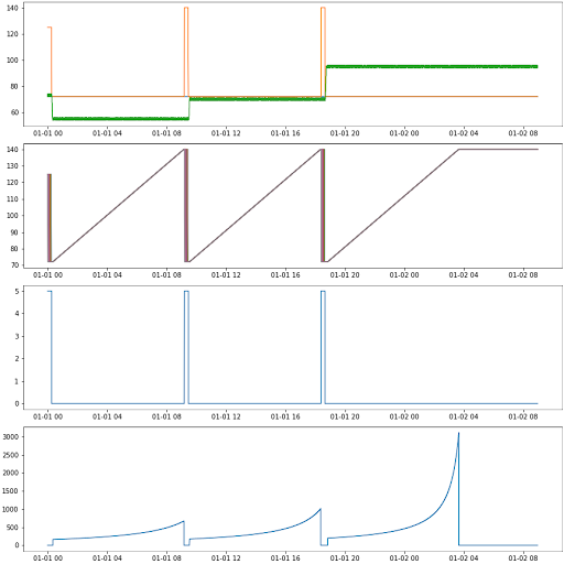
This will plot all of the data in the correct plot, and display the plot. Now our plot shows data, and provides some information. It should now look like this:

It’s still not a good plot though. It doesn’t have any x- or y-axis labels. It doesn’t have any legends. It doesn’t have a title. There’s too much data making it very hard to read and it uses lines instead of dots for measurements (it’s customary to use dots for measured values and lines for simulated values).
Fortunately, we can take care of all of those things one at a time.
4. Add Descriptive Information
Adding descriptive information to the plot is rather straightforward. This is especially true because we set ourselves up for success when creating the dictionary earlier. To make this plot more valuable we want to add four elements:
-
Legends to each plot, including labels for each data series
-
x-axis labels
-
y-axis labels
-
A title for the full image
The legend is an easy one to add. For this, we need to specify the label for each data series when plotting it, which we do by specifying the “label” parameter for that plot command. Fortunately, we also added the desired labels as values in the nested dictionary above so we can simply reference that! To do so, we need to dig into our columns dictionary with the top-level key (represented by “key”) and the second-level key (represented by “parameter”) to retrieve the value stored there, and set the label parameter to that value. In other words, we need to modify the plotting code to be:
row = 0

for key in columns.keys():

   for parameter in columns[key].keys():

       axs[row].plot(data_reduced[parameter], label = columns[key][parameter])

   row += 1
Now each plotting command gets the correct label assigned to it.
We can add the legends to the plot by calling the .legend() function on each axs index while iterating through the plots. In other words, the following will have legends on each plot.
row = 0

for key in columns.keys():

   for parameter in columns[key].keys():

       axs[row].plot(data_reduced[parameter], label = columns[key][parameter])

   axs[row].legend()

   row += 1
To add x- and y-axis labels, we need to call the .set() function on each axs index, and set the xlabel and ylabel parameters. Fortunately, the keys in the top-level dictionary contain the information we want to place on each plot and the x-axis label is always stating that it’s datetime, and stating the format. We can add axis labels by adjusting our code in the following way:
row = 0

for key in columns.keys():

   for parameter in columns[key].keys():

       axs[row].plot(data_reduced[parameter], label = columns[key][parameter])

   axs[row].legend()

   axs[row].set(ylabel = key, xlabel = 'DateTime (MM-DD HH)')

   row += 1
The last piece of descriptive information is a title for the entire image. We do this by calling the .suptitle() function, which will place a title at the top of the image. Recall that this is why we set constrained_layout = True earlier. Without that comment, the title could end up in a strange position. Try running the code without setting constrained_layout just to see what happens.
Since this plot currently shows all data during all tests, we can give the plot a not-very-specific name to highlight that it shows everything. We can do that by adding a line calling .suptitle(), so our code is:
row = 0

for key in columns.keys():

   for parameter in columns[key].keys():

       axs[row].plot(data_reduced[parameter], label = columns[key][parameter])

   axs[row].legend()

   axs[row].set(ylabel = key, xlabel = 'DateTime (MM-DD HH)')

   row += 1
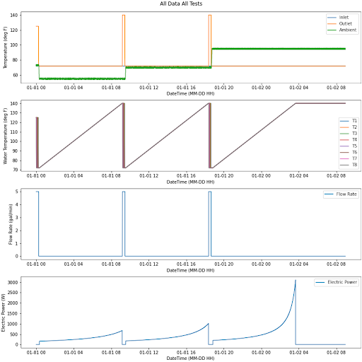
This yields the following image.

The data is now displayed on four different subplots, ensuring that the data set is clearly displayed and visible. The x and y axes are labeled, ensuring that the reader knows what the data represents. The legends identify each individual data series. Finally, there’s a nice title at the top stating from which test the data comes.
5. Reduce the Data Set
One problem still exists: We have three tests in a single plot. This style creates an abundance of data, which isn’t easy for the reader to interpret. A better solution is to filter the data and create three separate plots, one representing each of the three tests. To do that we need to execute the following steps:
-
Filter the data using Pandas’ indexing rules
-
Change the title to represent the current test
-
Plot the data
For this example I’ll show how to create the first plot, representing the test with a 50 deg F ambient temperature. If you want to create all three plots you could write a for loop using the example above, or tips from learning the fundamentals of Python control flow and how to split large data sets.
In this case, I found the right indices to use through the famous “guess and check” method. In other words, I told the script that I wanted to keep the first x rows of the DataFrame, plotted it, decided it was the wrong number and kept trying until I got it right. A smarter way would be to split the data set based on conditions in the data set, such as when the water flow rate changes.
I ended up finding the right number of rows to keep was 3400. Once I discovered that, I was able to filter the data with the following code:
index = 3400

data_reduced = data[data.index < data.index[index]]
This creates a new DataFrame called data_reduced which contains only the first 3400 rows of data. It’s important to create a new DataFrame when doing this because the other option overwrites your original DataFrame. If you do that, then when you try to plot the second and third tests, you’ll discover the data no longer exists. You’d have to reload the data set each time. You can do that if you want, but it’s time-consuming (and annoying) so I don’t recommend it.
Next, we need to change our plotting code to reference the reduced DataFrame instead of the original. You can do that by changing your line to the following:
axs[row].plot(data_reduced[parameter], label = columns[key][parameter])With that change, each time the code plots data, it’ll pull from the reduced data set instead of the original one.
And, finally, you need to change the title of your plot. Since this plot only shows the first test, with 50 deg F ambient temperature, we can change the plot to say that.
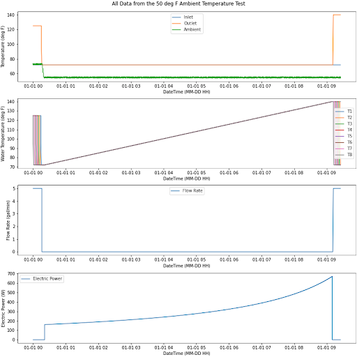
plt.suptitle('All Data from the 50 deg F Ambient Temperature Test')And with that you’ve made all of the changes necessary to plot only the first test. When you run the code you should receive the following image.

Now we’re one step closer to having a complete communication tool. The plots are now much more targeted at precisely the data set we need, making it easier for your audience to interpret the data.
6. Add Visual Style
There are two visual styling changes to make our plot a better communication tool.
-
Typically we plot measurements as points while we plot simulated data as lines. We should change our data sets to dots and remove the lines (because all data columns represent measured data).
-
We should customize the colors to match either our color preferences or a desired template.
Changing the data sets from lines to points is pretty easy. Matplotlib provides several marker and line style options that you can use to customize your plots. To implement these marker and line style options we need to edit our plotting line of code to make our specifications. Since we want to present the data as points with no lines, we can change the code accordingly:
axs[row].plot(data_reduced[parameter], label = columns[key][parameter], marker = '.', linestyle = '')The marker documentation for Matplotlib shows that specifying . will yield circular points. The documentation for linestyle is quite straightforward for specifying lines, but doesn’t explicitly tell you how to remove the lines. By specifying nothing, as we’ve done above, we’ll have the desired effect.
Then we want to specify the colors. One way I like to do this is through programming a dictionary that stores colors so you have a template you can easily reference on every project. Maybe your company, school or organization has a template of preferred presentation colors you can simply store in a dictionary to always use. (That’s the case where I work.)
For the sake of this example, I’ll create a dictionary using standard Matplotlib reference colors. While there are many ways to implement colors in Matplotlib, the named colors are an easy way to get started. I want to save several of these colors in a dictionary that I can later iterate through to specify different colors for each data set. For this example I made the following dictionary:
colors = {
         '1': 'limegreen',
         '2': 'teal',
         '3': 'dodgerblue',
         '4': 'darkviolet',
         '5': 'black',
         '6': 'darkgray',
         '7': 'red',
         '8': 'sandybrown'
        }
Notice the keys in this dictionary are strings of integers in numerical order. This sets me up to easily use a for loop to iterate through the colors in the dictionary, and apply a different color each time the code plots a data series. To do that, we need to initialize an iterator before entering the for loop, update the iterator each time the code passes through the for loop and reference the iterator to call a color when plotting. We can accomplish all of this by changing our code to:
i = 1
   for parameter in columns[key].keys():
       axs[row].plot(data_reduced[parameter], label = columns[key]   [parameter], marker = '.', linestyle = '', color = colors[str(i)])
       i += 1
In that case, our iterator is i. We set it to 1 initially so it matches the first key in the dictionary. Then we pass it into the plotting code, where we convert it to a string, then tell Matplotlib to plot the data set using the color matching that key. Finally, after plotting but still within the for loop, we add one to the iterator thus moving to the next iterator in the dictionary for the next color. Then the code plots the next data series with the second color, and moves on to the third color before progressing further through the loop. The code keeps doing that until it runs out of data series.
One thing to keep in mind is that, if you use this method, you must specify as many colors in the dictionary as you have data series. If you try to plot nine data series with eight colors specified, you’re gonna have a bad time.
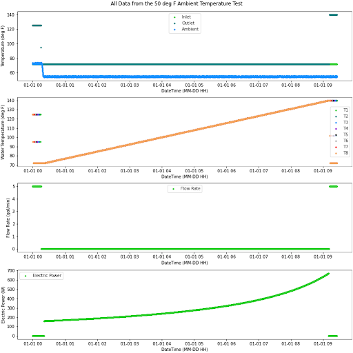
With those two changes, running the code yields the following plot.

Now that plot is a good communication tool!
Frequently Asked Questions
What is the difference between .subplot() and .subplots()?
The .subplot() function produces a single subplot, while the .subplots() function produces multiple subplots arranged in a grid.
How can I create subplots with different sizes?
Users can apply the figsize parameter to generate subplots of varying sizes, adjusting the width and height of each.
How do I share the x-axis across all subplots?
The sharex parameter allows users to have all plots share the same x-axis, with the x-axis label appearing only on the axis of the bottom plot. To achieve this, set sharex so that sharex=True.


