Data science is all about communication. Those of us interested in the subject spend our time learning new numerical methods, how to manipulate data and how to create regressions to draw conclusions from the data set.
But none of that is worth anything if you can’t communicate the results.
Since most people don’t want to dig through data sets or examine statistical models to understand the data set, plotting is the most important communication tool in a data scientist’s arsenal.
Fortunately, Python offers packages designed specifically to help you create report-ready plots that are sure to help you communicate with your boss or clients.
If You’ve Never Used Python
Regular Python users can skip this section, but for those who haven’t used Python before you’ll need to do a little setup work to get started.
There are many different ways to access and use Python so you have a lot of freedom to experiment and take your pick. I prefer to use the Anaconda distribution of Python which comes with several important packages and the Spyder IDE.
If you download and install the distribution then you’ll have everything you need to follow along.
Once you’ve finished downloading and installing Anaconda, open the Spyder IDE to get started.
First Steps
The first steps to plotting with bokeh are importing the bokeh functions we need to use and obtaining a data set.
Since we don’t have a data set to plot we’ll use numpy to create a rudimentary one. The data set itself doesn’t matter all that much here; we just need something that we can use to explore bokeh’s functions.
We need to start with import statements. First, we’ll import the bokeh functions that enable us to create report-ready plots. We’ll also import numpy because we want to use that to create our data set.
(There’s no need to learn too much about numpy for the time being. We’ll use it to create some arrays and that’s about it.)
Getting Started With Bokeh
- Import the bokeh functions that we need to use.
- Obtain a data set.
- Get plotting!
To import these bokeh functions use the code:
from bokeh.plotting import figure, save, output_file

import numpy as np
The bokeh functions we imported will allow us to create figures (figure), give us the capability to save the plots that we create (save), and let us specify where we save the resulting plots (output_file).
We imported the entire numpy package, which gives us access to all of its functions. Since we added the text “as np” we can now reference numpy by typing “np.”
We can then use numpy to create two arrays, which will give us data to plot. We’ll create two arrays representing the x and y data in our plot. The x data will run from zero to 10 with steps of one, and the y data will run from 0 to 5 with steps of 0.5.
You can create those arrays with the following code:
x = np.arange(0, 10, 1)

y = np.arange(0, 5, 0.5)
If you run the code and examine the output you’ll notice neither list includes the final value (10 for x and 5 for y). This is a trait of Python and lists will always behave in that way. If you really want to include the final values you need to set your upper limit as your desired value plus one step. So if you really want to include 10 and 5 in these data sets you’d need to set the upper limit of x to be 11 and upper limit of y to be 5.5.
Creating Our First Plot
In order to plot this new data set we first need to create a plot object. We do this by calling the bokeh function “figure” with the necessary inputs and assign it to a variable.
Keep in mind that none of the inputs in the “figure” function are truly necessary. Bokeh will create your plot without them, but you won't have a report-ready plot without them. The truly necessary inputs are:
-
Width: This specifies the width of the plot image specified in pixels. I typically start a plot with width set to 800 pixels, and find that this is a good default value. However, you may want to use different sizes for different purposes.
If you have simple plots and want to place several next to each other you could make smaller plots. If you have a very complex plot that displays a lot of data you might need to make it larger for legibility. Use your best judgement.
-
Height: This specifies the height of the plot in pixels. It functions the same way as width. I use a default value of 400 pixels for the height but, similarly to width, adjust as needed.
-
x_axis_label: This specifies the label on the x axis of the plot, telling your reader what the x data represents. This should be a very detailed and specific input so the reader can understand exactly what they’re looking at.
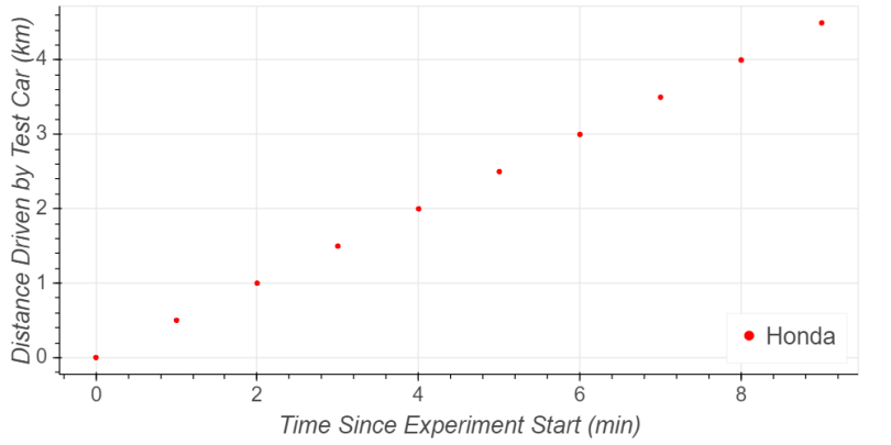
For instance, if your x data represents the time since an experiment started expressed in minutes, you’d want to input “Time Since Experiment Start (min).” That’s what we’ll use for this example.
-
y_axis_label: This is the same as the x-axis label except it’s for the y axis. This tells your reader what the y data in your data set represents.
For instance, if your y data represents the distance driven by a car since the start of an experiment in kilometers, you'd want to input “Distance Driven by Test Car (km).”
The following code shows the specific syntax.
p1 = figure(width=800, height=400, x_axis_label='Time Since Experiment Start (Minutes)', y_axis_label = 'Distance Driven by Test Car (Kilometers)')That code creates the plot object and assigns it to the variable “p1.” Now we can edit the plot by editing the variable p1.
The next step is to add our data to the plot. To do this we need to create a data series in the plot, assign our x and y data to it, and provide the inputs needed to describe the data set.
To add a data series presenting our x and y data as a circle we can call the figure object’s “circle” function. Then we can provide the details by specifying the following inputs:
-
x data: This input tells bokeh what array describes the x values of your data set. This could be a column in a dataframe, or it could be a standalone array. In this example we have the standalone array we called “x” so that will be our input.
-
y data: This is the same as x data, only it describes the y values of the data set. We will be using our standalone array called “y.”
-
Legend: This allows us to provide a name to the data series that we’re entering. This provides valuable context to the reader, especially if there are multiple data series included in the plot.
For example, if we’re plotting performance in a race and there are two cars, we’ll need unique legend entries for both so the user can tell which data set represents which car. For the sake of this example we’ll create a legend entry labeling our car as a Honda.
-
Color: This input sets the color of the markers representing the data points. There are many options available. For this example we’ll create red circles representing the data set.
The following code will add a new data series to p1 representing our data:
p1.circle(x, y, legend_label='Honda', color = 'red')After creating the plot we need to tell Python where to save the plot, then tell it to do so. We set the save location using the output_file function. This function takes two inputs, one specifying the location to save the file and the other specifying the name of the file.
We can tell the program to save the file on the desktop, and name the file using the following code. Note that this code assumes you’re writing your program on a Windows PC and that your login is JSmith. You’ll need to change ‘JSmith’ to match your login.
output_file(r'C:\Users\JSMith\Desktop\FirstPlot.html', title = 'First Plot')When we save the plot that code will create a new .html file on your desktop named ‘FirstPlot.’
We can save the file by instructing bokeh to save plot p1 with the following code:
save(p1)Running the code will now create the .html file specified above. Opening that file will yield the following results.

On the right side of the plot you’ll see several useful tools. These tools include the following options:
-
Pan: The pan tool lets you move the plot around. If you select this option, as indicated by the light blue bar to the left of it, you can left click on the plot and drag your mouse. Doing so will show you different sections of the plot.
-
Box Zoom: This tool gives you the ability to create a box in the plot on which you’d like to zoom in. You choose a spot on the plot, click and drag your mouse before releasing the button to zoom in on a portion of the plot.
-
Wheel Zoom: This tool lets you select a spot on the plot to zoom around by hovering your cursor over it, then zoom in or out using your mouse wheel.
-
Save: This is how you save the plot as a standard image file, which enables you to save a high-resolution version of your plot that’s ready for embedding in reports and publications. This is the most useful tool for this tutorial.
Improving the Plot
You may have noticed a few problems with that plot. Some important issues include:
-
The legend covers the final data point hiding some of the data.
-
The x- and y-axis legend fonts are small making them hard to read.
-
The tick labels are too small.
-
The legend is also hard to read.
Fortunately, bokeh offers the tools we need to correct these issues.
The legend is the easiest to fix so we’ll start there. The figure object contains a legend.location function that we can use to relocate the legend. We can set the location of the legend to the bottom right corner of the plot by adding the following code to our plot-creation section:
p1.legend.location = "bottom_right"Bokeh also provides the functions we need to change the axis label font sizes. We can do this by adding two more lines of code to the section creating the plot. The following code sets the axis labels to 16-point font.
p1.xaxis.axis_label_text_font_size = "16pt"

p1.yaxis.axis_label_text_font_size = "16pt"
Two more lines of code can change the font size of the ticks on each axis. The following code sets the ticks on each axis to 14-point font.
p1.xaxis.major_label_text_font_size = "14pt"

p1.yaxis.major_label_text_font_size = "14pt"
Finally, the following line of code sets the font size for the legend to 16-point font.
p1.legend.label_text_font_size = '16pt'Now that we’ve resolved those issues, running the code will create the following plot.
See the improvement in that plot? It’s much easier to read the axes, both axis labels and tick labels, and the legend. Moving the legend to the lower right revealed a data point that wasn’t previously visible. Overall, this plot does a much better job of conveying information to your audience.
Adding Additional Data Series
A plot with only a single data series doesn’t provide an opportunity for comparison or tell much of a story. Fortunately, bokeh makes it simple to add new data series to the same plot. You merely need to add a new line of code adding a data series, the same way we did before.
First, for this example we need to create a new set of data points. We can do so using numpy the same way we did before, with the following code:
y2 = np.arange(0, 20, 2)Then we can add that new data set to the plot by adding a single line to the plot creation section.
p1.diamond(x, y2, legend_label='Ferrari', color = 'blue')Notice there are four changes from the original data series to this one. First, I changed the y data to reference our new y2 instead of the original y1. This tells Python to reference our new data series.
Secondly, I changed the legend to say “Ferrari” instead of Honda. It’s moving four times as fast so that seemed like a safe choice. I also set the color to blue making it visually different from the original data set easy for your audience to differentiate.
Finally, for the second data set, I changed the markers from circles to diamonds. This is important for accessibility purposes (you may have a reader who is color blind) but also because people sometimes read papers by printing them. More than likely, they’ll be reading in black and white. If all data sets use circles then people reading black and white copies won’t have any idea what they’re looking at.
One issue you aren’t aware of (I only know about it because I already ran the code and examined the results!) is that adding the Ferrari data moved the Honda data further down, and the legend now obscures a data point. To resolve that issue we can move the legend to the top left with the following code:
p1.legend.location = "top_left"Running the code to create the final plot returns the following image.

Notice how much better this is than the original plot. It’s much easier to read the axes and legend than it was before. None of the data points are hidden behind the legend. The markers use different colors and shapes to make them more visually appealing and accessible. Finally, the two data series provide an interesting comparison.
Now that is a report-ready plot.
Frequently Asked Questions
What is Bokeh used for in Python?
Bokeh is a Python library that helps create interactive and report-ready plots for data visualization.
How do I install the tools needed to use Bokeh?
You can use the Anaconda distribution of Python, which includes Bokeh and the Spyder IDE, to get started quickly.
How do I create a simple plot in Bokeh?
Start by importing Bokeh’s plotting functions and NumPy to generate data, then use figure() to create a plot and circle() or diamond() to add data points.
How do I save a Bokeh plot?
Use the output_file() function to specify the save location and name, then call save() to generate an HTML file.