Whether we wish to predict financial market trends or electricity consumption, time is an important factor that must be considered in our models. For example, it would be interesting to forecast at what hour is peak consumption in electricity. This could be useful for adjusting the price or the production of electricity.
What Is a Time Series Model?
A time series model is a set of data points ordered in time, where time is the independent variable. These models are used to analyze and forecast the future.
Enter time series. A time series is a series of data points ordered in time. In a time series, time is often the independent variable, and the goal is usually to make a forecast for the future.
However, there are other aspects that come into play when dealing with time series.
- Is it stationary?
- Is there a seasonality?
- Is the target variable autocorrelated?
In this post, I’ll introduce different characteristics of time series and how we can model them to obtain as accurate as possible forecasts.
Characteristics of Time Series Models
To understand time series models and how to analyze them, it helps to know their three main characteristics: autocorrelation, seasonality and stationarity.
Autocorrelation
Informally, autocorrelation is the similarity between observations as a function of the time lag between them.
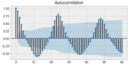
Above is an example of an autocorrelation plot. If you look closely, you’ll see that the first value and the 24th value have a high autocorrelation. Similarly, the 12th and 36th observations are highly correlated. This means that we will find a very similar value every 24th unit of time.
Notice how the plot looks like a sinusoidal function. This is a hint for seasonality, and you can find its value by finding the period in the plot above, which would give 24 hours.
Seasonality
Seasonality refers to periodic fluctuations. For example, electricity consumption is high during the day and low during night, or online sales increase during Christmas before slowing down again.
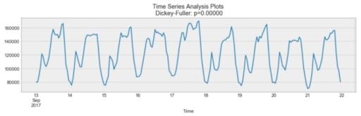
As you can see above, there is a daily seasonality. Every day, you see a peak towards the evening, and the lowest points are the beginning and the end of each day.
Remember that seasonality can also be derived from an autocorrelation plot if it has a sinusoidal shape. Simply look at the period, and it gives the length of the season.
Stationarity
Stationarity is an important characteristic of time series. A time series is said to be stationary if its statistical properties don’t change over time. In other words, it has a constant mean and variance, and its covariance is independent of time.
Looking at the same plot, we see that the process above is stationary. The mean and variance don’t vary over time.
Often, stock prices are not a stationary process. We might see a growing trend, or its volatility might increase over time (meaning that variance is changing).
Ideally, we’d want to have a stationary time series for modeling. Of course, not all of them are stationary, but we can make different transformations to make them stationary.
How to Test Whether a Process Is Stationary
You may have noticed that the title of the plot above is “Dickey-Fuller.” This is the statistical test that we run to determine if a time series is stationary or not.
What Is the Dickey-Fuller Test?
The Dickey-Fuller test is a statistical test used to evaluate whether a time series is stationary or not. It evaluates the null hypothesis to determine if a unit root is present. If the equation returns p>0, then the process is not stationary. If p=0, then the process is considered stationary.
Without getting into any technical details, the Dickey-Fuller test tests the null hypothesis to determine if a unit root is present.
If it is, then p > 0, and the process is not stationary.
Otherwise, p = 0, the null hypothesis is rejected, and the process is considered to be stationary.
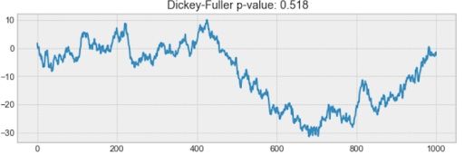
For example, the process below isn’t stationary. Notice how the mean isn’t constant through time.
How to Build a Time Series Model
There are many ways to model a time series in order to make predictions. The most popular ways include:
- Moving average.
- Exponential smoothing.
- Double exponential smoothing.
- Triple exponential smoothing.
- Seasonal autoregressive integrated moving average (SARIMA.)
Moving Average
The moving average model is probably the most naive approach to time series modeling. This model simply states that the next observation is the mean of all past observations.
While simple, this model can be surprisingly effective, and it represents a good starting point.
Otherwise, the moving average can be used to identify interesting trends in the data. We can define a window to apply the moving average model to smooth the time series and highlight different trends.
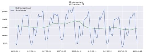
In the plot above, we applied the moving average model to a 24-hour window. The green line smoothed the time series, and we can see that there are two peaks in a 24-hour period.
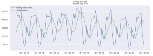
Of course, the longer the window, the smoother the trend will be. Below is an example of a moving average in a smaller window.
Exponential Smoothing
Exponential smoothing uses similar logic to moving average, but this time, a different decreasing weight is assigned to each observation. In other words, less importance is given to observations as we move further from the present.
Mathematically, exponential smoothing is expressed as:
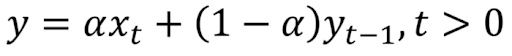
Here, alpha is a smoothing factor that takes values between zero and one. It determines how fast the weight decreases for previous observations.
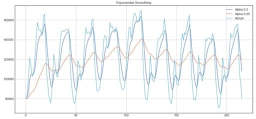
From the plot above, the dark blue line represents the exponential smoothing of the time series using a smoothing factor of 0.3, while the orange line uses a smoothing factor of 0.05.
As you can see, the smaller the smoothing factor, the smoother the time series will be. This makes sense, because as the smoothing factor approaches zero, we approach the moving average model.
Double Exponential Smoothing
Double exponential smoothing is used when there is a trend in the time series. In that case, we use this technique, which is simply a recursive use of exponential smoothing twice.
Mathematically:
Here, beta is the trend smoothing factor, and it takes values between zero and one.
Below, you can see how different values of alpha and beta affect the shape of the time series.
Triple Exponential Smoothing
This method extends double exponential smoothing by adding a seasonal smoothing factor. Of course, this is useful if you notice seasonality in your time series.
Mathematically, triple exponential smoothing is expressed as:
Where gamma is the seasonal smoothing factor and L is the length of the season.
Seasonal Autoregressive Integrated Moving Average Model (SARIMA)
SARIMA is actually the combination of simpler models that create a complex model that can present a time series exhibiting non-stationary properties and seasonality.
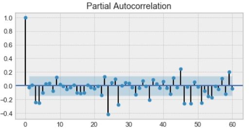
First, we have the autoregression model, AR(p). This is basically a regression of the time series onto itself. Here, we assume that the current value depends on its previous values with some lag. It takes a parameter p, which represents the maximum lag. To find it, we look at the partial autocorrelation plot and identify the lag after which most lags are not significant.
In the example below, p would be four.
Next, we’ll add the moving average model MA(q). This takes a parameter q which represents the biggest lag after which other lags are not significant on the autocorrelation plot.
Below, q would be four.

After that, we’ll add the order of integration I(d). The parameter d represents the number of differences required to make the series stationary.
Finally, we’ll add the final component: seasonality S(P, D, Q, s), where s is simply the season’s length. This component requires the parameters P and Q which are the same as p and q, but for the seasonal component. Finally, D is the order of seasonal integration representing the number of differences required to remove seasonality from the series.
Combining all, we get the SARIMA (p, d, q)(P, D, Q, s) model.
The main takeaway is this: Before modeling with SARIMA, we must apply transformations to our time series to remove seasonality and any non-stationary behaviors.
That was a lot of theory to wrap our head around. Let’s explore some applications and examples of time series models before learning how to apply the techniques discussed above.
Applications of Time Series Models
Time series models offer several applications that make them suitable for a range of industries.
Determining Patterns
Businesses that rely on seasonal sales, monthly online traffic spikes and other repetitive behavior can establish expectations based on time series models, gauging their overall health and performance.
Forecasting Future Trends
Based on previous data collected through time series models, businesses can predict how future trends may develop to protect their financial resources, explore new markets, restock inventory and perform other tasks.
Detecting Anomalies
Time series models also allow organizations to more easily spot data shifts that may signal unusual behavior or changes in the market.
Examples of Forecasting With Time Series Models
Many different sectors rely on time series models to spur business growth and innovation. These are some of the industries most impacted by this method.
Healthcare
Time series models can be used to monitor the spread of diseases by observing how many people transmit a disease and how many people die after being infected.
Agriculture
Time series models take into account seasonal temperatures, the number of rainy days each month and other variables over the course of years, allowing agricultural workers to assess environmental conditions and ensure a successful harvest.
Finance
Financial analysts can leverage time series models to record sales numbers for each month and predict potential stock market behavior.
Cybersecurity
IT and cybersecurity teams can develop patterns in user behavior with time series models, allowing them to be aware of when behavior doesn’t align with normal trends.
Retail
Retailers may apply time series models to study how other companies’ prices and the number of customer purchases change over time, helping them optimize prices.
Time Series Model Example: Predicting Stock Prices
For our first project, we will try to predict the stock price of a specific company. Now, predicting stock prices is virtually impossible. However, it remains a fun exercise, and it will be a good way to practice what we have learned.
We will use the historical stock price of the New Germany Fund (GF) to try to predict the closing price in the next five trading days. (You can code along with the dataset and notebook.)
1. Import the Data
import numpy as np
import pandas as pd
import matplotlib.pyplot as plt
import seaborn as sns
sns.set()

from sklearn.metrics import r2_score, median_absolute_error, mean_absolute_error
from sklearn.metrics import median_absolute_error, mean_squared_error, mean_squared_log_error

from scipy.optimize import minimize
import statsmodels.tsa.api as smt
import statsmodels.api as sm

from tqdm import tqdm_notebook

from itertools import product

def mean_absolute_percentage_error(y_true, y_pred):
    return np.mean(np.abs((y_true - y_pred) / y_true)) * 100

import warnings
warnings.filterwarnings('ignore')

%matplotlib inline

DATAPATH = 'data/stock_prices_sample.csv'

data = pd.read_csv(DATAPATH, index_col=['DATE'], parse_dates=['DATE'])
data.head(10)
First, we’ll import some libraries that will be helpful throughout our analysis. Also, we need to define the mean average percentage error (MAPE), as this will be our error metric.
Then, we’ll import our data set and the first ten entries. You should get:
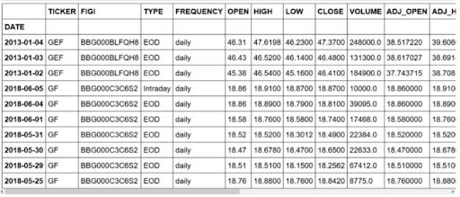
As you can see, we have a few entries concerning a different stock than the New Germany Fund (GF). Also, we have an entry concerning intraday information, but we only want end of day (EOD) information.
2. Clean the Data
data = data[data.TICKER != 'GEF']
data = data[data.TYPE != 'Intraday']
drop_cols = ['SPLIT_RATIO', 'EX_DIVIDEND', 'ADJ_FACTOR', 'ADJ_VOLUME', 'ADJ_CLOSE', 'ADJ_LOW', 'ADJ_HIGH', 'ADJ_OPEN', 'VOLUME', 'FREQUENCY', 'TYPE', 'FIGI']
data.drop(drop_cols, axis=1, inplace=True)
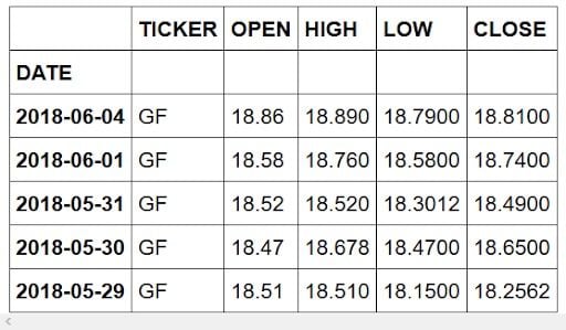
data.head()First, we’ll remove unwanted entries.
Then, we’ll remove unwanted columns, as we solely want to focus on the stock’s closing price.
If you preview the dataset, you should see:
Now, we’re ready for exploratory data analysis.
3. Exploratory Data Analysis (EDA)
# Plot closing price

plt.figure(figsize=(17, 8))
plt.plot(data.CLOSE)
plt.title('Closing price of New Germany Fund Inc (GF)')
plt.ylabel('Closing price ($)')
plt.xlabel('Trading day')
plt.grid(False)
plt.show()
We’ll plot the closing price over the entire time period of our data set.
You should get:
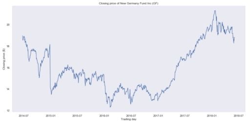
Clearly, this is not a stationary process, and it’s hard to tell if there is some kind of seasonality.
4. Moving Average
Let’s use the moving average model to smooth our time series. For that, we’ll rely on a helper function that will run the moving average model over a specified time window, and it will plot the result smoothed curve:
def plot_moving_average(series, window, plot_intervals=False, scale=1.96):

    rolling_mean = series.rolling(window=window).mean()

    plt.figure(figsize=(17,8))
    plt.title('Moving average\n window size = {}'.format(window))
    plt.plot(rolling_mean, 'g', label='Rolling mean trend')

    #Plot confidence intervals for smoothed values
    if plot_intervals:
        mae = mean_absolute_error(series[window:], rolling_mean[window:])
        deviation = np.std(series[window:] - rolling_mean[window:])
        lower_bound = rolling_mean - (mae + scale * deviation)
        upper_bound = rolling_mean + (mae + scale * deviation)
        plt.plot(upper_bound, 'r--', label='Upper bound / Lower bound')
        plt.plot(lower_bound, 'r--')

    plt.plot(series[window:], label='Actual values')
    plt.legend(loc='best')
    plt.grid(True)

#Smooth by the previous 5 days (by week)
plot_moving_average(data.CLOSE, 5)

#Smooth by the previous month (30 days)
plot_moving_average(data.CLOSE, 30)

#Smooth by previous quarter (90 days)
plot_moving_average(data.CLOSE, 90, plot_intervals=True)
Using a time window of five days, we get:
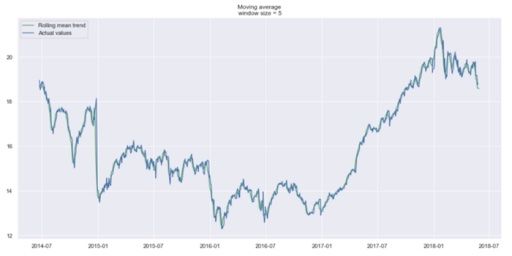
We can hardly see a trend because it’s too close to the actual curve. Let’s smooth by the previous month, and previous quarter to compare the results.
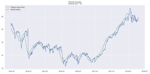
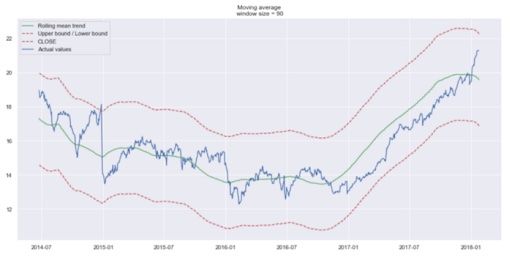
Trends are easier to spot now. Notice how the 30-day and 90-day trends show a downward curve at the end. This might mean that the stock is likely to go down in the following days.
5. Exponential Smoothing
Now, let’s use exponential smoothing to see if it can pick up a better trend.
def exponential_smoothing(series, alpha):

    result = [series[0]] # first value is same as series
    for n in range(1, len(series)):
        result.append(alpha * series[n] + (1 - alpha) * result[n-1])
    return result

def plot_exponential_smoothing(series, alphas):

    plt.figure(figsize=(17, 8))
    for alpha in alphas:
        plt.plot(exponential_smoothing(series, alpha), label="Alpha {}".format(alpha))
    plt.plot(series.values, "c", label = "Actual")
    plt.legend(loc="best")
    plt.axis('tight')
    plt.title("Exponential Smoothing")
    plt.grid(True);

plot_exponential_smoothing(data.CLOSE, [0.05, 0.3])
Here, we use 0.05 and 0.3 as values for the smoothing factor. Feel free to try other values and see what the results are.
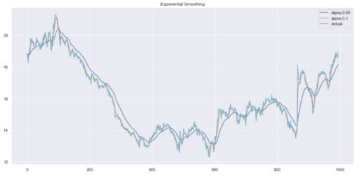
As you can see, an alpha value of 0.05 smoothed the curve while picking up most of the upward and downward trends.
Now, let’s use double exponential smoothing.
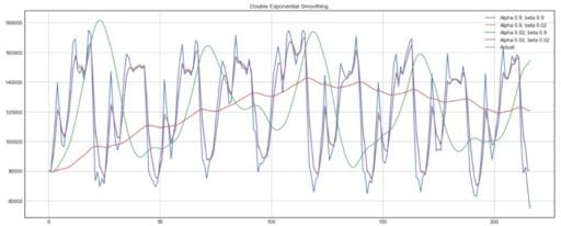
6. Double Exponential Smoothing
def double_exponential_smoothing(series, alpha, beta):

    result = [series[0]]
    for n in range(1, len(series)+1):
        if n == 1:
            level, trend = series[0], series[1] - series[0]
        if n >= len(series): # forecasting
            value = result[-1]
        else:
            value = series[n]
        last_level, level = level, alpha * value + (1 - alpha) * (level + trend)
        trend = beta * (level - last_level) + (1 - beta) * trend
        result.append(level + trend)
    return result

def plot_double_exponential_smoothing(series, alphas, betas):

    plt.figure(figsize=(17, 8))
    for alpha in alphas:
        for beta in betas:
            plt.plot(double_exponential_smoothing(series, alpha, beta), label="Alpha {}, beta {}".format(alpha, beta))
    plt.plot(series.values, label = "Actual")
    plt.legend(loc="best")
    plt.axis('tight')
    plt.title("Double Exponential Smoothing")
    plt.grid(True)

plot_double_exponential_smoothing(data.CLOSE, alphas=[0.9, 0.02], betas=[0.9, 0.02])
And you get:
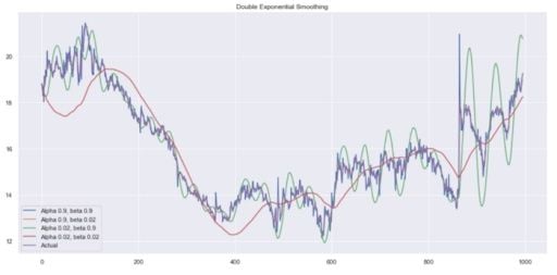
Again, experiment with different alpha and beta combinations to get better-looking curves.
7. Modeling
As outlined previously, we must turn our series into a stationary process in order to model it. Therefore, let’s apply the Dickey-Fuller test to see if it is a stationary process:
def tsplot(y, lags=None, figsize=(12, 7), syle='bmh'):

    if not isinstance(y, pd.Series):
        y = pd.Series(y)

    with plt.style.context(style='bmh'):
        fig = plt.figure(figsize=figsize)
        layout = (2,2)
        ts_ax = plt.subplot2grid(layout, (0,0), colspan=2)
        acf_ax = plt.subplot2grid(layout, (1,0))
        pacf_ax = plt.subplot2grid(layout, (1,1))

        y.plot(ax=ts_ax)
        p_value = sm.tsa.stattools.adfuller(y)[1]
        ts_ax.set_title('Time Series Analysis Plots\n Dickey-Fuller: p={0:.5f}'.format(p_value))
        smt.graphics.plot_acf(y, lags=lags, ax=acf_ax)
        smt.graphics.plot_pacf(y, lags=lags, ax=pacf_ax)
        plt.tight_layout()

tsplot(data.CLOSE, lags=30)

# Take the first difference to remove to make the process stationary
data_diff = data.CLOSE - data.CLOSE.shift(1)

tsplot(data_diff[1:], lags=30)
You should see:
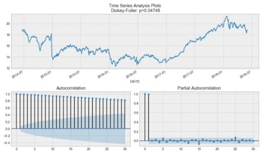
By the Dickey-Fuller test, the time series is unsurprisingly non-stationary. Also, looking at the autocorrelation plot, we see that it’s very high, and it seems that there’s no clear seasonality.
To get rid of the high autocorrelation and make the process stationary, let’s take the first difference (line 23 in the code block.) We simply subtract the time series from itself with a lag of one day, and we get:
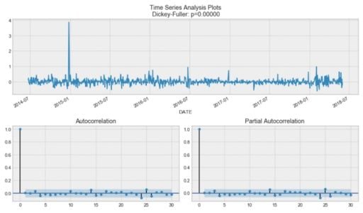
Our series is now stationary, and we can start modeling.
8. SARIMA
#Set initial values and some bounds
ps = range(0, 5)
d = 1
qs = range(0, 5)
Ps = range(0, 5)
D = 1
Qs = range(0, 5)
s = 5

#Create a list with all possible combinations of parameters
parameters = product(ps, qs, Ps, Qs)
parameters_list = list(parameters)
len(parameters_list)

# Train many SARIMA models to find the best set of parameters
def optimize_SARIMA(parameters_list, d, D, s):
    """
        Return dataframe with parameters and corresponding AIC

        parameters_list - list with (p, q, P, Q) tuples
        d - integration order
        D - seasonal integration order
        s - length of season
    """

    results = []
    best_aic = float('inf')

    for param in tqdm_notebook(parameters_list):
        try: model = sm.tsa.statespace.SARIMAX(data.CLOSE, order=(param[0], d, param[1]),
                                               seasonal_order=(param[2], D, param[3], s)).fit(disp=-1)
        except:
            continue

        aic = model.aic

        #Save best model, AIC and parameters
        if aic < best_aic:
            best_model = model
            best_aic = aic
            best_param = param
        results.append([param, model.aic])

    result_table = pd.DataFrame(results)
    result_table.columns = ['parameters', 'aic']
    #Sort in ascending order, lower AIC is better
    result_table = result_table.sort_values(by='aic', ascending=True).reset_index(drop=True)

    return result_table

result_table = optimize_SARIMA(parameters_list, d, D, s)

#Set parameters that give the lowest AIC (Akaike Information Criteria)
p, q, P, Q = result_table.parameters[0]

best_model = sm.tsa.statespace.SARIMAX(data.CLOSE, order=(p, d, q),
                                       seasonal_order=(P, D, Q, s)).fit(disp=-1)

print(best_model.summary())
Now, for SARIMA, we first need to define a few parameters and a range of values for other parameters to generate a list of all possible combinations of p, q, d, P, Q, D, s.
Now, in the code cell above, we have 625 different combinations. We will try each combination and train SARIMA with each to find the best-performing model. This might take a while depending on your computer’s processing power.
Once this is done, we’ll print out a summary of the best model, and you should see:

We can finally predict the closing price of the next five trading days and evaluate the mean absolute percentage error (MAPE) of the model.
In this case, we have a MAPE of 0.79 percent, which is very good.
9. Compare the Predicted Price to Actual Data
# Make a dataframe containing actual and predicted prices
comparison = pd.DataFrame({'actual': [18.93, 19.23, 19.08, 19.17, 19.11, 19.12],
                          'predicted': [18.96, 18.97, 18.96, 18.92, 18.94, 18.92]},
                          index = pd.date_range(start='2018-06-05', periods=6,))


#Plot predicted vs actual price

plt.figure(figsize=(17, 8))
plt.plot(comparison.actual)
plt.plot(comparison.predicted)
plt.title('Predicted closing price of New Germany Fund Inc (GF)')
plt.ylabel('Closing price ($)')
plt.xlabel('Trading day')
plt.legend(loc='best')
plt.grid(False)
plt.show()
Now, to compare our prediction with actual data, we can take financial data from Yahoo Finance and create a DataFrame.
Then, we make a plot to see how far we were from the actual closing prices:
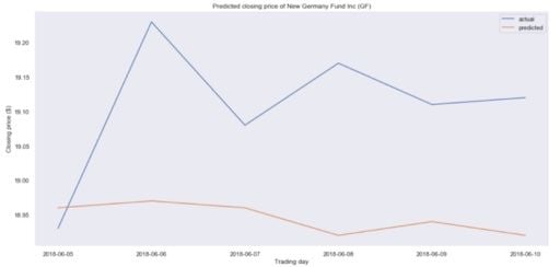
It seems that we are a bit off in our predictions. In fact, the predicted price is essentially flat, meaning that our model is probably not performing well.
Again, this is not due to our procedure, but to the fact that predicting stock prices is essentially impossible.
From the first project, we learned the entire procedure of making a time series stationary before using SARIMA to model. It’s a long and tedious process with a lot of manual tweaking.
Now, let’s introduce Facebook’s Prophet. It’s a forecasting tool available in both Python and R. This tool allows both experts and non-experts to produce high-quality forecasts with minimal effort.
Predict Air Quality With Prophet
The title says it all: We will use Prophet to help us predict air quality. You can code along with the full notebook and data set.
1. Import the Data
import warnings
warnings.filterwarnings('ignore')

import numpy as np
import pandas as pd
from scipy import stats
import statsmodels.api as sm
import matplotlib.pyplot as plt

%matplotlib inline

DATAPATH = 'data/AirQualityUCI.csv'

data = pd.read_csv(DATAPATH, sep=';')
data.head()
As always, we start by importing some useful libraries. We will then print out the first five rows:
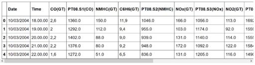
As you can see, the data set contains information about the concentrations of different gasses. They were recorded at every hour for each day.
If you explore the data set a bit more, you’ll notice that there are several instances of the value -200. Of course, it does not make sense to have a negative concentration, so we will need to clean the data before modeling.
Therefore, we need to clean the data.
2. Data Cleaning and Feature Engineering
# Make dates actual dates
data['Date'] = pd.to_datetime(data['Date'])

# Convert measurements to floats
for col in data.iloc[:,2:].columns:
    if data[col].dtypes == object:
        data[col] = data[col].str.replace(',', '.').astype('float')

# Compute the average considering only the positive values
def positive_average(num):
    return num[num > -200].mean()

# Aggregate data
daily_data = data.drop('Time', axis=1).groupby('Date').apply(positive_average)

# Drop columns with more than 8 NaN
daily_data = daily_data.iloc[:,(daily_data.isna().sum() <= 8).values]

# Remove rows containing NaN values
daily_data = daily_data.dropna()

# Aggregate data by week
weekly_data = daily_data.resample('W').mean()

# Plot the weekly concentration of each gas
def plot_data(col):
    plt.figure(figsize=(17, 8))
    plt.plot(weekly_data[col])
    plt.xlabel('Time')
    plt.ylabel(col)
    plt.grid(False)
    plt.show()

for col in weekly_data.columns:
    plot_data(col)
Here, we start off by parsing our date column to turn into “dates.”
Then, we’ll turn all the measurements into floats.
After, we’ll take the average of each measurement to aggregate the data by day.
At this point, we still have some NaN that we need to get rid of. Therefore, we remove the columns that have more than eight NaN. That way, we can then remove rows containing NaN values without losing too much data.
Finally, we aggregate the data by week, because it will give a smoother trend to analyze.
We can plot the trends of each chemical. Here, we show that of NOx.
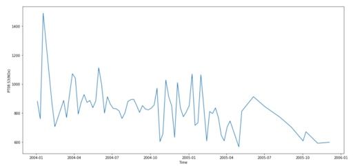
Oxides of nitrogen are very harmful, as they react to form smog and acid rain, as well as causing the formation of fine particles and ground-level ozone. These have adverse health effects, so the concentration of NOx is a key feature of air quality.
3. Modeling
# Drop irrelevant columns
cols_to_drop = ['PT08.S1(CO)', 'C6H6(GT)', 'PT08.S2(NMHC)', 'PT08.S4(NO2)', 'PT08.S5(O3)', 'T', 'RH', 'AH']

weekly_data = weekly_data.drop(cols_to_drop, axis=1)

# Import Prophet
from fbprophet import Prophet
import logging

logging.getLogger().setLevel(logging.ERROR)

# Change the column names according to Prophet's guidelines
df = weekly_data.reset_index()
df.columns = ['ds', 'y']
df.head()

# Split into a train/test set
prediction_size = 30
train_df = df[:-prediction_size]

# Initialize and train a model
m = Prophet()
m.fit(train_df)

# Make predictions
future = m.make_future_dataframe(periods=prediction_size)
forecast = m.predict(future)
forecast.head()

# Plot forecast
m.plot(forecast)

# Plot forecast's components
m.plot_components(forecast)

# Evaluate the model
def make_comparison_dataframe(historical, forecast):
    return forecast.set_index('ds')[['yhat', 'yhat_lower', 'yhat_upper']].join(historical.set_index('ds'))

cmp_df = make_comparison_dataframe(df, forecast)
cmp_df.head()

def calculate_forecast_errors(df, prediction_size):

    df = df.copy()

    df['e'] = df['y'] - df['yhat']
    df['p'] = 100 * df['e'] / df['y']

    predicted_part = df[-prediction_size:]

    error_mean = lambda error_name: np.mean(np.abs(predicted_part[error_name]))

    return {'MAPE': error_mean('p'), 'MAE': error_mean('e')}

for err_name, err_value in calculate_forecast_errors(cmp_df, prediction_size).items():
    print(err_name, err_value)

# Plot forecast with upper and lower bounds
plt.figure(figsize=(17, 8))
plt.plot(cmp_df['yhat'])
plt.plot(cmp_df['yhat_lower'])
plt.plot(cmp_df['yhat_upper'])
plt.plot(cmp_df['y'])
plt.xlabel('Time')
plt.ylabel('Average Weekly NOx Concentration')
plt.grid(False)
plt.show()
We will solely focus on modeling the NOx concentration. Therefore, we’ll remove all other irrelevant columns.
Then, we’ll import Prophet.
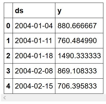
Prophet requires the date column to be named ds and the feature column to be named y, so we make the appropriate changes.
At this point, our data looks like this:
Then, we define a training set. For that we will hold out the last 30 entries for prediction and validation. Afterwards, we simply initialize Prophet, fit the model to the data, and make predictions.
You should see the following:
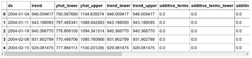
Here, yhat represents the prediction, while yhat_lower and yhat_upper represent the lower and upper bound of the prediction respectively. Prophet allows you to easily plot the forecast, and we get:
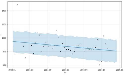
As you can see, Prophet simply used a straight downward line to predict the concentration of NOx in the future.
Then, we can check if the time series has any interesting features, such as seasonality:
Here, Prophet only identified a downward trend with no seasonality.
Evaluating the model’s performance by calculating its mean absolute percentage error (MAPE) and mean absolute error (MAE), we see that the MAPE is 13.86 percent and the MAE is 109.32, which is not that bad. Remember that we did not fine tune the model.
Finally, we just plot the forecast with its upper and lower bounds:
You’ve now learned how to robustly analyze and model a time series and applied your knowledge in two different projects.
Frequently Asked Questions
What are the different types of time series models?
There are many types of time series models, but the main ones include moving average, exponential smoothing and seasonal autoregressive integrated moving average (SARIMA).
What are the characteristics of time series models?
Autocorrelation, seasonality and stationarity are the main characteristics of time series models.