In their operations, organizations commonly use time series data, which refers to any information collected over a regular interval of time. Analyzing time series data yields insights like trends, seasonal patterns and forecasts into future events that can help generate profits. For example, by understanding the seasonal trends in demand for retail products, companies can plan promotions to maximize sales throughout the year.
Time Series Analysis in Python
Time series data, which means any information collected over a regular interval of time, is frequently used in business operations to predict trends or make forecasts. Examples include daily stock prices, energy consumption rates, social media engagement metrics and retail demand, among others.
How Does Time Series Analysis Work?
When analyzing time series data, you first need to check for stationarity and autocorrelation. Stationarity is a way to measure if the data has structural patterns like seasonal trends. Autocorrelation occurs when future values in a time series linearly depend on past values. You need to check for both of these in time series data because they’re assumptions that are made by many widely used methods in time series analysis. For example, the autoregressive integrated moving average (ARIMA) method for forecasting time series assumes stationarity. Further, linear regression for time series forecasting assumes that the data has no autocorrelation. Before conducting these processes, then, you need to know if the data is viable for the analysis.
During a time series analysis in Python, you also need to perform trend decomposition and forecast future values. Decomposition allows you to visualize trends in your data, which is a great way to clearly explain their behavior. Finally, forecasting allows you to anticipate future events that can aid in decision making. You can use many different techniques for time series forecasting, but here, we will discuss the autoregressive integrated moving average (ARIMA).
We will be working with publicly available airline passenger time series data, which can be found here.
How to Analyze Time Series Data in Python
1. Reading and Displaying Data
To start, let’s import the Pandas library and read the airline passenger data into a data frame:
import pandas as pd
df = pd.read_csv("AirPassengers.csv")
Now, let’s display the first five rows of data using the data frame head() method:
print(df.head())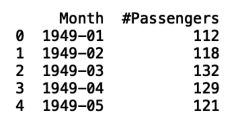
We can see that the data contains a column labeled “Month” that contains dates. In that column, the dates are formatted as year–month. We also see that the data starts in the year 1949.
The second column is labeled “#Passengers,” and it contains the number of passengers for the year–month. Let’s take a look at the last five records the data using the tail() method:
print(df.tail())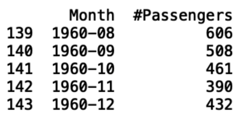
We see from this process that the data ends in 1960.
The next thing we will want to do is convert the month column into a datetime object. This will allow it to programmatically pull time values like the year or month for each record. To do this, we use the Pandas to_datetime() method:
df['Month'] = pd.to_datetime(df['Month'], format='%Y-%m')
print(df.head())
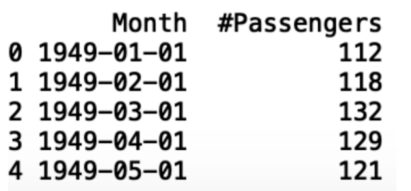
Note that this process automatically inserts the first day of each month, which is basically a dummy value since we have no daily passenger data.
The next thing we can do is convert the month column to an index. This will allow us to more easily work with some of the packages we will be covering later:
df.index = df['Month']
del df['Month']
print(df.head())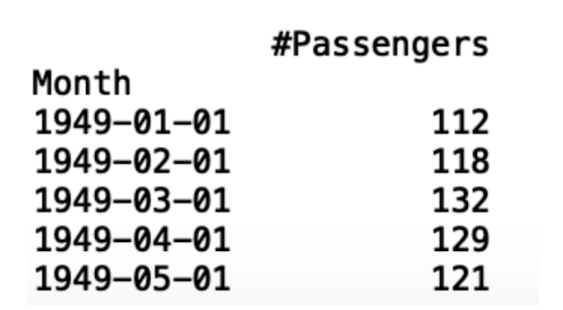
Next, let’s generate a time series plot using Seaborn and Matplotlib. This will allow us to visualize the time series data. First, let’s import Matplotlib and Seaborn:
import matplotlib.pyplot as plt
import seaborn as sns
Next, let’s generate a line plot using Seaborn:
sns.lineplot(df)And label the y-axis with Matplotlib:
plt.ylabel(“Number of Passengers”)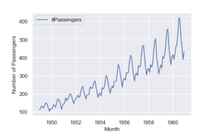
2. Stationarity
Stationarity is a key part of time series analysis. Simply put, stationarity means that the manner in which time series data changes is constant. A stationary time series will not have any trends or seasonal patterns. You should check for stationarity because it not only makes modeling time series easier, but it is an underlying assumption in many time series methods. Specifically, stationarity is assumed for a wide variety of time series forecasting methods including autoregressive moving average (ARMA), ARIMA and Seasonal ARIMA (SARIMA).
We will use the Dickey Fuller test to check for stationarity in our data. This test will generate critical values and a p-value, which will allow us to accept or reject the null hypothesis that there is no stationarity. If we reject the null hypothesis, that means we accept the alternative, which states that there is stationarity.
These values allow us to test the degree to which present values change with past values. If there is no stationarity in the data set, a change in present values will not cause a significant change in past values.
Let’s test for stationarity in our airline passenger data. To start, let’s calculate a seven-month rolling mean:
rolling_mean = df.rolling(7).mean()
rolling_std = df.rolling(7).std()
Next, let’s overlay our time series with the seven-month rolling mean and seven-month rolling standard deviation. First, let’s make a Matplotlib plot of our time series:
plt.plot(df, color="blue",label="Original Passenger Data")Then the rolling mean:
plt.plot(rolling_mean, color="red", label="Rolling Mean Passenger Number")And finally, the rolling standard deviation:
plt.plot(rolling_std, color="black", label = "Rolling Standard Deviation in Passenger Number")Let’s then add a title:
plt.title("Passenger Time Series, Rolling Mean, Standard Deviation")And a legend:
plt.legend(loc="best")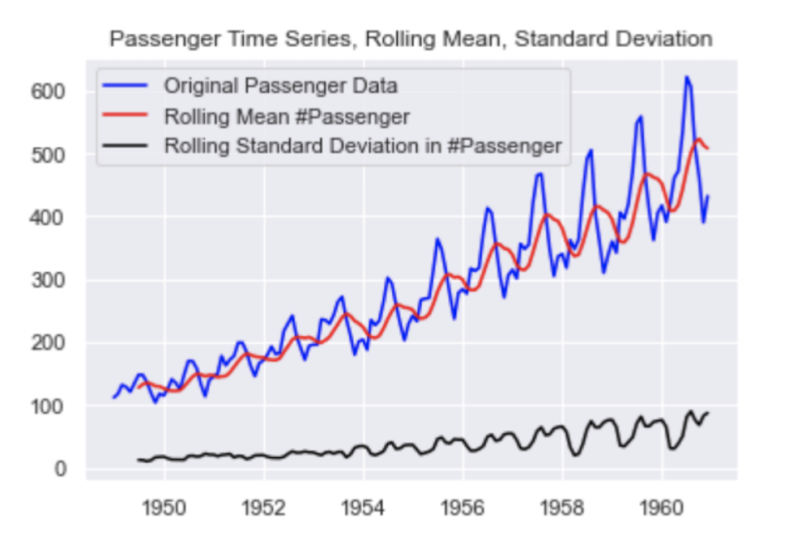
Next, let’s import the augmented Dickey-Fuller test from the statsmodels package. The documentation for the test can be found here.
from statsmodels.tsa.stattools import adfullerNext, let’s pass our data frame into the adfuller method. Here, we specify the autolag parameter as “AIC,” which means that the lag is chosen to minimize the information criterion:
adft = adfuller(df,autolag="AIC")Next, let’s store our results in a data frame display it:
output_df = pd.DataFrame({"Values":[adft[0],adft[1],adft[2],adft[3], adft[4]['1%'], adft[4]['5%'], adft[4]['10%']]  , "Metric":["Test Statistics","p-value","No. of lags used","Number of observations used",
                                                        "critical value (1%)", "critical value (5%)", "critical value (10%)"]})
print(output_df)
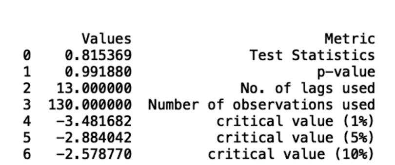
We can see that our data is not stationary from the fact that our p-value is greater than five percent and the test statistic is greater than the critical value. We can also draw these conclusions from inspecting the data, as we see a clear, increasing trend in the number of passengers.
3. Autocorrelation
Checking time series data for autocorrelation in Python is another important part of the analytic process. This is a measure of how correlated time series data is at a given point in time with past values, which has huge implications across many industries. For example, if our passenger data has strong autocorrelation, we can assume that high passenger numbers today suggest a strong likelihood that they will be high tomorrow as well.
The Pandas data frame has an autocorrelation method that we can use to calculate the autocorrelation in our passenger data. Let’s do this for a one-month lag:
autocorrelation_lag1 = df['#Passengers'].autocorr(lag=1)
print("One Month Lag: ", autocorrelation_lag1)
Now, let’s try three, six and nine months:
autocorrelation_lag3 = df['#Passengers'].autocorr(lag=3)
print("Three Month Lag: ", autocorrelation_lag3)

autocorrelation_lag6 = df['#Passengers'].autocorr(lag=6)
print("Six Month Lag: ", autocorrelation_lag6)

autocorrelation_lag9 = df['#Passengers'].autocorr(lag=9)
print("Nine Month Lag: ", autocorrelation_lag9)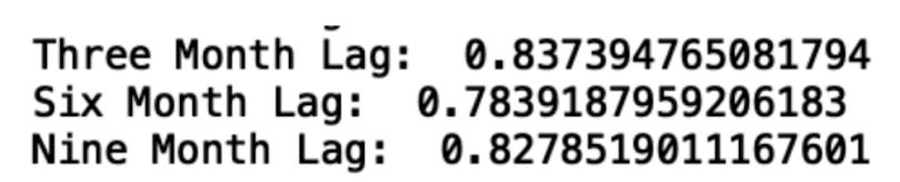
We see that, even with a nine-month lag, the data is highly autocorrelated. This is further illustration of the short- and long-term trends in the data.
4. Decomposition
Trend decomposition is another useful way to visualize the trends in time series data. To proceed, let’s import seasonal_decompose from the statsmodels package:
from statsmodels.tsa.seasonal import seasonal_decomposeNext, let’s pass our data frame into the seasonal_decompose method and plot the result:
decompose = seasonal_decompose(df['#Passengers'],model='additive', period=7)
decompose.plot()
plt.show()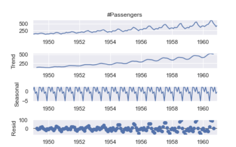
From this plot, we can clearly see the increasing trend in number of passengers and the seasonality patterns in the rise and fall in values each year.
5. Forecasting
Time series forecasting allows us to predict future values in a time series given current and past data. Here, we will use the ARIMA method to forecast the number of passengers, which allows us to forecast future values in terms of a linear combination of past values. We will use the auto_arima package, which will allow us to forgo the time consuming process of hyperparameter tuning.
First, let’s split our data for training and testing and visualize the split:
df['Date'] = df.index
train = df[df['Date'] < pd.to_datetime("1960-08", format='%Y-%m')]
train['train'] = train['#Passengers']
del train['Date']
del train['#Passengers']
test = df[df['Date'] >= pd.to_datetime("1960-08", format='%Y-%m')]
del test['Date']
test['test'] = test['#Passengers']
del test['#Passengers']
plt.plot(train, color = "black")
plt.plot(test, color = "red")
plt.title("Train/Test split for Passenger Data")
plt.ylabel("Passenger Number")
plt.xlabel('Year-Month')
sns.set()
plt.show()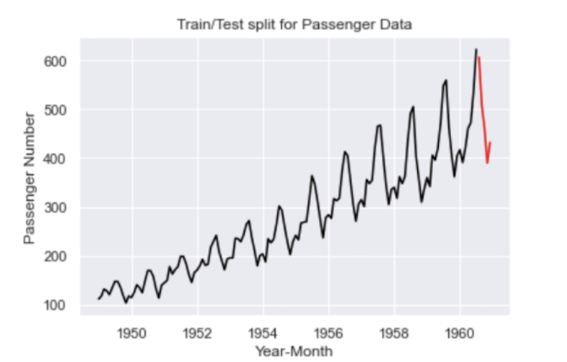
The black line corresponds to our training data and the red line corresponds to our test data.
Let’s import auto_arima from the pdmarima package, train our model and generate predictions:
from pmdarima.arima import auto_arima
model = auto_arima(train, trace=True, error_action='ignore', suppress_warnings=True)
model.fit(train)
forecast = model.predict(n_periods=len(test))
forecast = pd.DataFrame(forecast,index = test.index,columns=['Prediction'])
Below is a truncated sample of the output:
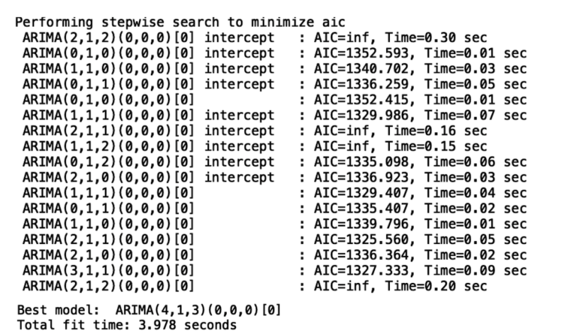
Now, let’s display the output of our model:
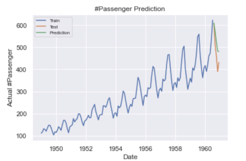
Our predictions are shown in green and the actual values are shown in orange.
Finally, let’s calculate root mean squared error (RMSE):
from math import sqrt
from sklearn.metrics import mean_squared_error
rms = sqrt(mean_squared_error(test,forecast))
print("RMSE: ", rms)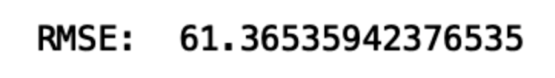
Importance of Time Series Analysis in Python
Conducting time series data analysis is a task that almost every data scientist will face in their career. Having a good understanding of the tools and methods for analysis can enable data scientists to uncover trends, anticipate events and consequently inform decision making. Understanding the seasonality patterns through stationarity, autocorrelation and trend decomposition can guide promotion planning throughout the year, which can improve profits for companies. Finally, time series forecasting is a powerful way to anticipate future events in your time series data, which can also significantly impact decision making. These types of analyses are invaluable to any data scientist or data science team that looks to bring value to their company with time series data. The code from this post is available on GitHub.
Frequently Asked Questions
What is a time series in Python?
Time series is a series of data points collected over an interval of time, where each point represents data at a specific timestamp. Python is one programming language used to help conduct time series analysis.
Is Python good for time series analysis?
Python is one of the best programming languages for time series analysis, as it has extensive libraries, functions and tools available for conducting data analysis.
Is R or Python better for time series?
Python is often preferred for time series analysis and forecasting due to its wide range of applications and libraries, though R is also effective when it comes to deep statistical or exploratory analysis of time series data.
What is the best data structure for time series data in Python?
DataFrames (especially when using pandas) and arrays are some of the best data structures for time series data in Python.