

In machine learning, precision and recall are two of the most important metrics when determining a model’s accuracy. Recall is a model’s ability to find all the relevant cases within a data set, while precision is its ability to identify only the relevant data points. Together, they play an important role in imbalanced classification problems, which involve data distributions that are skewed due to too many data points falling into a single class.
Consider the task of identifying terrorists trying to board flights. This is an imbalanced classification problem: we have two classes we need to identify — terrorists and not terrorists — with one category (non-terrorists) representing the overwhelming majority of the data points. It’s difficult to train a model to detect positive instances (terrorists) because few data points fall into this category to begin with. This is an example of the fairly common case in data science when accuracy is not a good measure for assessing model performance. Because even if this model performs with almost-perfect accuracy, the stakes of the situation are so high that it’s still not accurate enough to be all that helpful.
Precision and Recall in Machine Learning
To understand how to go beyond the accuracy of a machine learning model, let’s take a closer look at precision and recall and how they’re connected.
What Is Precision?
Precision is a metric evaluating the ability of a model to correctly predict positive instances. This reduces the number of false positives in the process. False positives are cases in which a machine learning model incorrectly labels as positive when they’re actually negative (in the previous example, that’s the non-terrorists that the model mistakenly classified as terrorists).
Precision = True Positives / (True Positives + False Positives)
What Is Recall?
Recall is a metric evaluating the ability of a machine learning model to correctly identify all of the actual positive instances within a data set. True positives are data points classified as positive by the model that are actually positive (correct), and false negatives are data points the model identifies as negative that are actually positive (incorrect).
Recall = True Positives / (True Positives + False Negatives)
How Are Precision and Recall Related?
While recall expresses the ability to find all relevant instances of a class in a data set, precision expresses the proportion of the data points our model says existed in the relevant class that were indeed relevant. This is a complementary relationship, but there is a trade-off depending on the metric we choose to maximize — when we increase the recall, we decrease the precision.
Returning to the example in the introduction, labeling 100 percent of passengers as terrorists is probably not useful because we would have to ban every single person from flying. This new model would suffer from low precision or the ability of a classification model to identify only the relevant data points.
Say we modify the model slightly and identify a single individual correctly as a terrorist. Now, our precision will be 1.0 (no false positives), but our recall will be very low because we still have many false negatives. If we go to the other extreme and classify all passengers as terrorists, we will have a recall of 1.0 — we’ll catch every terrorist — but our precision will be very low, and we’ll detain many innocent individuals.
Finding the right balance between precision and recall enables machine learning models to perform at a high level while adapting to various contexts. Now we have the language to express the intuition that our first model, which labeled all individuals as not terrorists, wasn’t very useful. Although it had near-perfect accuracy, it had zero precision and zero recall because there were no true positives.
Combining Precision and Recall Through the F1 Score
In some situations, we may want to maximize recall or precision at the expense of the other metric. For example, in preliminary disease screening of patients for follow-up examinations, we would probably want a recall near 1.0 — we want to find all patients who actually have the disease — and we can accept a low precision — we accidentally find some patients have the disease who actually don’t have it — if the cost of the follow-up examination isn’t high.
However, in cases where we want to find an optimal blend of precision and recall, we can combine the two metrics using the F1 score. The F1 score is the harmonic mean of precision and recall, taking both metrics into account in the following equation:
F1 = 2 ((Precision * Recall) / (Precision + Recall))
We use the harmonic mean instead of a simple average because it punishes extreme values. A classifier with a precision of 1.0 and a recall of 0.0 has a simple average of 0.5 but an F1 score of 0. The F1 score gives equal weight to both measures and is a specific example of the general Fβ metric where β can be adjusted to give more weight to either recall or precision. If we want to create a classification model with the optimal balance of precision and recall, then we try to maximize the F1 score.
Visualizing Precision and Recall
Before diving into an example of precision and recall, we need to talk briefly about two concepts we use to show precision and recall.
Confusion Matrix
The confusion matrix is useful for quickly calculating precision and recall given the predicted labels from a model and the true labels. A confusion matrix for binary classification shows the four different outcomes: true positive, false positive, true negative, and false negative. The actual values form the columns, and the predicted values (labels) form the rows (you may see the rows and columns reversed — there isn’t a standard). The intersection of the rows and columns shows one of the four outcomes.
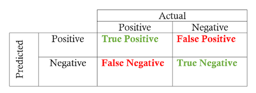
Going from the confusion matrix to the precision and recall requires finding the respective values in the matrix and applying the equations:
Recall = True Positives / (True Positives + False Negatives)
Precision = True Positives / (True Positives + False Positives)
Receiver Operating Characteristic (ROC) Curve
The other main visualization technique for showing the performance of a classification model is the receiver operating characteristic (ROC) curve. The idea is relatively simple: the ROC curve shows how the relationship between recall and precision changes as we vary the threshold for identifying a positive data point in our model. The threshold represents the value above which we consider a data point in the positive class.
If we have a model for identifying a disease, our model might output a score for each patient between zero and one, and we can set a threshold in this range for labeling a patient as having the disease (a positive label). By altering the threshold, we try to achieve the right balance between precision and recall.
A ROC curve plots the true positive rate on the y-axis versus the false positive rate on the x-axis. The true positive rate (TPR) is the recall, and the false positive rate (FPR) is the probability of a false alarm. Both of these can be calculated from the confusion matrix:
True Positive Rate = True Positives / (True Positives + False Negatives)
False Positive Rate = False Positives / (False Positives + True Negatives)
A typical ROC curve looks like this:
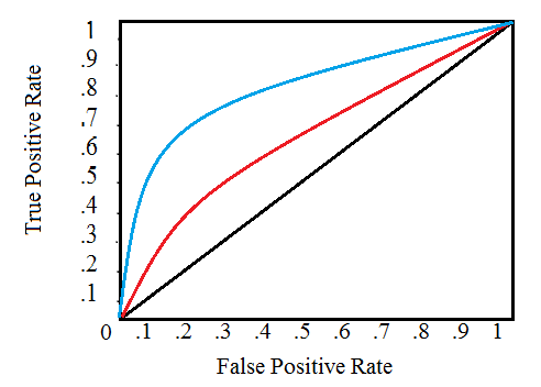
The black diagonal line indicates a random classifier, and the red and blue curves show two different classification models. For a given model, we can only stay on one curve, but we can move along the curve by adjusting our threshold for classifying a positive case. Generally, as we decrease the threshold, we move to the right and upwards along the curve.
With a threshold of 1.0, we would be in the lower left of the graph because we identify no data points as positives, leading to no true positives and no false positives (TPR = FPR = zero). As we decrease the threshold, we identify more data points as positive, leading to more true positives but also more false positives . Eventually, at a threshold of 0.0, we identify all data points as positive and find ourselves in the upper right corner of the ROC curve (TPR = FPR = 1.0).
Finally, we can quantify a model’s ROC curve by calculating the total area under the curve (AUC), a metric that falls between zero and one with a higher number indicating better classification performance. In the graph above, the AUC for the blue curve will be greater than that for the red curve, meaning the blue model is better at achieving a blend of precision and recall. A random classifier (the black line) achieves an AUC of 0.5.
Recap: Precision vs. Recall
Let’s do a quick recap of the terms we’ve covered and then walk through an example to solidify the new ideas we’ve learned.
Four Outcomes of Binary Classification
- True Positives: data points labeled as positive that are actually positive.
- False Positives: data points labeled as positive that are actually negative.
- True Negatives: data points labeled as negative that are actually negative.
- False Negatives: data points labeled as negative that are actually positive.
Recall and Precision Metrics
- Recall: the ability of a classification model to identify all data points in a relevant class.
- Precision: the ability of a classification model to return only the data points in a class.
- F1 Score: a single metric that combines recall and precision using the harmonic mean.
Visualizing Recall and Precision
- Confusion Matrix: shows the actual and predicted labels from a classification problem.
- Receiver Operating Characteristic (ROC) Curve: plots the true positive rate (TPR) versus the false positive rate (FPR) as a function of the model’s threshold for classifying a positive data point.
- Area Under the Curve (AUC): metric to calculate the overall performance of a classification model based on area under the ROC curve.
Calculating Precision and Recall Example
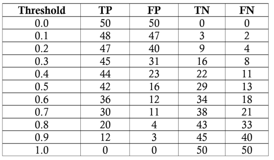
Our task will be to diagnose 100 patients with a disease present in 50 percent of the general population. We will assume a black-box model, where we put in information about patients and receive a score between zero and one. We can alter the threshold for labeling a patient as positive (has the disease) to maximize the classifier performance. We will evaluate thresholds from 0.0 to 1.0 in increments of 0.1, at each step calculating the precision, recall, F1 and location on the ROC curve. Here are the classification outcomes at each threshold:
We’ll do one sample calculation of the recall, precision, true-positive rate and false-positive rate at a threshold of 0.5. First, we make the confusion matrix:
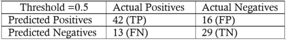
We can use the numbers in the matrix to calculate the recall, precision and F1 score:
Then we calculate the true positive and false positive rates to find the y and x coordinates for the ROC curve:

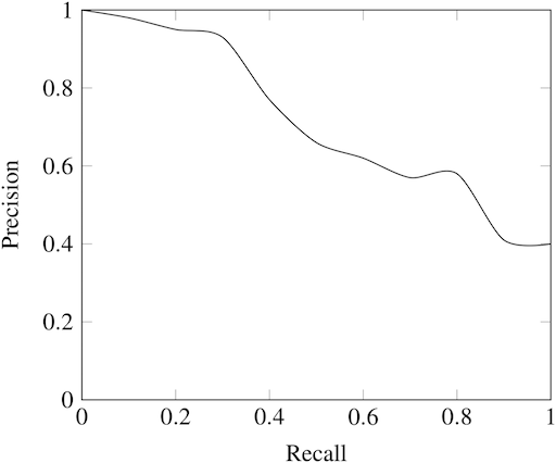
To make the entire ROC curve, we carry out this process at each threshold. As you might imagine, this is pretty tedious, so instead of doing it by hand, we use a language like Python to do it for us! The Jupyter Notebook with the calculations is on GitHub for anyone to see the implementation. The final ROC curve is below with the thresholds above the points:
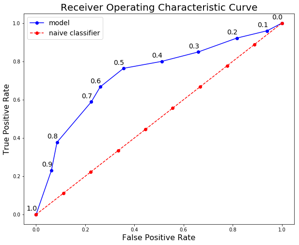
Here we can see all the concepts come together. At a threshold of 1.0, we classify no patients as having the disease and hence have a recall and precision of 0.0. As the threshold decreases, the recall increases because we identify more patients that have the disease. However, as our recall increases, our precision decreases because, in addition to increasing the true positives, we increase the false positives.
At a threshold of 0.0, our recall is perfect — we find all patients with the disease — but our precision is low because we have many false positives. We can move along the curve for a given model by changing the threshold and can select the threshold that maximizes the F1 score. To shift the entire curve, we would need to build a different model. A model with a curve to the left and above our blue curve would be a superior model because it would have higher precision and recall at each threshold.
The final model statistics at each threshold are:
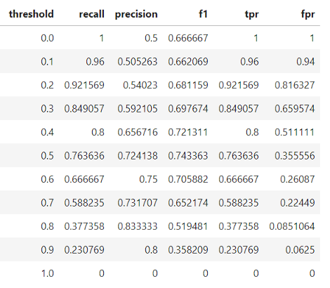
Based on the F1 score, the overall best model occurs at a threshold of 0.5. If we wanted to emphasize precision or recall to a greater extent, we could choose the corresponding model that performs best on those measures.
Going Beyond Accuracy With Precision and Recall
Although better-suited metrics than accuracy — such as precision and recall — may seem foreign, we already have an intuitive sense of why they work better for some problems such as imbalanced classification tasks.
Statistics and machine learning provide us with the formal definitions and the equations to calculate these measures. Knowing about recall, precision, F1 and the ROC curve allows us to assess classification models and should make us think skeptically about anyone touting only the accuracy of a model, especially for imbalanced problems.
Frequently Asked Questions
What is recall vs. precision?
Recall is the ability of a machine learning model to detect all relevant cases within a data set, identifying all instances of data points belonging to a certain class. Meanwhile, precision determines the number of data points a model assigns to a certain class that actually belong in that class.
What is the formula for precision and recall?
The formula for precision is the number of true positives divided by the number of true positives plus the number of false positives:
Precision = True Positives / (True Positives + False Positives)
The formula for recall is the number of true positives divided by the number of true positives plus the number of false negatives:
Recall = True Positives / (True Positives + False Negatives)
What is precision and recall in Python?
Precision and recall serve the same purposes in Python. Recall determines how well a machine learning model identifies all positive or relevant instances in a data set, while precision measures how well the model identifies instances that actually belong to the relevant class.


