ROC curves, or receiver operating characteristic curves, are one of the most common evaluation metrics for checking a classification model’s performance in machine learning. Unfortunately, many data scientists often just end up seeing the ROC curves and then quoting an AUC (short for area under the ROC curve) value without really understanding the various problems ROC curves solve, or what the AUC value means and how they can use them more effectively.
That’s why it’s important for data scientists to have a fuller understanding of both ROC curves and AUC.
What Is ROC Curve and AUC?
An ROC curve (receiver operating characteristic curve) measures the performance of a classification model by plotting the rate of true positives against false positives. AUC (area under the ROC curve) is the probability that a classifier will rank a randomly chosen positive instance higher than a randomly chosen negative one.
Why Use ROC Curve and AUC?
So, the first question that comes to mind before we even start to learn about ROC curves and AUC is why not use a fairly simple metric like accuracy for a binary classification task? After all, accuracy is pretty easy to understand as it just calculates the percentage of correct predictions by a model.
The answer is that accuracy doesn’t capture the whole essence of a probabilistic classifier, i.e., it is neither a threshold-invariant metric nor a scale-invariant metric. What do I mean by that? Better to explain using some examples.
1. Why is accuracy not threshold-invariant?
Assuming a threshold of 0.5 for a logistic regression classifier, what do you think the accuracy of this classifier is?

If you said 50 percent, congratulations. We would misclassify the two zeros as ones. This result isn’t that great. But is our classifier really that bad? Based on accuracy as an evaluation metric, it seems that it is. But what if we change the threshold in the same example to 0.75? Now, our classifier becomes 100 percent accurate. This should lead us to ask how we can come up with an evaluation metric that doesn’t depend on the threshold. That is, we want a threshold-invariant metric.
2. Why is accuracy not scale-invariant?
Now, let’s do the same exercise again, but this time our classifier predicts different probabilities but in the same rank order. This means that the probability values change, but the order remains the same. So in Classifier B, the rank of predictions remains the same while Classifier C predicts on a whole different scale. So, which of the following is the best?
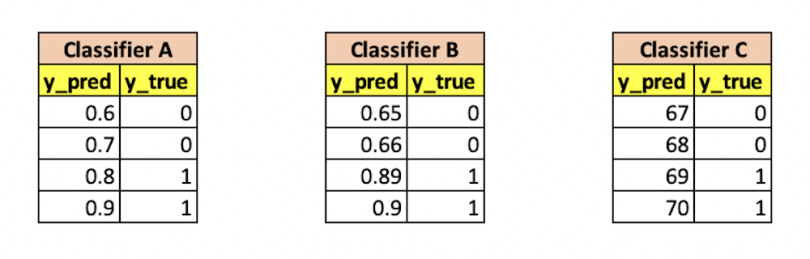
In all these cases, we can see that each classifier is largely the same. That is, if we have a threshold of 0.75 for Classifier A, 0.7 for Classifier B and 68.5 for Classifier C, we have a 100 percent accuracy on all of them.
The property of having the same value for an evaluation metric when the rank order remains the same is called the scale-invariant property. This property can really help us in cases where a classifier predicts a score rather than a probability, thereby allowing us to compare two different classifiers that predict values on a different scale.
So, finally, we want an evaluation metric that satisfies the following two conditions:
- It is threshold invariant, i.e., the value of the metric doesn’t depend on a chosen threshold.
- It is scale-invariant, i.e., it measures how well predictions are ranked rather than their absolute values.
The excellent news is that AUC fulfills both the above conditions. Before we can even look at how AUC is calculated, however, let’s understand ROC curves in more detail.
What Is ROC Curve?
An ROC curve is a graph displaying the performance of a binary classification model at every classification threshold. This curve plots two metrics known as true positive rate (TPR) and false positive rate (FPR) at different classification thresholds. On an ROC curve graph, TPR is represented on the Y-axis and FPR is represented on the X-axis. Both TPR and FPR increase when the classification threshold is lowered, as this classifies more observations as positive.
What Is True Positive Rate and False Positive Rate?
But how do we make ROC curves ourselves? To understand this, we need to understand true positive rate (TPR) and false positive rate (FPR) first. So, let’s say we have the following sample confusion matrix for a model with a particular probability threshold:
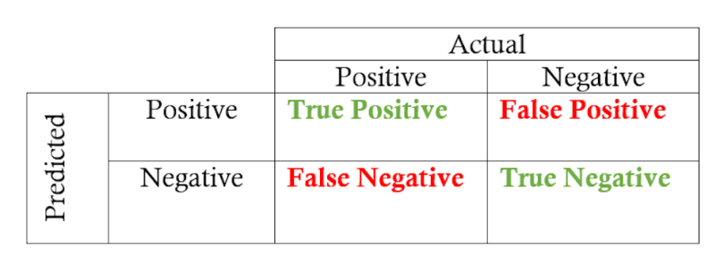
To explain TPR and FPR, I usually give the example of a justice system. Naturally, any justice system only wants to punish people guilty of crimes and doesn’t want to charge an innocent person. Now let’s say that the model above is a justice system that evaluates each citizen and predicts either a zero (innocent) or a one (guilty).
In this case, the TPR is the proportion of guilty criminals our model was able to capture. Thus, the numerator is guilty criminals captured, and the denominator is total criminals. This ratio is also known as recall or sensitivity.
TPR (True Positive Rate)/Sensitivity/Recall = TP/(TP+FN)
The FPR is the proportion of innocents we incorrectly predicted as criminals (false positives) divided by the total number of actual innocent citizens. Thus, the numerator is innocents captured, and the denominator is total innocents.
FPR (False Positive Rate) = FP/(TN+FP)
Usually, we would want high TPR (because we want to capture all the criminals) and low FPR (because we don’t want to capture innocent people).
How to Create an ROC Curve
So, how do we plot ROC Curves using TPR and FPR? We plot false positive rate (FPR) on the X-axis vs. true positive rate (TPR) on the Y-axis using different threshold values. The resulting curve when we join these points is called the ROC Curve.
Let’s go through a simple code example here to understand how to do this in Python. Below, we just create a small sample classification data set and fit a logistic regression model on the data. We also get the probability values from the classifier.
from sklearn.datasets import make_classification
from sklearn.linear_model import LogisticRegression
from sklearn.metrics import roc_curve
from sklearn.metrics import roc_auc_score
import plotly.express as px
import pandas as pd

# Random Classification dataset
X, y = make_classification(n_samples=1000, n_classes=2, random_state=1)

model = LogisticRegression()
model.fit(X, y)

# predict probabilities
preds = model.predict_proba(X)[:,1]
Now we want to evaluate how good our model is using ROC curves. To do this, we need to find FPR and TPR for various threshold values. We can do this pretty easily by using the function roc_curve from sklearn.metrics, which provides us with FPR and TPR for various threshold values as shown below:
fpr, tpr, thresh = roc_curve(y, preds)

roc_df = pd.DataFrame(zip(fpr, tpr, thresh),columns = ["FPR","TPR","Threshold"])
Now all that remains is plotting the curve using the above data. We can do this by using any graphing library, but I prefer plotly.express as it is pretty easy to use and even allows you to use plotly constructs on top of plotly express figures. As you can see in the below curve, we plotted FPR vs TPR for various threshold values.

How to Use ROC Curves
We can generally use ROC curves to decide on a threshold value. The choice of threshold value will also depend on how the classifier is intended to be used. So, if the above curve was for a cancer prediction application, you want to capture the maximum number of positives (i.e., have a high TPR) and you might choose a low value of threshold like 0.16 even when the FPR is pretty high here. This is because you really don’t want to predict “no cancer” for a person who actually has cancer. In this example, the cost of a false negative is pretty high. You are OK even if a person who doesn’t have cancer tests positive because the cost of a false positive is lower than that of a false negative. This is actually what a lot of clinicians and hospitals do for such vital tests and also why a lot of clinicians do the same test for a second time if a person tests positive. (Can you think why doing so helps? Hint: Bayes Rule).
Otherwise, in a case like the criminal classifier from the previous example, we don’t want a high FPR as one of the tenets of the justice system is that we don’t want to capture any innocent people. So, in this case, we might choose our threshold as 0.82, which gives us a good recall or TPR of 0.6. That is, we can capture 60 percent of criminals.
What Is AUC?
The AUC is the area under the ROC Curve. This area is always represented as a value between 0 to 1 (just as both TPR and FPR can range from 0 to 1), and we essentially want to maximize this area so that we can have the highest TPR and lowest FPR for some threshold.
AUC has multiple properties like threshold invariance and scale invariance, which necessarily means that the AUC metric doesn’t depend on the chosen threshold or the scale of probabilities. These properties make AUC pretty valuable for evaluating binary classifiers as it provides us with a way to compare them without caring about the classification threshold.
Scikit-learn provides a utility function that lets us get AUC if we have predictions and actual y values using roc_auc_score(y, preds).
It can also be mathematically proven that AUC is equal to the probability that a classifier will rank a randomly chosen positive instance higher than a randomly chosen negative one. Thus, an AUC of 0.5 means that the probability of a positive instance ranking higher than a negative instance is 0.5 and hence random. A perfect classifier would always rank a positive instance higher than a negative one and have an AUC of 1.
So, is AUC threshold-invariant and scale-invariant?
Yes, AUC is threshold-invariant as we don’t have to set a threshold to calculate AUC.
For checking scale invariance, I will essentially do an experiment in which I multiply our predictions by a random factor (scaling) and also exponentiate the predictions to check whether the AUC changes if the predictions change even though their rank-order doesn’t change. As AUC is scale-invariant, I would expect the same ROC curve and same AUC metric. Below, you can see the scaling on the left and exponential rank order on the right.

And that is in fact what I got. Only the threshold changes as the scale changes. The shape of the curve, as well as the AUC, remains precisely the same.
ROC and AUC in Machine Learning
An important step while creating any machine learning pipeline is evaluating different models against each other. Picking the wrong evaluation metric or not understanding what your metric really means could wreak havoc to your whole system. I hope that, with this post, I was able to clear some confusion that you might have had with ROC curves and AUC.
If you want to learn more about how to structure a machine learning project and the best practices for doing so, I would recommend this excellent third course named “Structuring Machine Learning Projects” in the Coursera Deep Learning Specialization. Do check it out. It addresses the pitfalls and a lot of basic ideas to improve your models.
Frequently Asked Questions
What is ROC and AUC curve?
ROC curve (receiver operating characteristic curve) is a graph displaying the performance of a binary classification model at every classification threshold. It plots the metrics true positive rate (TPR) and false positive rate (FPR) at different classification thresholds.
AUC (area under the ROC curve) measures the area lying below the entire ROC curve. It represents the probability that a classifier will rank a randomly chosen positive instance higher than a randomly chosen negative one. This probability is shown as a value between 0 and 1.
What does an ROC curve tell you?
An ROC curve helps determine the ability of a statistical test to discriminate between groups, compare the performance of two or more tests or find the optimal cut-off value where sensitivity (true positive rate) and specificity (true negative rate) on a diagnostic test are equal.
What is a good ROC curve?
A good ROC curve generally has an AUC value of 0.8 or higher. An ideal ROC curve is one that has an AUC of 1.