A data visualization can be the starting point for your problem-solving work. A data visualization is a brilliant way to build your descriptive analytics. Descriptive analytics is describing the situation, but we don’t want to read a massive table of data to find out what is happening, so how do we simplify that?
5 Steps to Build a Data Visualization
- Know your objective.
- Know your audience.
- Know your tool.
- Know your visualization types.
- Know your story.
We utilize a data visualization. In that data visualization, we need to capture the “what is happening?” and use it to build out our descriptive analytics. If we want to problem-solve effectively with data, we must have a solid understanding and foundation of what is happening. To help us build our data visualization, let’s look at a few steps we can take.
Know Your Objective
When you are building dashboards, are you working directly toward a goal or objective? What is it that you are building the dashboard for? Yes, I think we all realize we are building it for some reason, but a question that we may ask is how is that objective hitting the team, business unit or organizational goal? Take the time to study and know your objective for the dashboard.
Image: Shutterstock / Built In
I think in the world of data and analytics, what we find is that we are doing a lot of work that may not be of a lot of value. At one point in my career, I was speaking with an organization. Now, if I have my numbers right, they had 400 dashboards and were using six of them. You read that right. Six. Now, how does this happen? Why is it we build out these dashboards or visualizations and get to a point where we have 400 and are only using six?
I would say not having a clear direction is a key element of this. For descriptive analytics to be effective, we must have that clear objective, that north star we are working toward. Think of the amount of time that could be opened up by not maintaining 400 dashboards; think of the flow of the four levels of analytics that could come to fruition with the freeing of time in this situation.
Know Your Audience
Have you ever been spoken to and wondered what in the world that person was talking about? Have you ever been speaking and felt, this group does not get a word of what I am saying? There are probably countless examples of dialogue or speaking where one side or the other, or both, don’t know what in the world the other is saying. Knowing your audience is one of the key things you can do to build a good data visualization and strong descriptive analytics.
Once you know what you are truly trying to achieve with your data and analytical work, then go into knowing the audience. Is it an audience of one? Do you have a smaller group, maybe your team you are working on or with? Or is the audience large and you are delivering a webinar, keynote presentation or breakout session?
Knowing your audience is an absolutely crucial element of building out a strong data visualization. We may know what we like and we can build to that, but if it isn’t what your audience likes, they may not react to it as enthusiastically as we would like. Know your audience to help you get buy-in to the descriptive analytic and story you are trying to share.
Know Your Tool
This may seem obvious, but is it, though? How well do we truly know the tools we are using? Some of the tools are Qlik, Power BI, Tableau, and yes, even Microsoft Excel. Maybe you know the tools you use very well, but you need to know the tool well enough to build the data visualization you want. Know the tool’s limitations. Know how easy it is for the audience to filter and utilize the visualization effectively. Know how to bring the tool to life for your audience.
Unfortunately, as is the case with probably a lot of data and analytics tools, we get caught up in the areas of the tool we like and we may miss out on different features the tool has for us to really bring our descriptive analytic to life. Don’t let personal preferences impede the success you can have. Please note, though, that you can utilize your personal preferences in the tool to be successful and drive the descriptive analytic forward.
What I am discussing here is the mindset of not allowing yourself to see the openings and opportunities the tool has for you to make your visualization even better.
Know Your Visualization Types
Do you find yourself building descriptive analytic visualizations with the same charts and visualizations? Do you find yourself using the same colors within the visualization? Do your dashboards all look alike?
If you answer these questions in the affirmative, that isn’t necessarily a bad thing, especially if you are communicating your story or your descriptive analytic well.
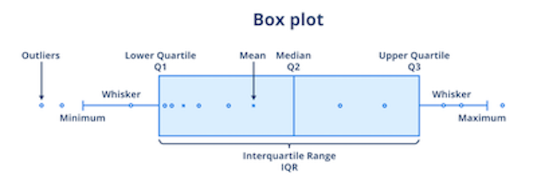
What I don’t want is for you to miss out on ways to build a visualization that are more effective at driving descriptive analytics and telling the story of what is happening. If there are charts and visualizations you have heard of before but don’t know how they work, take the time to invest in yourself and learn. One of the key things a new visualization may do for you is help you see data in a different light and drive new insight.
Know Your Story
Overall, for your data visualization to be the most effective it can be, drive your descriptive analytics by knowing your story. Do you know the context and the problem you are solving? Do you know how you will use your descriptive analytics and do you know how this fits into the problem solving you are doing?
Ask yourself questions like: What is the audience I am addressing here? What is the business objective or business question we are answering with this descriptive analytic? Have I looked at all the different types of visualizations that are possible for this story? Just question it and see if you know the story. Utilize this to help you with a powerful descriptive analytic through data visualization.
A quick note on asking your questions: Don’t get caught in analysis paralysis or perfection paralysis. The reality is, we can overthink things. We can overdo it. Let’s not let that happen. Let’s make sure we learn to be effective and efficient.
Data-driven problem solving is a key element to driving descriptive analytics effectively. Having the right mindset and the right data visualization are great ways to help with data-driven problem solving. They can help set the frame and story correctly. Ensure you are developing in these areas effectively.
Excerpted from Be Data Analytical by Jordan Morrow ©2023. Text and cover reproduced and adapted with permission from Kogan Page Ltd.


