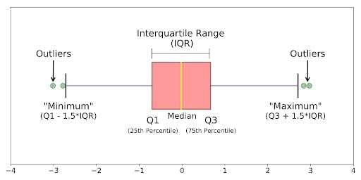
A boxplot, also known as a box plot or box-and-whisker plot, is a standardized way of displaying the distribution of a data set based on its five-number summary of data points: the “minimum,” first quartile [Q1], median, third quartile [Q3] and “maximum.” Here’s an example.
Boxplots can tell you about your outliers and what their values are. They can also tell you if your data is symmetrical, how tightly your data is grouped and if and how your data is skewed.
What Is a Boxplot?
A boxplot is a standardized way of displaying the distribution of data based on its five-number summary (“minimum”, first quartile [Q1], median, third quartile [Q3] and “maximum”). Boxplots can tell you about your outliers and their values, if your data is symmetrical, how tightly your data is grouped and if and how your data is skewed.
In this tutorial I’ll answer the following questions:
- What is a boxplot?
- How can I understand the anatomy of a boxplot by comparing a boxplot against the probability density function for a normal distribution?
- How do you make and interpret boxplots using Python?
As always, the code used to make the graphs is available on my GitHub. With that, let’s get started.
What Is a Boxplot?
A boxplot is a graph that gives a visual indication of how a data set’s 25th percentile, 50th percentile, 75th percentile, minimum, maximum and outlier values are spread out and compare to each other.
A boxplot is drawn as a box with a line inside of it, and has extended lines attached to each of its sides (known as “whiskers”). The box is used to represent the interquartile range (IQR) — or the 50 percent of data points lying above the first quartile and below the third quartile — in the given data set. The whiskers are used to represent the variability of the minimum, maximum and any outlier data points in comparison to the IQR (the longer the whisker, the wider the variability of the attached data points to the IQR).
The box’s left edge or bottom end represents the first/lower quartile (Q1; the 25th percentile) of the data. The line inside the box represents the median (Q2; the 50th percentile) of the data. The box’s right edge or top end represents the third/upper quartile (Q3; the 75th percentile) of the data. If a dot, cross or diamond symbol is present inside the box, this represents the mean of the data.
As for whiskers of the boxplot, the left whisker shows the minimum data value and its variability in comparison to the IQR. The right whisker shows the maximum data value and its variability in comparison to the IQR. Whiskers also help present outlier values in comparison to the rest of the data, as outliers sit on the outside of whisker lines.

- Median (Q2/50th percentile): The middle value of the data set.
- First Quartile (Q1/25th percentile): The middle number between the smallest number (not the “minimum”) and the median of the data set.
- Third Quartile (Q3/75th percentile): The middle value between the median and the highest value (not the “maximum”) of the dataset.
- Interquartile Range (IQR): 25th to the 75th percentile.
- Whiskers (shown in blue)
- Outliers (shown as green circles)
- “Minimum”:
Q1 - 1.5*IQR - “Maximum”:
Q3 + 1.5*IQR
When to Use a Boxplot
A boxplot may help when you need more information from a data set/distribution than just the measures of central tendency (mean, median and mode). Boxplots can illustrate the variability or dispersion of all data points present within a set, giving a good indication of outliers and how symmetrical the data is.
Although boxplots may seem primitive in comparison to a histogram or density plot, they have the advantage of taking up less space, which is useful when comparing distributions between many groups or data sets.
What defines an outlier, “minimum” or “maximum” may not be clear yet. The next section will try to clear that up for you.
Boxplot on a Normal Distribution
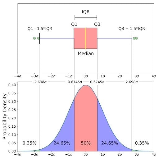
The image above is a comparison of a box-and-whisker plot of a nearly normal distribution and the probability density function (PDF) for a normal distribution. The reason why I am showing you this image is that looking at a statistical distribution is more commonplace than looking at a boxplot. In other words, it might help you understand a boxplot.
This section will cover:
- How outliers are (for a normal distribution) 0.7 percent of the data.
- What a “minimum” and a “maximum” are.
Probability Density Function and Boxplots
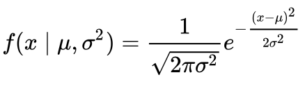
This part of the post is very similar to my 68–95–99.7 rule article (normal distribution), but adapted for a boxplot. To be able to understand where the percentages come from, it’s important to know about the probability density function (PDF). A PDF is used to specify the probability of the random variable falling within a particular range of values, as opposed to taking on any one value. This probability is given by the integral of this variable’s PDF over that range — that is, it is given by the area under the density function but above the horizontal axis and between the lowest and greatest values of the range. This definition might not make much sense so let’s clear it up by graphing the probability density function for a normal distribution. The equation below is the probability density function for a normal distribution:
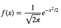
Let’s simplify it by assuming we have a mean (μ) of 0 and a standard deviation (σ) of 1.
You can graph this using anything, but I choose to graph it using Python.
# Import all libraries for this portion of the blog post
from scipy.integrate import quad
import numpy as np
import matplotlib.pyplot as plt
%matplotlib inline

x = np.linspace(-4, 4, num = 100)
constant = 1.0 / np.sqrt(2*np.pi)
pdf_normal_distribution = constant * np.exp((-x**2) / 2.0)
fig, ax = plt.subplots(figsize=(10, 5));
ax.plot(x, pdf_normal_distribution);
ax.set_ylim(0);
ax.set_title('Normal Distribution', size = 20);
ax.set_ylabel('Probability Density', size = 20);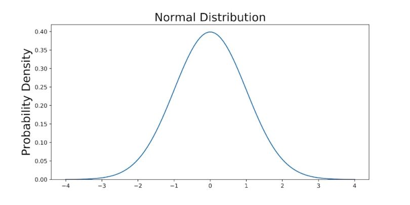
The graph above does not show you the probability of events but their probability density. To get the probability of an event within a given range we will need to integrate. Suppose we are interested in finding the probability of a random data point landing within the interquartile range .6745 standard deviation of the mean, we need to integrate from -.6745 to .6745. You can do this with SciPy.
# Make PDF for the normal distribution a function
def normalProbabilityDensity(x):
    constant = 1.0 / np.sqrt(2*np.pi)
    return(constant * np.exp((-x**2) / 2.0) )

# Integrate PDF from -.6745 to .6745
result_50p, _ = quad(normalProbabilityDensity, -.6745, .6745, limit = 1000)
print(result_50p)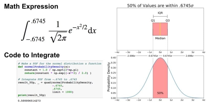
You can do the same for “minimum” and “maximum.”
# Make a PDF for the normal distribution a function
def normalProbabilityDensity(x):
    constant = 1.0 / np.sqrt(2*np.pi)
    return(constant * np.exp((-x**2) / 2.0) )

# Integrate PDF from -2.698 to 2.698
result_99_3p, _ = quad(normalProbabilityDensity,
                     -2.698,
                     2.698,
                     limit = 1000)
print(result_99_3p)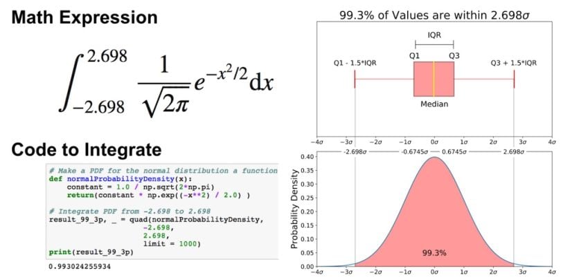
As mentioned earlier, outliers are the remaining 0.7 percent of the data.
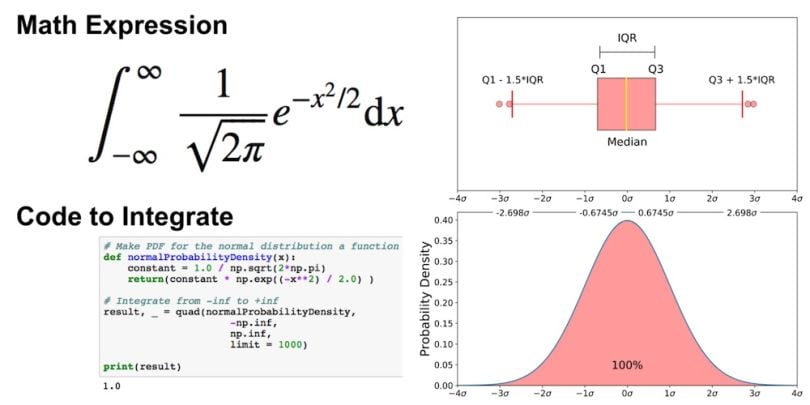
It is important to note that for any PDF, the area under the curve must be one (the probability of drawing any number from the function’s range is always one).
How to Graph and Interpret a Boxplot
This section is largely based on a free preview video from my Python for Data Visualization course. In the last section, we went over a boxplot on a normal distribution, but as you obviously won’t always have an underlying normal distribution, let’s go over how to utilize a boxplot on a real data set.
To do this, we will utilize Python and the Breast Cancer Wisconsin (Diagnostic) Data Set. If you don’t have a Kaggle account, you can download the data set from my GitHub.
Read in the Data
Before graphing, let’s read in the data in Python. The code below reads the data into a pandas DataFrame.
import pandas as pd
import seaborn as sns
import matplotlib.pyplot as plt

# Put dataset on my github repo
df = pd.read_csv('https://raw.githubusercontent.com/mGalarnyk/Python_Tutorials/master/Kaggle/BreastCancerWisconsin/data/data.csv')
How to Graph a Boxplot
We use a boxplot below to analyze the relationship between a categorical feature (malignant or benign tumor) and a continuous feature (area_mean).
There are a couple ways to graph a boxplot through Python. You can graph a boxplot through Seaborn, Matplotlib or pandas.
Graphing a Boxplot With Seaborn
The code below passes the pandas DataFrame df into Seaborn’s boxplot.
sns.boxplot(x='diagnosis', y='area_mean', data=df)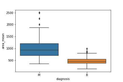
Graphing a Boxplot With Matplotlib
I made the boxplots you see in this post through Matplotlib. This approach can be far more tedious, but can give you a greater level of control.
malignant = df[df['diagnosis']=='M']['area_mean']
benign = df[df['diagnosis']=='B']['area_mean']

fig = plt.figure()
ax = fig.add_subplot(111)
ax.boxplot([malignant,benign], labels=['M', 'B'])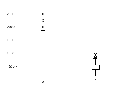
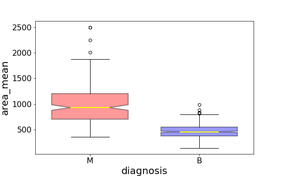
Notched Boxplot in Matplotlib
The notched boxplot allows you to evaluate confidence intervals (by default 95 percent confidence interval) for the medians of each boxplot.
malignant = df[df['diagnosis']=='M']['area_mean']
benign = df[df['diagnosis']=='B']['area_mean']

fig = plt.figure()
ax = fig.add_subplot(111)
ax.boxplot([malignant,benign], notch = True, labels=['M', 'B']);
Graphing a Boxplot With Pandas
You can plot a boxplot by invoking .boxplot() on your DataFrame. The code below makes a boxplot of the area_mean column with respect to different diagnosis.
df.boxplot(column = 'area_mean', by = 'diagnosis');
plt.title('')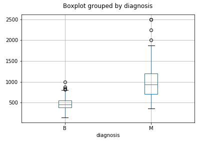
How to Interpret a Boxplot
Data science is about communicating results so keep in mind you can always make your boxplots a bit prettier with a little bit of work (see the code here).
Using the graph, we can compare the range and distribution of the area_mean for malignant and benign diagnoses. We observe that there is a greater variability for malignant tumor area_mean as well as larger outliers.
Also, since the notches in the boxplots do not overlap, you can conclude that with 95 percent confidence, the true medians do differ.
Here are a few other things to keep in mind about boxplots:
- You can always pull out the data from the boxplot in case you want to know what the numerical values are for the different parts of a boxplot.
- Matplotlib does not estimate a normal distribution first and instead calculates the quartiles from the estimated distribution parameters. The median and the quartiles are calculated directly from the data. In other words, your boxplot may look different depending on the distribution of your data and the size of the sample (e.g. asymmetric and with more or fewer outliers).
Hopefully this wasn’t too much information on boxplots. My next tutorial goes over How to Use and Create a Z Table (Standard Normal Table). If you have any questions or thoughts on the tutorial, feel free to reach out through YouTube or X.
Frequently Asked Questions
What does a boxplot show?
A boxplot shows the distribution of values in a data set based on its five-number summary. The five-number summary is the minimum, first quartile, median, third quartile and maximum in a data set.
How can I draw a boxplot?
To draw a boxplot, do the following:
- Determine the data set's five-number summary (minimum, first quartile, median, third quartile and maximum values).
- Draw a number scale, and number it so it can contain the minimum and maximum values.
- Mark where the five-number summary values fall on the scale.
- Draw a box where the edges connect at the first quartile and third quartile.
- Draw a line in the box at the median.
- Draw lines (whiskers) from the edges of the box that reach to the minimum and maximum values on each side.
How to interpret a boxplot graph?
In a boxplot graph, the box represents the data’s interquartile range (IQR), which is the 50 percent of data points above the first quartile and below the third quartile. Each whisker (line) on the side of a boxplot represents the top and bottom 25 percent of data points, where the line at the start of the box goes to the minimum value and the line at the end of the box goes to the maximum value. The longer the whiskers, the larger the variability may be in the data set. Any circles or points outside of the whiskers represent outliers in the data.
What is a boxplot best used for?
Boxplots are best used to summarize a data set and show a high-level distribution of data points, especially in comparison to multiple groups or other data sets.
What can you not tell from a boxplot?
A boxplot doesn’t show the exact shape of the data distribution (like detailed peaks or data skews in the distribution), individual data points or the total number of data points in a data set. Boxplots also don’t always show the mean and mode of a data set.