There’s no way to sugarcoat it: Planning a website or redesign is an enormous undertaking. At the enterprise level, a site redesign can take several months to more than a year to complete, cost hundreds of thousands, even millions, of dollars and span thousands of pages.
If you’re the one planning for the design, you’ll need to consider the time and cost, as well as messaging, site layout, brand identity, user experience and performance.
You’ll need to meet with key stakeholders to define business goals and figure out who your customers are and why they’re coming to your site.
You’ll also need to create content that engages your audience at key touchpoints and nudges them through your funnel.
And that’s just the beginning.
“The more professional your website looks, the more legitimacy is placed on you automatically. It’s a gut reaction somebody feels instantly.”
After you’ve conducted research with stakeholders and devised a path forward, you’ll actually need to build the thing. That could mean hiring a third-party web development agency or creating an entirely new codebase in-house. Either way, you’ll have to think about the architecture and SEO structure, third-party integrations and responsiveness across screen sizes and browsers.
Even after the launch, you won't be done. You’ll need to continue to iterate and test how well the site is performing against benchmarks. (And considering the average lifespan of a website is just two years and seven months, you probably don’t want to spend years building it).
Granted, all this can seem a bit overwhelming. But don’t get discouraged.
9 Steps for Website Planning
- Define your goals.
- Develop a budget and timeline.
- Conduct discovery research.
- Plan the site structure.
- Optimize the user experience.
- Craft a brand-focused visual design.
- Create and license your content.
- Develop and test the site.
- Launch a beta and iterate.
Jeff Gapinski, co-founder and president of the web design and development agency Huemor, says a tactical approach to planning can make the process more approachable. And, if well considered, the fruits of your labor will give you an edge over competitors whose websites are slow, opaque or difficult to navigate.
Think about this: Inc. Magazine reported that 38 percent of people will stop engaging with a website if they find it unattractive, and research from Google in 2016 found 53 percent of mobile site visitors will leave a page that takes more than three seconds to load.
“The more professional your website looks, the more legitimacy is placed on you automatically,” Gapinski said. “It’s a gut reaction somebody feels instantly.”
Ultimately, a well-designed website that loads quickly and looks attractive leads to a better page experience, happier users and higher conversion rates. Here several web design professionals outline the key steps to have in mind as you begin the planning process.
Define Your Goals
Elliot Olson, the lead web designer at Studio Anansi, a Portland-based consultancy that specializes in web design for small businesses, nonprofits and entrepreneurs, said defining a single, overarching goal helps focus the design process around a shared vision.
Whether that goal is to increase average order value, grow the user base or get a certain percentage of users to sign up for an email list — it should be clearly defined and measurable.
“We get crystal clear that there only be one goal,” Olson said. “Because if there is focus on two different competing goals, the main target doesn’t get accomplished. It’s great to get likes on your Facebook page. But is that translating to what you need? Are you selling a product or service, or bringing the audience closer to converting? To paying you?”
Bear in mind, the scope of Olson’s projects tend to be relatively modest — six- to eight-week projects for clients with a budget under $10,000.
In larger organizations, there are likely multiple goals for a website and key decision-makers will need to build consensus around what these are and who is responsible for achieving them, said Kelly Goto, the author of the bestselling Web Redesign 2.0: Workflow That Works, and the founder and CEO of the design consultancies gotomedia and gotoresearch.
Hosting a kickoff meeting, in which executives and leaders from the marketing, product, design and sales teams meet to plot the design and development direction can be a good place to start. The team should define business goals, identify a target audience, discuss current pain points, and set a vision for what success looks like.
“Because if you’re spending a couple $100,000 or more on a content management system and you’re shifting your architecture and this is a two-year vision for a new website, that’s a lot of budget and time for any organization,” Goto said. “Defining the project and getting clarity on what the goals are from key stakeholders is really important.”
Develop a Budget and Timeline
The cost and projected length of a website build can vary widely, depending on the project scope and the site’s functionality. At gotomedia, Goto said, projects typically last eight months to a year and cost upwards of $400,000, depending on the number of unique pages, and how much work the design and development team does retooling the site architecture and developing high-touch content features such as product demos and data visualizations.
Because projects can vary widely, Goto said a percentage-based budget can be a useful planning framework, with roughly 20 percent of the budget devoted to the site architecture, 50 percent of the budget to the homepage and key landing pages, and 10 to 20 percent to project management.
As Gapinski noted in a post on Huemor’s blog, a total budget lower than $60,000 for a small- or mid-sized company can lead to lackluster results. (The post includes separate pricing formulas for B2B websites and e-commerce sites that are useful for reference).
Websites for many small- and mid-sized companies perform poorly, he told me, because costs associated with key elements are not adequately budgeted. Below are key areas that should be considered:
Often Overlooked Budget Considerations
- Search engine optimization.
- Responsive wireframing.
- Accessibility compliance.
- Content auditing.
- Photography and video production fees.
- Licensing costs.
- Content management system integration.
- Microsite development.
- Log-in structures for developers, original equipment manufacturers and partners.
- Quality assurance testing.
Conduct Discovery Research
Prior to partnering with an agency, public firms and companies building websites larger than 100 pages will typically be required to develop a web design RFP (request for proposals). The document provides an overview of business goals and a description of your target audience, the project’s technical scope, data migration and compliance plans, and the project’s budget and timeline.
“When RFPs are created, it’s really great if the goals are articulated upfront, if you know who the product owner is, and who the decision-makers are,” Goto said.
Gotomedia uses this information — culled from the client’s research — along with stakeholder surveys and interviews, a content audit of the client’s existing site, and a review of competing sites to refine the project scope and outline key deliverables in a creative brief.
User interviews are a particularly important aspect of the discovery stage. These can be conducted remotely through third-party services, such as UserTesting, dscout, Userlytics or Validately, or performed in-house. Generally, it’s most effective when they are directed at a sought-after audience, or, in the case of a redesign, a group of loyal users.
“A lot of websites are very factual, but they don’t make an attempt at connecting: talking directly to their customers about the challenges they may be facing.”
Rooted in the tenets of design thinking, the idea behind user research is to “define what your users care about in relation to your product and business objectives,” said Marlene Arata, a product manager at the San Francisco office of the engineering, design and product development studio Carbon Five.
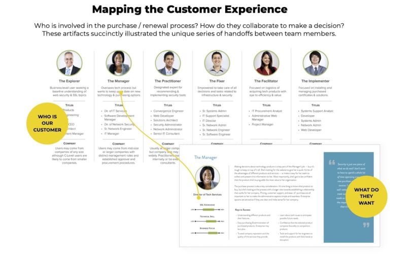
To visualize this, Goto said gotomedia media creates user journey maps that represent the experiences of personas as they navigate a website. Identifying how distinct user segments make decisions at key touchpoints helps teams tailor a site’s messaging and interface design to these segments and, ideally, boost usage and conversion rates.
“If we can make connections that, in and of itself, is advantageous,” Gapinski said. “A lot of websites are very factual, but they don’t make an attempt at connecting; talking directly to their customers about the challenges they may be facing.”
Plan the Site Structure
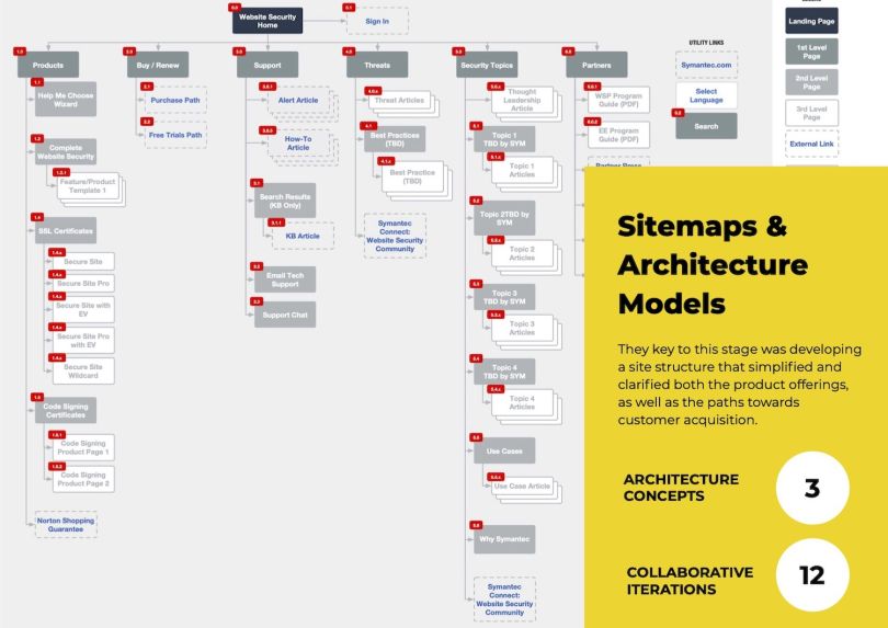
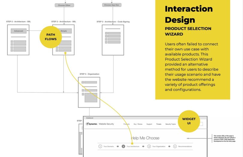
Once you have a good understanding of your audience, it’s time to map the site structure. You can think of a website a bit like a genealogical tree. The information architecture — often articulated in a comprehensive sitemap plotting page hierarchies and linkages, and more granular wireframes for individual pages — describes a website’s organization. When well conceived, it helps users feel grounded and guides them quickly and easily to what they’re looking for.
Exercises like card sorting and tree jacking can help determine how people group information into categories, what they expect to see first and how to surface the right information at the right time. Information architecture becomes increasingly important — and more difficult to conceptualize — as the scale of a website grows. Developing templates for repeated page themes and elements can streamline the process.
“If we look at creating an enterprise-level site with thousands of pages, there’s about eight to 12 templates that end up being key templates,” Goto said. “There’s a header, there’s a footer, there’s a left-hand nav, and then there’s built-in components, and there’s probably eight to 12 of these. Then there’s probably 30 to 40 custom pages that are standalone, unique pages that also have to be designed.”
With mobile devices comprising 51 percent of global internet usage, you’ll also want to think about how the information will present on mobile phones. A large screen of 1,920 by 1,080 pixels may have room for a top-level navigation bar, a carousel of stories, links to products and a prominent call to action. But this information will need to be reconfigured for mobile devices.
“If you’re looking at responsive design, you need to be able to look at everything on a grid system.”
If most of your users are visiting your site from a phone, a mobile-first or mobile-in-mind approach may be the best way forward. Google’s page experience update, which began rolling out in June and preferences mobile friendly design in search rankings, is another reason to start the design process with a small screen in mind.
Many companies are turning to responsive websites that perform well across devices. These sites typically require the use of CSS grids or media queries to define breakpoints where the layout, image scale and typographical arrangement will change based on the viewport size and a device’s orientation. Typically columns will collapse into stacked cards on a mobile screen.
“It’s kind of like old newspaper days, where there are columns and grids,” Goto said. “So if we understand the language that we’re going to be designing on top of, usually you have a four-column grid system or a 12-column grid system [to guide the page layout]. If you’re looking at responsive design, you need to be able to look at everything on a grid system.”
Optimize the User Experience
Gapinski told me user experience is often overlooked in website planning. The visual and sound feedback that occurs for a “hover state,” for example — when a user moves their cursor over a menu or navigation item in anticipation of an action — is spotty or ambiguous on many websites. A rigorous process for testing these interactions should be built into the development schedule.
A style guide that defines the interface elements — search fields, checkboxes, buttons, text fields, sliders, breadcrumbs, list boxes, pagination and containers — and how their status is conveyed to the user can help ensure the consistency of a user’s experience within and among pages.
Funneling users toward the product or service page, without being annoying or predatory, is another UX design consideration to keep at the forefront of website planning, Gapinski said. The sequenced automation of strategic messages at key customer touchpoints can incentivize users to do things you want them to, like hang out on your site longer, sign up for an email list or buy things. For instance, a customer might see a pop-up chat window when they first view a product to help answer questions or receive an email reminder or coupon when they begin to check out.
“Your entire design strategy should center on accessibility. You should be thinking about whether the site will continue to be viable in one to two years as accessibility compliance guidelines evolve.”
Accessibility should be built into the usability framework as well. Though web accessibility overlays like accessiBe and Userway can be installed as widgets to check for compliance with Title III of the Americans with Disabilities Act and the latest version of the Web Content Accessibility Guidelines (version 2.1), they often miss the mark, failing to sync to end user tools, making pages stickier and sometimes interfering with user preferences.
To be meaningful, Gapinski said, accessibility should be built into the development process and outlined in product requirements documents and acceptance criteria.
“Your entire design strategy should center on accessibility,” he said. “You should be thinking about whether the site will continue to be viable in one to two years as accessibility compliance guidelines evolve.”
Craft a Brand-Focused Visual Design
The web’s visual design tends to get mistaken for an easy layup — an application of brand guidelines already developed — when, in reality, it requires much more time and investment.
“The CEO might say, ‘We already spent money on rebranding and we know what our brand is,’” Goto said. “‘Take the colors and apply them.’ It does not happen that way. Anyone that wants any kind of unique storytelling aspect, or new imagery, will need to pay more.”
The creation of iconography, graphics, interactive elements and videos — even the selection and curation of royalty free photos — needs to be folded into the development schedule and allocated in the budget.
To illustrate the importance of visual design, Gapinski pointed me to a website Huemor created for the agricultural financing company AgAmerica Lendings. The bulk of the homepage is devoted to landscape photography and grainy, high-contrast video, embellished with a gritty font that appears almost as though it were screen-printed. The style distinguishes the company from rivals by “making [the company] look less like a bank and more like a lifestyle brand,” Gapinski said.
“You want to look at top competitors, locally and nationally, and make sure, as the design comes together, it’s not too similar to competitors and gives you a distinct visual identity.”
While a professional-looking site is relatively easy to create with templates, the real estate allotment and element placeholders may not adequately reflect the brand, he told me. A website, in other words, is not an all-you-can-eat buffet, it’s a carefully balanced dish.
Olson, who has moved away from wireframes in favor of live prototypes, said showing stakeholders the “click-through experience” of top-level pages and subpages on various devices — phones, laptops, desktops — can bring them more deeply into the experience and give her a chance to talk through the choices she’s proposing. Retro fonts and color gradients may be in vogue now, but will they be in five years? And do they reflect what makes the brand distinctive?
“Shopping at Old Navy is different from Neiman Marcus or Nordstrom,” she said. “And what your audience is expecting from the website is different. You want to look at top competitors, locally and nationally, and make sure, as the design comes together, it’s not too similar to competitors and gives you a distinct visual identity.”
Create and License Your Content
Regardless of the type of site you are creating, content creation is paramount. What does your business do? What services does it offer? Can users find contact information and a phone number? (About 44 percent will leave your site, if they can’t, according to a 2015 usability report from KoMarketing).
Many companies have a content manager in-house, who “speaks the language” of the company, and understands its values and business goals. These individuals are important to the process, but can be hard to find because they possess a rare skill set: a mix of writing and editing chops, information design knowledge, and organization and management skills.
“You need a centralized person to coordinate all of the content. And if you have a 2,000 page site, and you’re redesigning it, you have to get rid of a ton of content as well. So that’s a really big deal,” Goto said.
Here’s an article that helps define the role and responsibilities (that include developing and writing content, and tracking website traffic) and what to look for when hiring.
Develop and Test the Site
How development progresses depends largely on a company’s design methodology.
Marlene Arata is a product manager at the San Francisco office of the digital product development consultancy Carbon Five. She said the company, which works with clients like Hulu, Fandango, Masterclass and Good Eggs, approaches web development from an agile framework. During a one- or two-week-long design sprint, the design team creates low fidelity mock-ups of key pages and front-end concepts. These mock-ups are based on user stories and often tied to optimized search terms. In the final days of the sprint, after first-round mock-ups are internally validated, the design and engineering teams, working in parallel, create clickable, high-fidelity prototypes to trial with select users.
“The benefit of an agile approach is that it’s cost effective to prototype something before putting it into code, and that appeals to most stakeholders,” she said. “It expands the time to market somewhat, but it brings clarity to what you’re bringing to market and what that market is.”
The development plan should prioritize the instrumentation of analytics that can measure key progress indicators, Arata told me. An evaluation of third-party tools can help determine which tools can be more cost effectively coded in-house and which can be purchased as web-based API plug-ins.
“The benefit of an agile approach is that it’s cost effective to prototype something before putting it into code, and that appeals to most stakeholders.”
Once a website that serves users’ basic needs is developed, it can be launched as a beta. From there, the design team continues to iterate based on information they learn from users, while improving accessibility to users they may not have adequately considered, such as those over age 60 or those who use assistive technologies.
“There are various ways to test your minimum viable product in the market,” Arata said. “Start with declaring a hypothesis to test — for example, A/B testing a call to action from an email campaign. Next run an experiment with tools like Google Analytics, Optimizely or Amplitude to validate whether your theory is correct. Share these findings with your team and incorporate relevant discoveries into future versions of your website.”
Another item that should be at the top of the development team’s list? Optimizing load speed, particularly on mobile websites. Google reported in 2018 that if a page takes three seconds to load 32 percent of users will leave the site; that bounce rate jumps to 90 percent at five seconds. Web structures that support compressed HTML, CSS and Javascript, right-sized images and videos, and lazy loading can significantly improve performance.
Launch a Beta and Iterate
The launch is an exciting milestone. But it’s important not to rush through key tasks at the eleventh hour.
At Huemor, a prelaunch checklist helps ensure all major bugs have been fixed and there are no landmines waiting to go off when the site goes live. Prior to the launch, a team budgets time to “write and double-check all page titles and meta descriptions” and “clean up 301 redirects and block confirmation pages from being indexed,” according to the company’s blog. Back-end analytics tools are also checked to ensure the site is properly tracking user behavior.
“If we want to launch the website on Wednesday, the last day anyone would work on it would be Friday. We have an insurance plan built in to make sure nothing could potentially disrupt the site.”
Several days before the launch, the team double-checks site performance against acceptance criteria. No content changes are made during this interval.
“If we want to launch the website on Wednesday, the last day anyone would work on it would be Friday,” Gapinski said. “We have an insurance plan built in to make sure nothing could potentially disrupt the site.”
On the day of the launch, the team ensures the site is secured through a cryptographic key pair and updates the domain name.
Typically, within 30 to 60 minutes the site goes live.
But that doesn’t mean the job is done. A blog Gapinski wrote, titled, “How to Plan for a Website Redesign,” suggests that S.M.A.R.T (specific, measurable, achievable, relevant and time-bound) goals, sometimes called key performance indicators, are a good way to measure results. For example, “I want to increase conversion rate from Facebook ads by 25 percent,” or “I want 33 percent more leads on my website compared to 2018.”
You probably won’t get everything right and you may have to revisit elements of the design to hit your targets. But that’s okay: Consider it a work in progress.
“The thing that people need to plan for is iteration,” Goto said. “So let’s get your core content shifted over or built from scratch to this new CMS, or coded by hand. And let’s try and do it in three months. Then plan for a year of iteration. Iterate on navigation. Iterate on landing pages. Iterate on lead generation and streamlining the flow to acquisition. And every quarter have a goal that is measurable.”