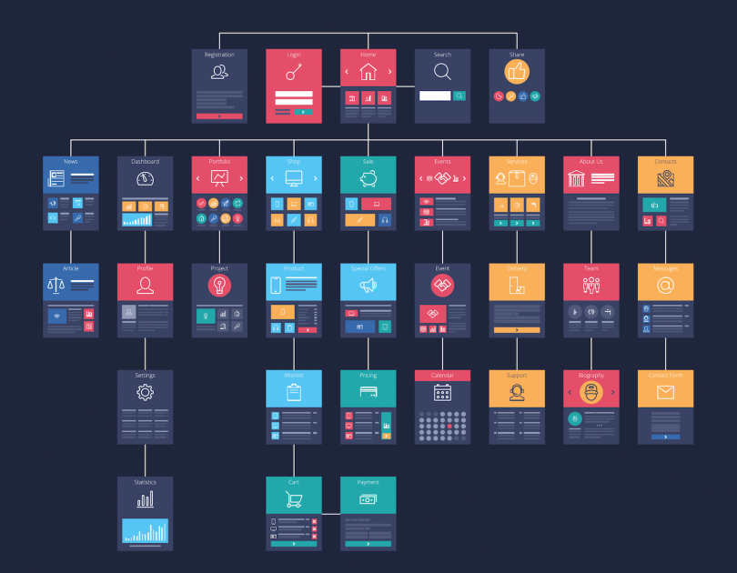
For some, the phrase “information architecture” is an unnecessarily confusing description of what it typically conveys: a site map or user flow.
What Is Information Architecture?
“If you think of a museum, there’s the sidewalk, and then the entrance, and then the lobby, and then floor one, and the route to floor two, or whatever that experience is. So, in that sense, sure — architecture,” Sam Girma, a designer at the UX research and design firm Blink, said. “But when you look at the document, it’s this weird mappy thing, not architecture.”
So if information architecture doesn’t apply to a physical building, what is it and how is it used?
What Is Information Architecture in UX?
There are several ways to define or conceptualize what information architecture is. Naema Baskanderi, a senior product manager at the online auto marketplace Adesa, relates information architecture to a library.
“Like a librarian, [the designer] knows where everything belongs,” she said.
For Clarence Huang, a software engineer at Intuit, information architecture is a “road through the wilderness. You define the road the user takes and constrain them in some ways as you build these paths.”
At its core, information architecture is a plan or thought out system of how content will be accessible to users on a website or mobile app. Still, the gauziness of information architecture — which can also be thought of as a mental model to describe the organization and sequence of tasks users perform in a website or app — appears to be more than just a semantic concern.
Information architecture may sound reminiscent of UX. Although they are related concepts, there are distinct differences. Information architecture provides the blueprint of the design; it is the foundation of the user experience. UX needs information architecture in order to create an interface that is pleasant to interact with.
Put another way: UX aims at making a user comfortable, while information architecture tries to understand a user’s desires. Still, the two models of thinking work together and need each other to create a successful design.
The metaphors designers and engineers use to describe information architecture are not just fanciful descriptions. They reflect the diversity of forms a website or app can take and important differences in how designers think about organizing the flow of information within and across pages.
Opinions vary as to the best models to describe information architecture, but there is wide consensus in the design community that a thoughtful approach can make a significant difference to the performance and usability of a digital product.
“You’re not only thinking about the point-A-to-point-B experience, you’re thinking about behaviors, you’re thinking about objectives and the different modalities that go into every digital site. Without that, you’d be lost,” Lauralee Sheehan, founder of the Toronto-based design agency Digital 55, said. “The frameworks aren’t sexy, but they’re super important.”

Why Is Information Architecture Important?
Information Architecture helps product teams prioritize key elements of a design.
Users typically leave a website after only 10 to 20 seconds. A website with a clear mission and value is more likely to have several minutes of user engagement. Information architecture strives to make a website’s value immediately understandable to users.
Information architecture can also increase conversion because it helps create a site map. A successful site map is able to identify parts of a product that are either functioning properly or poorly. A site map can also validate the information progression in a new site or redesign.
Information architecture serves as a roadmap for user-interface development and software engineering. This means user flows can be quickly adapted into later aspects of a build.
Luckily, because information architecture is the practice of making a map or model, there isn’t a need for support documentation. If a user can find what they are looking for on a website, there naturally won’t be as many customer support tickets.

How to Create Information Architecture for UX
Understand Product Goals and User Desires
Before creating a site map, designers should consider the goals of the product and the environment and motivations of its users. A commuter reading a mobile screen on a subway train, for example, has a far different experience than a Kindle reader lying in bed at night. These considerations inform navigational pathways.
“This is pretty standard practice,” Girma said. “You figure out different flows from your personas, and what their goals are and the tasks they need to perform to get to their goals.”
Customer interviews and online card-sorting exercises — in which test users group products by their relationships — help validate assumptions about user habits and inclinations. Are shoes and bags appropriately grouped together as accessories? Should the categories “men” and “women” take precedence to apparel type? Card-sorting exercises help answer these questions.
An idea known as information scent conceives of users as predators in search of food: If you give them the right cues at the right time, they will sniff out what they’re looking for, even if this requires considerable scrolling. If the path does not lead to “food,” however, they’ll give up. Good design can boost engagement by plotting the sequence of components and interactions in a way that rewards users at the right time.
These modalities get fairly sophisticated. Intuit’s design team, for example, uses design systems, or asset libraries, to define consistent standards for motion and sound effects, common interactions and navigational patterns — even style guidelines for the tone and voice of labels and messages.
Girma compares the stepwise progression of ideas involved in information architecture — which can include tree-like flowmaps, task flows, user flows and site maps — to the iterative process of drafting an essay.
“You don’t just go and make a website from scratch; you start diagramming and drawing out placeholders and general items: ‘This is what it could be; this is what I think happens.’ And then you can start notating the scrolls or the actual user interface, the behavior of things,” she said.
Don’t Rush the Design
Doing the front-end research to create a site map can seem like extra work, especially in a deadline-driven environment, but it is important not to rush it.
“As a designer, you’re like, ‘Oh my god, I want to pick colors and fonts.’ You want to get into the making of the thing,” Girma said. “But this is one of the easier ways to make educated decisions that inform your design efforts, ultimately. You should do this to answer the ‘for whom’ and the ‘why’ before you jump into making the thing.”
In a typical scenario, as sections of a design model take shape and evolve, multiple stakeholders — including engineers, content writers, customer support teams and executives — are invited into the process. This tends to occur in phases determined by the design lead.
In addition to getting everyone on the same page, a collaborative approach to information architecture can help determine release prioritization, diagnose problems that interfere with site performance and user satisfaction and reduce the need for support documentation.
Design a Site Plan
Typically, site map development is an iterative process led by a senior-level UX designer or product owner. The map itself can be created in programs like Figma, Invision Freehand, Adobe XD, Lucid Charts — even Microsoft Excel. The U.K. and U.S. governments offer templates, and UX research organizations like the Nielsen Norman Group offer guidance, but typically site creation happens organically.
For existing sites under redevelopment, an initial audit helps define content and layout priorities, Baskanderi said.
Many websites have the same core elements, she added — a landing page, a search bar, a menu, an account creation flow — but the arrangement of these elements and where and when users encounter them can have a major effect on a user’s experience, and, ultimately, whether they stick around.
Colors or positions on a site map denote the hierarchy of ideas, and connecting lines plot the experience of users from page to page. Dashed lines indicate navigational possibilities — for example, the onboarding experience a new user would go through, but an existing user would not.
The shopping experience on Sears’ e-commerce site, for instance, is the product of a thoughtfully rendered site map, Baskanderi told Built In. A user considering buying a refrigerator will see top-level categories arranged by product type: french door, bottom freezer and so on.
“So it makes it easier for the user to find what they’re looking for faster, which increases customer satisfaction, ” she said. “And, if you’re thinking about e-commerce, hopefully if you make it easier for them to find what they’re looking for, they’ll buy what they’re looking for.”

Information Architecture Examples
While formalized best practices in information architecture are still emerging, designers and engineers are amassing anecdotal evidence of effective information architecture strategies. Below are two examples of information architecture that illustrate the value of unconventional approaches to navigation.
Depth-Based Navigation
Digital 55 developed a set of web-based learning experiences for Athabaskan University in Canada, including a course for leaders navigating the COVID-19 pandemic and a course on allyship and inclusion.
Persona research baked into the design process has helped the team discern that its audience is fairly tech savvy.
“They’ve been around; they’re on social,” Sheehan said. “They know how to navigate Google. They’re not going to get lost.”
Based on this finding, the design team steered away from a traditional menu-based navigational structure in favor of what Sheehan calls, “depth-based navigation.” While a traditional rule of thumb in UX design is to lead users to their destinations in no more than three clicks, the mantra is losing relevance as users become more accustomed to clicking through multi-layered menus on sites like Spotify and Netflix.
Depth-based scrolling allows new information to enter the user’s field of vision horizontally.
“Like how your playlist pops up on Spotify,” Sheehan explained. “You haven’t really changed where you are, but the environment has changed. That’s a really interesting thing we’re really playing around with.”
To help visualize different elements on a site map, Digital 55 divides modalities into four main buckets: static content, interactive user actions, film and micro-animations, and branching paths. Flows are designed to structure these elements in a logical progression. A typical landing page module might have a hero image on top, followed by a story, an interactive video demo and several case studies.
Limiting scroll time is a concern, Sheehan admitted, but, in some cases, engaging storytelling can be a more important objective than navigational speed. Sheehan calls these interactive blocks the “meat” of the navigational experience.
Certain aspects of a site-map design are more or less a given — for instance, front-end copy, a navigational menu and contact details. But it’s the gray areas where designers can take liberties based on user personas — such as inviting tech-savvy users to scroll horizontally or discover hidden menus — that help differentiate high-performing sites from also-rans.
“Sometimes with information architecture, it can be a little stifling. It seems really functionary and almost clinical,” Sheehan said. “You don’t want to put a project at risk. But you do want to stay ahead of the curve in terms of how people are interacting online.”

Site Search and Navigation
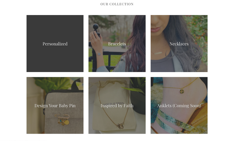
Baskanderi, in addition to her ongoing work at Adessa, where she was involved in auditing the site map, she launched her own e-commerce site Noor & Deen, where she sells hand-engraved jewelry. Created using Shopify, the site is a good illustration of how cross-referencing items in visual navigation can be a useful tool.
Beneath the hero image and a Valentine’s Day call-out, the jewelry collection is represented in six image tiles arranged in a grid. A customer looking for necklaces will find them not only in the “Necklaces” tile, but also in the tile “Inspired by Faith.”
“I put it in two places, because I want the customer to be able to find it,” Baskanderi told me. “Where they look depends on their mental model and what they’re looking for.”
Carrie Webster, a Sydney-based UX consultant writing for Smashing Magazine, cautions that too many options can lead to “choice deferral,” where a user chooses not to make a decision at all.
But, on Noor & Deen’s site, the choices are limited, and while some people might be searching for a necklace, others might be seeking a piece of jewelry that represents their belief system or that of whomever they’re buying for. Providing both options gives customers the best experience, Baskanderi said.
The larger point may be that users are idiosyncratic in their preferences, and site design needs to be responsive to these differences. While duplication of information is generally considered a hallmark of poor design, dual navigation is often an asset.
“In order to provide the best user experience for your customers,” Webster writes, “you may need to consider integrating a site search, in conjunction with an effective and well-designed site navigation, if your website has a complex structure and large amounts of information.”
In the article, she notes several useful navigational examples: a “wizard-style” application form; a search function that uses metatags to cross-reference synonymous results too cumbersome to list; a visual-style search function akin to Pinterest’s; and the “megamenu” categorization of Politico’s top-level menu.
Ultimately, you want to keep users focused on the task at hand and lead them where they want to go. You’ve got, maybe, 10 to 20 seconds.


