If you’ve had half an eye on 2020 web design, you’re probably familiar with the latest fashions. Dark mode with hot pops of color. Glowing futuristic duotones. Three-dimensional, softly shadowed imagery that creates the dramatic feel of an immersive experience.
But aesthetic features, as nearly any UX designer will tell you, are only a small part of web design. The real mark of achievement, said Autumn Schultz, director of experience design at Rocketmiles, has to do with empathy: deeply understanding the user, so you can give them what they want, when they want it, and make the experience enjoyable.
“Where I think a lot of designers get trapped is when they follow these pretty generalized rules,” she said. “Like, a website should be clean; there should be whitespace. And that could be true, but it’s not helping them in the long run. Principles become effective when they’re grounded in UX research and really knowing your customer well.”
“Principles become effective when they’re grounded in UX research and really knowing your customer well.”
In The Design of Everyday Things, Don Norman, a co-founder and consultant at the Nielsen Norman Group who researches and writes about human-centered design, articulates a set of six principles — visibility, feedback, affordance, mapping, constraints and consistency — that distill that idea further and have become required reading for just about any designer, whether they build websites or coffee makers.
These are all excellent guide posts for web design, but we wanted to dig deeper. How are designers abiding canonical rules and, in some instances, finding wiggle room to break them? We spoke with Schultz and designers at Clay, Codal and Squarespace, for a window into the web design principles they find most useful.
11 Top Web Design Principles
- Know Your User and Their Needs
- Let Content Reign Supreme
- Balance Consistency and Discoverability
- Be Playful With Animation
- Start With Mobile in Mind
- Consider Affordance
- Prioritize Accessibility
- Exercise Progressive Disclosure
- Establish Trust and Credibility
- Tree-Test Your Prototypes
- Do Not Induce Anxiety
Know Your User and Their Needs
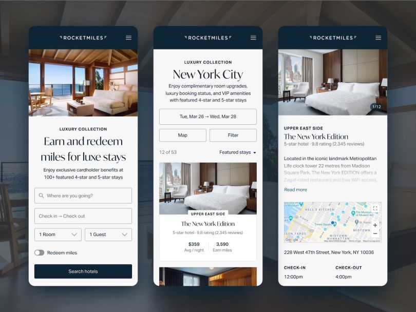
For Schultz, a website is only as good as the user’s experience. In a way, this seems obvious. If you’re not designing for the user, then who are you designing for? But how this basic principle dictates design decisions has powerful implications.
Someone on a travel site looking to book a reservation for a trip to Alaska, for example, is coming to the site maybe once a year and comparing it against others they’re exploring. To stand out, the site must surface accommodations quickly and provide enough visual interest to hold the user’s attention. Discoverability, in other words, is paramount. A website designed as a B2B tool for a customer service agent, on the other hand, has a very different purpose, and thus a very different set of constraints.
“Perhaps that customer service person is gauged by the amount of time they spend on the phone,” Schultz explained. “They can only be on the phone for two minutes, for example.”
In that case, the time threshold guides the entire process, filtering out any design options that don’t load fast and yield information quickly.

Let Content Reign Supreme
Thoughtfully crafting the narrative of a product or a brand before jumping into the visual design stage can give a website a more meaningful and coherent direction, said Samantha Kogle, a senior product design manager at the New York-based website building platform Squarespace.
“We shouldn’t underestimate the power of storytelling and its ability to connect people to an idea, a product, a service or whatever it might be you are putting online,” Kogle wrote.
“We shouldn’t underestimate the power of storytelling and its ability to connect people to an idea, a product, a service or whatever it might be you are putting online.”
To put this principle into practice, Kogle recommends designing with “real” content that is germane to the brand. Though it can be easy to fall prey to using the most beautiful stock imagery and Lorem ipsum to make a design look its best, “in reality, perfect imagery and the exact right amount of characters rarely make their way into the final product, especially when designing for a small business,” she wrote. “Start with a plan for your content and focus on how you want to tell the story.”
Balance Consistency and Discoverability
Alexander Khmelevsky is the UX director at Clay, a UX/UI branding agency in San Francisco, where he has worked with companies like Amazon, Corsair, Google and Fossil. He said consistency is one of the most essential web design principles, especially for enterprise systems. Google’s G Suite is a prime example.
“The consistent experience feels more natural. When the behavior of interactive elements on the website is in line with the user’s expectations, the experience is perceived as easy to use and intuitive,” he wrote.
“I may want a search bar in the same place everywhere, but, perhaps, in some instances, that search bar seems less than appropriate.”
As with any principle, though, there are exceptions. “There’s usually a tension between consistency and discoverability,” Schultz told me. “So, for example, I may want a search bar in the same place everywhere, but, perhaps, in some instances, that search bar seems less than appropriate.”
For instance, on a typical e-commerce site with a basket and a cart: “If I’m entering my credit card information, is it important to me that I can search for more items? Probably not.”

Be Playful With Animation
Interactive web experiences and animation can add movement to a website and make it come to life for users. When done well, animation can also help educate customers about how a website or mobile app works. “People tend to remember and respond favorably to small, unexpected and playful pleasures,” Khmelevsky wrote.
Clay’s website is an object lesson in how this is achieved. A carousel of clips of web animations for clients like BMW, ADP, Sony, MoneyLion and Facebook shows color skins drifting down to form objects on the screen, haptic hand gestures activating mobile functions and a simulated network of vans and wireless signals depicting Facebook’s Terragraph, a terrestrial connectivity system for dense urban areas.
Start With Mobile in Mind
Shannon Sajkowski, a UX designer at the Chicago-based full-service design agency Codal, said that, while mobile-first design has become immensely popular across the industry, it is not always fruitful when migrating ideas to desktop. For B2B websites with complex dashboards, it can be particularly frustrating.
“Where that gets tricky is that sometimes it’s harder to scale up than it is to scale down your design,” she said.
Codal abandoned a mobile-first approach after trying it with a skincare mobile app. A quiz typically taken by dermatology patients while waiting for appointments in the office appeared mis-sized when people tried to take it on their home computers.
“Sometimes it’s harder to scale up than it is to scale down your design.”
As an alternative, Codal has embraced a “mobile-in mind” approach, designing mobile and desktop wireframes at the same time to test the breakpoints. Codal’s design team typically creates mock-ups of both versions of the experience in InVision, and later runs a Q&A review using the inspect tool in Chrome DevTools or a plug-in feature.
“That way, you can change your screen really quickly to see the different scenarios: small desktops, small laptops, tablets and so on,” she said.

Consider Affordance
Blue text signifies a hyperlink. A profile icon is represented by the silhouette of a head and torso. Nearly everyone knows this. But back when Apple released its first iPhone, Schultz said, people were less versed in visual design language, and the company borrowed its aesthetic more directly from objects in the physical world. If you opened a notepad, for instance, your screen looked like the page of a notebook.
The idea of affordance, or using unambiguous symbols and signifiers to convey to users what something does, is one of Norman’s mainstays. The challenge for designers is to understand how affordance evolves over time. Today, a button leading to app integrations might be represented by a Hollywood Squares-style icon. Though the symbol is somewhat abstract, regular software users will recognize it because they’ve seen it so many times before.
“As we move forward, the need to map back, one for one, isn’t as important because we’re all learning this together,” Schultz said.
Prioritize Accessibility
Designing with accessibility in mind is ethically sound and makes sense from a business perspective. As Built In has previously reported, if your website is not built for accessibility, it can exclude up to 25 percent of your potential users and lead to aggravated customers, lost business and reputational damage.
“Accessibility has always been important, but I think it’s become especially important now that there is a movement to design inclusively.”
On the interface level, accessibility can mean many things: high color contrast and HTML semantic mark-up for users with low vision; ease of keyboard navigation and speech input technologies for those with mobility limitations; controlled animations and emoji for photosensitive users. Shultz recommends adhering to Web Content Accessibility Guidelines and striving for at least Double A compliance, which requires, among other things, that text and images meet basic color contrast requirements of 4.5:1.
“Accessibility has always been important, but I think it’s become especially important now that there is a movement to design inclusively,” Schultz said.
Exercise Progressive Disclosure
Put simply, the most important information should be the easiest to find. Once a user is oriented to a site, more technical details and advanced features can be unveiled.
“In my work, I always strive to be as minimalistic as possible and show only what is necessary on each page,” Khmelevsky wrote. “I try to avoid over-explaining things and showing everything all at once.”
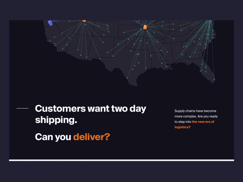
Ware2Go, an on-demand warehousing and fulfillment network for UPS, is an example of this principle in practice. The homepage is largely composed of whitespace, with a deep blue graphic of a storage facility and a brief value proposition telling the company’s story in miniature. Site visitors interested in more information can find it in a simple top-line navigation bar with “About,” “Our Solution,” “Resources” and “Sign-In” tabs.
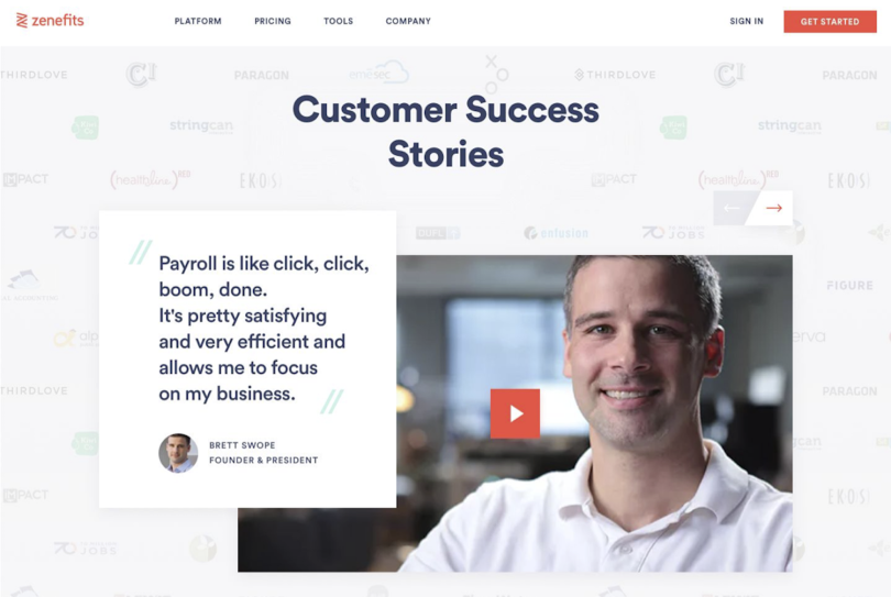
Establish Trust and Credibility
The importance of establishing trust and credibility can hardly be overstated. “No matter what website we are working on, an e-commerce or a marketing website, we always follow this design principle. As designers, we have to reassure visitors that the company or product is real and that there are people behind it,” Khmelevsky wrote.
He points to the website design of Zenefits, an HR and payroll services company, as a case in point. Photos and bios of executive team members, a funder list, customer success stories, accessible email contacts and live chat support are prioritized in the design to reinforce the legitimacy of the company and its site.
Tree-Test Your Prototypes
When working with clients, Codal relies on tree-testing exercises to evaluate the performance of a site’s architecture. Are navigational paths intuitive, and do they lead users where they expect to go quickly and without confusion? If you’re browsing for something obscure like Himalayan sea salt on an e-commerce website, can you find it without losing your mind? Tree testing, or tree jacking, can help answer those questions.
Sajkowski said the exercise can be done “guerilla-style” with a group of eight or 10 internal team members, or through fee-based websites like Optimal Sort, which require a minimum of 40 test participants. Companies with existing websites can use such services to run analyses of various web layouts and taxonomies.
“They’ll give you the pathways, and the percentage of people who took them. Then they’ll give you the percentage of people who got to their destination on the first click or went back and got there on their second click. So it’s data driven.”
Do Not Induce Anxiety
Anxiety — and how to prevent it — has become front of mind for many web designers. “I’ve been seeing this zeitgeist of websites playing on anxiety,” Schultz said. “So things like a timer ticking down, or ‘twenty people are viewing this,’ or anything that’s tapping into someone’s FOMO. There’s been a push in the other direction to knock that off. And to make things less addicting and less anxiety inducing.”
“There’s been a push ... to make things less addicting and less anxiety inducing.”
One way this manifests, Schultz said, is on e-commerce sites. Try to purchase a month of Showtime and five Redbox movie nights, and you’ll see a static message reporting the number of packages sold that today. If you hover over the message, a slider notification alerts you that the item is moving fast and it’s important to act quickly to redeem the deal. Such features create a sense of urgency that is effective in compelling action. However, they can be nerve-racking for users, and UX designers have begun rebelling against them.
“You want people to come back and buy more stuff or like your thing, or spend some more time on your website,” she said. “And so the challenge is, how do you get everyone to align on the ethics of your business?”