


Five years ago, when responsive design started taking off, many designers and developers created websites with fixed breakpoints tailored to specific devices and resolutions. Now, with high-resolution 4K screens and users more accustomed to vertical scrolling on smartphones, responsive design has had to evolve.
“We used to test for specific breakpoints — from zero to 320 [pixels] when the iPhone came out,” said Chris Madrigal, a lead front-end engineer at the design portfolio site Dribbble. “Now it’s hard to pick out specific breakpoints because some phones or tablets fall outside that, and you’re not always looking at websites in full view. So it’s better to enter code with fluid design in mind.”
These days, most responsive websites change dynamically as their viewport size and orientation changes. Drawing on new tools and techniques, developers and designers create flexible sites that display and perform well on most devices, and will continue to, even as new form factors emerge.
What is Responsive Web Design?
New Tools Are Emerging to Make the Job Easier
Today, smartphones comprise 51 percent of global internet usage, and mobile-first design, often the first stage of a responsive approach, has become standard practice. Techniques like media queries, fluid grids and flexible visuals have opened new possibilities for front-end developers and designers who can consider not just device class, but the size and resolution of a browser window.
Still, responsive design needs to be approached with nuance and customization. “The illusion that you can just fold elements and stack them, it often doesn’t work because you lose the path of the customer journey,” said Pieter Vanlperen, a veteran software architect who is the managing partner of PWV consultants.
Understanding how to create user friendly experiences across devices — tidily right-sizing and arranging elements like well-positioned furniture in an apartment — requires ingenuity and close collaboration between design and development teams. To see how it works in action, here are 12 outstanding examples to consider.
Content Prioritization
One of the most important aspects of responsive design is content prioritization — determining the value propositions, calls to action and imagery that will take precedence at the top of the page. With standard smartphone screen sizes averaging 4.7 to 6.5 inches and the most common mobile screen resolution being just 360 by 640 pixels, designers have limited space for communicating their messages. A mobile-first approach can narrow attention to key branding elements and business goals.
Consider the results of a 2018 eye-tracking study by Nielson Norman Group showing that users spend 57 percent of their time above the fold and that the “first two screenfuls” of information — 2,160 pixels on a 1,920 by 1,080 pixel screen — occupy 74 percent of all viewing time. So if you want to make a strong first impression and drive conversion, the top of the page is crucial.

Ashcroftlawfirm.com
When Postali developed a website for a law firm led by former U.S. Attorney General John Ashcroft, emphasizing the legacy and pedigree of the partners was a top priority, said Samuel Ballinger, the marketing firm’s creative director. That required a collaborative approach that brought together copywriters and designers to ensure the top-level messaging and primary calls to action spoke to each other and appeared above the fold.
It’s really emphasizing two things: the prominence of these attorneys, and trying to capture as many visual pieces as [we] can.”
A content prioritization strategy guided by the reputations of the partners became especially important in deciding what to emphasize further down the page as well, Ballinger said. Cases resolved, specialty areas and the practice’s legal philosophy were left out in favor of links to articles written by the partners. A slate gray color palette, a close-up image of the Lincoln Memorial, and a sans-serif tagline with an Art Deco feel convey a sense of refinement in a small space.
“It’s really emphasizing two things: the prominence of these attorneys, and trying to capture as many visual pieces as you can, and a lot of that comes through custom graphics, where they don’t get in the way of the user’s experience,” Ballinger said.
Etsy
Many design and development teams optimize the user experience for small screens before turning to larger ones, Ballinger said. From a development standpoint this makes intuitive sense: It’s easier to move into a bigger house than to downsize to a smaller one. But imposing strict up-front constraints can also improve the user experience and improve conversion rates.
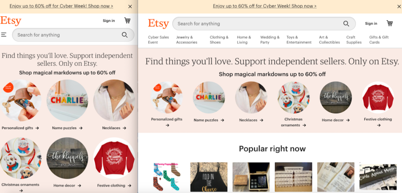
The consumer goods site Etsy is a seminal example. Open the browser on a desktop and you’ll find five shopping categories tailored to the season: holiday sales, personalized gifts, Christmas ornaments, necklaces and stockings. The sixth category — face masks — is also timely. These same categories are represented as circular icons on the mobile site. While Etsy’s brand presence is fairly innocuous, more a function of its sellers than it’s own distinct imprint, its mobile-first approach ensures users can quickly find high-priority content; in this case, items they’re looking to purchase.
“With responsive design, especially, I think the most successful you’re going to be ensuring your website works across all platforms is starting with mobile first,” Ballinger said.
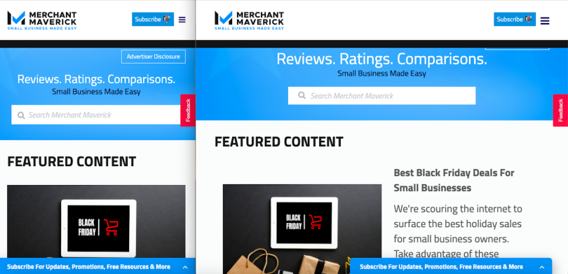
Merchant Maverick
Merchant Maverick’s design approach foregrounds blogs and product reviews aimed at educating small businesses about how to access credit and loans. Fluid breakpoints created using CSS ensure this content displays well on all devices. By detecting the pixel width of a user’s window, hard-coded settings automatically rearrange a multi-column desktop grid of feature stories to a single column of vertically stacked cards on smaller screens.
With 45 percent of users on mobile these days, we’re really looking at that first, and probably desktop second.”
H1 and H2 headers and paragraph styles are presented in high contrast — black font against a white background — to increase readability. Elements of a top-line desktop navigation bar are reduced to a hamburger menu, and a recommendation carousel is presented as a single row of sliding panes.
“With 45 percent of users on mobile these days, we’re really looking at that first, and probably desktop second. And just really trying to keep our content very simple and consumable,” Weston Happ, a website developer at Merchant Maverick, said.
CSS Grids and Media Queries
Differences in screen resolution have made simple resizing based on device class an antiquated approach. Tools like CSS Grid Layout can help designers arrange two-dimensional grids to house both parent elements and the children contained within them. This lets them change features like typography and imagery on a percentage basis, so they are legible and proportional to related elements.
Media queries allow for further refinement of a site’s appearance by defining breakpoints where the layout, image scale and typographical arrangement will change holistically based on viewport size and a device’s orientation. Applying these techniques can prevent ugly line breaks, tedious mobile scrolling and icons that look tiny or gigantic. Perhaps most important, it can ensure your images appear crisp on all screens.
“Often, the people who have the best monitors are the most visual people. So [blurry images are] the quickest way to lose those people from your site, especially if that’s a target market for you: a Mac evangelist or something,” Vanlperen said.
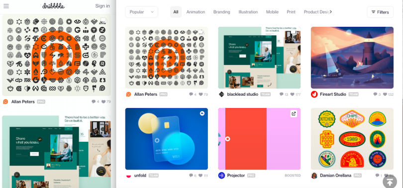
Dribbble
As a site for designers to display their portfolio work and find inspiration, Dribbble places images at the core of its online experience. A “shot page” of square-tiled PNGs is optimized across devices using a combination of techniques. Developers use media queries to run condition checks that change the style and layout of elements on the screen based on a window’s pixel size.
Markups in CSS Grid fluidly adjust the number of columns that appear in a window to optimize image resolution based on targeted breakpoints. Shrink the size of your browser, and you’ll see Dribbble’s columns collapse as images restack vertically in real time. The grids are flexible and adjust to fit any sized screen, whether that’s a mobile phone less than 768 pixels wide, a medium screen from 768 to 1,100 pixels wide or a large monitor above 2,000 pixels wide.
It has a big return for us on SEO and how search engines rank our pages.”
Backstage at Dribbble, developers use an image property in HTML 5 called source sets to store multiple images for each tile. These are selectively pulled to match the device class and screen size, thus reducing load time by using smaller files on smaller screens. Lazy loading in JavaScript also improves performance. This development trick allows text and upper-page images to appear quickly but pauses image loading later in the page until a viewer scrolls down to that location. Taken together, these techniques not only make for a more pleasant experience for users on slow networks or with poor phone connectivity — they also improve search performance.
“It has a big return for us on SEO and how search engines rank our pages. To be quite honest, what is a web page without images, right, or without a grid of images or a gallery?” Madrigal said. “But if it takes more than a second to load, there’s a 20 percent chance users are going to bounce.”

Dazzle
Zipeng Zhu, the designer and animator who founded the studio Dazzle, works on web design projects with clients like Microsoft, Netflix and The New Yorker. His splashy, kaleidoscopic design sensibility is on vivid display in a responsive website his studio developed in collaboration with the Tel Aviv-based web development company Wix.
The hard part about responsive design is you’re not going to be able to design for every pixel in the world.”
Using its proprietary tool Editor X, Wix set the viewport height of the canvas image at 100 percent to ensure its fidelity across devices, said head of product Gali Erez. No matter what the screen size or resolution is on a viewer’s device, they will alway see the landing page’s visual elements at full height, giving the colorful, high-octane graphics their due.
“The hard part about responsive design is you’re not going to be able to design for every pixel in the world. So you’ve got to give everything percentages, and then the [height and width settings] know how to play around no matter what the size,” Erez said.
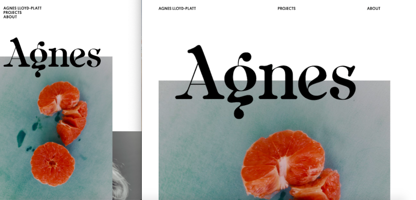
Agnes Lloyd Platt & Thu Van Tran
Large fonts are trending in web design — particularly among artists and creative agencies, Erez said. The websites of London-based fashion photographer and filmmaker Agnes Lloyd-Platt and Parisian visual artist Thu-Van Tran offer two views of how text-scaling tools can ensure typography looks appealing and legible across devices.
On Lloyd-Platt’s site, the large presentation of the artist’s name is fluidly scaled and docked to the surrounding imagery; it is as much a part of the artistic composition as the blood oranges and black-and-white portraiture behind it. The font size of running text jumps at key breakpoints, and within these established pixel dimensions, line breaks are automatically adjusted to ensure line length is relatively consistent. Thu-Van Tran’s site uses text scaling, similarly, to set the maximum and minimum size of the text at breakpoints and ensure important information — such as a list of past exhibitions — is readable and maintains structural parallelism.
Performance and the Rise of Adaptive Design
When Google switched to mobile-first web indexing in March, it accelerated an industry-wide movement toward responsive design, said Nate Nead, CEO of the software consulting firm DEV.co.
Google uses a smartphone Googlebot to crawl for search results, and its website recommends that desktop and mobile content is consistent and that new sites are created using responsive design techniques. A page experience update scheduled to launch in May, which will emphasize load speed in search rankings, is likely to make mobile-friendly design even more important.
“If your competitors are loading twice as fast as your site, even if you are under the three second rule for user experience, you’re still not going to be as good as they are,” he said, citing Google research data that shows the chance of a user leaving a site jumps 32 percent as page load time goes from one to three seconds.
But what if you don’t want to make more compromises than you have to? Enter: adaptive design.
Typically, responsive sites send the same HTML code to all devices, letting CSS handle the rendering on the client side. Websites built with adaptive design, however, send CSS media queries to identify device sizes and return a version of the website optimized for a particular device.
The advantage of adaptive design, writes Chris Castiglione, who teaches digital literacy at Columbia University, is that you can “optimize the site speed, usability, aesthetics and media load time” for screen sizes that are seeing the most traffic. That means you can focus resources and spending where it is likely to yield the biggest impact. The downside is “you need to update your code whenever a new device is released, which isn’t ideal.”
Whichever approach you choose, performance should be a key benchmark.
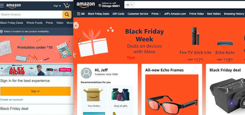
Amazon
Amazon is a blue-book example of adaptive design. If you scale down a desktop browser window on Amazon, the content will flow off the screen. A mobile phone will surface an entirely different layout and visual hierarchy.
As the old Steve Jobs adage goes, ‘simplicity is the ultimate sophistication.’”
Happ said Amazon’s web design layouts, though distinct from one device to the next, preserve the same desired functionality. Whether visiting the site on desktop or mobile, the primary workflow a user goes through on Amazon — using the search bar to find consumer goods — remains the same. Linked shopping icons may be removed or streamlined for mobile, but the search bar remains front and center, prominently displayed and optimized to produce relevant, skimmable results.
“You’re really able to get everything done that you’re looking to get done. It may be simplified a little on mobile. But it does an excellent job of not diminishing usability,” Happ said.
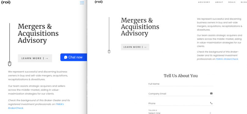
(roi)
People don’t behave the same way on mobile devices as they do on desktop. They want information more quickly, and sometimes stripping content to its bare essentials can serve that goal while improving load time, Nead told me. The website design for (roi), a mergers and acquisitions advisory for which Nead is the managing director, is an example of how a limited palette can migrate well to mobile. The broker’s value proposition is described on a clean white page. “Learn more” and live chat buttons stay above the fold in desktop and mobile views to capture key functionality at a glance. A contact form is easy to find via a hamburger menu.
“As the old Steve Jobs adage goes, ‘simplicity is the ultimate sophistication,’” Nead said, referencing the 1977 brochure for the Apple II computer. “Less is more — especially when you gauge how many visitors are likely coming from a mobile device.”
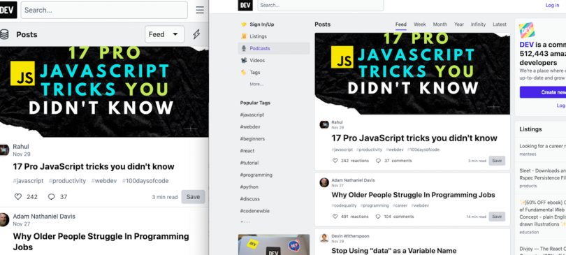
dev.to
When Google makes load times a more significant component of its search engine algorithm this spring, minimalism on mobile devices is likely to become even more popular. The utilitarian design of the career development site dev.to is one way this might play out. In the mobile view, desktop sidebar menus with links to job listings, newsletters, popular tags and podcasts disappear, leaving behind an uninterrupted stream of blog posts. This is the highest-value content to the audience, and it loads almost instantaneously, allowing users to quickly browse an orthogonal stack of top headlines.
Sometimes experiences should be different, because something loads faster [on mobile] or meets more of the user’s needs there.”
“There are these two poles: one being minimalism, and the other being super responsive design, in which the mobile experience is the same as the desktop’s. But [congruency] is not always a good thing. Sometimes the experiences should be different, because something loads faster [on mobile] or meets more of the user’s needs there,” Nead said.
Bells and Whistles
With new tools at their disposal, designers are becoming more daring in how they approach web design. Designers and developers at the cusp of responsive design are rethinking how an experience may unfold as users scroll a page. What will appear or vanish as they scroll down the page? Where will they land when arriving from a search browser?
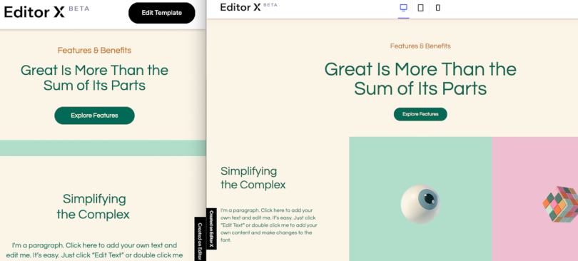
Editor X
In February, Wix released a closed beta version of Editor X, a design toolkit that creates a no-code environment for designers to integrate CSS techniques. The platform is a showcase of responsive design tools, Erez said, including sticky position, which anchors certain interface elements to a fixed position on the screen, but allows other items to slide over the top for a layered, peekaboo effect. Along with CSS grid and flexbox tech, the site features a “dev mode,” for developers to use JavaScript to create custom functionality.
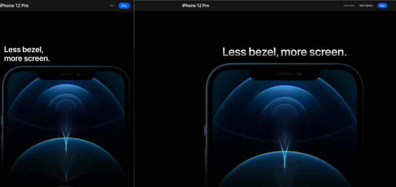
Apple
Apple arrived late to the party, not making its online experience responsive until 2014, Happ said — but the company has caught up quickly. A product page for the new iPhone 12 Pro is a case study of what can be done to make scrolling more interactive. With stark white text against a pitch black background, the page’s focus is the messaging — “Less bezel, more screen,” “Surgical grade stainless steel,” — and the sleek, reflective contours of the phone. As a user scrolls downward, the text and images disappear into expressed space, a powerful visual effect that calls to mind the Star Wars prelude.
What’s especially notable, Happ said, is the way the desktop animation effects migrate seamlessly to mobile. From a technical perspective, finger scrolling demands different capture behavior than mouse or touchpad navigation. Nevertheless, the quality of the experience is nearly one to one. When full-width images of the featured phone are too large to fit on a mobile device, animated reflections recreate a sense of suspense and mystique.
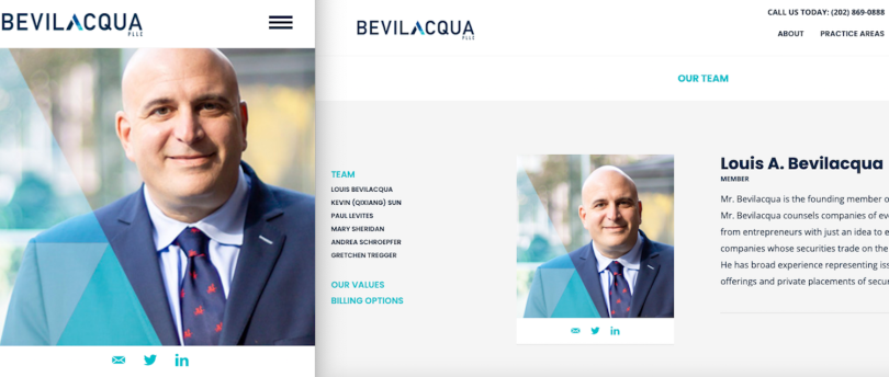
Bevilacquapplc.com
The website Postali developed for the District of Columbia law firm Bevilacqua PLLC is a lesson in how on-page navigation can quickly get users where they want to go. Attorney bios are anchored to the page, so that if a user is doing a name search for a specific attorney on Google, they will immediately arrive at that attorney’s description on the page. This approach, while rare, can be effective in sites featuring long-form content or information with selective value to users. It is especially useful on mobile devices.
“You need to make sure you’re laying out the navigation of the page in a way where a user on mobile is going to get to exactly where they need to be without having to scroll through the entire page,” Ballinger said.


