

Why would anybody use GitHub on their phone?
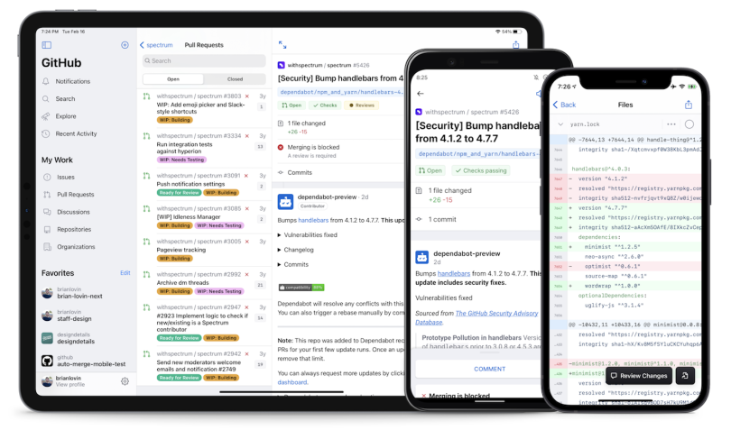
That was the question skeptics posed to Ryan Nystrom, director of engineering at GitHub and a former iOS engineering lead at Instagram, when, shortly after being hired, he was tasked with shrinking a decade of workflows, tools and messaging on the software development hosting site into a framework for a mobile app.
The critics’ argument was that coding was too fussy and screen space-intensive to do on a phone.
But judging from usage and engagement data, they were wrong. Since launching the beta in early 2020, GitHub has seen the app downloaded three million times and used for 1.2 million code reviews and 600,000 code merges, according to an email a company spokesperson shared with Built In.
None of which is to say the development process was easy. In fact, the project’s challenges speak to why many companies, especially startups building their first digital experiences, begin with a mobile-first approach.
It is much, much easier to start really little than to start on a huge canvas and shrink things down.”
“[Mobile-first] is kind of exactly what it says,” Nystrom told me. “Instead of taking what traditionally has been designed for big screens, big monitors, laptops or whatever, you’re starting with a really tiny screen and then scaling upwards, because it is much, much easier to start really little than to start on a huge canvas and shrink things down.”
When your core users are people on the go, mobile-first design tends to work quite well. Instagram, Snapchat — even the New York Times — use infinite scrolls, stacked stories and sticky navigation to hold users’ attention and help them quickly browse stories and updates.
But what if your company is designing software for an investment analyst scanning dual monitors at a trading desk? Or a United States Department of Agriculture researcher monitoring regional plant populations on a large screen? Or users who have physical limitations or who live in parts of the world with sluggish broadband networks? Or any one of the 161 million Netflix subscribers browsing a personalized menu for something entertaining to watch?
Suddenly, the mobile-first approach seems less relevant, if not misguided.
A Tactical Approach to Mobile-In-Mind Design
- Assess the habits and needs of your user base. This will help determine if a mobile-first design approach is worthwhile.
- Define content priorities to establish a user-friendly information hierarchy.
- Choose a responsive or adaptive design strategy to migrate the experience across devices and viewports.
- Identify areas to eliminate spatial inefficiencies, such as gutters and tab bars.
- Create a component library of mobile-friendly features. Auto-generated text responses, sticky navigation tabs and stackable cards can improve usability.
- Mine collections of best practices.Consider Google’s mobile-friendly design and indexing guidelines, Kotlin tutorials for Android and Apple’s human interface guidelines.
- Develop prototypes to test user engagement.
“I’ve watched, like, an episode of Breaking Bad on my phone, but that’s not optimal, right?” said Ryan Hatch, a UX content strategists at the Colorado-based API chat provider Stream. “I would bet inside Facebook offices, they’re not thinking mobile first. They’re thinking product first, customer first, user first. And, wherever that person is, they’re able to reach them.”
Hatch’s view is becoming more and more commonplace. If mobile-first design was all anybody could talk about five years ago, mobile-in-mind is the preferred nomenclature among many designers today.
That’s not to detract from its value. In addition to streamlining the development process, a mobile-first approach can help you reach significantly more users. Research from Statista shows smartphones comprise 51 percent of global internet usage, and mobile-first design is often the first stage of responsive or adaptive design frameworks that tailor the user’s experience to any device they’re using.
“Designing mobile first is very important because it helps highlight what is most important to the business,” said Emma Moore, who is the founder of the Colorado-based development agency PVT Group and has held previous UX research, product management and UI design roles at companies including Disney. “So you get this hierarchy of information very organically.”
And even if you’re a mature company like GitHub or Stream that developed its site for large screens first, a mobile mindset can be valuable in translating that experience to smartphones and tablets. Here are several tips to consider when applying the approach in practice.
Assess Your User Base
Before going down the path of mobile first, it’s a good idea to take an inventory of your user base. Hatch likes to tell the story of his earlier agency work for a company that offered customers small, non-traditional loans. Almost half of the borrowers were non-native English speakers, and many were using older-model Android phones with slower connection speeds. In this case, usability and load speed were the core concerns.
“What’s most important is to really understand how, when and why the audience is going to use your product,” he said.
That’s why ESPN’s app offers bite-sized highlight reels, and LinkedIn’s in-app messaging service offers text-based auto-replies for responding to direct messages, he told me. These features understand users are likely to engage with mobile experiences in highly specific contexts, such as walking to commuter trains or thumbing their phones in bed at night.
Similarly, when Nystrom’s team began GitHub’s mobile app design, they drew an important distinction between the kind of work developers were likely to do at a desk — mainly, writing code — and the type of work they could do on their phones — triaging notifications, organizing files and reviewing and approving code drafts.
Streamline Your Information Architecture
Paring down a website to its core features and functionalities is the hallmark of mobile-first design, and that begins with well-considered information architecture.
Standard smartphone screen sizes average 4.7 to 6.5 inches, and the most common mobile screen resolution is just 360 by 640 pixels. That means designers have limited space for key features and messages, and content prioritization is crucial to meaningful engagement.
“Things need to stack, they can’t take forever to load, and there need to be really quick CTAs [calls to action],” Hatch explained.
Nearly half of Steam’s core user base of product managers and software engineers access the service via mobile. With that constituency in mind, two main goals are driving a current effort to translate the web landing-page experience to mobile.
Stream’s Mobile Design Priorities
- Obtain site visitors’ emails for potential sales leads.
- Display the product’s value proposition and core chat features in a pleasing way.
These priorities have led to internal discussion about possible space-saving options, such as eliminating the desktop hero image or condensing the top-level navigation bar to a hamburger or slider menu. They’ve also prompted Hatch to consider integrating predefined text inputs so users can perform quick automated replies in chat.
Things need to stack, they can’t take forever to load, and there need to be really quick CTAs [calls to action].”
Facebook Marketplace and the online marketplace OfferUp embed simple, time-saving interactions particularly well, he told me. Rather than engaging in bartering, a process that can require extensive head-down typing and a fair amount of emotional bandwidth, mobile users can select from a short list of auto-generated messages and tap plus or minus indicators to adjust the offer price for a listed item. This simplifies the transaction, especially for people on foot.
“Three or four common openers Facebook has provided say, in effect, ‘Hey, is this available?’ ‘Hey, would you consider less?’ ‘Hey, do you offer shipping?’ And it’s like, select, boom, and just send it to me,” Hatch said. “This helps assuage insecurity.”
The development team at GitHub, meanwhile, has had to rethink web-based rules for visual and navigational hierarchy, Nystrom told me. Developers are accustomed to URL hacking — using search terms to quickly navigate to important information. But to ease navigation inside the app, the team chose to replace a global search field with top-of-page tab bars.
The decision comes with trade-offs. Some developers are reluctant to use tab bars on mobile apps because they take up already scarce space. On an early-model iPhone of 320 by 480 pixels, Nystrom said, a typical 50-point tab bar could swallow up to 10 percent of the viewport height. But when the alternative is hitting the back arrow icon a half dozen times to reach the navigational entry point, a tab bar may be the most painless, user-friendly solution.
Then there’s the issue of information density: How much white space should you leave between text, images and buttons, so the display doesn’t appear cramped? When Nystrom was at Instagram, white space was revered as part of the “relaxing and enjoyable experience” the team sought to convey. But the user base at GitHub is entirely different. It turns out coders prefer layout configurations more tightly packed.
“Really quickly, we started getting feedback about our overuse of white space, which became really interesting,” Nystrom said. “We started to lean into the fact that our audience is developers. So instead of making these really breathable spaces between lines of code and gutters and padding and stuff, we chose a pretty dense configuration.”
Choose Adaptive or Responsive Design
Planning the site architecture of mobile apps raises another important consideration: whether to situate a mobile-first approach within a responsive design or adaptive design framework. Responsive sites typically send a single code set to all devices. Fluid grids and media queries allow the layout, image scale and typographical arrangement to change holistically based on viewport size and a device’s orientation.
Adaptive design, on the other hand, requires developers to write unique code for each device. Though it is often better for optimizing site speed, media load time and usability, adaptive design is time intensive and unlikely to be embraced by legacy organizations, especially those where the engineering team has the ear of C-suite executives.
“Even Disney doesn’t do a lot of adaptive design, because it’s just comprehensively too much for engineering to do all the time,” Moore told me.
There is even a more recent evolution of design mutability — progressive web applications (PWAs) — which add features of native mobile applications like push notifications, home screen icons and offline content to supported browsers. Microsoft’s PWA adoption in Windows 10 may be a sign of where things are headed — with more and more websites looking and performing like native apps.
If you’re hearing the words, ‘tech debt,’ or, ‘Let’s just get it done first,’ there’s a budgeting issue and you’re not going to have the freedom to do everything.”
Teasing out the interests of senior leaders can help designers plan a strategy that aligns with organizational interests.
“If you’re hearing words like, ‘We can’t do that right now; we have to wait.’ Or if you’re hearing the words, ‘tech debt,’ or, ‘Let’s just get it done first,’ there's a budgeting issue and you’re not going to have the freedom to do everything. You’re going to have to be really lean and smart and agile,” Moore said.
Just because there are financial or staff constraints, however, doesn’t mean an ambitious designer can’t advocate for a strategy they think will help a company flourish. Adaptive design or PWAs may seem out of reach at a startup or midsize firm, but if their value can be proven with conversion metrics, data leaders may be willing to come along for the ride.
“Create the mobile experience, don’t ask,” Moore said. “Never ask to do it. Start with mobile. And if the question comes up, say, ‘This is the industry standard.’”
“You can run rogue experiments in Google Analytics,” she added. “Propagate the mobile version to, maybe, 5 percent of your market, so that no one freaks out. And if it’s converting better after a month and a half, then you have an argument that’s data driven.”

Make Usability Your First Concern
When people use mobile apps, their orientation is often quite different from a web user’s. They have an immediate need they want serviced as quickly as possible. Perhaps they have a train or flight to catch. Maybe they want to check their account balance before making a purchase. Whatever the goal, it often comes with a heightened sense of urgency.
Disney is a company that understands such contextual factors well, Moore told me. Images on the Disney World app collapse in a vertical stack that situates the most pertinent slides on top, often with embedded promotions.
“You’ll notice that everything can be easily localized,” Moore explained. “The images are very light, because the connection in India may be slower than in America. People are still going to want to plan their trip. So practicality far supersedes the [aesthetic] experience.”
Mobile-first design, she told me, comes down to usability — making the experience as intuitive and functional as possible. While this can be improved by reducing load time and giving key messaging prominence on a page, it can also be enhanced by the types of components and navigational interactions an app supports.
Don’t be afraid if your Adobe Sketch file is 25 inches long. That’s the experience.”
There’s a reason, for instance, that infinite scroll has become popular on mobile apps, such as the New York Times’, Facebook’s and Snapchat’s. With an inexhaustible supply of content that offers variable rewards as users encounter new stories or posts, the apps don’t give users a compelling reason to leave. On a mobile app, where users are likely using a finger to sift through content, scrolling is a responsive interaction that keeps them hooked.
“It’s tempting as designers, and I’m going through this right now, to build a module with four taps to tap through everything,” Hatch said. “And that might work really well on a desktop, but it doesn’t work so well on mobile. So don’t be afraid if your Adobe Sketch file is 25 inches long. That’s the experience.”
For a large, mature platform like GitHub’s, however, supporting a user-friendly mobile experience presents a different set of challenges. In the recent app release, conspicuous buttons and checkboxes allow developers to review and merge pull requests. Users can jump to isolated blocks of code within a markup file, and a blend of native and web rendering tools prevent slow page loads and jumpy scrolling.
“It’s really difficult to take the unbounded number of configurations and styles you can get with Markdown and HTML and then bring them to the phone using native text-rendering libraries,” Nystrom said. “Not only should it work, but it’s got to be super fast. And it’s got to be stable.”
But as difficult as it can be to migrate a large-screen experience to mobile, supporting a user-friendly, device-agnostic platform — even for edge cases like code reviews — is probably a wise investment.
As Built In reported, Google recently switched to mobile-first indexing, using a smartphone Googlebot to crawl all websites for recommended search content. In addition, as the article noted, a Google page experience update scheduled to launch in May “will emphasize load speed in search rankings” and “is likely to make mobile-friendly design even more important.”
If companies weren’t already prioritizing mobile-friendly design for search engine optimization, the pending update is likely to give them the nudge.
Consider Material Design Standards and Tooling
For resource-strapped startups and midsize software firms, the good news is that, in the last several years, it has become much easier to create mobile apps using stabilized, cross-platform languages such as React Native.
While creating a uniform experience across devices may require CSS adaptations and conditional code statements for certain animations and interactive effects, the proliferation of such “build once, deploy everywhere” technologies limits the need to hire different engineering teams to separately develop Android and iOS versions of the same app.
“What React Native does for UI/UX is allows you to do really nice in-line error messaging and provide quick feedback to the user,” Moore said. “So knowing how React Native works can give you a lot of freedom in the micro-interactions that people love, and it’s not a lot of cost to the company, because most of it is pre-made.”
I would strongly recommend following a lot of what the big tech companies have done and learned, and probably avoid reinventing the wheel.”
At the same time, Google’s mobile-friendly design and indexing guidelines, Kotlin tutorials for Android and Apple’s human interface guidelines provide instructive blueprints for designers and developers to follow.
“I would strongly recommend following a lot of what the big tech companies have done and learned, and probably avoid reinventing the wheel,” Nystrom said. “There’s some great frameworks, tools and documentation, both for design and the underlying technologies that make this a lot safer and more seamless.”
Nystrom told me mobile apps of today fall in two main camps: apps designed like TikTok and Snapchat with artful animations and gestures that create a “fluid, in-crowd feeling,” and stock apps that “look and feel almost as though they were made by Apple or Google and belong on your phone.”
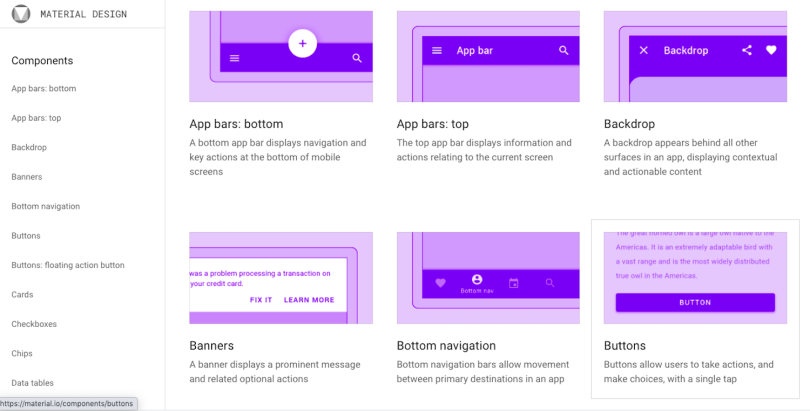
GitHub’s mobile app is more like the latter. Adhering closely to the native development guidelines Google and Apple provide, the design team scratch-built the Android and iOS apps with visual legibility and ease of use in mind. Much of the six-month process was spent creating a component library, using Figma to house stock UI components from Apple’s UIKit, Swift and Google’s material design and component libraries.
“You almost drag and drop the components into designs and prototypes,” Nystrom explained. “I’m making it sound like we get all this stuff for free. It’s not that easy. But, by and large, having an actual design system and framework and using Figma has been super, super helpful.”
The emergence of digital assistants, augmented reality and virtual reality are broadening the spectrum of experience designer’s concerns. But what’s becoming increasingly clear is that mobile apps and web browsers are not likely to go away any time soon. Even if the past year saw more people at home using Zoom, exercising on boutique fitness platforms and talking to digital assistants like Alexa, mobile hasn’t exactly taken it on the chin.
“Even when we are at home, we still need our phones,” Hatch said. “I think the main primary purpose is just direct communication: with each other and with companies. ‘Hey, are you guys open today?’ ‘Do you allow in-store dining?’ ‘Can I get ahold of somebody?’ And that comes from in-app chat, text messages and email.”
“Maybe in five years we won’t be carrying around phones,” he added, “but we’ve gone through 12 iterations of the iPhone and, in practice, we’re holding a phone that looks pretty much like it did 10 years ago. And, if I were going to bet, we’ll be doing the same thing in 2030.”


