Thematic maps are a kind of data visualization method that can help display geospatial data effectively. Choropleth maps are one of the most widely used types of thematic maps, but what are some alternatives? In this article, we review some of the best thematic mapping techniques out there, their use cases, and the pros and cons of each type.
7 Types of Thematic Maps
- Choropleth Map
- Bivariate Choropleth Map
- Value-by-Alpha Map
- Dot Distribution Map
- Graduated Symbol Map
- Heat Map
- Cartogram
What Is a Thematic Map?
A thematic map is a type of map that provides a visual display of geospatial information based on a specific theme or topic. These maps pull together relevant data of a subject (infection cases, election results, income distribution, etc.) and represent this information spatially, or in regard to its associated global, national or local area. This is done to help users understand the relationship between given themes and their physical, geographic locations.
While navigation maps guide us from point A to point Z and reference maps highlight features like coastline and terrains, thematic maps focus on a specific subject or theme.
There are several types of thematic map visualizations, each with various applications. Let’s have a look at the seven most commonly used types.
Types of Thematic Maps
1. Choropleth Map
The choropleth map is one of the most frequently used maps in geospatial data. With this type of thematic map, we use color to represent statistics proportionally to its location. For example, let’s look at the unemployment rate by U.S. county. As you can see, choropleths are good at displaying densities using colors.
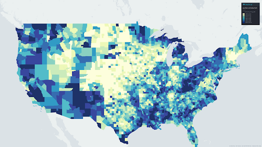
We use choropleth maps to convey statistical values in different geographical scales, from local to global. However, choropleth maps have some limitations. One particular drawback of using choropleth maps is that geographical spaces aren’t uniform, and thus the displayed results might not portray the right results. For example, large geographic areas (like Texas or California) might dominate the visual.
Make sure to normalize the attribute for the choropleth map (otherwise, the visual is misleading). One way to normalize the choropleth map is to divide the statistical values with the population of the geographic area.
Choropleth Map Advantages:
- They clearly display densities (ratios) of quantities using color.
Choropleth Map Disadvantages:
- The visual tends to generalize the data.
- Geographical spaces aren’t uniform so some areas may appear overrepresented.
2. Bivariate Choropleth Map
Bivariate choropleths are similar to choropleth maps with one exception: Instead of using one variable to display densities, bivariate choropleth maps (as the name might suggest) use two variables at once. This method compares two dissimilar distributions on the same map.
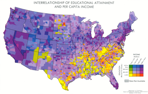
The best use cases for bivariate choropleth maps are when you have two dissimilar attributes that you want to display at once.
Bivariate Choropleth Map Advantages:
- You can visualize two themes at once.
- They’re aesthetically pleasing.
Bivariate Choropleth Map Disadvantages:
- They can be complex and hard to read.
- It’s hard to have an interactive version of a bivariate map.
3. Value-by-Alpha Map
Another thematic map closely related to the bivariate choropleth is the value-by-alpha (VBA) map. Value-by-alpha is a bivariate choropleth technique where we consider two variables that affect each other such as election results and population density. The second variable acts as an equalizer for the other variable of interest.

VBA modifies the background color through the alpha variable (transparency). Thus, lower values fade into the background, while higher values rise to the top. VBA maps came into existence to reduce the larger size bias in choropleth maps.
VBA Map Advantages:
- They display bivariate relationships with classes of more than three.
- They’re aesthetically pleasing.
VBA Map Disadvantages:
- They’re complex and sometimes hard to read.
- It’s hard to have an interactive version of the bivariate map.
4. Dot Distribution Map
A dot distribution map (or dot density map) is a thematic map type that uses dots to display the presence or absence of a feature. Typically, one point is assigned to represent a larger quantity. For example, in the below map, one dot represents 100 indigenous people in Australia.
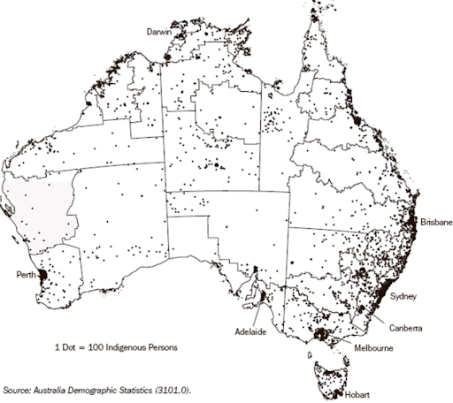
This map clearly shows the trend or spatial pattern of where indigenous people live across Australia.
Note that the points are mostly generated randomly, which means the points are arbitrarily placed inside the geographic area. For example, if you have a rectangle as your geographic area, the points can have different patterns depending on the random selection. The smaller the geographic area the better. The example I used from Australia above uses cities as the geographic area. The map, however, uses the region boundaries more appropriately for visual purposes. Data scientists should interpret this accordingly.
Dot Distribution Advantages:
- The best way to visualize spatial patterns.
- An effective way to represent different categories using colors.
Dot Distribution Disadvantages:
- Randomly generated points might differ from one iteration to another.
- If the map doesn’t have borders drawn, we don’t know exactly where these points are located.
5. Graduated Symbol Map
Graduated symbol maps are an alternative to choropleth maps. The difference between them is that, instead of using color to indicate feature attributes or statistics, the graduated symbol map (or graduated circle map) uses points. The data is likely stored in polygons and then converted to centroid points for these areas. We use this type of map when we intend to visualize quantity rather than density (as we do with the choropleth map).
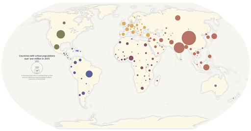
We divide the feature attribute quantities into classes using different classification techniques like quantile, natural breaks and equal intervals. For example, the graduated symbol map above separates the population for some cities into five classes. Each of these classes has a specific dot size depending on the classification of the population in that city.
Graduated Symbol Map Advantages:
- This does a better job showing raw quantities (rather than densities as we saw with choropleth maps).
- They clearly convey where and how much (quantities).
Graduated Symbol Map Disadvantages:
- They are less exact than distribution maps.
- They need preprocessing to derive centroids.
- Overlapping circles can cause confusion (but you can use transparency to help that shortcoming).
6. Heat Map
Heat maps display the density of points on a geographic map and can effectively visualize the intensity of the variable through a color scale. A heat map shows hot spots or concentrations of points. This technique is often used when geographic boundaries are not that important.
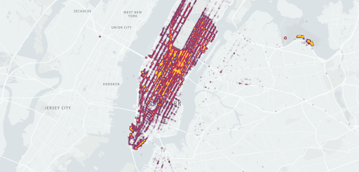
Heat Map Advantages:
- Heat maps make it easy to understand relationships between data points and the overall trend.
Heat Map Disadvantages:
- If you don’t use the color appropriately, you might affect the visualization’s legibility.
- Color transitions might reflect perceptions that aren’t present in the data.
7. Cartogram
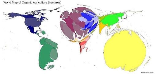
A cartogram is a thematic map type in which you rescale the size of an area to be proportional to the feature it represents. Therefore, the rescaled size communicates the feature attributes selected. As a result cartograms necessarily distort area sizes.
There are different types of cartograms but the most widely used is what we call contiguous cartograms. For contiguous cartograms, you can maintain the topology but you end up distorting the shape dramatically.
Cartogram Advantages:
- They’re good at showing numbers (such as a population).
Cartogram Disadvantages:
- Since the geographic areas are distorted, areas might not be recognizable.
- They are intended for map-literate audiences only.
What Is a Thematic Map Used For?
Thematic maps are used to highlight correlations, patterns or trends present in geospatial data, and to compare data between two or more different locations. This is helpful for understanding the physical distribution of data in topics like weather, living species or human behavior and characteristics. A thematic map also provides a visual reference when analyzing or teaching about relationships in geospatial data, making it useful for drawing conclusions that may otherwise be missed when viewing data only in a spreadsheet or table.
Frequently Asked Questions
What is a thematic map?
A thematic map is a type of map used to visually display geospatial data (data related to a certain location) based on a specific theme or topic. Thematic maps can help visualize the distribution of data related to population, election results, weather measurements and more within a designated area.
What are the most common types of thematic maps?
Some of the most common types of thematic maps include:
- Choropleth maps
- Dot distribution maps
- Graduated symbol maps
- Heat maps
- Cartograms


