Imagine this: you spend hours upon hours cleaning data, exploring and modeling it. It’s interesting! Your results are valid and statistically significant. Unfortunately, your data visualization is dull and ineffective so your audience can’t see the work you’ve done. They don’t understand your story.
Learning how to visualize your data effectively is like learning how to tell a compelling story.
One of the essential aspects of being a data scientist is the ability to effectively communicate data analysis results using various kinds of visualizations. Unfortunately, we often spend too much time learning new analysis methods, libraries and approaches, or getting familiar with new data sets and trending machine learning algorithms, and not enough time improving our visualization skills.
Keys to Compelling Data Visualization
- K.I.S.S.—Keep is simple, stupid.
- Choose the right chart.
- Visualize one aspect per chart.
- Spice up your axis range.
- Use transformations to emphasize change.
- Scatter your points in your scatter plot.
- Pick your palette wisely.
Don’t misunderstand me. Staying up to date with new technology is an important part of having a successful career in data science. However, we also need to devote time to upgrading our visualization and storytelling skills, too.
Your choice of chart, colors and style will make a tremendous difference in how others perceive your data, your work and you. Fortunately, these simple guidelines can make your data visualization both visually appealing and completely captivating.
1. K.I.S.S.—Keep It Simple, Stupid
Data visualizations such as graphs and charts should make it easier for others to read, understand and interpret your data. Always try to avoid complex, crowded visualizations.
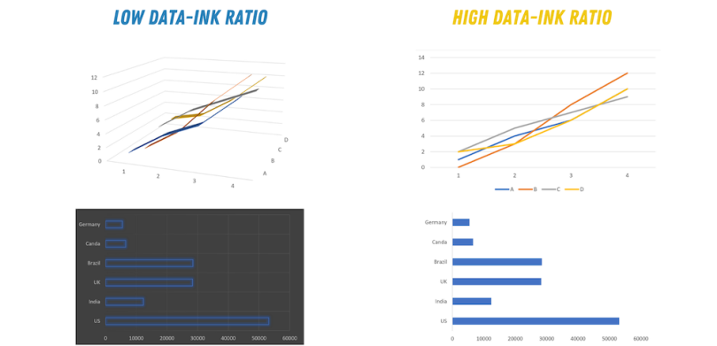
Whenever you’re creating a visualization, you need to pay attention to the data-ink ratio. Data-ink ratio is a term we use to refer to the amount of data versus redundant ink in the graph, such as background effects and colors or 3-D representations of the data (i.e. non-data-ink). Instead of using multi-dimensional graphs, you can use visualization properties, such as shape, color and thickness, to differentiate and distinguish your various data sets.
For your visualization to be simple and effective, your data-ink ratio needs to be high.
2. Choose the Right Chart
When you create a graph you need to pay attention to your data type to choose the best chart to represent it accurately.
Based on the data you’re using, the type of chart you use will differ. Here are some easy-to-follow guidelines:
-
Categorical data: Use a bar chart if you have more than five categories. Otherwise, use a pie chart.
-
Nominal data: Use bar charts or histograms if your data is discrete or line/area charts if your data’s continuous.
-
Show the relationship between values in your data set: Use a scatter plot, bubble chart, or line charts.
-
Compare values in your data set: Use a pie chart for relative comparison and bar charts for precise comparison.
3. Visualize 1 Aspect per Chart
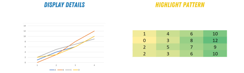
Before creating a chart you need to decide whether you’re trying to demonstrate patterns or details. Whatever you do, don’t try to tell two stories at once. To make your visuals more effective, display only one aspect at a time.
If you need to show two sides of your data (e.g. a pattern and some details), use two different plots. For example, you can use a line chart to show details and a heat map or horizon graph to show the pattern within the data.
Horizon graphs display multiple time-series in parallel. Horizon graphs are similar to a time-series plot. However, horizon graphs use color to highlight differences and extremes across time-series.
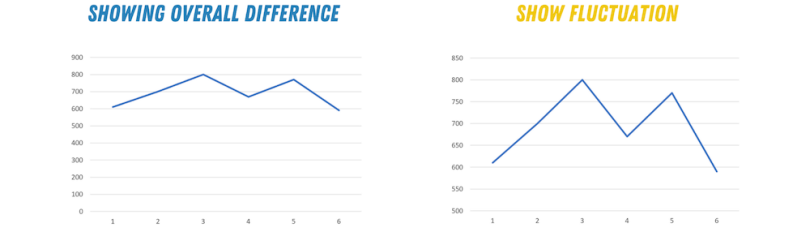
4. Spice Up Your Axis Range
Your vertical and horizontal axes’ ranges depend on the type of story you’re trying to tell. Whatever the story, make your axes interesting!
For example, if you’re using a bar chart to show the maximum value of different data sets, your axes need to start from zero. However, if you want to show your data fluctuation in precise numbers, you need to zoom in on your axes to make this fluctuation clear. It's easier to see variations in a data set when the plot limits are closer to the fluctuation range.
5. Emphasize Change Rate With Data Transformation
The decision to use a transformation in your visualization depends on both your data set and the intent of the plot. Applying transformations to your graph can change both the impression and the information conveyed by your chart.
Generally speaking, you can transform two aspects of your graphs. Your axes or the data itself.
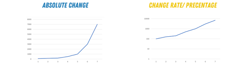
Transforming Your Axes
When plotting a data set, you can either use a linear or a logarithmic scale. We often use logarithmic scales to display the percentage of change during a period of time, so the points on the scale are not positioned equidistantly.
We use a linear scale, on the other hand, to display the absolute difference between various unique points of your data set.
Transforming Your Data
Logarithmic scales are sometimes challenging to understand. You can get around that by transforming your data. For example, instead of displaying absolute values, you can normalize your values to the mean or a specific value.
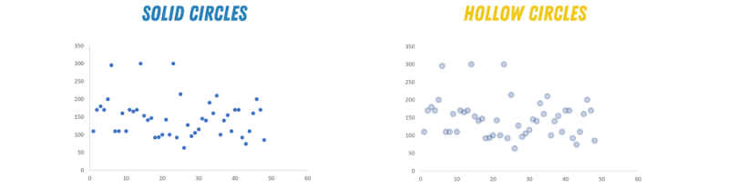
6. Scatter Points in Your Scatter Plots
When using a scatter plot, sometimes two or more circles may overlap each other, which could make reading the data much harder. Overlapping points can also hide the actual size of a specific cluster within the graph. In other words, your story is getting muddy!
One thing you can do to avoid this problem and make your scatter plot more meaningful is to use different opacities for your circles. Another strategy to achieve a similar effect is to plot unfilled circles. (This approach may not be beneficial in the case of large data sets. In that case, using the opacity option may be better.) You can also change the sizes of the circles to have an overall clearer visualization.
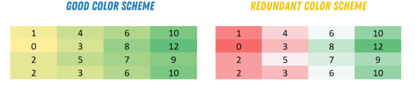
7. Pick Your Palette Wisely
Colors can make or break your graph. When you’re creating new visuals and choosing your color scheme, ask yourself two questions.
Are my Colors Visible on All Platforms?
Sometimes when we build charts to present at a meeting, we forget to test how it’ll appear on different platforms.
Will your data be clear when displayed on a computer or a phone? What about the lighting? Do you need to use high screen brightness to see the chart clearly, or does it work regardless?
What Media Will I Use to Present my Chart?
If you’re creating charts to be printed, the type of paper may affect your choice of colors. Sometimes a color palette that’s clear on your screen may not be distinct enough when printing on a specific kind of paper.
On that note, use a narrow color palette when you’re designing your graph. Good design will draw your audience into the story you’re telling. Bad design will make them want to run for the hills. If you’re creating a heat map, you need to use the gradient of one color and not different colors. Using different colors may confuse your audience and make your map difficult to understand.
Visualizing data is often the best and most straightforward approach to communicate your findings to a broad audience. Whenever we create charts and graphs we should keep them simple, direct and easy to read.
Remember, your data tells a story, and your choice of visualization can make the story exciting, compelling, dull or even downright painful.