

Exploratory data analysis (EDA) is an important part of every data scientist’s workflow. EDA allows data scientists to summarize the most important characteristics of the data they’re working with. In the case of financial data analysis, this includes generating simple summary statistics such as standard deviation in returns and average returns, visualizing relationships between stocks through correlation heatmaps, generating stock price time series plots, boxplots, and more.
Let’s consider the analysis of three stocks: Amazon (AMZN), Google (GOOGL) and Apple (AAPL).
Steps to Perform Financial Data Analysis in Python
- Generate summary statistics and visualizations
- Analyze risk and return
- Generate lagging indicators to understand stock price trends
This should form a solid foundation for the beginner who wants to get started learning how to analyze financial data in Python. Before we get started, here are some of the tools we’ll use.
The pandas-datareader is a Python library that allows users to easily access stock price data and perform statistical analysis tasks such as calculating returns, risk, moving averages, and more. In addition, matplotlib and seaborn are libraries in Python that further allow you to create data visualizations such as boxplots and time series plots. The combination of these libraries enable data scientists to pull powerful insights from financial data with relatively few lines of code.
Risk analysis of stocks is important to understand the uncertainty in stock price fluctuation. This can help investors choose which stocks they’d like to invest in depending on their risk tolerance. We can use moving average calculations to further inform investment decisions through describing the directional trend in stock price movement.
Finally, Bollinger Band plots are a useful way to visualize price volatility. Bollinger Band plots and moving averages are what we call lagging indicators. This means they’re based on long term shifts and help us understand long term trends. This is in contrast to leading indicators which are used to predict future price movements.
Accessing Financial Data Using Pandas-Datareader
To start we’ll need to install the pandas-datareader library using the following command in terminal:
pip install pandas-datareaderNext let's open up a new Python script. At the top of the script, let’s import the web object from the pandas_datareader.data module. Let's also import the built in datetime package which will allow us to create Python datetime objects:
import pandas_datareader.data as web

import datetime
Now let’s pull stock price data for Amazon, store it in a variable called amzn, and display the first five rows of data:
amzn = web.DataReader('AMZN','yahoo',start,end)

print(amzn.head())
We see that the data frame has columns High, Low, Open, Closed, Volume and Adjusted Close. These values are based on stock prices during a trading session which is typically between 9:30 am to 4:00 pm. Let’s consider what each of these columns mean:
Understanding Stock Market Vocabulary
- High price: the highest price of a stock during a trading session
- Low price: the lowest price of a stock during a trading session
- Close price: the price of a stock at the end of a trading session
- Open price: the price of a stock at the beginning of a trading session
- Adjusted close: the closing price after making adjustments for stock splits and dividends
Next thing we should do is save this data to a .csv file using the pandas to_csv method:
amzn.to_csv(f’amzn_{start}_{end}.csv’, index=False)Now that we have data for AMZN, let's pull data for GOOGL and AAPL. We’ll start with GOOGL and then move to AAPL.
googl = web.DataReader('GOOGL','yahoo',start,end)

print(googl.head())

googl.to_csv(f"googl_{start}_{end}.csv", index=False)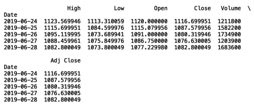
Next, let’s pull AAPL:
aapl = web.DataReader('AAPL','yahoo',start,end)
print(aapl.head())
aapl.to_csv(f"aapl_{start}_{end}.csv", index=False)

We should now have three files containing two years of stock price data for AMZN, GOOGL and AAPL. Let’s read these files into new pandas dataframes:
import pandas as pd

amzn_df = pd.read_csv(f'amzn_{start}_{end}.csv')

googl_df = pd.read_csv(f'googl_{start}_{end}.csv')

aapl_df = pd.read_csv(f'aapl_{start}_{end}.csv')
Exploring and Visualizing Financial Data
Next we can generate some simple statistics. An important metric for understanding stock price movements is return. Return is defined as the opening price minus the closing price divided by the opening price (R = [open-close]/open). Let’s calculate returns for each ticker. Let’s start by calculating the daily returns for AMZN:
amzn_df['Returns'] = (amzn_df['Open'] - amzn_df['Close'])/amzn_df['Open']
A simple visualization we can create is a histogram for the daily returns in AMZN stock price. We can use seaborn for styling and matplotlib to generate a histogram:
import matplotlib.pyplot as plt

import seaborn as sns

amzn_df['Returns'] = (amzn_df['Open'] - amzn_df['Close'])/amzn_df['Open']

amzn_df['Returns'].hist()

plt.title('AMZN Stock Price Returns Distribution')

plt.show()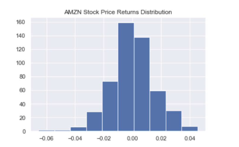
And we can repeat this for GOOGL:
googl_df['Returns'] = (googl_df['Open'] - googl_df['Close'])/googl_df['Open']

googl_df['Returns'].hist()

plt.title('GOOGL Stock Price Returns Distribution')

plt.show()
And AAPL:
aapl_df['Returns'] = (aapl_df['Open'] - aapl_df['Close'])/aapl_df['Open']

aapl_df['Returns'].hist()

plt.title('AAPL Stock Price Returns Distribution')

plt.show()
We can also calculate the mean returns and the standard deviation in returns for each stock and display them in the title of the histogram. These statistics are very important for investors. Mean returns give us an understanding of a stock investment’s profitability. The standard deviation is a measure of how much the returns fluctuate. We call this risk in the financial world. Typically, higher risks are associated with higher returns. Let’s show an example for AMZN. First we store the mean and standard deviation in variables and use f-strings to format the title:
mean_amnz_returns = np.round(amzn_df['Returns'].mean(), 5)

std_amnz_returns = np.round(amzn_df['Returns'].std(), 2)

plt.title(f'AMZN Stock Price Returns Distribution; Mean {mean_amnz_returns}, STD: {std_amnz_returns}')

plt.show()
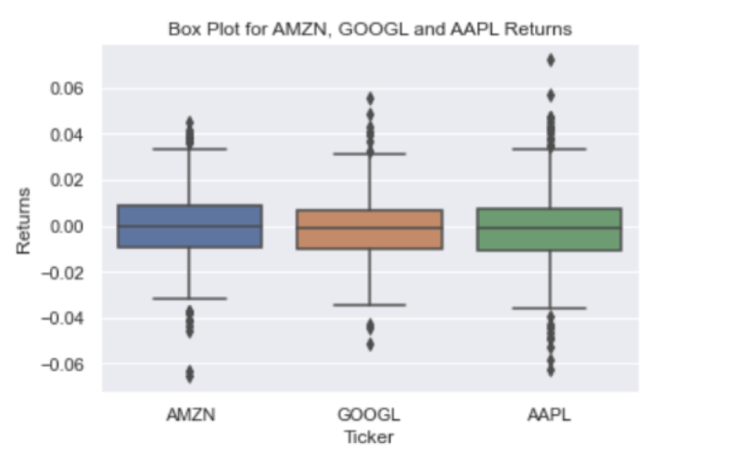
Another useful data visualization is boxplots. Similar to histograms, this is another way to visualize mean, dispersion and skewness in data. In the context of our financial data, it can help us compare the mean returns, the dispersion in returns, and the skewness in returns for each stock, which can help inform investment decisions. First let’s combine the returns for each stock into a single data frame:
amzn_df['Ticker'] =  'AMZN'

googl_df['Ticker'] =  'GOOGL'

aapl_df['Ticker'] =  'AAPL'

df = pd.concat([amzn_df, googl_df, aapl_df])

df = df[['Ticker', 'Returns']]

print(df.head())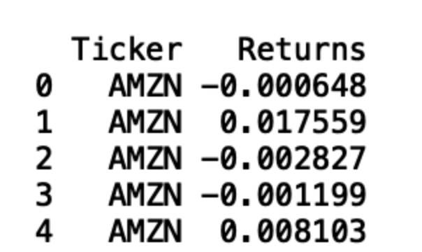
To generate boxplots we use the following code:
sns.boxplot(x= df['Ticker'], y = df['Returns'])
plt.title('Box Plot for AMZN, GOOGL and AAPL Returns')
plt.show()
The final visualization we’ll discuss is the correlation heat map for returns. This visualization helps us understand if there are linear relationships between stock price returns. This is important because it can provide insights into the relationship between stocks in an investor’s portfolio and as a result can also help inform how an investor builds their portfolio. To create our heatmap let’s first create a new data frame that contains a column for each ticker:
df_corr = pd.DataFrame({'AMZN':amzn_df['Returns'], 'GOOGL':googl_df['Returns'], 'AAPL':aapl_df['Returns']})
Next let’s calculate the correlation between each stock’s returns:

This heatmap shows that each of these stocks have a positive linear relationship. This means that when the daily returns of AMZN increase, AAPL and GOOGL are also likely to increase. The reverse is also true. If AMZN returns decrease, the others are also likely to decrease. A good investment portfolio contains diversified assets. In this context, this means we should select stocks that are not strongly correlated with each other like AAPL, AMZN, and GOOGL. This is because if the returns for one stock dips, your entire portfolio returns will also decrease. In a diversified portfolio with stocks that are uncorrelated, one stock price will not necessarily decrease or increase along with any others.
Lagging Indicators
The next calculations we’ll walk through are two different kinds of lagging indicators, moving average and Bollinger Band plots. The moving average is a common technique analysts use to smooth out short-term fluctuations in stock prices to understand trends in price direction. Here we’ll plot the moving average for AMZN, GOOGL and AAPL. Let’s start with AMZN. We’ll plot the 10-day moving average for the AMZN adjusted close stock price and consider stock prices after January 23, 2021:
cutoff = datetime.datetime(2021,1,23)

amzn_df['Date'] = pd.to_datetime(amzn_df['Date'], format='%Y/%m/%d')

amzn_df = amzn_df[amzn_df['Date'] > cutoff]

amzn_df['SMA_10'] = amzn_df['Close'].rolling(window=10).mean()

print(amzn_df.head())

plt.plot(amzn_df['Date'], amzn_df['SMA_10'])

plt.plot(amzn_df['Date'], amzn_df['Adj Close'])

plt.title("Moving average and Adj Close price for AMZN")

plt.ylabel('Adj Close Price')

plt.xlabel('Date')

plt.show()
In the above plot the blue line is the moving average and the orange is the adjusted close price. We can do the same for GOOGL:
googl_df['Date'] = pd.to_datetime(googl_df['Date'], format='%Y/%m/%d')

googl_df = googl_df[googl_df['Date'] > cutoff]

googl_df['SMA_10'] = googl_df['Close'].rolling(window=10).mean()

print(googl_df.head())

plt.plot(googl_df['Date'], googl_df['SMA_10'])

plt.plot(googl_df['Date'], googl_df['Adj Close'])

plt.title("Moving average and Adj Close price for GOOGL")

plt.ylabel('Adj Close Price')

plt.xlabel('Date')

plt.show()
And finally AAPL:
aapl_df['Date'] = pd.to_datetime(aapl_df['Date'], format='%Y/%m/%d')

aapl_df = aapl_df[aapl_df['Date'] > cutoff]

aapl_df['SMA_10'] = aapl_df['Close'].rolling(window=10).mean()

print(googl_df.head())

plt.plot(aapl_df['Date'], aapl_df['SMA_10'])

plt.plot(aapl_df['Date'], aapl_df['Adj Close'])

plt.title("Moving average and Adj Close price for AAPL")

plt.ylabel('Adj Close Price')

plt.xlabel('Date')

plt.show()

The last type of plot I’ll discuss is the Bollinger Band plot, which is a way to visualize the dispersion in the moving average. The bands are defined by upper and lower bounds that are two standard deviations away from the simple moving average. This is useful for traders because it allows them to take advantage of fluctuations in price volatilities. Let’s generate a Bollinger Band plot for AMZN:
amzn_df['SMA_10_STD'] = amzn_df['Adj Close'].rolling(window=20).std()

amzn_df['Upper Band'] = amzn_df['SMA_10'] + (amzn_df['SMA_10_STD'] * 2)

amzn_df['Lower Band'] = amzn_df['SMA_10'] - (amzn_df['SMA_10_STD'] * 2)

amzn_df.index = amzn_df['Date']

amzn_df[['Adj Close', 'SMA_10', 'Upper Band', 'Lower Band']].plot(figsize=(12,6))

plt.title('10 Day Bollinger Band for Amazon')

plt.ylabel('Adjusted Close Price')

plt.show()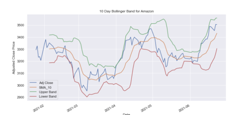
And for GOOGL:
googl_df['SMA_10_STD'] = googl_df['Adj Close'].rolling(window=10).std()

googl_df['Upper Band'] = googl_df['SMA_10'] + (googl_df['SMA_10_STD'] * 2)

googl_df['Lower Band'] = googl_df['SMA_10'] - (googl_df['SMA_10_STD'] * 2)

googl_df.index = googl_df['Date']

googl_df[['Adj Close', 'SMA_10', 'Upper Band', 'Lower Band']].plot(figsize=(12,6))

plt.title('10 Day Bollinger Band for Google')

plt.ylabel('Adjusted Close Price')

plt.show()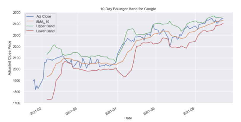
And finally for AAPL:
aapl_df['SMA_10_STD'] = aapl_df['Adj Close'].rolling(window=10).std()
aapl_df['Upper Band'] = aapl_df['SMA_10'] + (aapl_df['SMA_10_STD'] * 2)
aapl_df['Lower Band'] = aapl_df['SMA_10'] - (aapl_df['SMA_10_STD'] * 2)
aapl_df.index = aapl_df['Date']
aapl_df[['Adj Close', 'SMA_10', 'Upper Band', 'Lower Band']].plot(figsize=(12,6))
plt.title('10 Day Bollinger Band for Apple')
plt.ylabel('Adjusted Close Price')
plt.show()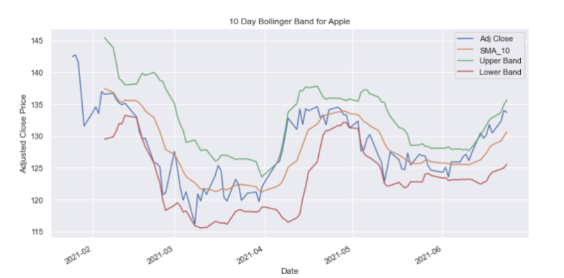
If you are interested in accessing the code used above, it's available on GitHub.
There are a wide variety of useful tools for pulling, analyzing and generating insights from financial data. The combination of these tools make it easy for beginners to start working with financial data in Python. Together these skills can be used for personal investment, algorithmic trading, portfolio building and more. Being able to quickly generate statistical insights, visualize relationships and pinpoint trends in financial data is invaluable for any analyst or data scientist interested in finance.


