

Data visualization and exploration are critical tasks in data science. However, it takes a lot of time, code and tinkering to produce even a single visualization.
What if you had an intelligent tool that automatically suggests relevant and aesthetically beautiful data visualizations to enable you to discover and explore your data quickly?
I’m not talking about suggesting a single bar chart or a couple of visuals, here. I’m talking about using one line of code to get back interactive data visuals that you can filter even further by features from columns in the data set.
Enter Lux: a Python API for Intelligent Visual Discovery.
Why Use Lux for EDA?
Data Discovery With Lux
You first need to install Lux in your environment, which you can do by running either of these two commands:
pip install lux-api
conda install -c conda-forge lux-api
If you are using Jupyter Notebook, activate the notebook extension:
jupyter nbextension install --py luxwidget
jupyter nbextension enable --py luxwidget
For Jupyter Lab users, run the following to activate the lab extension:
jupyter labextension install @jupyter-widgets/jupyterlab-manager
jupyter labextension install luxwidget
Now that you’ve installed Lux and have your Jupyter extensions, let’s look at the basics of Lux for data discovery.
Basic Functionality
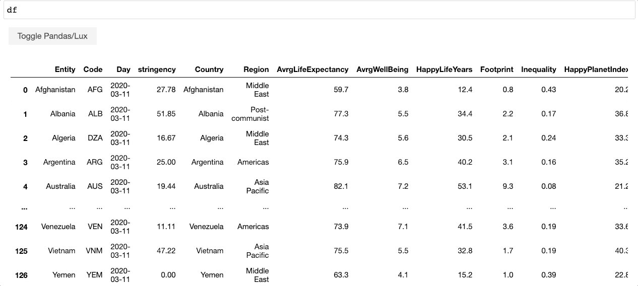
In order to get the interactive data discovery tool in Lux, and the recommended visuals, read your data with Pandas and call the name of your data frame.
import pandas as pd
import lux
df = pd.read_csv("https://raw.githubusercontent.com/plotly/datasets/master/gapminderDataFiveYear.csv", parse_dates=["year"])
df
Instantly, you get your data frame displayed just like Pandas. In addition, you have the toggle button for “Toggle Pandas/Lux.” When you click on this button, you’ll get back interactive data visualization suggestions. Here’s what the process looks like.
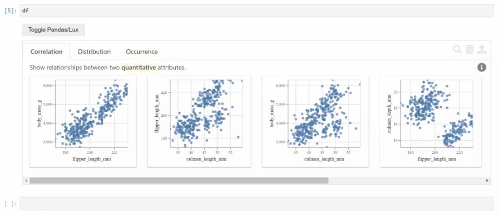
Depending on the data, Lux visualizes correlations, distributions, occurrences and, if you have time or geospatial data, you’ll also get temporal and geographic data visualization suggestions.
I’ve reviewed several auto EDA tools and libraries but I’ve never seen a more powerful EDA tool that also incorporates geospatial data; Lux is the only one.
Intent and Filtering
I’m sure you’re now wondering what more you can do with this fantastic tool at your disposal. Lux is flexible and versatile. It enables you to interact with data visualizations easily with intent, while seamlessly filtering the data.
Let’s see what you can do with intent functionality. Instead of just taking what Lux throws at you, you’re free to choose which feature(s) you want to explore in your data.
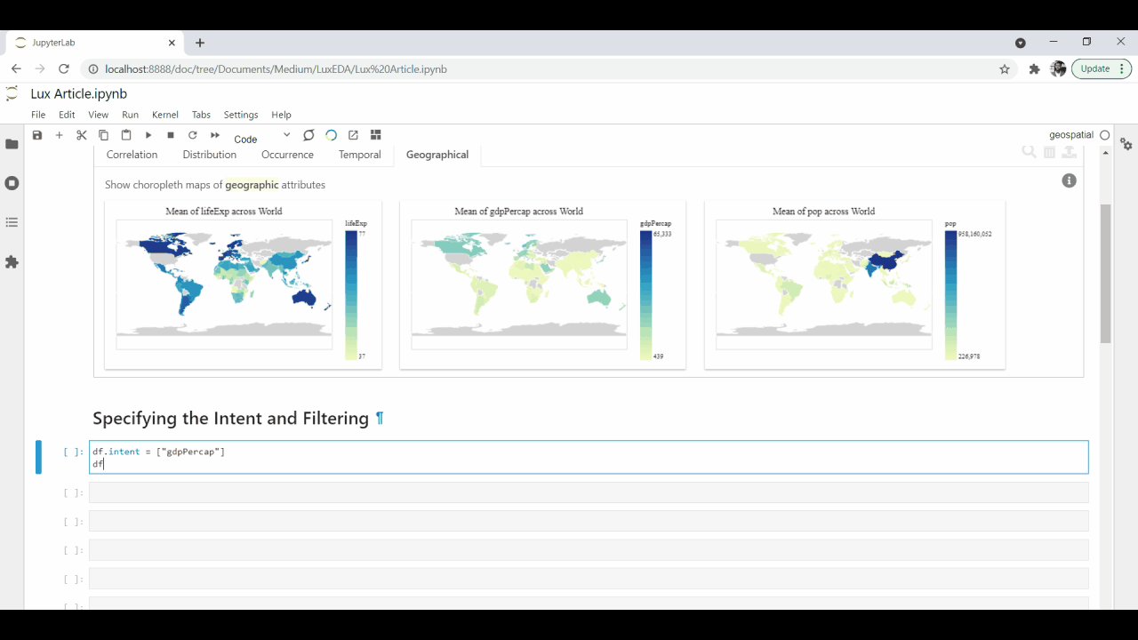
If we want to examine, for example, the GDP feature in the data set, we can pass that in the intent method.
df.intent = ["gdpPercap"]
df
Lux will take the intent feature and produce more immediately relevant data visualizations. This means, instead of the randomly-generated visuals, you now have specific recommendations for visuals with additional features from the data set.
If you want to get the filters beforehand, you can also pass that under the intent method.
df.intent = ["gdpPercap","continent=Europe"]
df
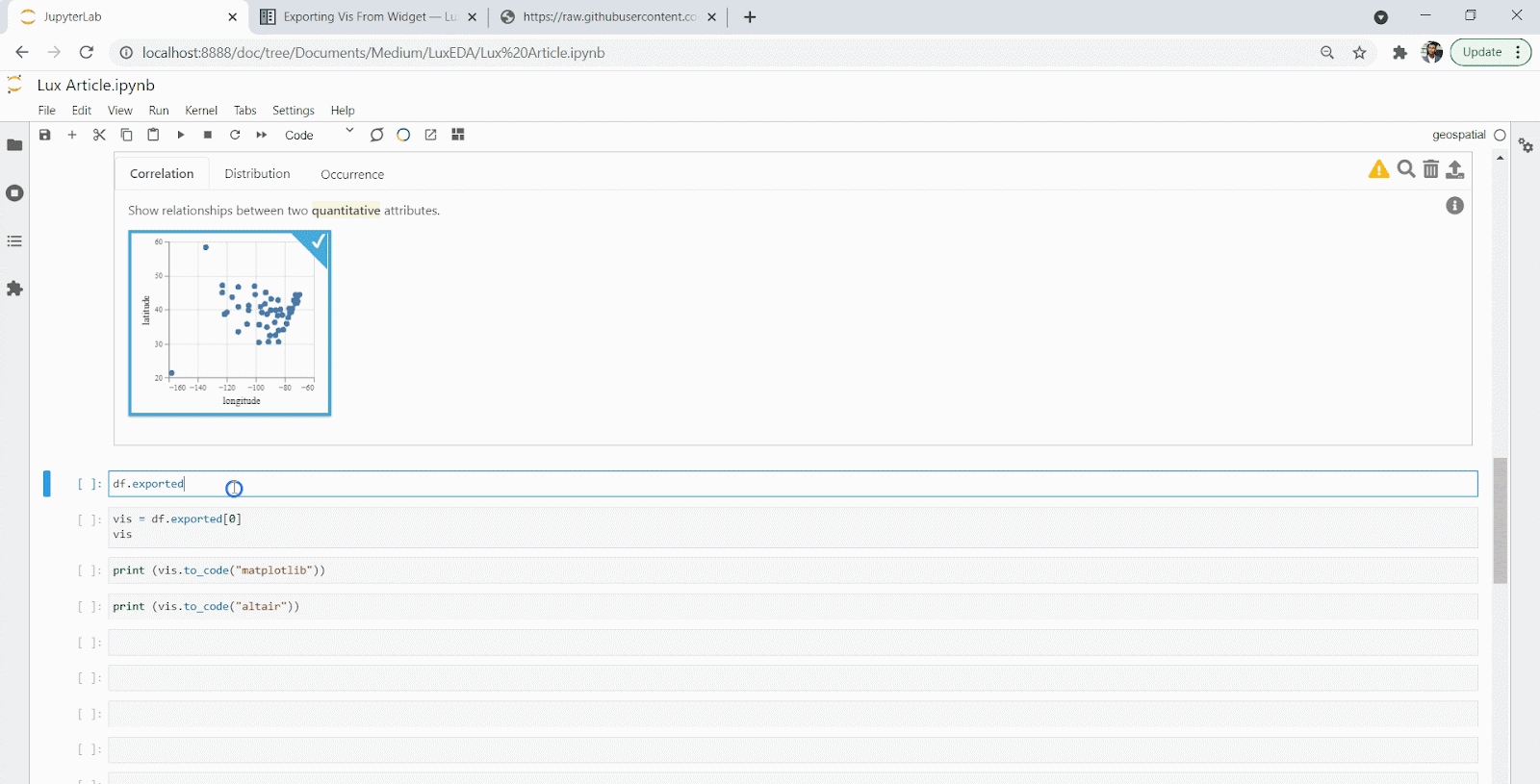
Exporting Visuals
Exporting these visuals is easy with Lux. You need to select one or more visuals and hit the export button. This will create a list of visuals you’ve chosen. In this example, I’ll show you how to export a single visualization.
Now that you’ve exported your visualization, you can access the exported visualization and manipulate it however you like. You can also export the code behind the data visualization easily.
Final Thoughts
With Lux, you can speed up the EDA process in data science and customize it according to your intention. I love that it offers a geospatial data visualization option, but it has limited functionality because it can’t treat coordinates as geographic features. I love the easy-to-use API Lux provides as well as its flexibility and its integration with the data science Python ecosystem. Most of all, you can save time and energy because you can quickly develop relevant EDA visualizations without writing a large body of code.


