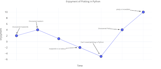
The sunk-cost fallacy, one of many harmful cognitive biases that afflict all of us, refers to our tendency to devote time and resources to a lost cause because we have already spent — sunk — so much time in the pursuit. The sunk-cost fallacy leads us to stay in bad jobs, grind away at a project even after we know it won’t work, and, yes, continue to use the tedious, outdated Python plotting library Matplotlib when better alternatives exist.
After years of struggling with Matplotlib, I realized the only reason I continued to use it was the hundreds of hours I sunk into learning the convoluted syntax. The complexity of Matplotlib had caused me hours of frustration on StackOverflow figuring out how to format dates or add a second y-axis. Fortunately, once I understood my reluctance to switch was irrational, I found there are now many easier-to-use alternatives for plotting in Python. After exploring the options, a clear winner emerged as measured by ease-of-use, documentation and functionality: the Plotly Python library.
4 Reasons to Switch to Plotly in Python
- Ability to efficiently create charts for rapid data exploration
- Interactivity for subsetting/investigating data
- Ability to show different data views to find relationships or outliers
- Customization of figures for presentations and reports
In this article, we’ll dive into Plotly, learning how to make interactive data visualizations and plots in less time than Matplotlib, often with one line of code. This rapid iteration means we can more fully explore our data and use it to make better decisions — the ultimate point of data science.
All of the code for this article is available in a Jupyter notebook on GitHub. The charts are interactive, and since GitHub doesn’t render Plotly plots natively, you can explore the visuals on NBViewer here.
Note: This article is intended to show the capabilities of Plotly and does not always follow the best visualization practices as laid out by Edward Tufte. An accessible, free, online book teaching these best practices is Fundamentals of Data Visualization by Claus Wilke.
Plotly Overview
The Plotly Python package is an open-source library built on plotly.js, which in turn is built on the powerful d3.js. We’ll be using a lighter-weight version of the core Python Plotly library, Cufflinks, which is designed to work natively with Pandas DataFrames.
In terms of abstraction, Cufflinks > Plotly > plotly.js > d3.js which means we can work with Python code at a high level and get the incredible interactive graphics capabilities of d3. Cufflinks can also be extended with the core Plotly library functionality for more detailed charts.
Note: The maker of the Python library is also called Plotly, a graphics company with several products and open-source tools. The Python library is free to use, and we can make unlimited charts in offline mode plus up to 25 charts in online mode to share with the world.
I did the work in this article in a Jupyter Notebook with Plotly + Cufflinks running in offline mode. Installing Plotly and Cufflinks is as simple as pip install cufflinks Plotly, and the notebook shows how to import the libraries and set up offline mode. The data set for this article contains stats about my Medium articles, which you can also find on Github to follow along.
Single Variable Distributions: Histograms and Boxplots With Plotly
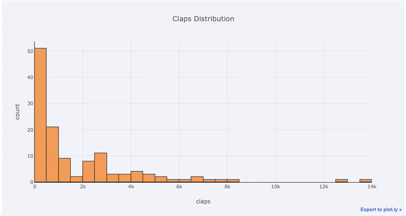
Single variable (univariate) plots are a standard way to start a data analysis. We use the histogram to show a one-dimensional distribution (although it has some issues). First, let’s make an interactive histogram of the number of claps by articles (claps being a form of appreciation for a Medium article).
Note: In the code, df refers to the Pandas DataFrame with the article stats.
df['claps'].iplot(
    kind='hist',
    bins=30,
    xTitle='claps',
    linecolor='black',
    yTitle='count',
    title='Claps Distribution')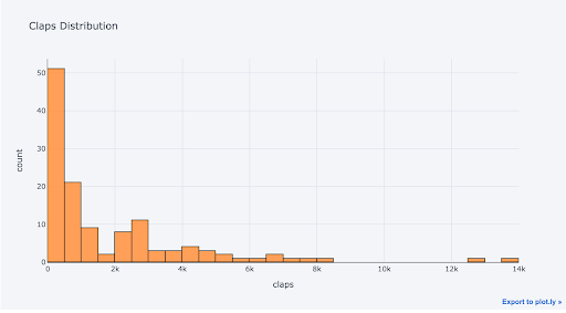
All Plotly graphs are interactive even though it’s hard to tell from the static image. Interactivity means we can rapidly explore the data, zoom in on points of interest and compare stats.
For those used to Matplotlib, all we have to do is add one more letter to our plotting code (iplot instead of plot), and we get a much better-looking and interactive chart!
To compare two one-dimensional variables, we plot overlaid histograms. Here we graph the time of day at which I started writing articles and the time of day at which I published articles.
df[['time_started', 'time_published']].iplot(
    kind='hist',
    linecolor='black',
    bins=24,
    histnorm='percent',
    bargap=0.1,
    barmode='group',
    xTitle='Time of Day',
    yTitle='(%) of Articles',
    title='Time Started and Time Published')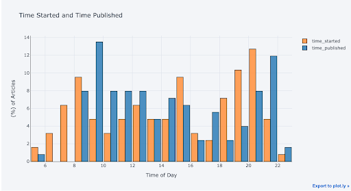
It looks like I tend to start writing articles later in the day (6-8 p.m.) and most frequently publish around 9 a.m. with a secondary peak at 10 p.m.
With a little bit of Pandas data manipulation, we can make a barplot:
# Resample to monthly frequency and plot
df2 = df[['view','reads','published_date']].\
        set_index('published_date').\
        resample('M').mean()


df2.iplot(kind='bar', xTitle='Date', yTitle='Average',
   title='Monthly Average Views and Reads')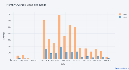
Combining Pandas data manipulation with Plotly graphing means we can rapidly create many different graphs to explore our data from different perspectives.
For a boxplot of the fans per article by publication, we pivot the data and then plot:
df.pivot(columns='publication', values='fans').iplot(
       kind='box',
       yTitle='fans',
       title='Fans Distribution by Publication')
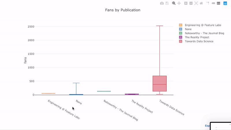
Boxplots contain a lot of information on the distribution of a variable, and the interactive plot allows us to examine each of these values. We can also compare the distributions segmented by category (in this case the publication for the article).
Time-Series With Plotly
A large portion of real-world data has a time element. Fortunately, Cufflinks was designed with time-series visualizations in mind. If we set the index of the data frame to a time-series and then plot other variables, Cufflinks will automatically plot a time series with correct date-time formatting on the x-axis.
# Set index to the publication date to get time-series plotting

df = df.set_index(“published_date”)

# Plot fans and word count over time
df[['fans', 'word_count', 'title']].iplot(
    y='fans',
    mode='lines+markers',
    secondary_y = 'word_count',
    secondary_y_title='Word Count',
    opacity=0.8,
    size=8,
    symbol=1,
    xTitle='Date',
    yTitle='Claps',
    text='title',
    title='Fans and Word Count over Time')
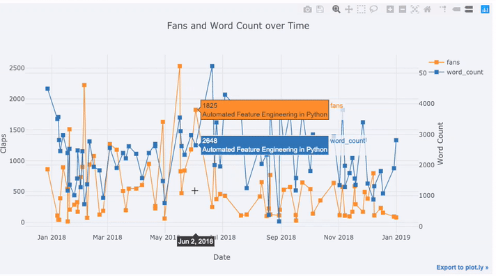
With this single line of code, we do the following:
-
Graph the fans and word count over time with points connected by lines
-
Add a secondary y-axis because our variables have different ranges
-
Add in the title of the articles as hover information
For more information, we can also add text annotations to a graph. Here we graph the monthly word count over time with annotations:
df_monthly_totals.iplot(
   mode='lines+markers+text',
   text=text,
   y='word_count',
   opacity=0.8,
   xTitle='Date',
   yTitle='Word Count',
   title='Total Word Count by Month')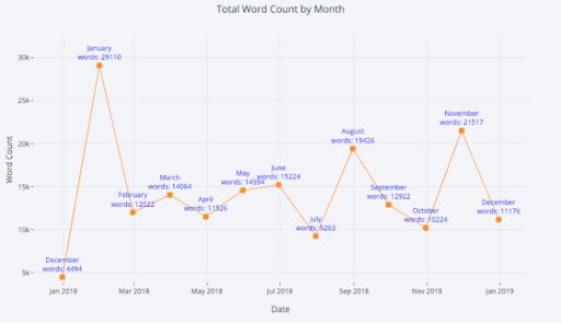
For those who are so inclined, you can even make a pie chart to show the percentage of a variable in different categories:
df.groupby("publication", as_index=False)["word_count"].sum().iplot(
    kind="pie",
    labels="publication",
    values="word_count",
    title="Percentage of Words by Publication",
)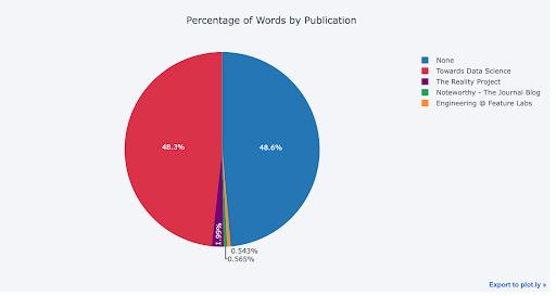
Pie charts often get a bad rap in the data science community because it’s hard to compare pie slices. However, they still seem to be popular outside data science (especially in the C-suite), so I’m guessing we data analysts will have to keep making them.
Two or More Variable Distributions With Plotly
So far we’ve looked at graphs showing the distribution of one variable (histograms and boxplots) and the evolution of one variable over time (time-series line plots). Next, we’ll move to graphs with two or more variables. We’ll start with the scatterplot, a straightforward graph that allows us to see the relationship between two (or more) variables.
Let’s look at the relationship between the percentage of an article read and the estimated reading time of the article:
df.iplot(
    x='read_time',
    y='read_ratio',
    xTitle='Read Time',
    yTitle='Reading Percent',
    text='title',
    mode='markers',
    title='Reading Percent vs Reading Time')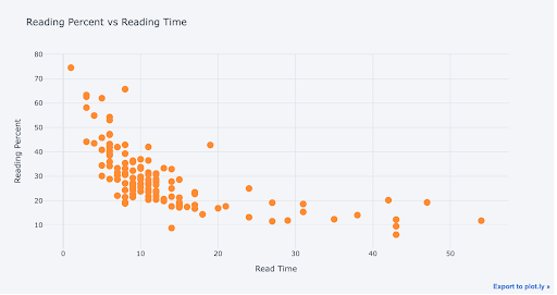
We can clearly see the decreasing percentage of the article read as the length increases. This must be evidence of the decline in attention span from the internet we’re always hearing about!
With Cufflinks + Plotly, we can customize our scatterplots by changing the axis scale to log, adding a best fit (trend) line or showing a third variable by coloring the points. Here’s an example of the latter:
df.iplot(
    x='read_time',
    y='read_ratio',
    categories='publication',
    xTitle='Read Time',
    yTitle='Reading Percent',
    title='Reading Percent vs Read Time by Publication')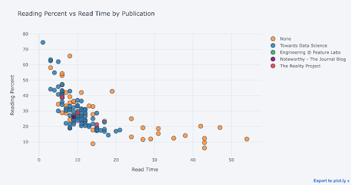
We change an axis to a log scale with a Plotly layout (see the Plotly documentation for the layout specifics) and specify bestfit=True to add in a trend line.
# Specify log x-axis using a layout
layout = dict(
    xaxis=dict(type='log', title='Word Count'),
    yaxis=dict(type='linear', title='views'),
    title='Views vs Word Count Log Axis')

df.sort_values('word_count').iplot(
    x='word_count',
    y='views',
    layout=layout,
    text='title',
    mode='markers',
    bestfit=True,
    bestfit_colors=['blue'])
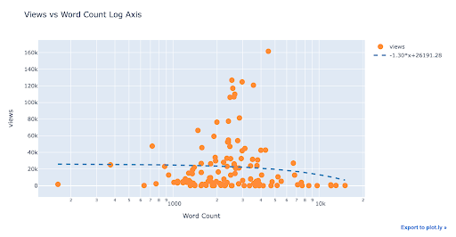
There doesn’t appear to be a strong relationship between views and word count, at least from this view.
Note: the log scale can sometimes hide or reveal relationships that are or are not visible with a linear scale.
We can show four or even five variables on the same chart by sizing points by a variable and using different shapes for different categories. However, charts with too much information can be difficult to make sense of so don’t get carried away adding variables just because you can.
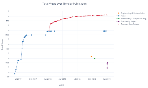
As with univariate distributions, we can combine Pandas data manipulation with Cufflinks to get more detailed views of the data. The following graph shows the cumulative views by publication.
df.pivot_table(
   values='views', index='published_date',
   columns='publication').cumsum().iplot(
       mode='markers+lines',
       size=8,
       symbol=[1, 2, 3, 4, 5],
       layout=dict(
           xaxis=dict(title='Date'),
           yaxis=dict(type='log', title='Total Views'),
           title='Total Views over Time by Publication'))
See the notebook or the documentation for more examples of Cufflinks’s extra functionality.
Advanced Plots With Plotly
Now we’ll get into a few plots you probably won’t use all that often but are nevertheless visually striking. These graphs are not the mainstays of data exploration, but they can serve as an eye-catching plot to draw a viewer into a presentation. For these figures, we’ll use the plotly figure_factory module, another wrapper on the core Plotly library for more advanced visuals.
Scatter Matrix
When we want to explore relationships among many variables, a scattermatrix (also called a scatterplot matrix or splom) is a solid option:
import plotly.figure_factory as ff

figure = ff.create_scatterplotmatrix(
    df[['claps', 'publication', 'views', 'read_ratio', 'word_count']],
    height=1000,
    width=1000,
    text=df['title'],
    diag='histogram',
    index='publication')
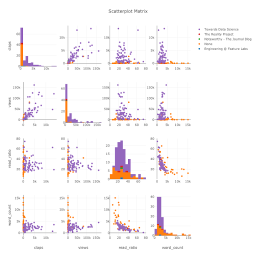
This plot is fully interactive (see the notebook), which allows us to identify relationships between pairs of variables we can dive into even further (using the standard plots discussed above). The diagonal shows histograms for each variable, which can help us identify outliers in our data set that we’d need to address before further analysis or machine learning.
Correlation Heatmap
To visualize the correlations between numeric variables, we calculate the numeric correlations (Pearson correlation coefficient) and then make an annotated Plotly heatmap:
corrs = df.corr()

figure = ff.create_annotated_heatmap(
    z=corrs.values,
    x=list(corrs.columns),
    y=list(corrs.index),
    colorscale='Earth',
    annotation_text=corrs.round(2).values,
    showscale=True, reversescale=True)
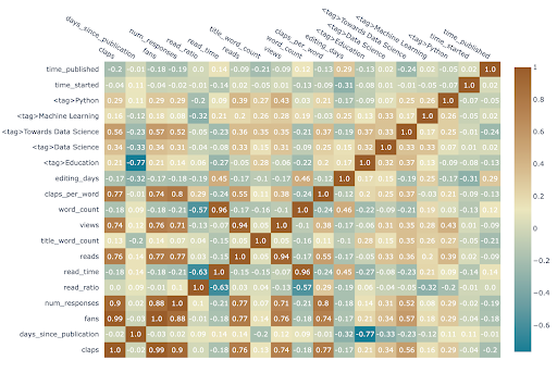
Correlation heatmaps, like scatterplot matrices, are helpful for identifying relationships between variables that we can analyze further using standard graphs or statistics. Relationships between variables are also crucial for machine learning because we need to use features with predictive power. There are several more complex plots available in figure_factory for data set exploration.
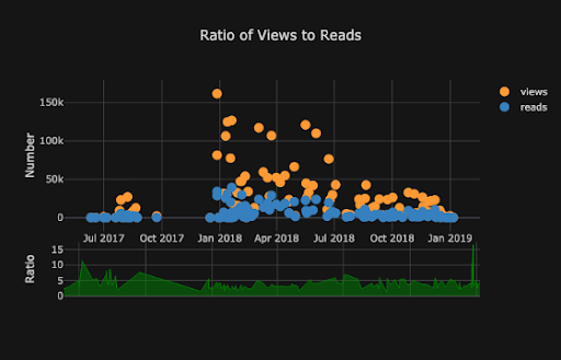
Themes in Plotly
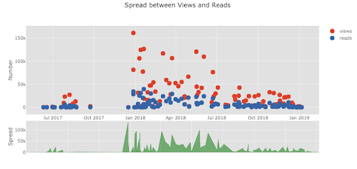
Cufflinks has several themes we can use to apply different styling with no effort. For example, below we have a ratio plot in the “space” theme and a spread plot in “ggplot” (which may be familiar to those used to working in the R statistical language):
Cufflinks also supports making 3-D plots, although I generally advise against them (as do books on data visualization). Three-dimensional plots are difficult to comprehend and extract usable insights from. Graphs should never be more complicated than necessary, and most actionable information is going to come from easily-understood charts showing only one or two variables.
With all the charts covered in this article, we are still not exploring the full capabilities of the library! I’d encourage you to check out the Plotly documentation to see the range of visualizations available and to look at some spectacular examples.
Plotly allows us to make visualizations quickly for data exploration and helps us get better insight into our data through interactivity. Also, let’s admit it, plotting should be one of the most enjoyable parts of data science! With other libraries, plotting is a tedious task, but with Plotly, we regain the joy of making a great figure.
Frequently Asked Questions
What is Plotly Python used for?
Plotly for Python, or plotly.py, is a library used to create interactive graphs, charts and visualizations in Python. Over 40 different chart types can be made using Plotly in Python, including bar charts, line charts, scatter plots and more.
Is Python Plotly free?
Yes — Plotly for Python is a free and open-source library.
What is the difference between Plotly and Matplotlib?
Plotly may be most useful for quick data exploration and creating interactive visualizations for web browsers. It is available for Python and other programming languages like JavaScript, Julia, MATLAB and R.
Matplotlib may be most useful for creating detailed, customizable visualizations and has robust documentation. It is only available for Python.