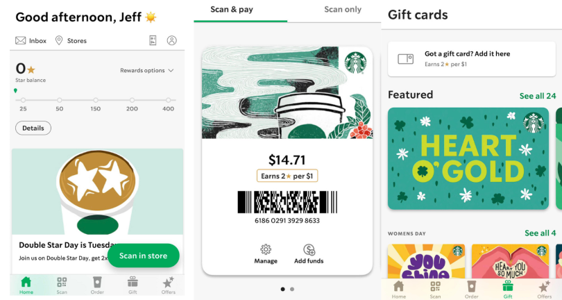
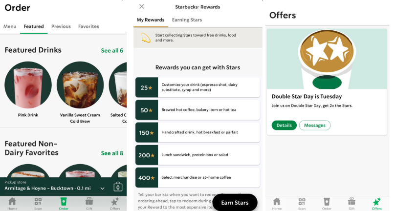
When I spoke with Adam Brotman, who oversaw the launch of the Starbucks mobile app and acclaimed rewards program as the company’s chief digital officer, he kept circling back to words like affinity and love.
“When it comes to building a loyalty program, what you’re really talking about is not some piece of technology, or any one particular tactic,” he told me. “What you’re really talking about is building and strengthening a relationship with the customer.”
Brotman is now at the helm of a new venture called Brightloom. Through a licensing agreement with Starbucks, the company is applying elements of the coffee giant’s source code and design methodology, along with its own proprietary artificial intelligence software, in a cloud-based SaaS platform to help restaurants and retailers better understand and deliver personalized messages to their customers.
As Brotman, who left Starbucks in 2018 for a role as president and chief experience officer at J. Crew, will tell you, Brightloom’s service fills a market gap. While most restaurants and retailers have point-of-sale systems and online ordering options, few have the software capabilities and the roster of data professionals to analyze transaction records in a way that can be leveraged to offer relevant offers and promotions. Thus, they can’t build the kind of customer-loyalty program Starbucks is known for.
“The key to having great loyalty in digital is having a combination of relevant messages and convenience and rewards. They’re all spun together in a user experience that allows the customer to feel seamlessly dialed in with you as a brand.”
Beyond that, Brotman said, third-party delivery services like Doordash often keep customers logged in through cookies. That can make first-party data difficult to come by for small retailers who outsource online ordering but wish to build independent loyalty programs. Capturing registration data in the mobile experience is what gives companies like Starbucks an edge. (Quick aside: When the Starbucks app notified me the app used cookies to track my in-app behavior, the very next dialog box displayed an offer to buy a cookie from the store — an ironic and unabashed wink at its own data-mining practices.)
“The key to having great loyalty in digital is having a combination of relevant messages and convenience and rewards,” Brotman told me. “They’re all spun together in a user experience that allows the customer to feel seamlessly dialed in with you as a brand and that, in turn, creates this flywheel effect you can build on.”
To put this in context, Jim Collins, author of the business management book Good to Great, describes the flywheel effect as the practice of “relentlessly pushing a giant, heavy flywheel, turn upon turn, building momentum until a point of breakthrough, and beyond.”
A key idea, Brotman said, is that with a clear, consistent design framework and incremental inputs — offers, coupons, games — you can create a feedback loop that yields compounding returns over time. Here he offers tips for designing a mobile app that can trigger the effect, drawing customers into an orbit of digital experiences that keep them committed to your brand.
Four Keys to Building a Strong Rewards Program
- Give users autonomy in the payment process. A pre-paid program with voluntary options to use a credit card or services like Apple Pay, PayPal and Chase Pay can increase program participation.
- Collect only the most pertinent user data during registration. A visitor’s user name and password, alongside an email or phone number associated with the account, is typically all the information you need.
- Offer differentiated rewards and promotions for “smart segments.” Product recommendations, promotions and discounts yield the best returns when customized to the activity and purchase habits of data-derived cohorts.
- Make participation feel like a game. A rewards program based on points is likely to have more success than one based on a set number of transactions or cash discounts.
Give Users Autonomy in the Payment Process
When the Starbucks app was first released, Brotman said, customers had to have a prepaid card to place orders and earn reward points. The user flow made it relatively easy to do this. With a couple clicks, new users could add a credit card or link to Apple Pay or PayPal.
The opt-in payment structure was a deliberate choice. Giving customers control over when they add money to their accounts and how much they contribute makes buying beverages or food items more like the voluntary act of pre-paying for tickets at a food festival than the largely invisible — and contractually binding — practice of signing up for a monthly subscription plan and watching money vanish from a bank account.
User adoption rates suggest the payment flow is working: A 2019 eMarketer forecast estimated the Starbucks app would have 25.2 million users by the end of that year, second only to Apple Pay with 30.3 million users, and representing 39.4 percent of all U.S. proximity mobile-pay users.
In simple terms, it’s more encouraging to watch available funds go up than go down.

Collect Only the Most Pertinent User Data During Registration
New users tend to be highly impressionable, and roadblocks during registration can imperil an otherwise well-conceived loyalty program. That’s why Brotman recommends paring down the onboarding process to its bare essentials.
When collecting users’ data, there are a few items you need to collect to ensure multi-factor authentication: a visitor’s user name and password, and an email or phone number associated with the account. But, generally, that’s all you need and all you should ask for.
Far too many companies try to capture too much information too quickly, Brotman said, scaring off potential customers with lengthy form fields before they’ve experienced the value of an app. Details that can be tied to promotions — like a user’s favorite restaurants or their birthday — are best left for a later stage of the user journey.
On the Starbucks app, the option to enter my birthday for a free treat (along with my address if desired) was embedded in the personal information tab of my profile — not a prerequisite for loyalty program membership. Similarly, the option to use the touch ID fingerprint associated with my iPhone to log in, add money and transfer funds was presented as a non-obligatory checkbox choice.
“Now you’ve got all the ingredients. Data and a digital relationship and an account — what at Starbucks we called a ‘digitized customer relationship.’”
For companies that wish to collect registration data for promotional use, a key goal of onboarding should be to establish an opt-in marketing relationship, Brotman said. This should be done with as few clicks as possible.
Shortly after users are prompted to enter their credentials, for example, an auto-populated text field with the account holder’s information might appear beside a prompt that asks, “Does this look right?” The screen is ostensibly confirming the accuracy of the user’s information. But, in the hands of a clever designer, that same screen can present an option for the user to consent to receive offers and promotions. One screen serves double duty.
“Now you’ve got all the ingredients,” Brotman said. “Data and a digital relationship and an account — what at Starbucks we called a ‘digitized customer relationship.’”
Offer Differentiated Rewards and Promotions for ‘Smart Segments’
Once that relationship is established, the same rewards and incentives that enticed customers to create an account can help sustain their patronage.
The best mobile rewards programs, according to Brotman, offer incentives that are personalized and highly relevant to customers, so much so that they can seem like a form of mind reading.
When I opened the Starbucks app for the first time in several weeks, the home screen greeted me by name, displayed my “star rewards” balance and invited me to “let the sunshine in” with a Pineapple Matcha. The next day, while reclined in a dental chair, I got a notification offering me a free coffee. It’s as if the app knew I needed a reward for calmly enduring a teeth cleaning.
These promotions have nothing to do with telepathy, of course. Rather, they’re derived from hard data: what people are buying, what menu options they’re browsing, which promotions they react to, which they don’t and how active they are on the app. Over time, proprietary predictive models like Starbucks’ or Brightloom’s can predict what customers will order next and, importantly, how frequently they will do so and what they’re willing to spend.
“Generally speaking, the best practice is to give your least active customers the biggest discounts to reactivate them. For more active customers, you can offer relevant messages with smaller discounts.”
This leads to more effective promotions. Not only do algorithms learn, for instance, that it’s bad practice to recommend a hamburger to a vegetarian, they also become adept at right-sizing offers according to individual activity and purchase habits.
Brotman will tell you my recent remission from the app likely related to the generosity of the offer. In other words, I had been gone too long. It was time to pull me back in.
“Generally speaking, the best practice is to give your least-active customers the biggest discounts to reactivate them,” he said. “For more active customers, you can offer relevant messages with smaller discounts.”
The ability to group customers into discrete categories, called “smart segments,” is a big part of what Brightloom offers clients like Jamba Juice and Evergreens. The transaction records of anonymized account IDs — sometimes tens of thousands of them — are retrieved from a secure data warehouse and spun through predictive machine learning models to create meaningful customer cohorts.
With access to these groupings, Brotman said, companies can send discounts and product recommendations to smart groups and test their performance against the same promotions sent to control groups. A high rate of differentiation in email open rates or redemption claims signals effective messaging. The key is to right-size offers on a cohort basis.
“Too little an incentive, or too hard to earn, and it’s not enough for customers to come back and care,” Brotman said. “Too big an incentive and it’s too easy kill yourself with discounts.”

Make Participation Feel Like a Game
When it comes to interface design, the key to a loyalty rewards program is to structure the incentives as part of a game. This can be as simple as giving users points for purchases rather than rewarding them for a set number of transactions or providing cash discounts, Brotman told me. A 50-cent discount isn’t likely to get someone to jump from their office chair at 2 p.m. to buy a coffee. But if a registered user sees the potential to achieve a measurable goal — say, 50 stars for a brewed hot coffee — their mental framework is entirely different.
“At Starbucks, what was so fun and interesting to observe was how a points-based loyalty program could be as effective as it was at a relatively small discount because of the game psychology aspect that we saw happen,” Brotman said. “No matter what demographic they’re in, customers love to win games and level up.”
The thinking behind this payment structure echoes the tenets of the self-determination theory of University of Rochester psychologists Richard Ryan and Edward Deci — in essence, that humans favor autonomy in decision making. People also love rewards, which is why in-store refills, birthday rewards, gift-giving options and other perks have been effective in building loyalty on the Starbucks app. But it is the way these rewards are baked into the interface design, Brotman said, that make them so effective.
“At Starbucks, what was so fun and interesting to observe was how a points-based loyalty program could be as effective as it was at a relatively small discount because of the game psychology aspect.”
For years, retailers and restaurants have been seeing their primary customer relationships transition to digital, but the COVID-19 pandemic has accelerated the trend. A “State of What Feeds Us” survey by the location software company Bluedot found, for example, a significant uptick in the percentage of customers using mobile apps to order menu items from fast food (36 to 51 percent), fast casual (22 to 38) and sit-down restaurants (16 to 32 percent) since the start of the pandemic.
Now that people are growing accustomed to mobile ordering and doing it more often, Brotman told me, brands have an enlarged opportunity to attract and retain customers through the ease and convenience of their interfaces. Tellingly, he refers to the best mobile apps as “remote controls for how you interact with a brand.”
Simply by scanning a QR code at checkout, a registered Starbucks app user effectively performs three tasks at once: authenticating their account, paying for a menu item and updating their star balance. This happens almost instantaneously, either at the register or, if they’ve ordered ahead, before they even enter the store. Users feel like “privileged members of a club,” Brotman told me, because they get to order ahead, skip lines and gain access to games and offers, many of which are personalized.
Not everyone in the design community is so effusive in their praise of the app. John Zimmerman, a professor at Carnegie Mellon’s Human-Computer Interaction Institute who teaches courses in user-experience design, service design and innovation, told Built In the menu hierarchy could be simplified and there are equity issues involved in a mobile rewards program that allows certain customers to get their orders faster.
“The experience for the in-store customer can be very much like, ‘These people are jumping line,’” he said.
But it’s hard to deny the track record of a customer-loyalty program that has 19.3 million 90-day active U.S. members, representing 24 percent of all transactions, and is seeing 10 percent year-over-year growth. Whether Brightloom can trigger and measure that customer growth and retention in smaller retailers and restaurants remains an open question, but it seems a worthy gambit.
Just compare the Starbucks rewards program to the experience of going to a coffee shop and claiming a punch card. In the past 20 years, I’ve probably had a dozen rewards cards. But they got lost or thrown away when my wallet started to feel too much like George Costanza’s. Or I simply forgot to request a punch at the register when making a purchase. In all those years, I redeemed a free coffee maybe once or twice. And I certainly never earned a second free drink from the same restaurant or felt anything like the magnetic pull of the flywheel effect.
Mobile loyalty, on the other hand, seems like a different game.


