The first free coffee I scored through the Starbucks mobile app had nothing to do with the rewards program.
Here’s how it went down: My wife had ordered a grande blonde roast from her office in downtown Chicago. Except, in a flurry of pre-trial planning amid a global pandemic, she neglected to update the pick-up location in the app. She is an extremely thoughtful person, so she gave me a phone call, suggesting I pick it up at the location a block from our house.
“I don’t want it to go to waste,” she said. “You might as well drink it.”
Ten minutes later, I walked up to the counter and said, “Order for Sarah.” I stood in one of the little social distancing circles behind a glass partition. “Colors” by Beck was playing in the background.
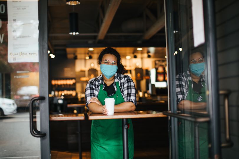
The masked barista gestured to a cup on the counter with Sarah’s name on it. I grabbed the coffee and off I went, no questions asked.
I found my iPhone full of new apps: Postmates, Toast, Dunkin’, Panda Express. How many of these apps, I wondered, would survive the pandemic?
Isn’t this a less-than-perfect example of mobile ordering? Well, right. It didn’t go as planned. And perhaps, from time to time, coffees ordered ahead through the mobile app get snatched by the wrong Ben, forgotten about or even stolen. But I imagine cases of lattes gone missing are fairly rare.
In a past life as a freelancer, I spent quite a bit of time at Starbucks, writing or catching up on emails on days I got sick of being alone in the house. But neither I, nor my wife, had done much mobile ordering until restrictions at area restaurants briefly required curbside pick-up for purchase. Suddenly, I found my iPhone full of new apps: Postmates, Toast, Dunkin’, Panda Express. How many of these apps, I wondered, would survive the pandemic?
But perhaps Starbucks was different. I had learned in an earlier interview with Janelle Estes, chief insights officer at UserTesting, that the company’s mobile ordering experience is considered a best-in-class model — an example of an intuitive menu design with simple pay options that performs well in usability tests.
Why Starbucks Is Killing It at Curbside
The usage and sales data would certainly seem to support that view. David Oragui, in a case study published on Medium, writes that “Starbucks has the most regularly used branded loyalty rewards app,” based on a 2018 survey of 500 smartphone owners. Fifty percent of those surveyed used restaurant loyalty apps — more than double the share who used food delivery apps such as Postmates and Uber Eats — and among those who did, nearly half used the Starbucks app.
In a fiscal statement from Q3 2020, Starbucks reported mobile order and pay made up a record 22 percent of transactions, with 16.3 million active U.S. rewards program members representing 46 percent of all sales.
A separate 2018 eMarketer study, meanwhile, showed more than 23 million customers in the United States use the app’s pre-loaded payment system for proximity mobile payment. For comparison, that’s higher than Apple Pay (22 million), Google Pay (11 million) and Samsung Pay (9.9 million) — and Starbucks is forecast to remain on top through 2022, according to the study. (Apple Pay caught up with Starbucks late last year.)
There are a number of apparent reasons for the app’s success. Oragui points to the user-friendly design and a loyalty program that rewards customers two stars for every dollar spent, along with perks like in-store refills, birthday rewards, gift-giving options, member offers, and integrations with Spotify and Lyft.
The app can “recall your favorite order, suggest what food items might pair well with that order, and suggest where you’d like to pick it up.”
Beyond this, the app learns the user’s preferences over time. You can quickly see where the closest location is, view currently available food and drink selections, and see how many minutes it will take until your drink is ready.
“From highlighting what’s ‘now playing’ overhead in Starbucks stores, to personalized beverage and food offers, the content is highly relevant to customers,” Oragui wrote. The app can “recall your favorite order, suggest what food items might pair well with that order, and suggest where you’d like to pick it up.”
Ease of ordering and payment is another reward for users, according to a report on App Samurai — especially when it means reducing in-store wait time. The app uses a Starbucks gift card that can be loaded with funds from a credit card, Apple Pay or Google Pay, and scanned at checkout for payment.
But the App Doesn’t Get Everything Right
Despite the app’s consumer popularity and accolades from UX professionals, it’s fumbling on some fundamental design features that could improve the user experience, said John Zimmerman, a professor at Carnegie Mellon’s HCI Institute who teaches courses in user experience design, service design and innovation.
1. Difficult Payment Onboarding
The first problem is that paying is harder than it needs to be. “When the app first came out, my biggest problem — which they’ve never addressed — is the app never learns who pays for their coffee with the app,” Zimmerman said. That is, “it never lands you on the pay tab. When you launch the app inside a Starbucks, you have an SSID from the Wi-Fi that tells the phone it’s in a Starbucks. Like, it knows with great certainty where it is. And to me, this is low-hanging fruit for a very simple inference.”
That inference being: If you’re in the store, you’re probably ready to pay. Why require the user to choose the pay tab manually?
“So early on, you would have people really struggling to get to the pay tab to show the barcode to pay for their drink, which slowed the line down, unnecessarily,” Zimmerman said. “Eventually they added a shortcut key to the home screen you could push to get to it. But it’s sort of like, ‘Why else am I opening my phone inside of a Starbucks?’”
“Early on, you would have people really struggling to get to the pay tab to show the barcode to pay for their drink, which slowed the line down, unnecessarily.”
When new users struggle to make a payment, Zimmerman told me, it can create a cascading sequence of negative consequences: not only does the line behind the customer grow, but those in line become increasingly impatient.
“You’re putting a lot of pressure on the customer who’s using the mobile payment system, and that’s not good for you,” Zimmerman said. “You want to drive people to use this. And [you’re] sort of not fulfilling the thing that makes the transaction better for the customer.”
2. Complicated Menu Architecture
A second shortcoming he points to is the design hierarchy of the menu. Broad categorical groupings — Hot Coffees, Cold Coffees, Frappuccino Blended Beverages — don’t mirror the thought process of most users. “If you think about how people express themselves, it’s more like, ‘I want a tall Americano now,’ right? So they’ve artificially forced a choice on you in a sequence that’s not necessary. It’s tedious to make all those selections,” Zimmerman said.
This isn’t necessarily an easy fix, though. Because of the high level of customization Starbucks offers, the design language needed to communicate with a customer about what they want, and that they’re going to get it, can be highly complex.
“Very early on, when you only had like three or four drinks, the barista would translate what you ordered into Starbucks talk, right?” Zimmerman said. “And they would put the cup upside down or right side up. They had all these little indicators to reduce a breakdown in communication between the person at the cash register and the barista making the beverage.”
As drink and customization options became more expansive, however, “when it was like, ‘I need a half-caf or a skinny latte,’” the company needed more expressiveness to convey these variations. “And they kept updating their system as they changed their suite of offerings,” Zimmerman said.
In short, translating the model of fast consistency and virtually unlimited customization to a phone with limited screen real estate presents a daunting challenge.
3. Order Fulfillment Confusion
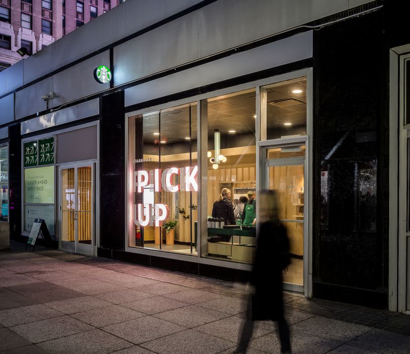
While the mobile app may be making it easier for order-ahead customers to get their drinks quickly and made to order, Zimmerman believes it runs the risk of simultaneously damaging the experience of those who order in the store and feel ignored. In fairness, Starbucks has added dedicated to-go bars for mobile customers and tablets for baristas to accept payment, according to Oragui, but Zimmerman said these haven’t fully solved the problem.
“The experience for the in-store customer,” he said, “can be very much like, ‘These people are jumping line.’”
I Decided to Investigate
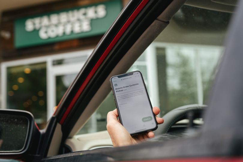
A few days after picking up a free coffee courtesy of my wife’s location miscue, I decided to download the Starbucks app to experience it myself. Consistent with what Zimmerman said, payment was not immediately intuitive. Before I could place an order, I had to create a profile and register a Starbucks Card. The option to load the card with funds from Apple Pay was obvious, but how to add a credit card was less apparent, tucked away in a sub-menu.
The barista showed remarkable patience in helping me figure this out.
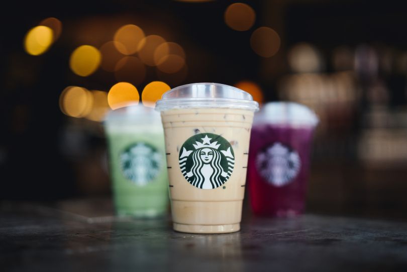
Though the option to order was readily apparent, the first choices displayed were featured drinks. Naturally, they looked delicious — almond-colored Frappuccinos drizzled in caramel, a nitro cold brew with salted honey cold foam, a creamy pink iced guava passionfruit drink that looked absolutely incredible. But I just wanted a tall blonde roast, so I navigated to the menu tab and selected the Hot Coffees icon. There it was, a few rows down, among other selections in the Brewed Coffees list.
While the menu may have taken some time to navigate, it was certainly pretty and well-curated. Isn’t menu browsing, after all, its own kind of window shopping?
In any case, I had made my first official Starbucks mobile order, earning 150 stars thanks to a summer rewards promotion. That was enough for a free handcrafted drink, a hot breakfast or a parfait. Waiting for my drink, I played the Starbucks Summer Game, an in-app fixed-screen video game that involves dropping a ball through a labyrinth of spinning gears into a cup — and potentially earning more reward points. It reminded me, vaguely, of Plinko from The Price is Right.
None of the walk-up customers who placed their orders in the store seemed too bothered when my coffee arrived on the bar a moment later. Then again, it was 2 p.m. and there was no line.
Three Ways to Improve the Mobile UX
Zimmerman, it’s worth noting, is not an incorrigible Starbucks basher with an axe to grind. The app’s apparent flaws come as a surprise, he said, from a company that historically “has done an excellent job innovating in service and changing the meaning of the beverage” from an unremarkable add-on to a democratized form of “self-reward.”
Through its widespread appeal, Starbucks also has also contributed to a broader cultural shift, he said. Where Zimmerman grew up in the Pacific Northwest, it was deemed socially unacceptable for men to add milk to their coffee. Now he sees construction workers pull up to job sites, Starbucks beverages with whipped cream on top in hand.
“That’s kind of amazing,” Zimmerman said.
But Zimmerman believes the app could have benefited from more extensive prototyping, and that, as a result, it is missing some “low-hanging fruit” that could help smooth the migration of the Starbucks in-store experience to the smartphone.
1. Recognize and Infer Payment Patterns Through Machine Learning
Starbucks tracks your in-app behavior, he told me, whether you purchase a drink, give someone a gift card, or listen to music through the Spotify integration. Existing geolocation data from your mobile phone, meanwhile, allows Starbucks to pinpoint where you are. Together, these tools could streamline payment processing by making machine learning inferences.
“If, every time you open the app in the store, you immediately navigate to the pay tab, why can’t the app just do that work for the user?” he asked.
Uber’s rider app, he told me, already does this to great effect. For a frequently made trip, such as a ride home from the local airport, it suggests the destination. “It doesn’t just say, ‘Where to?’ it says, ‘Do you want to go home?’ It gives you that shortcut because it’s making the inference from your pattern of behavior.”
2. Improve Voice-Enabled Ordering
A second area for improvement — voice-enabled ordering — is something Starbucks itself has identified as a priority in its pipeline, according to a briefing on the company’s website. In January of 2017, the company beta tested voice-ordering options for one thousand customers. Select users could place orders using the My Starbucks barista feature within the mobile iOS app or through a skill on Amazon Alexa. More recently, Starbucks expanded the service to make it available for Google Assistant, and on Alexa-enabled devices, including some Ford vehicles.
“You experience hunger and the store is coming toward you. But that is not the point at which I want to be navigating a mobile app.”
Zimmerman said Starbucks’ gradual roll-out of voice-enabled ordering is emblematic of a larger trend that is likely to have its most significant impact in rural areas and, specifically, for orders placed by motorists. Through voice commands tied to predicted arrival times calculated by location pings, people may soon be able to submit advance drink or food orders to restaurants or gas station convenience stores, such as Sheetz, and have them waiting on arrival.
“You experience hunger and the store is coming toward you. But that is not the point at which I want to be navigating a mobile app,” he said. “So I think there are huge opportunities in that space.”
3. Create Timed Ordering Options
Timed ordering options — where you place an order to be picked up at a specified time in the future — are another aspect of the mobile experience Starbucks and its competitors aren’t capitalizing on as well as they could, Zimmerman said. Mobile apps that allow users to reserve restaurant tables for specific times are also surprisingly rare, he said.
One exception to the rule is the restaurant reservation app Nowait, a Pittsburgh-based start-up recently acquired by Yelp for $40 million — all cash — that folds Nowait’s timed waitlist system into the Yelp app.
For customers, the benefit is obvious: not having to wait in line. But the app is useful for restaurant proprietors and managers too, Zimmerman said, particularly given the space and occupancy challenges many restaurants are facing due to COVID-19 restrictions. The app can help them gauge visitation and avoid “no-show” reservations.
“You have this limited resource of tables,” Zimmerman said. “You’re trying to spread your customers out to have most of your tables full, most of the time.”
The Stickiness of Self-Reward
At home, I played with the app some more. On the Home screen was a button to “Add to Siri.” Once I tapped it to create the shortcut, I was able to say, “Order Starbucks,” and Siri asked, rather politely, “Would that be your grande blonde roast at Armitage & Hoyne - Bucktown?” In the span of seconds, Siri had magically become a knowledgeable barista.
“The Starbucks experience is built on the personal connection between our barista and customer,” said Gerri Martin-Flickinger, chief technology officer for Starbucks, in a prepared statement announcing the debut of voice ordering back in 2017. “So everything we do in our digital ecosystem must reflect that sensibility.”
I was beginning to understand what she meant. Whatever culture Starbucks had created in the physical world — a carefully curated and monetizable blend of convenience, comfort, caffeine and familiarity — its trademark je ne sais quoi, that culture was slowly, if imperfectly, shifting to the virtual realm. Soon it would be time for me to talk to Siri, or the friendly new barista I’d met at the counter, and reward myself with a free drink.

