If you’ve browsed the internet for Yeti bicycles, bundled your backcountry ski accessories on Patagonia’s kit-builder page or ordered an engraved knife from Buck Knives, you’ve likely seen web design work from ZaneRay Group. In the shadows of the Whitefish Range, where the quiet design powerhouse has its lone office, a 14-person design team has been struggling to keep pace with demand, sitting in an economic sweet spot during the pandemic as e-commerce specialists for outdoor retail brands.
“Most of our clients have seen significant growth,” said Strategic Director Kirk Cornelius. “A lot of novice outdoor enthusiasts have emerged during the pandemic, because getting outside and doing something on the trail, even if you’ve never done that before, is all of a sudden quite appealing.”
For ZaneRay, who recently earned a spot in Outdoor magazine’s 50 Best Places to Work list (for the fourth time), that means new work from outerwear companies like Osprey and Black Diamond and a product roadmap that’s been fast-forwarded five to seven years, Cornelius said.
“In the industry we work in, brand ethos is always the thing to hit coming to the site, and then the understanding of customers.”
The design agency has been around for decades, originally spinning off from Patagonia, where, in the late ’80s, Reed Gregerson, one of the three founders, built a pre-internet B2B portal to connect wholesale businesses to sales reps. With an office in a ski town about 30 miles outside Glacier National Park, many of the members of the team are outdoor enthusiasts themselves, and that’s part of the firm’s appeal to clients.
“From a design perspective, why that matters to these brands, is we use these brands. We’re all customers of these brands, and we understand the lifestyle,” Cornelius said.
The firm specializes in the development of personalized shopping features and checkout and shipping options. It often works with mid-tier brands in their second or third iterations of a site, helping customers navigate to products more quickly. Typically, the process starts with an audit of a client’s information architecture.
When working with outdoor brands with an established design ethos — like, say, the daredevil adventurism of Yeti Cycles — ZaneRay avoids over-embellishment, Cornelius said. The design team’s goal is to create user flows that help clients express their brand identities more clearly, without stealing the show.
“In the industry we work in, brand ethos is always the thing to hit coming to the site, and then the understanding of customers — ‘I know what you’re looking for,’ ‘I know what you need’ — manifests itself in our approach,” Cornelius said.
Design Tips for Improving E-commerce Performance
- Headless software supports strong visual narratives, while increasing marketing velocity.
- Animation works best for conversational interludes and “chapter breaks.”
- Filters, browse bars and configurable product selections help get customers through checkout more quickly — and personalize the experience.
- Kit builders can boost customers’ average order value.
Headless Software Supports Strong Visual Narratives
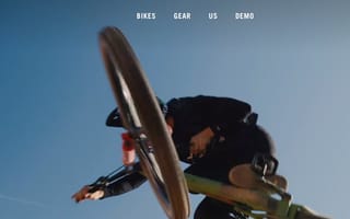
Visit the homepage of Yeti Cycles and you’ll see a mountain biker suspended hundreds, maybe thousands, of feet above a pocket canyon — a glimpse of the limit-testing physical marvels the company’s messaging suggests its products make possible. When ZaneRay redesigned the site, the bones were already there. It was a great-looking website, Cornelius said, and represented the brand well.
The problem was the lack of a consistent design system created a fragmented back-end experience that was a headache for developers. Worse, whenever the marketing team wanted to introduce new product lines or make subtle tweaks to improve the e-commerce experience, it created a development boondoggle.
“They felt pretty handcuffed with their previous site,” Cornelius said. “It would take them a month to put up a new product. On the new site, they can do that in minutes, and they can schedule it to launch on a certain day.”
The key step forward, Cornelius said, was the introduction of headless software. Traditional websites have a single code base that communicates back-end commands to the graphical user interface. Headless, as the name suggests, separates the back-end from the front-end content-management system, with an API acting as the intermediary.
“The goal was really empowering their marketing team to fully manage their site to increase marketing velocity, without the need for as many developers.”
According to Cornelius, the move to headless among many DTC brands reflects their focus on creating strong visual narratives with data-heavy image and video files. Supporting vibrant, breathing pages while minimizing load time can be costly. In the past, many design-forward apparel and outdoor brands relied on monolithic, workhorse frameworks that supported their needs, but were expensive and cumbersome to maintain.
“The goal was really empowering [the Yeti Cycles] marketing team to fully manage their site to increase marketing velocity, without the need for, maybe, as many developers,” Cornelius said. “It’s opened the door for a lot of new innovation and sets them up really well for future growth, where they can work with third parties to add different features to the site.”
Animation Works Best for Conversational Interludes and ‘Chapter Breaks’
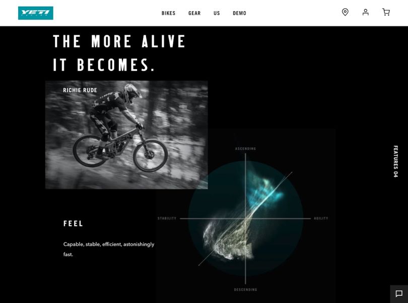
When you scroll down the page, an interesting layered effect unfolds. The background photograph of an airborne cyclist is fixed in place, but interface skins slide over the top introducing new page elements — a podcast series, an online showroom of carbon-fiber bikes (not for sale) and first-person stories of races and training sessions. For the user, the experience is akin to skimming through a culture magazine or photo essay.
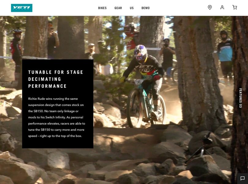
“We wanted to avoid having copy always overlaying these beautiful images, so we created these layers that led to nice little surprises, like when copy comes out of the mountains. But it’s not taking over the visuals, which are really how Yeti tells the story of its products and what you can do on its bikes.”
“We created these layers that led to nice little surprises, like when copy comes out of the mountains.”
While animations can bring a site to life, they can also be jarring and stall page loads if they’re overused or incorporated without clear intention. ZaneRay pared down Yeti’s original design, Cornelius told me, using animations sparingly to act as “chapter breaks” between stories, product details and purchase options.
“Apple does a really good job of this on its product pages too, and, of course, it’s Apple so it can invest a million dollars into its product page,” Cornelius said. “But you’ll see there are these really great dynamics that happen as you scroll through that lead you through the copy in a very subtle way, almost like you’re turning pages in a book.”
Filters, Browse Bars and Configurable Selections Personalize Checkout Pages
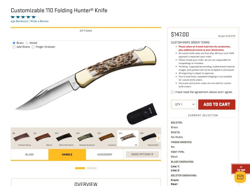
The most notable feature of a new responsive website ZaneRay built for Buck Knives, Cornelius told me, is a custom knife builder that allows customers to select the materials for the blade, handle and sheath and engrave their names or self-chosen messages on the handle.
For the century-old, Idaho-based heritage brand, configurable purchase options were conceived as a way to leverage a bespoke manufacturing process and American-made message. Custom-made collectible items don’t translate well to generic e-commerce sites, Cornelius explained, but that’s part of Buck’s value proposition: They can build to spec and ship from their own factory.
“Anytime you get into personalizing anything, it falls into different fulfillment structures.”
ZaneRay’s challenge was to integrate a nearly inexhaustible set of options into an intuitive navigational flow. Early research into production and order fulfillment was critical to defining the outputs users would see at checkout.
“Because any time you get into personalizing anything, it falls into different fulfillment structures: ‘OK, six weeks to manufacture, all the things leading up to shipment,’” Cornelius explained. “So we had to think through that holistic experience from a design solutions perspective.”
On the technical side, filtering became important to expedite the user experience. With simple “+” icons, users can search options by knife type, price and engraving options. Using custom templates, they can quickly build knives and try on new looks — seeing a knife handle morph from jigbone to cherrywood — as they change material selections. The price changes instantly as well. For uses with a specific make or model in mind, a browse bar makes it easy to bypass the standard drop-down menu.
“Certain types of knives are very specific to certain types of activities,” Cornelius said. “Camouflage is the same way, whether you’re a bird hunter or deer hunter, there are different patterns. So this type of filtering becomes really important to get people to the right category quickly.”
Kit Builders Boost Average Order Value
Outdoor brands are often lifestyle brands, and ZaneRay counts itself among them. Part of that lifestyle is a 40-hour work week. Anything above that, and salaried staff receive extra compensation. In their off hours, employees hike, go mountain biking and camp — and “we’re heavily outfitted in all that gear, because of what we do,” Cornelius told me.
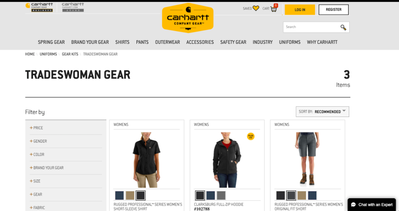
That lifestyle has led to the insight that grouping product offerings around experiences, rather than product types, can boost their clients’ key KPIs — namely, average order value. Using ZaneRay’s gear-builder feature, for example, customers of Carhartt’s uniform lines can build clothing ensembles around specific jobs. Builders, movers and tradespeople each have customized sets. A kit builder for Patagonia serves a similar function, grouping products together based on their use in outdoor excursions, such as backcountry ski trips.
Once customers build kits, retrievable fields store their information to expedite shopping on subsequent site visits. This saves an extra step at checkout.
“How do you get people quickly to what matters to them?” Cornelius said. “It’s the context: what type of product it is and how people shop for those things.”

