Have you ever wondered what’s so important about creating an extraordinary dashboard wireframe versus an average one? Can it really make that big of a difference for you and your business?
A well-designed dashboard sketch provides a clear and organized plan for product creation, making it easy for the people involved in its development to understand the basics of the product quickly.
3 benefits of using a great dashboard wireframe
- A well-thought-out dashboard outline makes it easy to navigate a lot of complicated information.
- Its user-centered design caters to the requirements and preferences of the users in the panel.
- It helps you visualize data by using graphs, charts, and other visual features, making the information more digestible.
What Is a BI Dashboard?
A business intelligence dashboard, or BI dashboard, is a distinctive tool that businesses use to keep track of essential data. A BI screen is like a detective’s evidence board, where all the clues for how to make an outstanding product are connected with red string.
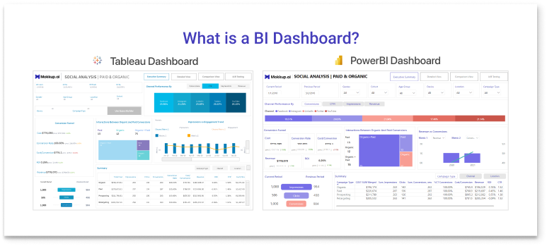
The BI dashboard gathers data from various sources, such as sales, customer feedback, and website visits, and organizes it neatly in one location. This improves decision-making by helping everyone in the company see what’s going well and what needs more attention.
Above is an example of a dashboard design. It shows data with graphs, filters, and titles. These elements help you understand the numbers and how they are used. By prioritizing user requirements in the design process, we can create wireframes that streamline the users’ journeys to fulfilling their desires and objectives.
Now that we know what a great dashboard should look like, let’s explore how to build one. Here are five tips for creating the most effective dashboard wireframe.
Prioritize Your Users and Set Goals
When wading through the murky waters of data in an analytics dashboard wireframe, a user-centered design is the lighthouse that guides people to where they need to go. By prioritizing the user in the design process, we can create wireframes that allow them to fulfill their objectives more quickly and painlessly than with visualization tools that don’t prioritize the user.
Setting clear goals and targets is the most important thing you can do when making a user-centered dashboard, helping you improve clarity, capability, and decision-making. These objectives guide the outline’s structure to provide users with their specific needs and desires.
Use Data to Measure Your Dashboard’s Success
Creating perfect dashboard wireframes is an art that combines precision and purpose, weaving together data to create a tapestry of insights. Once you’ve understood who your users are and outlined your goals, the next step is to determine the important measurements and data that complete the picture.
What data do dashboard wireframes need?
- Key metrics: Connecting business goals with relevant data determines the best metrics.
- Strategic data: To prevent confusion caused by unorganized data, highlight important details. It helps users understand crucial facts without overwhelming them.
- Visualization intelligence: A successful interface’s visualization capabilities help create appealing bar charts, line graphs, and heat maps to show information at a glance.
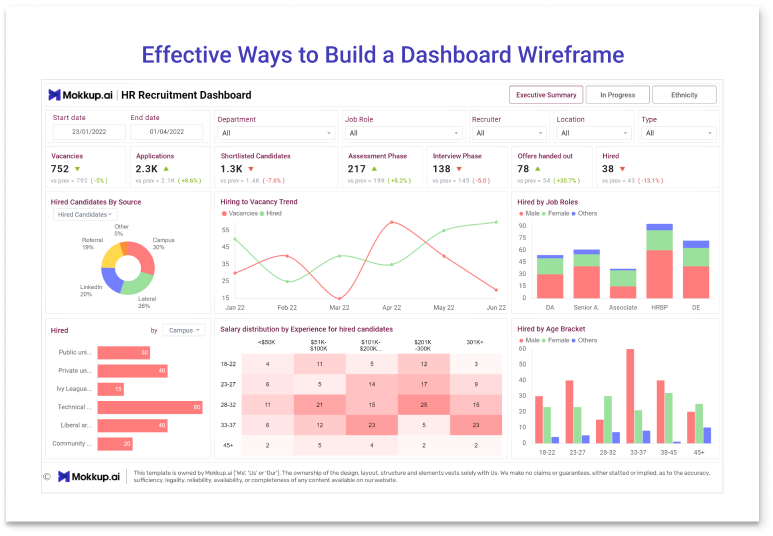
Creating a dashboard includes adding actionable insights to designs in order to give users more power and help them make informed decisions. Here is an example of a great dashboard user interface design:
This design shows data in a way that is easy to understand. Using clear, informative graphs in the right way shows how the data trends change over time. Filters are built right in, so users can change how they interact with the data and shape their own insights. Each title is placed in a way that gives immediate context and helps the user understand what the data means. In essence, this design combines things that look good with things that work well, making it easy to use.
How to Curate Your Dashboard’s Content and Layout
When it comes to important aspects for creating an exceptional dashboard wireframe, the structure of the content and design cannot be understated.
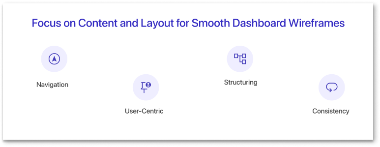
When creating your next dashboard wireframe, try using this set of strategic checkpoints to make sure you’re hitting the mark with your content and layout:
Navigation
Imagine creating a roadmap to help people navigate complex data. Ensuring that each component is in its proper place so that the user can clearly follow point A to point B will make their journey much smoother.
Map out the wireframe, remaining flexible as you account for the user’s natural flow from simple facts to in-depth examinations.
User-Centered
Lay out the dashboard like you would a gallery of paintings. Typically, the most famous art pieces that people come to see are displayed proudly in the center of the gallery, while the lesser-known art is off to the side for guests to peruse at their leisure. You should arrange your dashboard in the same way.
Based on user needs, highlight the most popular data, and place data that users interact with less on the margins.
Structure
In wireframe design, the layout grids and space to you are like blueprints to an architect. Consider grids as the blueprint for a city you’re designing to be easily walkable.
Finding the ideal balance between grid structure and adequate space ensures a clean, aesthetically pleasing design.
Consistency
Maintain typeface, color, and icon consistency.
This consistent visual language eases wireframe navigation and reduces the users’ mental workload.
Incorporate Intuition In Your Dashboard’s Navigation
Easy-to-use dashboard wireframes have straightforward navigation. Make menu features clear and simple, with a solid flow that reduces guessing, so that people can easily find their way. Group related features and operations together to increase consistency and intuitiveness.
And don’t forget to use interactive tools like charts, heat maps, filters, and themes to help users analyze data according to their preferences.
How to Make Your Dashboard Interactive
Developing wireframes for interactive dashboards is an iterative process that involves patience. You have to invite user feedback to ensure you’re catering to their needs.
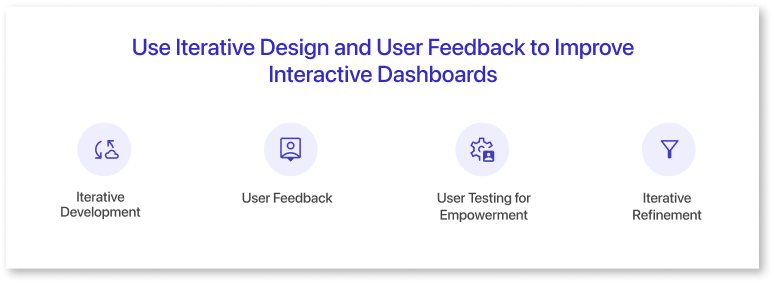
Here are 4 things to think about when aiming for an interactive design:
Iterative development
Consider the concept of continuous improvement, in which each iteration slowly improves the design by enhancing the previous one.
User feedback
Involve partners and potential users in feedback collection. Their insights are essential to designing wireframes that meet practical needs.
User testing
User testing is like holding a magnifying glass up to the users’ experiences. This method clearly identifies pain points and gives practical suggestions for their refinement.
Iterative refinement
The feedback cycle functions as a compass, directing designers to areas requiring improvement. This iterative refinement results in wireframes that are user-centered.
The journey of creating interactive dashboards involves a continuous loop of improvement. Wireframes should meet user needs, provide an enjoyable experience, and provide a functional user interface kit.
Dashboards Are More Than Just Data
A well-sketched dashboard wireframe or a well-designed dashboard should fit the goals of the business, while also guiding the user through the information and empowering them to shape their own experience.
Creating an effective dashboard wireframe is more than just putting together data — it’s also about shaping a user-centered experience. Your dashboard is at its most powerful when you use data insights and continuously refine, refine, refine.