

In this tutorial, I will go through creating a simple and interactive dashboard with the Panel library in Python. We will use Jupyter Notebook to develop the dashboard and serve it locally.
What Is Panel?
Basic Interactions in Panel
The easiest way to create interaction between any data set or plot in Panel is to use the interact function. It automatically generates widgets to control functions, making it useful for quickly testing interactive components.
Let’s see a simple example using Panel interact. Here we create a function that returns the product of a number, and we call Panel to interact on the function.
import panel as pn
def f(x):
  return x * x
pn.interact(f, x=10)
Now, we have an interactive control, where we can drag a slider; the product changes as we change the x values.
Panel’s interact function is easy to use and works well with controls, data tables, visualization or any panel widget. At this high level, you don’t see what’s going on inside, and the dashboard layout's customization requires indexing. However, it’s a clear and robust starting point.
If you want to have more control of your dashboards and customize them entirely, you can either use reactive functions or callbacks in Panel. In our dashboard, what we use depends on a more powerful function.
Panel Components
Before we go through creating the dashboard, let’s see the three most essential components in Panel that we’ll use in this dashboard.
Pane
A pane allows you to display and arrange plots, media, text or any other external objects. Panel supports most major Python plotting libraries, including Matplotlib, Bokeh, Vega/Altair, HoloViews, Plotly, Folium, etc. You can also use markup and embed images with pane.
Widget
Panel provides a consistent and wide range of widgets, including options selectors for single and multiple values (select, radio button, multi-select, etc.) and type based selectors (slider checkbox, dates, text, etc.).
Panel
A panel provides flexible and responsive customization to dashboard layouts. You can have either fixed-size or responsive resizing layouts when you are building dashboards. In Panel, you have four main types:
- Row : for horizontal layouts
- Column : for vertical layouts
- Tabs : selectable tabs layout
- GridSpec: for grid layout
In the next section, I’ll create a dashboard with interactive controls, data visualizations and a customized dashboard layout.
Creating a Dashboard With Panel
In this example, we’ll use the Global Active Archive of Large Flood Events data set from the flood observatory unit in Dartmouth. Let’s read the data and explore it before we begin constructing the dashboard.
import pandas as pd
import panel as pn

df = pd.read_csv("floods.csv")
df.head()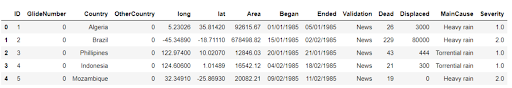
In this table, we have coordinates, the time of the flooding and calamities including death and displacement. Also, we have the main cause and severity of the flooding.
Sliders
We’ll use range sliders (a widget) for our dashboard to control the range of years when we plot the data visualization.
year = pn.widgets.IntRangeSlider(name='Years Range Slider', width=250, start=1985, end=2016, value=(1985, 2016), value_throttled=(1985, 2016))This code creates IntRangeSlider between 1985 and 2016. Now we can use this slider to get a value and pass it to a function. So let’s create a simple function that returns a text and the year slider values : value_throttled(start, end).
@pn.depends(year.param.value_throttled)
def year_range(year):
   return '### Floods Between {} -- {}'.format(year[0], year[1])
The above function prints out H3 markup text with start and end years depending on the range slider. Note that we’re using depends instead of interact here. With depends we have more control of the parameters.

# KPI -- Death
df["Began"] = pd.to_datetime(df["Began"])
df["Ended"] = pd.to_datetime(df["Ended"])
@pn.depends(year.param.value_throttled)
def dead_stat(year):
   return "### Death{}".format(
   df[df.Began.dt.year.between(year[0], year[1])]["Dead"].sum()
   )
pn.Row(dead_stat)
The dead_stat function is similar to the year range. Instead of only returning the year range, the dead_stat function returns the number of deaths between the start and end year selected.
Creating Data Visualization Plots With Panel and HvPlot
I’ll use the hvPlot library to visualize the data, but you can use any data visualization library of your choice. We’ll create two plots: a bar chart and a map. The logic is the same for both. We’re using the year range slider to control the input and the depends function to create the connection.
# Bar chart
@pn.depends(year.param.value_throttled)
def plot_bar(year):
   years_df = df[df.Began.dt.year.between(year[0], year[1])]
   bar_table = years_df["MainCause"]
    .value_counts()
    .reset_index()
    .rename(columns={"index":'Cause', "MainCause":"Total"})
   return bar_table[:10].sort_values("Total")
    .hvplot.barh("Cause", "Total",
      invert=False, legend='bottom_right', height=600)
# Map
@pn.depends(year.param.value_throttled)
def plot_map(year):
years_df = df[df.Began.dt.year.between(year[0], year[1])]
return years_df.hvplot.points('long', 'lat', xaxis=None, yaxis=None, geo=True, color='red', alpha=0.5, tiles='CartoLight', hover_cols=["Began", "Ended", "Dead", "Displaced"], size=5)The two functions above return two plots: a bar chart and a map. Let’s display them next and arrange the layout with Panel.
Panel Layout
I’ll use the simple row and column Panel functions to layout the dashboard. We have different objects in this dashboard, including an image, text and two main plots.
title = '# Worldwide Floods'
logo = pn.panel('floodsImage.png', width=200, align='start')
text = "Dataset:Global Active Archive of Large Flood Events "
# Header box
header_box = pn.WidgetBox(title, logo, year,  pn.layout.Spacer(margin=200), text, width=300, height=1000, align="center")
# Plot Box
plots_box = pn.WidgetBox(pn.Column(pn.Row(pn.Column(year_range), pn.layout.HSpacer(), pn.Column(dead_stat)), plot_map, plot_bar, align="start", width=600,sizing_mode="stretch_width"))
# Dashboard
dashboard = pn.Row(header_box, plots_box, sizing_mode="stretch_width")
dashboard
You can now use your dashboard inside a Jupyter Notebook, and you can serve it locally (refer to Panel documentation if you want to deploy the dashboard on the cloud).
Run the following command to serve the dashboard locally:
panel serve xxxx.ipynbThe following GIF shows how to serve the dashboard locally.

That is it for this tutorial. We have created a simple and interactive dashboard using Panel. In this article, we have gone through the basics of the Panel Python library and used the flood data to create an interactive data visualization dashboard with Python and served the dashboard locally.
With Panel, you can easily customize your dashboards and their superb documentation can help you take your dashboards to the next level.
Frequently Asked Questions
What is Panel in Python?
Panel is an open-source Python library that allows developers to create interactive dashboards and web apps by connecting widgets to plots, text, images or tables.
How do I create interactivity in a Panel dashboard?
In a Panel dashboard, use the interact function for quick interactivity or @pn.depends decorators for more customized control of dashboard behavior.
What types of widgets can I use in Panel?
The Panel library in Python supports a wide range of widgets to add to dashboards, including sliders, checkboxes, date pickers, text inputs and various selection tools like radio buttons and dropdowns.


