When was the last time you put on your noise-canceling headphones and comfortably browsed a pastel-colored website giving you the calmest-possible vibes?
Oh, that was a long time ago?
Same for me.
For an important minority in the population, however, such a relaxing setup is absolutely crucial. People with autism, along with other neurodivergent people with ADHD, dyslexia, and other conditions depend on calm and focused content in order to work, play, live, and thrive.
Would you enjoy trying to work while sitting under a flickering neon light with ad banners flashing at you, five different navigation bars causing confusion, and three glowy-flashy buttons luring you to “click here,” all at the same time?
This type of chaos is stressful for neurotypical people. For an autistic or otherwise neurodivergent person, it’s pure hell.
The good news is that serving autistic people can make life easier for neurotypical people, too. People generally prefer clear, polished websites with a calm and serene feel, versus a busy website with confusing navigation and blinking buttons in counterintuitive places.
Autism Designs: Areas to Focus On
- Layout
- Content
- Text
- Imagery
- Navigation
- Interaction
- Security
- Personalization
Why Autistic People and Autism Designs Matter
Autism, generally speaking, is a genetic neurological trait. Current evidence indicates that autistic brains have high synaptic connectivity and responsiveness. This means that people with autism perceive the world much more intensely. In situations where a lot is going on, this perception can lead to sensory overload and meltdowns.
As a result, many people with autism resort to coping strategies that calm their minds and, if this is not possible, avoid overwhelming situations altogether. They often engage in repetitive behavior, for example sticking to the exact same routine in the morning, and feel disoriented if they can’t follow the set pattern. They often avoid chaotic environments like parties or social get-togethers or unstructured websites with too many flashy ads and pop-ups.
Contrary to common belief, autistic people are no more or less intelligent than the average person. Many can get through life pretty well; however, their centers of interest might be distributed differently than those of their neurotypical peers. Many autistic people develop special interests; essentially, they go down a rabbit hole and get obsessed with paleontology, or physics, or software development. That’s not to say that neurotypical people don’t develop such interests from time to time; in autistic people, however, this tendency is more common and more intense when it occurs.
This is great news for recruiters. Many autistic people take a special interest in their job, and their need for routine means that they’re able to deliver outstanding results every day. On the other hand, companies need to make sure they make employees with autism feel comfortable. This means making accommodations to avoid chaotic environments and situations that might result in sensory overload.
Similar accommodations are useful to consider when developing a digital product like an app or a website. Not only may your workforce contain some autistic members, but your customer base might, too.
About 1 percent of the population worldwide is thought to have autism. That being said, the numbers tend to be higher in tech. Reasons for this include the ease of delving into special interests online and that a person with autism might find it (even more) tempting than a neurotypical person to avoid chaotic social situations by doing some on-screen work or play.
How to Design Autism-Friendly Products
Serving this important subset in your workforce or customer base might require some tweaks to your company’s existing digital products, however, along with clear design guides for upcoming products. Websites, apps, and other digital interfaces should all undergo such modification.
Many people with autism are brilliant at consuming and processing static information, even if it’s complex in nature. On the other hand, if things are moving and flashing, they may feel overwhelmed. Here are some best practices to make autisim-friendly products.
Autism Designs: Layout
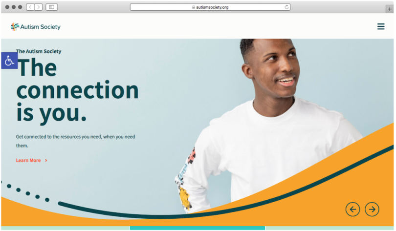
For the layout of your product, you should prefer plain, muted or pastel-colored skins. They should have few or no features that distract from the content. So, avoid neon-colored backgrounds and flashy ad-banners.
Consistency, clarity and structure are key. Similar types of content should, if possible, feature similar layouts. Clustering and highlighting the most used controls helps maintain a clear visual structure and reduces the number of potentially distracting elements.

Autism Designs: Content
Autistic people tend to think more in a more logically rigid way than many neurodivergent people. In consequence, your product must present content in a clear and objective fashion. Many autistic people benefit from knowing that they have all information on one page and that they can work through it at their own pace.
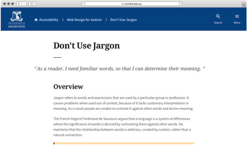
Autism Designs: Text
People with autism have a tendency to take things quite literally, so any text should avoid using unnecessary metaphors or figurative language. Undertones like irony or sarcasm are also hard to pick up for autistic people, so the text should either avoid these qualities completely or clearly highlight when such undertones are used. On Reddit, for example, commenters use “/j” and “/s” if they want to clarify that they are joking or sarcastic in what they’ve written. This technique helps neurodivergent people tremendously.
The text should stand in clear contrast to the background without using flashy colors, and ideally in a single, left-aligned column. Use two fonts at most: one for highlights and one for the body text. These should be clearly readable and ideally without serifs. Distinct sections and large margins are desirable, too.
Autism Designs: Imagery
You can use images when they complement the text. For example, you can show a graph illustrating economic growth over the last few years when the text is about the state of the economy recently. Images should not, however, be overly busy or unnecessarily bright-colored. They should also not serve as a background to the text.

Autism Designs: Navigation
Many neurotypical people would say that it’s good to know where on a site you are and where to click to get to the next page. A navigation bar is great for this!
Autistic people agree. Too many navigation bars and labels make things confusing, however. One navigation bar is enough.
Many people with autism work better with images. Therefore, every page should be clearly labeled, and a progress bar should be visible where the content might be long. Buttons should be large and contain an icon alongside a clear description. For example, a button might contain a symbol of a paperclip and the description “Attach File.” Avoid small, flashy buttons with just a symbol or simply saying “Click Here!”
Autism Designs: Interaction
Interactive products are good for neurotypical and neurodivergent people alike. Animated design elements can irritate an autistic user, however, if the animation serves no particular purpose. For example, many autistic people only enjoy hover effects when they add some benefit, like revealing more details. Animated transitions may look fancy, but if there’s no logical value to them, an autistic user might be left scratching their head over the reason for this transition for the next 30 minutes.
Big red flags for many autistic users are pop-ups since they’re hard to control and quite surprising. Senselessly animated content like GIFs may also cause confusion, especially when a meme would have done the job.
Autism Designs: Security
One important factor for many products are security measures. Multi-factor authentication, where you need to input a password and another code phrase like a PIN sent to your phone, can be a hassle for neurotypical people. Planning, sequencing and switching gears between tasks works differently for people with autism, however. For some autistic people, multi-factor authentication can therefore be impossible.
A more inclusive approach to security might be asking safety questions in the same app or site or using biometric data like a fingerprint or a face ID for extra security.
Autism Designs:Personalization
If you know a person with autism, you know one person with autism. The recommendations above are pretty general because no two autistic people are the same.
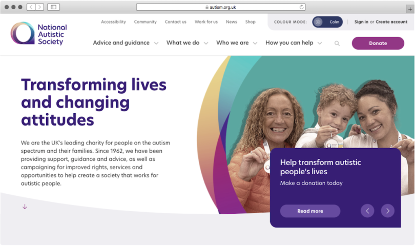
To make everyone feel comfortable with the look and feel of your product, consider adding personalization features such as being able to adjust the font size from large to small — this helps visually impaired people too — as well as the color scheme and the mood from vivid to calm. Excellent examples of personalization are Open Book, an assistive reading tool for autistic people, and the site of the National Autistic Society.

Why Inclusive Design Benefits Everybody
It’s perhaps not a coincidence that many of the slick designs of Apple devices were the creations of Steve Jobs, a man who may have been autistic himself. What feels like a luxury product to a neurotypical person is just right for autistic people, though.
Although one cannot deduce a general law for design from this, companies can make a better product for all users if they focus on designing for autistic clients. After all, a clean aesthetic and calming design are things that many neurotypical people like to see, too. It probably does no harm, either, to have a few autistic people working in your company. They know best what the autistic customer wants.


