The first step to solving any data related challenge is to start by exploring the data itself. This could involve looking at the distributions of certain variables or examining potential correlations between variables.
What Is a T-Distributed Stochastic Neighbor Embedding (t-SNE) Technique?
T-distributed stochastic neighbor embedding (t-SNE) is a dimensionality reduction technique that helps users visualize high-dimensional data sets. It takes the original data that is entered into the algorithm and matches both distributions to determine how to best represent this data using fewer dimensions.
The problem today is that most data sets have a large number of variables. In other words, they have a high number of dimensions along which the data is distributed. Data visualization can then become challenging and is often nearly impossible to do manually. However, such visual exploration is incredibly important in any data-related problem. Therefore, it is key to understand how to visualize high-dimensional data sets. This can be achieved using techniques known as dimensionality reduction. I’ll focus on two techniques that will allow us to do this: principal component analysis (PCA) and t-distributed stochastic neighbor embedding (t-SNE).
What Is a Principal Component Analysis (PCA)?
First, let’s get some high-dimensional data to work with.
How to Prepare Data for Visualization
We will use the Modified National Institute of Standards and Technology (MNIST) data set. We can grab it through Scikit-learn, so there’s no need to manually download it.
First, let’s get all libraries in place.
from __future__ import print_function
import time

import numpy as np
import pandas as pd

from sklearn.datasets import fetch_openml
from sklearn.decomposition import PCA
from sklearn.manifold import TSNE

# This magic command is for Jupyter notebooks; skip or comment out if running as a Python script.
# %matplotlib inline

import matplotlib.pyplot as plt
from mpl_toolkits.mplot3d import Axes3D

import seaborn as sns
Then let’s load in the data.
mnist = fetch_openml('mnist_784', version=1, as_frame=False)
X = mnist.data / 255.0  # Normalize pixel values
y = mnist.target.astype(int)  # Convert labels to integers if needed

print(X.shape, y.shape)
We are going to convert the matrix and vector to a pandas DataFrame for easier manipulation and plotting.
feat_cols = [ 'pixel'+str(i) for i in range(X.shape[1]) ]

df = pd.DataFrame(X,columns=feat_cols)
df['y'] = y
df['label'] = df['y'].apply(lambda i: str(i))

X, y = None, None

print('Size of the dataframe: {}'.format(df.shape))

[out] Size of the dataframe: (70000, 785)
We’ll take a random subset of the digits because we don’t want to be using 70,000 digits in our calculations. The randomization is important as the data set is sorted by its label (i.e., the first 7,000 or so are zeros, etc.). We’ll create a random permutation of the numbers zero to 69,999 to ensure randomization. This allows us to select the first 10,000 samples for our calculations and visualizations.
# For reproducability of the results
np.random.seed(42)

rndperm = np.random.permutation(df.shape[0])
We now have our DataFrame and our randomization vector. Now, we can check what these numbers actually look like. We’ll generate 15 plots of randomly selected images to do this.
plt.gray()
fig = plt.figure( figsize=(16,7) )
for i in range(0,15):
    ax = fig.add_subplot(3,5,i+1, title="Digit: {}".format(str(df.loc[rndperm[i],'label'])) )

ax.matshow(df.loc[rndperm[i],feat_cols].values.reshape((28,28)).astype(float))
plt.show()
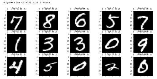
Now, we can start thinking about how we can actually distinguish the zeros from the ones and twos, and so on. If you were a post office, such an algorithm could help you read and sort handwritten envelopes using a machine instead of by hand. We have very advanced methods that do this today, but this data set still provides a good testing ground for understanding how specific methods for dimensionality reduction work and how well they work.
The images are all essentially 28-by-28 pixels, and therefore have a total of 784 dimensions, each holding the value of one specific pixel.
We can now reduce the number of dimensions drastically while trying to retain as much of the variation in the information as possible. This is where we get to dimensionality reduction. Let's first take a look at something known as principal component analysis (PCA).
How to Apply PCA in Python
PCA is a technique used to reduce the number of dimensions in a data set while retaining the most information. It uses the correlation between some dimensions and tries to provide a minimum number of variables that keeps the maximum amount of variation or information about how the original data is distributed. It does not do this through guesswork, but rather by using hard mathematics and a technique known as the eigenvectors of the covariance matrix of the data. These eigenvectors have the property that they point along the major directions of variation in the data. These are the directions of maximum variation in a dataset.
I am not going to get into the actual derivation and calculation of the principal components. Instead, we’ll use the Scikit-learn implementation of PCA.
Since we like our two- and three-dimensional plots, let’s start with that and generate from the original 784 dimensions, the first three principal components. We’ll also see how much of the variation in the total data set they actually account for.
pca = PCA(n_components=3)
pca_result = pca.fit_transform(df[feat_cols].values)

df['pca-one'] = pca_result[:,0]
df['pca-two'] = pca_result[:,1]
df['pca-three'] = pca_result[:,2]

print('Explained variation per principal component: {}'.format(pca.explained_variance_ratio_))

Explained variation per principal component: [0.09746116 0.07155445 0.06149531]
Given that the first two components account for about 25 percent of the variation in the entire data set, let’s see if that is enough to visually set the different digits apart. We can create a scatterplot of the first and second principal component and color each of the different types of digits with a different color. If we are lucky, the same type of digits will be positioned, or clustered, together in groups. This would mean that the first two principal components actually tell us a great deal about the specific types of digits.
plt.figure(figsize=(16,10))
sns.scatterplot(
    x="pca-one", y="pca-two",
    hue="y",
    palette=sns.color_palette("hls", 10),
    data=df.loc[rndperm,:],
    legend="full",
    alpha=0.3
)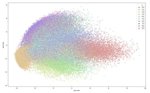
From the graph, we can see the two components definitely hold some information, especially for specific digits. But it’s not enough to set all of them apart. Luckily, t-SNE can help us reduce the number of dimensions for visualization.
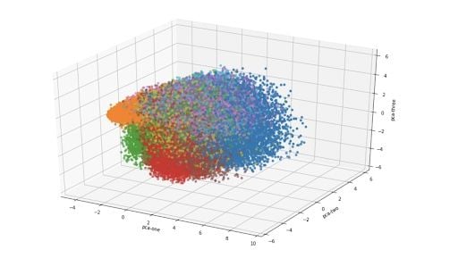
For a three-dimensional version of the same plot:
ax = plt.figure(figsize=(16,10)).gca(projection='3d')
ax.scatter(
    xs=df.loc[rndperm,:]["pca-one"],
    ys=df.loc[rndperm,:]["pca-two"],
    zs=df.loc[rndperm,:]["pca-three"],
    c=df.loc[rndperm,:]["y"],
    cmap='tab10'
)
ax.set_xlabel('pca-one')
ax.set_ylabel('pca-two')
ax.set_zlabel('pca-three')
plt.show()
How to Plot T-SNE in Python
T-Distributed Stochastic Neighbor Embedding (t-SNE) is another technique for dimensionality reduction, and it’s particularly well suited for the visualization of high-dimensional data sets. Contrary to PCA, it’s probabilistic technique that uses mathematical optimization.
According to the authors of the original paper on t-SNE, “T-distributed stochastic neighbor embedding (t-SNE) minimizes the divergence between two distributions: a distribution that measures pairwise similarities of the input objects and a distribution that measures pairwise similarities of the corresponding low-dimensional points in the embedding.”
What this means is that it looks at the original data that is entered into the algorithm and matches both distributions to determine how to best represent this data using fewer dimensions. It relies on some heavy computations to do this, so there are some serious limitations to this technique. For example, one of the recommendations is that, in case of very high dimensional data, you may need to apply another dimensionality reduction technique before using t-SNE.
|  It is highly recommended to use another dimensionality reduction
|  method (e.g. PCA for dense data or TruncatedSVD for sparse data)
|  to reduce the number of dimensions to a reasonable amount (e.g. 50)
|  if the number of features is very high.
The other key drawback is that original t-SNE scales quadratically in the number objects N. As a result, it can only be used for data sets with only a few thousand inputs. Anything more than that and the memory requirements become too large, making the method too slow and impractical due, according to the original study on t-SNE.
We’ll use the Scikit-learn implementation of the algorithm for the remainder of this article.
Contrary to the recommendation above, we will first try to run the algorithm on the actual dimensions of the data (784) and see how it does. We’ll only use the first 10,000 samples to run the algorithm on to make sure we don’t burden our machine in terms of memory and power/time. I’ll also run the PCA again on the subset to compare.
N = 10000

df_subset = df.loc[rndperm[:N],:].copy()

data_subset = df_subset[feat_cols].values

pca = PCA(n_components=3)
pca_result = pca.fit_transform(data_subset)

df_subset['pca-one'] = pca_result[:,0]
df_subset['pca-two'] = pca_result[:,1]
df_subset['pca-three'] = pca_result[:,2]

print('Explained variation per principal component: {}'.format(pca.explained_variance_ratio_))

[out] Explained variation per principal component: [0.09730166 0.07135901 0.06183721]
time_start = time.time()
tsne = TSNE(n_components=2, verbose=1, perplexity=40, n_iter=300)
tsne_results = tsne.fit_transform(data_subset)

print('t-SNE done! Time elapsed: {} seconds'.format(time.time()-time_start))

[out] [t-SNE] Computing 121 nearest neighbors...
[t-SNE] Indexed 10000 samples in 0.564s...
[t-SNE] Computed neighbors for 10000 samples in 121.191s...
[t-SNE] Computed conditional probabilities for sample 1000 / 10000
[t-SNE] Computed conditional probabilities for sample 2000 / 10000
[t-SNE] Computed conditional probabilities for sample 3000 / 10000
[t-SNE] Computed conditional probabilities for sample 4000 / 10000
[t-SNE] Computed conditional probabilities for sample 5000 / 10000
[t-SNE] Computed conditional probabilities for sample 6000 / 10000
[t-SNE] Computed conditional probabilities for sample 7000 / 10000
[t-SNE] Computed conditional probabilities for sample 8000 / 10000
[t-SNE] Computed conditional probabilities for sample 9000 / 10000
[t-SNE] Computed conditional probabilities for sample 10000 / 10000
[t-SNE] Mean sigma: 2.129023
[t-SNE] KL divergence after 250 iterations with early exaggeration: 85.957787
[t-SNE] KL divergence after 300 iterations: 2.823509
t-SNE done! Time elapsed: 157.3975932598114 seconds
Now that we have the two resulting dimensions, we can create a scatter plot of the two dimensions and color each sample by its respective label to visualize them.
df_subset['tsne-2d-one'] = tsne_results[:,0]
df_subset['tsne-2d-two'] = tsne_results[:,1]

plt.figure(figsize=(16,10))
sns.scatterplot(
    x="tsne-2d-one", y="tsne-2d-two",
    hue="y",
    palette=sns.color_palette("hls", 10),
    data=df_subset,
    legend="full",
    alpha=0.3
)
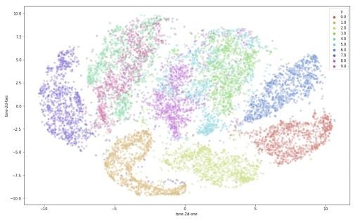
This is already a significant improvement over the PCA visualization we used earlier. We can see that the digits are very clearly clustered in their own sub groups. If we used a clustering algorithm to pick out the separate clusters, we could probably quite accurately assign new points to a label. Just to compare PCA and t-SNE:
plt.figure(figsize=(16,7))

ax1 = plt.subplot(1, 2, 1)
sns.scatterplot(
    x="pca-one", y="pca-two",
    hue="y",
    palette=sns.color_palette("hls", 10),
    data=df_subset,
    legend="full",
    alpha=0.3,
    ax=ax1
)

ax2 = plt.subplot(1, 2, 2)
sns.scatterplot(
    x="tsne-2d-one", y="tsne-2d-two",
    hue="y",
    palette=sns.color_palette("hls", 10),
    data=df_subset,
    legend="full",
    alpha=0.3,
    ax=ax2
)
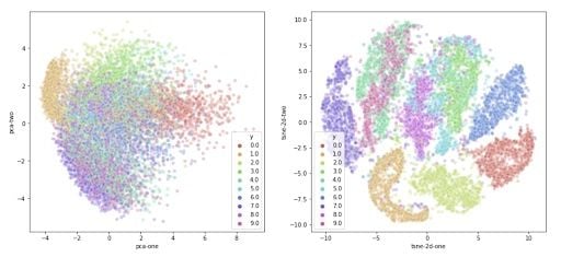
We can now take the recommendations to heart and reduce the number of dimensions before feeding the data into the t-SNE algorithm. We’ll use PCA again for this. We will first create a new data set containing the fifty dimensions generated by the PCA reduction algorithm. Then, we can use this dataset to perform the t-SNE.
pca_50 = PCA(n_components=50)
pca_result_50 = pca_50.fit_transform(data_subset)

print('Cumulative explained variation for 50 principal components: {}'.format(np.sum(pca_50.explained_variance_ratio_)))

[out] Cumulative explained variation for 50 principal components: 0.8267618822147329
The first 50 components hold around 85 percent of the total variation in the data.
Now, we can feed this data into the t-SNE algorithm. This time, we’ll use 10,000 samples out of the 70,000 to make sure the algorithm does not take up too much memory and CPU.
time_start = time.time()

tsne = TSNE(n_components=2, verbose=0, perplexity=40, n_iter=300)
tsne_pca_results = tsne.fit_transform(pca_result_50)

print('t-SNE done! Time elapsed: {} seconds'.format(time.time()-time_start))

[out] t-SNE done! Time elapsed: 42.01495909690857 seconds
And for the visualization:
df_subset['tsne-pca50-one'] = tsne_pca_results[:,0]
df_subset['tsne-pca50-two'] = tsne_pca_results[:,1]
plt.figure(figsize=(16,4))
ax1 = plt.subplot(1, 3, 1)
sns.scatterplot(
    x="pca-one", y="pca-two",
    hue="y",
    palette=sns.color_palette("hls", 10),
    data=df_subset,
    legend="full",
    alpha=0.3,
    ax=ax1
)

ax2 = plt.subplot(1, 3, 2)
sns.scatterplot(
    x="tsne-2d-one", y="tsne-2d-two",
    hue="y",
    palette=sns.color_palette("hls", 10),
    data=df_subset,
    legend="full",
    alpha=0.3,
    ax=ax2
)

ax3 = plt.subplot(1, 3, 3)
sns.scatterplot(
    x="tsne-pca50-one", y="tsne-pca50-two",
    hue="y",
    palette=sns.color_palette("hls", 10),
    data=df_subset,
    legend="full",
    alpha=0.3,
    ax=ax3
)
It produces the following plot:

From this plot, you’ll notice how all the samples are spaced apart and grouped together with their respective digits. This could be a great starting point to then use a clustering algorithm to try to identify the clusters. Or you can use these two dimensions as inputs to another algorithm like a neural network.
Frequently Asked Questions
What is t-SNE and what is it used for?
T-distributed stochastic neighbor embedding (t-SNE) is a non-linear dimensionality reduction technique used to visualize high-dimensional data in lower dimensions like 2D or 3D.
How is t-SNE different from PCA?
While principal component analysis (PCA) uses linear algebra and focuses on maximizing variance, t-SNE uses probabilistic methods to preserve local structure and neighborhood similarities in data visualizations.


