

The purpose of data analysis is to gain insights and find patterns in numbers. Visualizing data makes our analysis that much more valuable and easy to interpret—not to mention the fact visualization allows us to tell our data story to others in a compelling way.
The right charts and graphs make communicating your data findings (i.e. telling your story) more efficient and more effective. Humans are visual creatures, after all. We interact and respond to visual stimulation, and visualizing data is an important way to make it easier for us to understand our world.
Visualizing data can have many benefits, such as:
-
Showing change over time.
-
Determining the frequency of relevant events.
-
Pointing out the correlation between different events.
-
Analyzing costs and benefits of different opportunities.
While many data scientists turn to Matplotlib, Seaborn and Bokeh for their visualizations, I want to demonstrate how the Python library Pygal can help us create stunning, interactive visualizations to tell compelling stories with data.
Pygal
Pygal allows us to create beautiful interactive plots that we can turn into SVGs with an optimal resolution for printing or displaying on webpages using Flask or Django.
Pygal Data Visualizations
- Bar chart
- Treemap
- Pie chart
- Gauge chart
Getting Familiar With Pygal
To use Pygal, we need to install it first.
$ pip install pygal
Let’s plot our first chart. We’ll start with the simplest: a bar chart. To plot a bar chart using Pygal, we need to create a chart object and then add values to it.
bar_chart = pygal.Bar()
We’ll plot the factorial for numbers from zero to five. Here I defined a simple function to calculate the factorial of a number and then used it to generate a list of factorials for numbers from zero to five.
def factorial(n):

   if n == 1 or n == 0:

       return 1

   else:

       return n * factorial(n-1)

fact_list = [factorial(i) for i in range(11)]
Now, we can use this to create our plot:
bar_chart = pygal.Bar(height=400)

bar_chart.add('Factorial', fact_list)

display(HTML(base_html.format(rendered_chart=bar_chart.render(is_unicode=True))))
This will generate a beautiful, interactive plot.

If we want to plot different kinds of charts, we will follow the same steps. As you might’ve noticed, the primary method used to link data to charts is the add method.
Now, let’s start building something based on real-world data.
Application
For the rest of this article, I will be using this data set of the COVID-19 cases in the US to explain different aspects of the Pygal library.
First, to make sure everything works smoothly, we need to ensure two things:
-
Install both Pandas and Pygal.
-
Enable IPython display and HTML options in Jupyter Notebook.
from IPython.display import display, HTML
base_html = """
<!DOCTYPE html>
<html>
 <head>
 <script type="text/javascript" src="https://kozea.github.com/pygal.js/javascripts/svg.jquery.js"></script>
 <script type="text/javascript" src="https://kozea.github.io/pygal.js/2.0.x/pygal-tooltips.min.js""></script>
 </head>
 <body>
   <figure>
     {rendered_chart}
   </figure>
 </body>
</html>
"""
Now that we’re all set up, we can start exploring our data with Pandas; then we’ll manipulate and prepare the data for plotting using different kinds of charts.
import pygal
import pandas as pd
data = pd.read_csv("https://raw.githubusercontent.com/nytimes/covid-19-data/master/us-counties.csv")
This data set contains information about the COVID-19 cases, deaths based on dates, counties and states. We can see that using data.column to get an idea of the shape of the data. Executing that command will return:
Index(['date', 'county', 'state', 'fips', 'cases', 'deaths'], dtype='object')
We can get a sample of 10 rows to see what our data frame looks like.
data.sample(10)
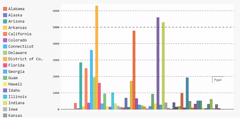
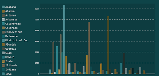
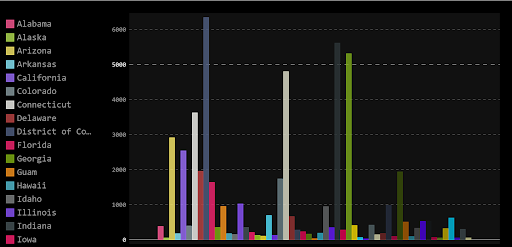
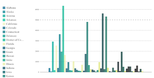
Bar Chart
Let’s start by plotting a bar chart that displays the mean number of cases per state. To do that, we need to execute the following steps:
Group our data by state, extract the case number of each state, then compute the mean value for each state.
mean_per_state = data.groupby('state')['cases'].mean()Start building the data and adding it to the bar chart.
barChart = pygal.Bar(height=400)

[barChart.add(x[0], x[1]) for x in mean_per_state.items()]

display(HTML(base_html.format(rendered_chart=barChart.render(is_unicode=True))))
And, voila, we have a bar chart. We can remove data by unselecting it from the legend list and re-add it by selecting it again.
 You can find the complete code for the bar chart here.
Treemap
Bar charts help show the overall data, but if we want to get more specific, we can choose a different type of chart, namely, a treemap. Treemaps are useful for showing categories within the data. For example, in our data set, we have the number of cases based on each county in every state. The bar chart was able to show us the mean of every state, but we couldn’t see the case distribution per county per state. One way we can approach that is by using treemaps.
Let’s assume we want to see the distribution of the detailed cases for 10 states with the highest number of cases. We need to manipulate our data first before plotting it.
Sort the data based on cases and then group them by states.
sort_by_cases = data.sort_values(by=['cases'],ascending=False).groupby(['state'])['cases'].apply(list)Use the sorted list to get the top 10 states with the highest number of cases.
top_10_states = sort_by_cases[:10]Use this sublist to create our treemap.
treemap = pygal.Treemap(height=400)

[treemap.add(x[0], x[1][:10]) for x in top_10_states.items()]

display(HTML(base_html.format(rendered_chart=treemap.render(is_unicode=True))))
One problem: this treemap isn’t labeled so we can’t see the county names when we hover over the blocks. We’ll only see the name of the state on the county blocks. To add the county names to our treemap, we need to label the data we’re feeding to the graph.
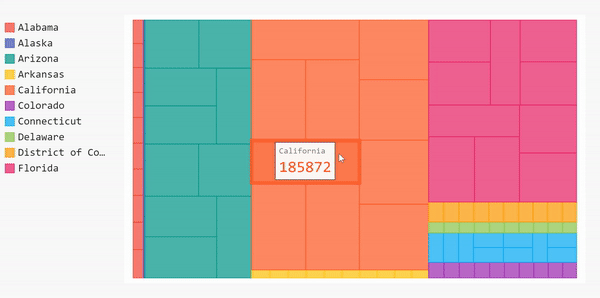
Before we do that, we need to clean up our data before adding it to the treemap. Our data is updated daily so there will be several repetitions for each county. For this project, we only care about the overall number of cases in each county (not the daily cases).
#Get the cases by county for all states
cases_by_county = data.sort_values(by=['cases'],ascending=False).groupby(['state'], axis=0).apply(
   lambda x : [{"value" : l, "label" : c } for l, c in zip(x['cases'], x['county'])])
cases_by_county= cases_by_county[:10]
#Create a new dictionary that contains the cleaned up version of the data
clean_dict = {}
start_dict= cases_by_county.to_dict()
for key in start_dict.keys():
   values = []
   labels = []
   county = []
   for item in start_dict[key]:
       if item['label'] not in labels:
           labels.append(item['label'])
           values.append(item['value'])
       else:
           i = labels.index(item['label'])
           values[i] += item['value']

   for l,v in zip(labels, values):
       county.append({'value':v, 'label':l})
   clean_dict[key] = county
#Convert the data to Pandas series to add it to the treemap
new_series = pd.Series(clean_dict)
Then we can add the series to the treemap and plot a labeled version of it.
treemap = pygal.Treemap(height=200)
[treemap.add(x[0], x[1][:10]) for x in new_series.iteritems()]
display(HTML(base_html.format(rendered_chart=treemap.render(is_unicode=True))))
Awesome! Now our treemap is labeled. If we hover over the blocks now, we can see the name of the county, the state and the number of overall cases in each county.
 If you want the complete code for the treemap above, it’s here.
Pie Chart
Now let’s create a pie chart to show the 10 states with the highest number of cases. Using a pie chart allows us to compare the number of cases in one state relative to the others.
Since we did all the data frame manipulation already, we can use that to create the pie chart right away.
first10 = list(sort_by_cases.items())[:10]
[pi_chart.add(x[0], x[1]) for x in first10]
display(HTML(base_html.format(rendered_chart=pi_chart.render(is_unicode=True))))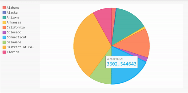 Here’s the complete code for the pie chart above.
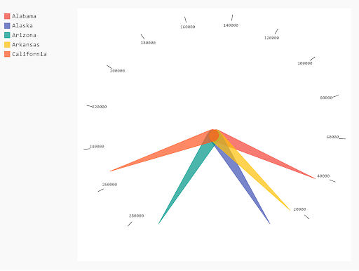
Gauge Chart
The last type of chart we’ll look at is the gauge chart, which ls useful for comparing values between a small number of variables. So, we’ll start by comparing the top five states in the data set.
The gauge chart has two shapes, the donut shape (in Pygal the SolidGauge) and the needle shape (also known as the Gauge).
The Donut Shape
gauge = pygal.SolidGauge(inner_radius=0.70)
[gauge.add(x[0], [{"value" : x[1] * 100}] ) for x in mean_per_state.head().iteritems()]
display(HTML(base_html.format(rendered_chart=gauge.render(is_unicode=True))))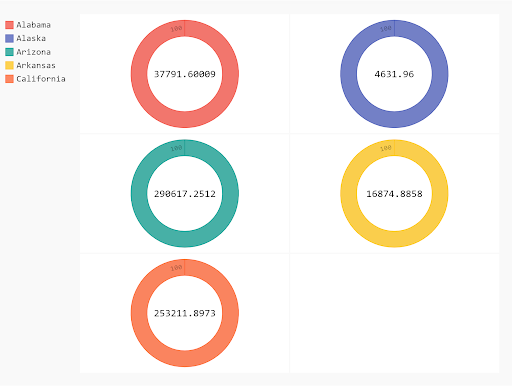
The Needle Shape
gauge = pygal.Gauge(human_readable=True)
[gauge.add(x[0], [{"value" : x[1] * 100}] ) for x in mean_per_state.head().iteritems()]
display(HTML(base_html.format(rendered_chart=gauge.render(is_unicode=True))))
Here’s the complete code for the gauge chart.
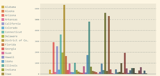
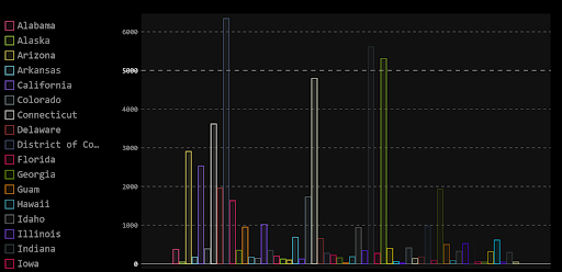
Styling
Pygal also gives us the opportunity to play with the chart colors. The styles the library already defines are:
- Default
- DarkStyle
- Neon
- Dark solarized
- Light solarized
- Light
- Clean
- Red blue
- Dark colorized
- Light colorized
- Turquoise
- Light green
- Dark green
- Dark green blue
- Blue
To use the built-in styles, you’ll need to import the style you want, or you can import them all.
from pygal.style import *Here are some examples of different built-in styles.
Aside from the color schemes detailed above, you can define a custom style by setting the parameters of a style object. Some of the properties you can edit are color, background, and foreground. You can also edit the opacity and the font properties of the charts.
Here’s the style object to my custom style.
from pygal.style import Style
custom_style = Style(
 background='transparent',
 plot_background='transparent',
 font_family = 'googlefont:Bad Script',
 colors=('#05668D', '#028090', '#00A896', '#02C39A', '#F0F3BD'))
(Note: the font-family property won’t work if you include the SVG directly. You have to embed it because the google stylesheet is added in the XML processing instructions.)
The Pygal library offers so many more options, more graph types, and more options to embed the result graph’s SVG on different websites. One of the reasons I like working with Pygal a lot is because it allows the user to unleash their creativity and create enchanting graphics that are interactive, clear and colorful. Have fun!
This article was originally published on Towards Data Science.


