

In the sixth (and final!) installment of this tutorial, we’ll use the data we’ve already collected, organized and evaluated. When we’re finished, you’ll have a performance map you can use to predict the COP of our hypothetical heat pump water heater as a function of the ambient temperature and average water temperature in the tank.
Without further ado, let’s get started. For this task we’ll need to create a new script. And, as always when creating new scripts the first step is — you guessed it — import statements.
What Packages Do I Import?
The necessary packages for this process are Pandas, NumPy, and itertools. You can import these three with the following code:
import pandas as pd
import numpy as np
import itertools
I’ll also demonstrate how to create three-dimensional plot you can use to review the regressions. This step isn’t strictly necessary for creating a performance map, but would be a helpful way to learn. If you wish to follow along with this part of the process, you should also use the following import statements to enable Matplotlib capabilities:
import matplotlib.pyplot as plt
from matplotlib import cm
These import statements will enable all of the needed functionality for this process.
5 Steps to Automate Your Regression
- Import your packages.
- Get your data into a useable format.
- Generate your regression.
- Evaluate your regression.
- Visualize Your results.
How Do I Get the Data Into a Usable Format?
First, we need to read the data into Python. We can do that using the same path variable we used earlier in the tutorial and modify it to locate each of the three data files saved after analyzing the data from each test. You should copy and paste your code from the script analyzing individual files to pull the same path declaration into this script.
Once you have the path defined, we need to use it as the base to read in all three of the data files. They were saved in a subfolder of path called “Analyzed” with the nomenclature ‘PerformanceMap_HPWH_xx_Analyzed.csv’ where xx is the intended ambient temperature of the test. Since the three tests were performed at 55, 70 and 95 degrees Fahrenheit we know we can read the files with the following code:
Data_55F = pd.read_csv(Path + r’\Analyzed\PerformanceMap_HPWH_55_Analyzed.csv’)

Data_70F = pd.read_csv(Path + r’\Analyzed\PerformanceMap_HPWH_70_Analyzed.csv’, skiprows = [1,2])

Data_95F = pd.read_csv(Path + r’\Analyzed\PerformanceMap_HPWH_95_Analyzed.csv’, skiprows = [1,2])
The lines to read the 70 deg F and 95 deg F data have a “skiprows” modifier at the end. This modifier tells Pandas to keep the headers in the data file but skip the first two rows of data. It’s important to use in this case because the first two rows in those files show data right when the system is starting up, and it leads to some erroneous results. This is a useful Pandas trick to remember for the future!
The data is now in three separate files but we need it all to be in a single file to create the performance map. We do this by simply creating a new data frame matching the data from one test, then appending the data from the other tests. Note the index isn’t modified when appending new data sets, which leads to three different rows having the exact same indices. Thus we also need to reset the index when combining the three data sets. We can do all this with the following code:
Data = Data_55F

Data = Data.append(Data_70F)

Data = Data.append(Data_95F)

Data = Data.reset_index()

del Data['index']
Now the data is in a usable format, we’re ready to move on to our next step.
Creating a Regression
The first step in creating a regression is to identify what type of regression you need. How many variables does the regression need to have? Is a linear regression good enough or does it need to be a higher order regression?
Our regression needs to be sensitive to changes in both the ambient temperature and the average water temperature, so we have two independent variables. Therefore we know we need a two-dimensional regression, and is an example of multiple regression. We can also tell from looking at the plots we created in part three of this tutorial that the COP regression is not linear (This is a bit hard to see! It’s very close to linear with water temperature but not with ambient temperature). This all tells us we need a regression method capable of orders higher than one.
I recommend using a higher order regression based on my knowledge of the data set. Sometimes you won’t be able to see know that right off the bat. In those cases, you can start generating regressions and see what happens. After creating a regression check the results. If the results are bad, try a different order. Guess and check is never ideal, but it can work in a pinch.
To create a regression, we need functions that return regression coefficients fitting the provided data set and allow us to specify the order of the resulting equation. Scikitlearn has functions that can do this for you but it’s important to understand the fundamentals, so we’ll use custom-made (and more transparent) functions here.
We define two functions: polyfit2d and polyval2d. These functions do as their names imply. The first function creates a two-dimensional polynomial and fits it to the provided data set. The second evaluates that polynomial for a given set of conditions. The code for these two functions is:
def polyval2d(x, y, m):

   order = int(np.sqrt(len(m))) - 1

   ij = itertools.product(range(order+1), range(order+1))

   z = np.zeros_like(x)

   for a, (i,j) in zip(m, ij):

       z += a * x**i * y**j

   return z

def polyfit2d(x, y, z, order):

   ncols = (order + 1)**2

   G = np.zeros((x.size, ncols))

   ij = itertools.product(range(order+1), range(order+1))

   for k, (i,j) in enumerate(ij):

       G[:,k] = x**i * y**j

       m, _, _, _ = np.linalg.lstsq(G, z)

   return m
Notice polyfit2d is based on the NumPy linear algebra least squares function. The polyfit2d function basically transforms your dataset and order specification so it can call that function and return the appropriate result. This is in accordance with the fundamentals of multiple regression.
Polyval2d follows the opposite process. The coefficients describing the polynomial are passed to it using the input “m.” The code then expands the coefficients (one term at a time) to evaluate the polynomial expression and add it to the variable “z.” Once you’ve evaluated all the terms, the script will return the final value of z as the result of using the polynomial to predict the result at the specified conditions.
Now that we have the functions, creating the regression requires only a single line of code. We need to use polyfit2d to return the regression coefficients that best match the polynomial to the COP data using the provided ambient temperature and water temperature data. The “Data” data frame we created in part five contains all of that information. Thus we can create the regression with the following code:
PolyFit2d_Coefficients = polyfit2d(Data[‘T_Amb (deg F)’], Data[‘Average Tank Temperature (deg F)’], Data[‘COP (-)’], o)Note the last term in that line of code is simply an o! As currently programmed, that line of code will not run. The “o” is a placeholder for the desired order of the equation. If you want to create a linear equation, replace “o” with “1.” A second order equation uses “2” instead of “o,” and so on. Once we define the order of the equation, we can run the code to generate a regression.
Is My Regression Good Enough?
This is an extremely important question. Ensuring a regression closely matches the input data set and is capable of accurately predicting other results is vital to the process. I’ll describe how to evaluate the models using brief statistical checks here, but there really is more to it. You need to be careful not to overfit or underfit your regressions by minimizing both model bias and variance. You also need to break up your data set to ensure your model has predictive power beyond simply matching the existing data set.
For this tutorial, we’ll focus on the mean, maximum and minimum errors when comparing the regression predictions to the data set. To do this, we need to evaluate the regression and calculate the percent error at each point, which we can do with the following code:
Data['Predicted COP, PolyFit (-)'] = polyval2d(Data['T_Amb (deg F)'], Data['Average Tank Temperature (deg F)'], PolyVal2d_1_Coefficients)

Data[‘Percent Error, PolyFit (%)’] = (Data[‘Predicted COP, PolyFit (-)’] — Data[‘COP (-)’]) / Data[‘COP (-)’] * 100
Now we have the three lines of code needed to create the regression of a specified order, evaluate the regression for each point in the data set and calculate the error in the regression predictions at each point. This allows us to identify the mean, maximum and minimum errors using the following code:
Data[‘Percent Error, PolyFit (%)’].mean()

Data[‘Percent Error, PolyFit (%)’].max()

Data[‘Percent Error, PolyFit (%)’].min()
Returning those statistics for first, second, third and fourth order regressions yields the following results:
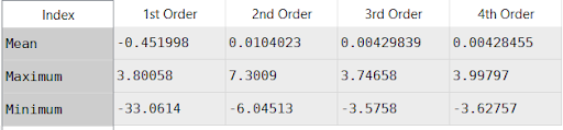
The results for the first order regression are terrible! The mean error is only -0.45%, a very good fit, and the max error is less than 4%, also a good fit, but the minimum error is -33%. Furthermore, exploring the resulting data set (which you should be able to do as soon as you run your script) shows the regression is pretty accurate except for the 95 deg F ambient temperature case with water temperatures over 130 degrees.
The second order regression returns better results, but still a poor match. The mean is good but the maximum of 7.3% and minimum of -6% indicate there’s still a good amount of error. The third and fourth order regressions return nearly the same result. The mean error in both cases is less than 0.0043%, an extremely good fit. The maximum and minimum are both less than 4%, also quite a good fit. Interestingly the maximum and minimum values for the fourth order regression are both more extreme than the third order regression. This is a sign of an overfit model; higher order causes more variance in the model, which makes it miss some values, even while showing a slightly stronger overall fit.
These results imply the third order regression is the best result here. Increasing the order of the model would add very little improvement, while actually making the worst predictions worse.
How Do I Visualize My Results?
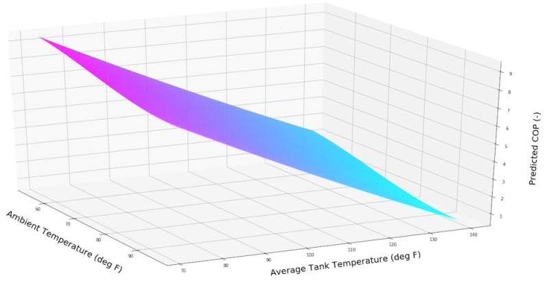
Plotting the results can be a good way to understand how well the regression is working. Maybe you want to plot the COP to see the performance of the heat pump or perhaps you want to plot the percent error of the regression so you can identify areas of the model that may have higher error than others. Fortunately, we only have two input variables and Matplotlib provides three dimensional plotting tools.
To create a useful three-dimensional plot of the regression we need to create a mesh of values to plot. This mesh will provide the predicted COP using the regression across the entire range of the data set, not only the tested values. This is important! The tests featured data at 55 deg F, 70 deg F, and 95 deg F ambient temperatures. Plotting the regression on a mesh spanning the range will also give predicted COP values across the entire range, not only those three points.
We can create the mesh using NumPy’s meshgrid and linspace functions. The meshgrid function creates a mesh from specified input arrays; the linspace function creates those arrays. If we want to create a meshgrid spanning our range of conditions, with 100 points in the x and y directions, we can do it with the following lines of code:
nx, ny = 100, 100

xx, yy = np.meshgrid(np.linspace(min(Data[‘T_Amb (deg F)’]), max(Data[‘T_Amb (deg F)’]), nx), np.linspace(min(Data[‘Average Tank Temperature (deg F)’]), max(Data[‘Average Tank Temperature (deg F)’]), ny))

zz = polyval2d(xx, yy, PolyFit2d_Coefficients)
Nx and ny state we want 100 values in the x and y dimensions of our array. The second line creates our x and y grids spanning the total range from the coldest ambient temperature to the hottest, and from the coldest tank temperature to the hottest. They also contain a fine mesh grid presenting many data points in between. Finally, the last line evaluates the created regression for each point in the meshgrid and stores it in zz.
To plot the data set we need to call Matplotlib’s three-dimensional plotting functions with the following code:
fig = plt.figure(figsize = (30, 15))

nDPlot = fig.add_subplot(111, projection='3d')

plt.hold(True)

nDPlot.plot_surface(xx, yy, zz, cmap = cm.cool, alpha = 1)

nDPlot.set_xlabel('Ambient Temperature (deg F)', labelpad = 25, fontsize = 20)

nDPlot.set_ylabel('Average Tank Temperature (deg F)', labelpad = 25, fontsize = 20)

nDPlot.set_zlabel('Predicted COP (-)', labelpad = 25, fontsize = 20)

PlotName = Path + r'\PerformanceMap\PolyVal3d'

plt.savefig(PlotName)
This creates a three-dimensional plot presenting the data in xx, yy and zz. The x axis represents the ambient temperature in deg F, the y axis represents the average tank temperature in deg F and the z axis represents the COP. The script will save the plot to the specified folder on your hard drive and you can open it as an image.
Saving the file as an image is a bit dissatisfying. You don’t always get the best angle, or the most insight into the data set. If you want to examine the data set it’s helpful to examine it from multiple different angles. Try using your Python terminal to enter the command “%matplotlib qt” and run the script again. This should create a new window with a three-dimensional plot you can rotate to get different angles. This allows you to explore the data set more, and to save the image with from the angle you want.
And we’re done! You now have a performance map predicting the coefficient of performance of heat pump water heaters as a function of the ambient temperature and average tank temperature. Plus, you’ve written python scripts that do this for you, which enables you to quickly repeat the process with other data sets at a later date. Feel free to add any of these lines of code to other scripts so you can have the same functionality on different projects. Have fun!
* * *
This multi-part tutorial will teach you all the skills you need to automate your laboratory data analysis and develop a performance map of heat pump water heaters. You can find the rest of the series here:
Need to Automate Your Data Analysis? Here’s How to Get Started.
How to Split Unmanageable Data Sets
These Python Scripts Will Automate Your Data Analysis
How to Check Your Data Analysis for Errors
Don’t DIY. Use Python Scripts to Check Data Quality for You.


