

The first part of this tutorial introduced the key concepts with which we’re working. If the terms “heat pump water heater,” “coefficient of performance (COP)” and “performance map” don’t mean anything to you, check it out.
Part two introduced the companion data set, and split the data set into multiple files with user-friendly names. In part three we created a script to analyze each of the individual data files. At the end of that process we’re left with one very important question.
Does it work?
We’ve covered a lot of ground and many things could’ve gone wrong. The experimentalist could have made a mistake running the test, leading to erroneous data. A sensor could have broken leading to lost data. There could be an error in the data processing code leading to weird results even though the input data is correct.
Part four of this tutorial will show you how to check the data for errors manually. This step is important as it teaches you all the concepts involved in error checking, such as how to think through what’s important in the test and how to examine the data to ensure everything worked correctly. This will set us up for the next phase of the tutorial where we’ll learn to automate this process.
Steps to Check Your Data Analysis for Errors
- Determine what may have gone wrong up to now.
- Import your Python packages.
- Plot and analyze your tests.
We’ll start with the same program as we did for part three. This time, we’ll add new code inside the for loop to analyze the data and take advantage of the fact that we’ve already imported Bokeh for plotting purposes.
The first step is to think about what could have gone wrong and what potential errors might be out there.
What Errors Should I Look For?
In order to identify the important error checks we need to consider what parts of the test are important. For these tests, I’ve identified the following points:
-
Initial water temperature: The initial water temperature must be higher than the specified initial water temperature. If it’s not, then the data set won’t cover the full test range and you’ll need to redo the test.
-
Final water temperature: Similarly, the final water temperature must be higher than the specified final water temperature. If it isn’t, then the data set will cut off early and not provide the required full test range.
-
Ambient temperature: The average ambient temperature over the course of the test must be close to the specified ambient temperature. Since each test provides the COP of the heat pump at the specified ambient temperature, an incorrect ambient temperature leads to an incorrect performance map.
-
Regression quality: The point of this work is to create a regression predicting the COP of the heat pump. This means we need to ensure both the calculated COP is within the two to eight range we’d typically expect to see and the COP regression we already created accurately predicts the COP in this test.
In order to check all of these items manually, we need to create plots that present the water temperature, ambient temperature and electricity consumption over the course of the test.
How Do I Create the Necessary Plots?
To create the necessary plots for each test, add the code to plot each item within the for loop. This will create each plot for a single test. The program will then move on to the next tests and create the plots for those as well.
Fortunately, we imported the necessary Bokeh functions in the last part of the tutorial and don’t need to worry about it this time. This means we can dive right in by writing a line of code to create the first plot object presenting the water temperature in the tank:
p1 = figure(width=800, height=400, x_axis_label='Time (min)', y_axis_label = 'Water Temperature (deg F)')This line references the Bokeh function “figure” to create a figure object. It’s assigned to the variable “p1” so we can edit that figure by referencing p1 in the future. Within the function it sets the width of the plot to 800 pixels, the height to 400 pixels, the x-axis label to “Time (min)” and the y-axis label to “Water Temperature (deg F).” We now have the structure of a plot that we can add data to as needed.
We add data by editing the figure to add new data series. We’ll use a new line for each data series we add. We can add the data by referencing the data frames used in the data analysis. To add the water temperature data to the plot we use the following code:
p1.circle(Data['Time Since Test Start (min)'], Data['T1 (deg F)'],   legend='Temperature 1', color = 'skyblue')

p1.circle(Data['Time Since Test Start (min)'], Data['T2 (deg F)'], legend='Temperature 2', color = 'powderblue')

p1.circle(Data['Time Since Test Start (min)'], Data['T3 (deg F)'], legend='Temperature 3', color = 'lightskyblue')

p1.circle(Data['Time Since Test Start (min)'], Data['T4 (deg F)'], legend='Temperature 4', color = 'lightblue')

p1.circle(Data['Time Since Test Start (min)'], Data['T5 (deg F)'], legend='Temperature 5', color = 'cornflowerblue')

p1.circle(Data['Time Since Test Start (min)'], Data['T6 (deg F)'], legend='Temperature 6', color = 'royalblue')

p1.circle(Data['Time Since Test Start (min)'], Data['T7 (deg F)'], legend='Temperature 7', color = 'blue')

p1.circle(Data['Time Since Test Start (min)'], Data['T8 (deg F)'], legend='Temperature 8', color = 'mediumblue')

p1.circle(Data['Time Since Test Start (min)'], Data['Average Tank Temperature (deg F)'], legend='Average', color = 'darkblue')
Each line of the above code adds a new data series to the plot. The lines call the p1.circle function, which specifies the new data series will be represented as circles on the plot.
Within the function call, the first item is the x data and the second is the y data. You can see that each data series adds the time from the start of the test (in minutes) as the x data and a different water temperature as the y data.
There are nine data series, with the first eight representing direct water temperature measurements from the data and the ninth representing the calculated average water temperature. The legend specification for each data series states how the data series should be represented in the legend, and the color specifies the color to be used for the circles in the plot. I chose to use lighter blues at the top of the tank and darker blues at the bottom.
Finally, we want to specify the location of the legend. If we don’t, the legend will likely cover a part of the data set thereby obscuring the information we need to see. We can place the legend in the bottom-right corner of the plot by adding the line:
p1.legend.location = "bottom_right"
This completes the first plot, so we can move on to the second plot, which represents the ambient temperature. This follows the same process we just went through to create a plot object and add a data series to it, so I’ll move a little more quickly here.
p2 = figure(width=800, height=400, x_axis_label='Time (min)', y_axis_label = 'Ambient Temperature (deg F)')

p2.circle(Data['Time Since Test Start (min)'], Data['T_Amb (deg F)'], color = 'red')
This creates a similar plot, but it only has one data series which shows the “T_Amb (deg F)” column from the data frame. Note that the y axis label has also changed to show the change in the data set.
The third plot we need shows the COP during the test. To create the third plot we’ll use the following code:
p3 = figure(width=800, height=400, x_axis_label=’Average Tank Temperature (deg F)’, y_axis_label = ‘Coefficient of Performance (-)’)
p3.circle(Data[‘Average Tank Temperature (deg F)’], Data[‘COP (-)’], legend = ‘Measurement’, color = ‘red’)
p3.line(np.arange(72, 140.1, 0.1), Regression(np.arange(72, 140, 0.1)), legend = ‘Regression’, color = ‘black’)
The new addition to this code is the inclusion of a line presenting the COP of the device, which we calculate using the regression from part three of the tutorial. We call it using the p3.line function.
Traditionally we use a line for simulated data. We then create the x data for this line by using a NumPy array ranging from 72 to 140.1 with a step size of 0.1. Note that since Python does not include the final entry in an array this actually creates data points ranging from 72 to 140.
The y data uses the same range as the input to our COP regression, then plots the calculated COP values. The legend and color entries are the same as in the previous plots.
That code creates the three plots, but it doesn’t actually save them. Bokeh saves the plots as a user-defined array in a .html file. To save the plots we need to specify the array and the .html file, then save the data. We can do this with the following code:
p = gridplot([[p1], [p2], [p3]])

output_file(Filename_Test[:-4] + '.html', title = Filename_Test[146:-4])

save(p)
The first line creates a gridplot object consisting of three lists. In this format, each list represents the plots to put in each row. Since the code enters the data as three separate lists, each containing a single plot, the .html file will present the plots in a single column. If we want to have multiple columns, we would add multiple entries into the lists.
The output_file function specifies the desired name of the file and the title to have on the .html file when opened. In this case, we use dynamic naming to give the plot the same name as the data file, but with a .html ending instead of a .csv. The “Filename_Test[:-4]” code removes the “.csv” from the name of the file. When specifying the file name we add “.html” to ensure it saves as a .html file. When specifying the title we don’t bother including the extension. Finally, we save the .html file containing the plots to the computer with save(p).
How Can I Use These Plots to Check the Results?
We can check the quality of the data and analysis by examining the plots to ensure they show what we need to see. Let’s walk through this by examining the three plots we just created for the 55 deg F ambient temperature test.
The first plot (below) shows the temperature of water at each depth in the tank over the course of the test.
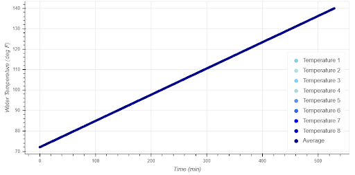
In this test, we can see every measurement started at 72 degrees Fahrenheit, which is exactly what we expected to see. Additionally, the final temperature reported by each measurement was 140 degrees Fahrenheit — as expected. Finally, we see the temperature in each measurement gradually increase, as we expect to see when the water is slowly warmed by a heat pump. This plot shows the data met the expectations we have for this data set.
(Remember this is fabricated data, not actual test measurements. I didn’t add any randomization into the data when creating it and that’s why this data set is remarkably smooth. Don’t ever expect things to be this smooth when working with real data.)
The second plot we’ll look at is the ambient temperature.

Notice how this data is a bit more random than the water temperatures. Instead of sitting directly at the 55 deg F specified in the test, the plot bounces from 54 degrees to 56 degrees. This is because I added a small amount of randomization to the ambient temperature in the companion data set to more accurately mirror what you should expect to see in real data. How do you check to ensure the ambient temperature was close enough to the specified 55 degrees when it’s not exactly at the set point?
In this case, it’s safe to say the test was set to 55 deg F as requested because the average of the data is clearly close to the data. It's also clear the equipment was well controlled because the temperature was always close to the set temperature. While the temperature varied from 54 to 56 degrees, it certainly never moved as low as 45 or as high as 70 degrees.
The final plot shows the calculated and regressed COP of the heat pump as a function of water temperature.

In this case we can see the measured COP of the heat pump gradually decreases from 72 to 140 deg F. We expected this since the increased water temperature makes it harder to transfer water from the refrigerant to the water. We’d also expect to see the gradual drop, as opposed to sudden or jerky changes in COP. Finally, we can see the COP falls in the anticipated two to nine range.
All told, these three plots all show the data fits within our specifications and indicate the test and calculations were performed correctly.
How Can I Automate This Process?
We’ve covered adding code to automatically plot the data sets as they’re analyzed, how to think about checking the data, and how to examine the plots to validate both the experiments and the calculations manually. This is an important step as results from a project based on bad data or bad calculations are, of course, not valuable.
However, this isn’t the best way to check for errors. If you perform projects with hundreds or thousands of tests, checking the plots for each test manually gets time consuming, expensive and tedious. It’s much more efficient to add a new section to the program that automatically compares the values coming from the experiments and from the calculations to user-specified thresholds. In this way, our code can automatically identify tests or calculations that don’t meet expectations, flag the potential errors and report those potential errors to the user. That’s where we’ll pick up next.
* * *
This multi-part tutorial will teach you all the skills you need to automate your laboratory data analysis and develop a performance map of heat pump water heaters. You can find the rest of the series here:
Need to Automate Your Data Analysis? Here’s How to Get Started.
How to Split Unmanageable Data Sets
These Python Scripts Will Automate Your Data Analysis
Don't DIY. Write Python Scripts to Check Data Quality for You.


