

Pareto analysis is a decision-making method widely used by analytics teams across disparate industries. It attributes the majority of a given problem to a top percentage of cases. Specifically, it’s based on the idea that 20 percent of causes result in 80 percent of problems. In practice, the 80/20 split is a guideline that generally suggests that a small minority of causes are responsible for the majority of problems. As such, the exact values don't have to precisely align with the 80/20 rule as the split in practice may be 75/25, 90/10, or 85/15. The heuristic is meant to be a guide for distinguishing the vital few factors that are pertinent to a problem from the insignificant many that aren’t.
Extremely versatile, Pareto analysis can identify impactful subsets of data in a wide variety of industries including retail, information technology, marketing, and healthcare.
The ability to create these charts from data is a valuable skill for data scientists and data analysts. Python provides a variety of tools and visualization libraries that allow you to easily create pretty Pareto charts that clearly communicate the top underlying causes of most problems in a system.
In this post, we will generate Pareto charts using synthetic emergency room patient readmission data. In our analysis, we will walk through the steps of generating a Pareto plot in Python. Using this data, we will analyze specific, real-world emergency room readmission scenarios. For our purposes, we will work with the Synthetic Healthcare Emergency Room Readmission data available on DataFabrica. The free tier is free to download, modify, and share under the Apache 2.0 license.
What is Pareto Analysis?
Pareto analysis is a decision-making method widely used by analytics teams across disparate industries. It’s based on the idea that 20 percent of causes result in 80 percent of problems. This heuristic is meant to be a guide for distinguishing the vital few factors that are pertinent to a problem from the insignificant many that aren’t. Extremely versatile, Pareto analysis can identify impactful subsets of data in a wide variety of industries including retail, information technology, marketing, and healthcare.
Steps of Pareto Analysis
A thorough Pareto analysis follows several steps.
- Define your problem and the associated causes. For example, in the case of prescription errors, the problem is the incorrect prescription of high blood pressure drugs and potential causes are “white coat hypertension” and “inaccurate readings.”
- Calculate the frequency of each cause within a problem.
- Sort the frequencies from highest to lowest.
- Plot a bar chart of the frequencies.
- Calculate the cumulative sum of the unit of measure through each cause. For example, calculate the total cumulative percentage of hypertension misdiagnosis across each cause.
- Create a line plot of the cumulative percentage.
- Label the left side of the y-axis with “Frequency” and the right side with “Cumulative Percentage.”
- Label the x-axis with the “Problem Causes” for the prescription error label “Prescription Error Causes.”
- Title the plot “Pareto Chart of Problem,” i.e., “Pareto Chart of Prescription Errors”
- Analyze Pareto Chart – Inspect the top few causes that contribute to most of the problems.
What Is a Pareto Chart?
A Pareto chart is a dual plot of a bar chart and a line plot. The bar chart corresponds to descending frequencies in an event, usually denoted by a category. Examples of events include a product selling, a customer churning, a patient returning to the emergency room, or any event that impacts a business, whether positively or negatively. The line plot corresponds to the cumulative sum in a specified unit of measure across events.
For example, in the case of a patient returning to the emergency room, also called patient readmission, the values in the line plot would be the cumulative sum of the number of readmission occurrences across all causes of readmission.
Pareto Chart Examples
Healthcare is an interesting application of Pareto analysis since it can improve patient outcomes, optimize resource allocation, facilitate disease management and more. Specifically, Pareto analysis can identify the causes of medical prescription errors, evaluate diagnostic accuracy, and identify the top causes of patient readmissions.
For example, in the context of identifying causes of prescription errors, you can use Pareto analysis to determine if the issue is incorrect dosages, patient mismatching, or duplicate prescriptions. Identifying the causes of prescription errors allows healthcare providers to focus resources on addressing the most impactful causes of these errors.
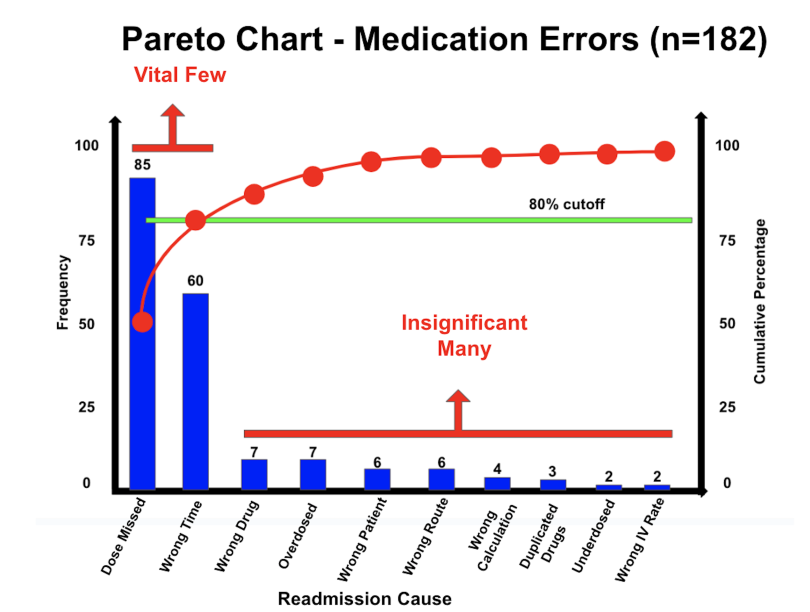
Below is a Pareto chart of prescription errors and their causes. From the plot, you can see that 80 percent of prescription errors are solely due to wrong dosage and wrong time.
In terms of diagnostics, healthcare providers can identify the top causes of misdiagnoses. For example, common misdiagnoses include abnormal blood pressure readings due to white coat hypertension, improper cuff size, and more. These errors can also lead to prescription errors like prescribing hypertension medication to someone with normal blood pressure.
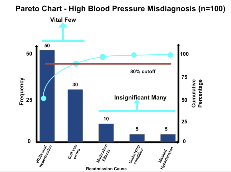
In the Pareto chart below, we see that 80 percent of high blood pressure misdiagnoses are due to white coat hypertension and cuff size errors.
You can also use Pareto analysis to identify prevalent factors driving readmission. Identifying the vital few causes of readmission among the insignificant many can significantly improve parient outcomes because providers can allocate resources toward prevention. By preventing readmission, hospitals can save money, reduce mortality rates, and ultimately provide better care to more patients.
How to Create a Pareto Chart
To start, let’s read our data into a Pandas DataFrame and display the first five rows of data:
import pandas as pd
df = pd.read_csv("emergency_room_readmission_data.csv")
df.head()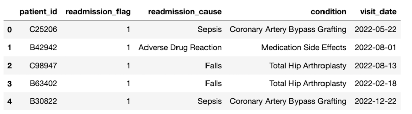
Next, let’s filter our data to only include readmitted patients:
readmitted = df[df['readmission_flag'] == 1]We can then use this filtered DataFrame to count the number of times a cause appears in the readmitted patient data:
cause_counts = readmitted['readmission_cause'].value_counts()Next, we can calculate the cumulative sum of readamission_cause counts and divide by the total count of readmissions to get the cumulative percentage in cause counts:
cumulative_percent = (cause_counts.cumsum() /cause_counts.sum())
* 100
Next, to be able to generate our Pareto chart, we need to define a Matplotlib subplot object, which we will call ax1:
import matplotlib.pyplot as plt
_, ax1 = plt.subplots()
The subplot object will allow us to generate a dual plot, containing a line plot and a bar chart. It will also allow us to format our chart with axis labels, legends and titles.
Next, let’s use ax1 to plot our bar chart of cause frequencies:
ax1.bar(cause_counts.index, cause_counts.values,
color='tab:cyan', label='Frequency')
And we can label our x and y axes:
ax1.set_xlabel('Readmission Cause')
ax1.set_ylabel('Frequency', color='tab:cyan')
Format the values to be frequency, color to be cyan for the y-ticks on the y-axis, and format the plot legend to be located on the upper left of the chart:
ax1.tick_params(axis='y', labelcolor='tab:cyan')
ax1.legend(loc='upper left')
Next, we will create a secondary y-axis, which is where the values for the cumulative percentages will reside:
ax2 = ax1.twinx()This step will enable us to overlay two plots, a bar chart for frequencies and a line plot for cumulative percentages.
Next, we generate a line plot of our cumulative percentages:
ax2.plot(cause_counts.index, cumulative_percent , zorder=2,
color='tab:red', label='Cumulative Percentage', marker='o')
And format the y-axis label to be cumulative percentage, y-ticks to be red, and legend to be on the upper right:
ax2.set_ylabel('Cumulative Percentage', color='tab:red')
ax2.tick_params(axis='y', labelcolor='tab:red')
ax2.legend(loc='upper right')
We can further format our chart by including a title:
plt.title('ER Readmission Pareto Chart')Also, let’s format the x-axis such that the readmission cause values are angled by 30 degrees. This makes the readmission cause values more readable as they would otherwise overlap each other:
plt.setp(ax1.get_xticklabels(), rotation=30,
horizontalalignment='right')
We can also format with the tight layout method, which makes the plot easier to read by tightening the figure:
plt.tight_layout()
plt.show()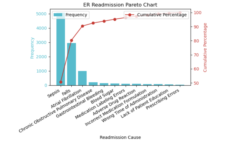
We see from the chart that 80 percent of readmissions in our data are due to sepsis and falls. Further, very few readmissions in our data are due to the wrong time of administration, lack of patient education and prescription errors. A few lines of Python code can generate an insightful Pareto chart that clearly distinguishes the most impactful causes of a problem from the other many trivial causes.
Pareto Analysis Best Practices
Pareto analysis is most effective when done with best practices in mind. So, you should always consider the following factors when generating Pareto charts and performing analysis on them:
- Make sure you have sufficient data. Although there is no exact cutoff, take measures to ensure that you have a large enough sample size. Many statisticians use n=100 as the minimum sample size required to generate meaningful statistical results, though this is not always possible in practice. Generally, the more data available per cause, the better.
- Clearly label axes. In order to gain the most insights from your Pareto chart, you should ensure that axes are clearly labeled and easy to understand. Given that Pareto charts are dual plots, failing to provide clear labels is bound to cause confusion.
- Choose contrasting colors for the line plot and bar chart. This helps to clearly differentiate the line plot from the bar chart.
- Clearly label root causes. The causes should be easy to interpret. Although you may not have complete control over them, if the cause descriptions are long or complicated, try to simplify them so that they are easy for the chart reader to understand.
- Limit the number of causes. Focus on the most important contributing causes. This also helps prevent the Pareto chart from becoming overcrowded, especially with causes that rarely occur in the data.
- Strive for method transparency. Clearly articulate the methods used to gather the data. This step can clearly communicate any biases in the data and can help ensure the reproducibility of results.
Advantages of Pareto Analysis
Pareto analysis is advantageous because it allows business decision-makers to identify the top underlying causes contributing to the bulk of a given problem. This knowledge helps prevent businesses from wasting resources on causes that rarely contribute to a problem. Knowing which cause to prioritize has tremendous business value as it can significantly improve the efficiency of services.
In the context of readmission, hospitals can filter down a potentially long list of causes of readmission. In our early example, we saw 80 percent of readmissions in our data are due to sepsis and falls, while very few are due to the wrong time of administration, lack of patient education or prescription errors. Hospitals can use this type of information to optimally allocate resources to patients who suffer from sepsis and falls instead of other, less common causes. Healthcare providers can analyze the initial visits for sepsis and fall injury victims and determine if there are any actions that can be taken with future patients to prevent future readmissions.
For example, consider a patient readmitted for sepsis after having a coronary artery bypass grafting surgery. Readmission prevention measures can be taken to prevent future occurrences with similar patients. This includes patient education on how to care for surgical wounds post-surgery, pre-surgery antibiotic administration (prophylaxis), understanding patient health history and more. By knowing which contributors to focus on, decision-makers can save time and resources.
Generally, Pareto analysis has the following advantages:
- Easy to understand
- Clear communication of problems and root causes
- Identification and prioritization of high-impact causes
- Optimization of resource allocation
- Risk minimization
Disadvantages of Pareto Analysis
Although Pareto analysis is a powerful tool for decision-makers it has its disadvantages. One disadvantage is that it requires sufficient data for results to be meaningful, which isn’t always possible in practice. It also assumes that the causes are independent, meaning that one cause doesn’t influence another.
This assumption is not very realistic in practice. For example, in the case of readmission, lack of patient education can interact with adverse drug reactions. If a patient is unaware of the side effects of a drug, they may return to the emergency room unnecessarily due to these side effects.
Another disadvantage is that we are limited to the known causes available in the data. Additional causes might be more impactful but unavailable in the data and therefore escape the analysis.
Finally, this method assumes that each cause has the same impact. In practice, however, certain causes may be more critical than others when considering readmission. For example, readmission for high blood sugar levels may not be as critical, regardless of frequency, as readmission for sepsis after surgery.
Generally, Pareto analysis has the following disadvantages:
- Dependent on available data
- Assumes causes are independent
- Limited to known causes
- Causes are equally weighted
Applications of Pareto Analysis
Pareto analysis has many applications across industries. Here are a few known applications of Pareto analysis. Note that these are just illustrative examples and don’t necessarily reflect ground truth.
Healthcare
- Identify the top 20 percent of causes for 80 percent of readmissions. For example, sepsis and falls account for 80 percent of readmissions.
- Identify the top 20 percent of causes for 80 percent of misdiagnoses. For example, white coat hypertension accounts for 80 percent of high blood pressure misdiagnoses.
- Identify the top 20 percent of causes for 80 percent of fraud instances. For example, x-ray imaging accounts for 80 percent of fraudulent health insurance claims.
Retail
- Identify the top 20 percent of products that account for 80 percent of company revenue. For example, you could determine the top 100 SKUs from a retailer that accounts for 80 percent of revenue.
- Identify the top 20 percent of customers that account for 80 percent of company revenue. For example, the top 100 SKUs from a retail business account for 80 percent of its revenue.
- Identify the top 20 percent of inventory that accounts for 80 percent of company revenue. For example, you could identify the top 100 SKUs from a retail line that account for 80 percent of revenue.
The code in this post is available on GitHub.
Use Pareto Analysis
Although Pareto analysis has its limitations, it is an invaluable tool for businesses and decision-makers. Identifying the most impactful causes of a problem can aid in resource allocation, cause prioritization and prevention, and increase the efficiency of business services. In the context of hospital readmission, this means decreasing readmission rates by allocating resources to the most impactful causes of a problem, improving patient outcomes, which consequently decreases emergency room patient mortality, and more. Many business tasks that involve an event and its causes can be made more efficient through Pareto analysis.
The free version of the synthetic emergency room patient readmission is here. The full data set can be found here.


