

Websites are crucial for any type of business. Whether you’re running an e-commerce store, a fashion line, a femtech solution, SaaS, or even a manufacturing concern, a website helps you build trust and credibility and reach wider audiences. Even 71 percent of small businesses today have a website. That’s why having a well-designed website is essential.
Not all business owners are familiar with web design and its best practices, however. Fortunately, I’m here with my web design dictionary so you can learn some of the most commonly used terminologies.
But before that …
UX Vs. Web Design: What’s the Difference?
UX design and web design both focus on solving users’ problems. UX design covers a range of products, however — websites, mobile apps, desktop apps, software, dashboards, games, and more. Meanwhile, web design is limited to desktop and mobile website interfaces.
What’s the Difference Between UX and Web Design?
Although these terms are used interchangeably, I beg to differ. And understanding the difference can help you make a better decision when hiring a design team member.
UX design and web design both focus on solving users’ problems. UX design covers a range of products, however — websites, mobile apps, desktop apps, software, dashboards, games, and more. Meanwhile, web design is limited to desktop and mobile website interfaces.
So, simply put, UX is the broader field in which web design belongs. And this article will guide you to learn the glossary so you can communicate better with your web designers.
The Web Design Dictionary
As much as I’d love to literally create the A to Z of UX glossary, I can’t since no terminology starting with X, Y, and Z exists. So, here’s the A to W of UX and web design:
The A to (Almost) Z of UX Web Design
- A — A/B Testing, Accessibility, Above the Fold
- B — Breadcrumbs, Below the Fold
- C — Call to Action, Cards
- D — Dashboard
- E — Empathy Map
- F — Flat Design, Floating Element, Flowchart
- G — Grid, Gutters
- H — Heatmap, Hierarchy
- I — Information Architecture
- J — Journey Map
- K — Kerning
- L — Landing Page
- M — Mockup, Modal Window
- N — Navigation Menu
- O — Onboarding
- P — Picker, Prototype, Progress Bar
- Q — Quality Assurance
- R — Responsive Design, Readability
- S — Sidebar, Sitemap
- T — Toggle, Tooltip
- U — UX Writing, Usability Testing
- V — Visual Hierarchy
- W — Wireframe, Whitespace
P.S. Don’t let the extensive list scare you away. Treat this list like a web design dictionary or guidebook.
A/B Testing, Accessibility, Above the Fold
A/B testing involves experimenting between two design, layout, and/or copy options to see which one performs better. Accessibility means making sure everyone can access your design, regardless of users’ level of ability. And above the fold is the top section of the website layout that users can see before scrolling down the page.
Breadcrumbs, Below the Fold
Breadcrumbs are a navigation tool that allow users to know where they are on a website — just like the breadcrumbs Hansel and Gretel used as a trail. Breadcrumbs are usually placed on top of the screen and look something like this: Dashboard > My Account > Settings.
Meanwhile, below the fold is what users see on the screen after scrolling down.
Call to Action, Cards
You can create a call to action as a button or a hyperlink that encourages users to do something — add to cart, subscribe, book a call, and more.
Cards come in handy when you want to place content from the same group side by side so users don’t have to scroll up and down to see everything. Subscription plans and product features are usually displayed as cards.
Dashboard
A dashboard is where users can find all the information and data they need. A customer dashboard can contain their personal data, transaction history, rewards, referrals, status, and others. There are other types of dashboards too:
4 Types of Web Dashboards
- Strategic dashboard: For tracking and report KPI or OKR progresses.
- Operational dashboard: For real-time data such as those in ticketing software.
- Analytical dashboard: For tracking engagement. Examples include Google Analytics or social media insights.
- Technical dashboard: For providing current and past data, as well as forecasts and recommendations.
Empathy Map
You can use empathy maps to visualize what each target audience or user persona would say, think, feel, and do in different scenarios. Check out this empathy map example from my book Made to Sell: Creating Websites That Convert.
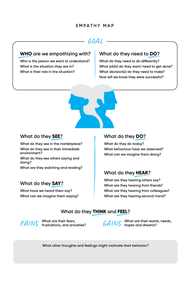
With this map, you get the insights you need to know to understand your audiences as they try to accomplish a specific goal. Don’t just assume, though. Work with your colleagues from the strategy, marketing, and even dev teams to research or conduct surveys and get reliable data. A/B testing might also come in handy here.
Flat Design, Floating Element, Flowchart
Flat design is quite common in the graphic design world — in web design, it means creating a webpage using simple layouts and two-dimensional elements. Floating elements hover (usually) on the bottom right corner of the screen, even when users scroll up and down. They’re commonly used for live chat, help, or back-to-top buttons.
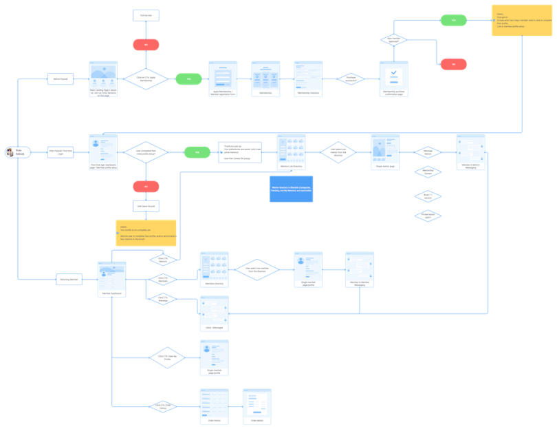
A flowchart diagram helps you and the other team members map out each possible step that users might take and what scenarios would unfold from it. Here’s what it looks like:
Grid, Gutters
You can use grids to help organize your layouts. Grids help you estimate where you will place texts, images, icons, and other elements. The spaces between each grid are called gutters, and they help you keep your elements from crashing into each other.
Heatmap, Hierarchy
A heatmap shows which area of your website gets the most user interaction. Do they engage with your main CTA or are they more interested in your hero video instead? This can help you decide if you need to revamp your layout, update the copy, or change the visuals to drive users to take the desired action.
A hierarchy allows you to show the level of importance of each element. For example, make your headline bigger with a more striking color so users pay attention to it first.
Information Architecture
Information architecture (IA) is how you organize information on the website so everything is easy to understand, easy to find, and easy to access. This is an important process when you set up your website navigation.
Journey Map
A journey map or user journey map helps you visualize the process that users go through from the very beginning until they take the desired action. This process includes whatever touchpoints they encounter; their actions, thoughts, and emotions; their problems; and their final decision.
Kerning
Part of typography and design, kerning is how you adjust the spacing between characters so the texts are easy to read, look neat, and highlight the main message.
Landing Page
A landing page is a single page that users end up on after clicking a link from email newsletters, ads, social media, blogs, or other sources — but usually not from a search engine result page. Each landing page serves one campaign, with one objective and one CTA, available for certain target audiences only.
Mockup, Modal Window
A mockup is a high-fidelity representation of your finished web design. You can use it for final approval and presentation to the stakeholders. Meanwhile, a modal window is another term for a pop-up window.
Navigation Menu
The navigation menu is that menu bar you find on top of the screen, containing your information architecture.
Onboarding
Onboarding is the initial process where you guide users to get used to your website, telling them where to find important information and how to take certain actions.
Picker, Prototype, Progress Bar
You can use a picker to let users choose a time, date, or color. A prototype is the mid-fidelity design of your web design with limited interactive representation. Prototypes are usually presented to the stakeholders before the final mockup. And a progress bar is the visual representation of an ongoing process like a download or installation process.
Quality Assurance
Quality assurance (QA) is one of the final steps before a website goes live. Both designers and developers review and test the site to see if everything runs without a problem.
Responsive Design, Readability
Responsive design is when you make your website layout look great and work well on different types of devices with different screen sizes. Readability means how easily users can read the texts on your web design.
Sidebar, Sitemap
A sidebar is a collapsible-expandable bar on the side of the screen that contains your website menu, features, or other elements.
Toggle, Tooltip
Toggle is a design element that lets users turn on or turn off a setting or feature. Tooltip is that small (i) on a page that explains what a feature does when you hover your cursor over it.
UX Writing, Usability Testing
No, you don’t need to write the website copy by yourself. You work with a UX writer who comes up with all the website content and microcopy — UX writing — and you bring them to life with the right layout and visuals. Real users evaluate your website during the usability testing process so you can collect their feedback and make improvements.
Visual Hierarchy
Yep, another hierarchy. Visual hierarchy allows you to guide your users’ attention from the most important to the least important design elements, which also guides them to take the desired action.
Wireframe, Whitespace
Creating wireframes is the early step of web design where you provide only the skeletal layouts of the web pages — no visuals, no text, and no colors. The purpose is to let the stakeholders focus only on the proposed layouts. And lastly, whitespace is the empty space in your web design, separating each design element so the interface doesn’t look jumbled together.
How to Use the A to Z of UX
Phew, that’s quite a list! But, hey, you don’t need to memorize each and every one of them.
The list is here to help familiarize yourself with the scope of work of web design, recruit the best web designers, and work with them more effectively. You can also bookmark this page so you can come back here in case you can’t remember a term or two.


