

When we think about designing a great user experience, we tend to focus on big things: the flows, the screen layouts, the content. But there’s another component to user experience that can have a tremendous impact that product teams tend to overlook. This component is called microcopy.
What Is Microcopy?
Microcopy is the term for the small bits of copy in the user interface that help users figure out how to do things. Examples include error messages, labels in a contact form, pop-up hints, among others. These words seem insignificant in the grand scheme of product design, but have a massive impact on conversions.
Why Microcopy Matters
Microcopy improves the user experience by providing clarity and guidance for users when they navigate menus, forms or pop-ups on a website. Microcopy often answers questions or addresses concerns users may have when using a software product, such as why they may need to provide certain details on a sign-up page or when their username and password are incorrect. It can also hyperlink to relevant explanation pages or resources, so users don’t have to manually leave the webpage to search for more information if a question arises.
How to Write Microcopy
Just because microcopy is small doesn’t mean it’s easy to design. Multiple factors play a considerable role in creating great microcopy, including knowing the user context, the language the users speak and the tone of voice they expect to hear. Here are just a few tips to remember when you want to make the most of your microcopy design.
Tips for Creating Microcopy
- Rewrite copy that doesn’t work well for users.
- Write copy that alleviates common user fears.
- Write helpful error messages.
- Help users make decisions.
1. Rewrite Copy That Doesn’t Work Well for Users
Good microcopy’s first and foremost property is making the interface more usable. Usability testing gives you insights into which parts of your product are clear to your users and which ones create confusion. Small changes in the user interface often make a huge difference here. So, analyze the microcopy when things aren’t working.
Start with areas in your product where you can measure user conversion. For instance, Veeam noticed through their on-page survey that many visitors were looking for a price. The term “quote” was unfamiliar to some groups of users (here, non-native speakers).

They tested changing the phrase from “Request a quote” to “Request pricing” and saw a whopping 161.66 percent increase in clicks to their lead gen form.

Takeaway: Conduct usability testing and optimize your copy based on insights gained from it.
2. Write Copy That Alleviates Common User Fears
Microcopy can assist users during their journey in your product. It can alleviate users’ doubts during registering, subscribing or buying from you. But to make this happen, you should anticipate their questions at any step of the way.
Here are a few common examples that are relevant to almost any product:
Fear of Spam
Connecting social media accounts to a product is a very common feature today. When you ask users to link their Facebook or Twitter account to your product, they should be able to take it for granted that the sign-up won’t be auto-Tweeted. At least, that’s true if you want them to have a positive experience. But many users are still afraid that their accounts will be used to send promo messages. You can craft microscopy to get out in front of this fear.
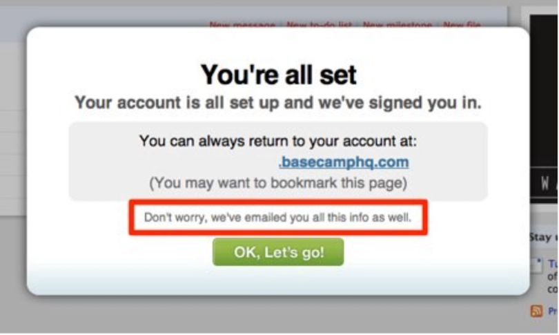
Fear of Data Loss
When your app provides essential information such as personal ID numbers, sign-in codes, or any other vital data, users tend to be afraid of losing this data when they close the dialog box, which puts a lot of unnecessary pressure on them. But microcopy can be used to mitigate this stress. Basecamp, a project management tool, reassures its users that they don’t need to worry about their data when creating a new account in the system.
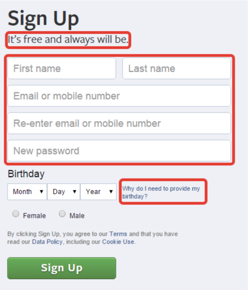
Fear of Sharing Personal Information
It might not be apparent to users why your service is asking for specific information. Some users will be afraid that their private data, such as phone numbers, will be used inappropriately (i.e., that their phone numbers become publicly available for other users). This is especially true for social network services. Here, Facebook makes it clear why its service asks for specific information.
Takeaway: Microcopy should address all potential user concerns.
3. Write Helpful Error Messages
An error state is the most frustrating part of the user journey. Nobody wants to see error messages when they use products, but they must from time to time. When something goes wrong, a user appreciates knowing exactly what happened. After all, if you aren’t explicit about the error, your users will have a hard time figuring out how to fix it.
MailChimp, an email automation service, clearly explains why users cannot log in to their accounts.
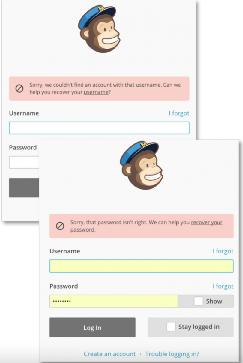
Takeaway: When you show an error message, try to explain what’s happening in simple terms so that anyone can understand the problem.
When writing microcopy for error messages, use simple language and short sentences. Users don’t want to read long blocks of texts about how to complete a single task. Ideally, you should offer one or two short sentences that clearly explain what happened and what users can do about the problem.
4. Help Users Make Decisions
Microcopy can motivate users to complete an action, especially when they have some doubts. For example, when potential customers see how large your customer base is, they are more willing to complete a sign-up procedure.
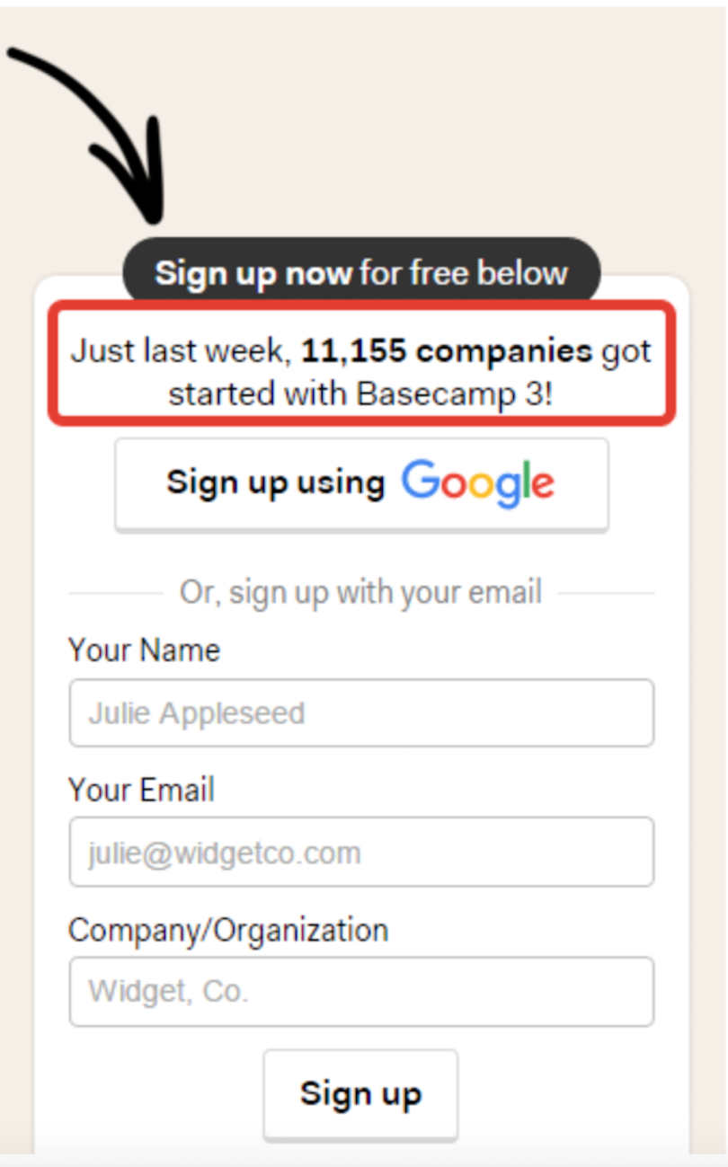
Here, Basecamp’s sign up form tells users that more than 11,000 companies use Basecamp, boosting its credibility.
Use Microcopy to Improve UX
Microcopy is more than just small bites of text. When used correctly, it becomes a powerful tool that acts as a helpful hand that guides users in their journey. The life of a design is in the detail, and when you care about your users, you write copy that helps them get the most from your product.
Frequently Asked Questions
What is microcopy?
Microcopy is the small, short text found in user interfaces that guides users through a software product. It's often utilized to answer user questions, address user concerns and inform users of errors on digital forms, pop-ups or subscription pages.
What is the difference between microcopy and UX copy?
Microcopy is writing that helps users navigate a software product and prevents roadblocks in the user journey. It is a smaller component of UX copy and UX writing. Form field labels, placeholder text and error messages like "Incorrect password" are examples of microcopy.
UX copy is writing on a software product interface that directs a user toward completing a specific product action or goal. It acts as the voice of a product and works to enhance the end-to-end user experience.
What are the benefits of microcopy?
Microcopy communicates clear and concise messages to users as they interact with a software product. It also provides clarity for user questions and concerns that may arise when using a product. This helps to build user trust, improve user engagement and increase product conversions.


