To be a successful graphic designer, a standout portfolio is essential.
It can be a challenge to catch the attention of recruiters and clients, though — they may only spend a few minutes reviewing your portfolio, so it has to make an impression from the get-go.
And while there’s no standard approach to crafting a graphic design portfolio, keeping a few expert-approved tips in mind may help you stand out from the pack.
Tips for Designing a Graphic Design Portfolio
- Specialize in a graphic design discipline.
- Show off your personality in your portfolio.
- Demonstrate your experience through case studies.
- Explain how each case study solves a problem.
- Communicate your thought process behind each project.
- Give your colleagues due credit.
- Select case studies meaningful to you.
- Advertise your work on social platforms.
- Focus on specific projects with a PDF portfolio.
- Break from popular design trends to be original.
- Keep your portfolio lean and relevant to your interests.
- Stay persistent when sharing your portfolio.
12 Graphic Design Portfolio Ideas and Tips
1. Specialize in a Graphic Design Discipline
To the broader public, the term graphic design applies to virtually any type of digital design. The design ecosystem, however, tends to be discipline-specific. Drilling down on the type of work you want to do, whether that’s creating logos or custom illustrations for a digital branding agency, designing social media cards for a marketing department, or working on an app’s iconography as part of a product team, can be crucial to landing an interview.
“I started as a designer eons ago,” Michael Sacca, former chief product officer at the design portfolio platform Dribbble, said. “The biggest mistake I made, which applies at Dribbble, is not making it clear what you do well. You might be okay at everything, but what do you excel at and where have you focused your attention? Make a decision: You can’t be everything to everyone.”
2. Show Off Your Personality in Your Portfolio
Give the hiring manager a glimpse of your personality. A short bio on the landing page of a personal web portfolio can illustrate this well. On Almost Studio’s website, multidisciplinary designer and founder Odes Roberts introduces himself in a large, sans serif font that dominates the screen. A biography on the “about” page gives viewers an immediate sense of who he is and how that identity manifests in his design ethos. “Everything real comes from honesty,” the site announces candidly.
That touch of individuality can make a difference, not only to potential clients, but to hiring partners.
“When you’re hiring, you’re not just hiring a set of hands, you’re hiring a brain, you’re hiring somebody with lived experience, everything they’re bringing with them,” Michael Johnson, executive director of design and experience at agency Happy Cog, said. “And however that comes through, that’s something that I’m definitely looking for.”
3. Demonstrate Your Experience Through Case Studies
A web portfolio is a good place to house a gallery of case studies that showcase the breadth of your work. Whether this is scratch-created or produced from a template, the important thing is that the layout matches the designer’s personality.
“There are tons of website builders out there: Webflow, WordPress or Squarespace,” Roberts said. “The main thing that needs to come out is you, not only you as a designer, but you as a person because that’s what sells what you know how to do.”
Roberts showcases work by clients such as Shutterstock and Northwestern Mutual, as well as more personal projects like MixTapes (in which he designs cover art for friends’ playlists) on a carousel because it reflects his design sensibility. “I enjoy a little bit of interactivity when I look at something,” he said. But other designers may prefer another format — a masonry grid or a long page of stacked cards — and that’s just fine, as long as it reflects their distinctive points of view.
That said, portfolio builders like Semplice can help spark ideas. Many template-based sites offer drag-and-drop workflows and options for interactive features such as page transitions, block layouts, cover effects and split grids.
4. Explain How Each Case Study Solves a Problem
It’s easy to overplay the interface gymnastics, though. When it comes to the layout, what you really want to do is arrange your work in a way that is direct, accessible and easy for a hiring manager to navigate.
“You don’t need to reinvent the wheel,” Cielle Charron, a freelance graphic designer and instructor at Portland State University, said. “I think UX and UI designers, especially, feel they need to make something completely new and completely custom. But in reality, the portfolio should be more about the work than the format itself.”
Yet the form of the written content is often its own proof of competency. Sacca recommends structuring the narrative hierarchy of each case study after author Simon Sinek’s Golden Circle model, a value proposition that leads with “the why.”
“Why does the project matter?” Sacca paraphrased it. “What problem were you solving and how did you solve it? That should be your opener.”
The framework doesn’t necessarily follow conventional wisdom, he added: “The problem isn’t that you got hired to design a dashboard. Why did you get hired to design a dashboard for the client, and what problems does it solve for the people using it?”
5. Communicate Your Thought Process Behind Each Project
Roberts is unequivocal in his belief about the function of design: “Design is not art. Design is solving problems. Art is for whatever you do outside of design.”
Not all designers share this view, but many will tell you that treating a portfolio like a pristine art object sends the wrong signal.
“We don’t hire designers for their technical skills,” Sacca said. “The medium in which you create — Sketch, Figma or Photoshop — doesn’t matter as long as you’re open to learning and adjusting to the company’s method. Tools can be learned: the deciding factor is how you approach problems and solve them.”
While showing off your mastery of design tools is helpful, it doesn’t get at the core of who you are as a graphic designer. Explaining how you address different challenges and tasks is just as important as proving that you can deliver an eye-catching final product.
“From a hiring perspective, you want to know the kind of person that you are hiring,” Charron said. “Not just that they can make beautiful work, but how do they arrive at that? What is their process like? So thinking about how in a portfolio you can show not only the glossy, beautiful final product, but also the messy bits in between.”
For each featured project, this might include a brief description that outlines the goals of a creative brief or project assignment, describes the designer’s role, and includes web pages, sketches, wireframes, user testing studies and other visual artifacts that trace the narrative of the project.
“Explain what your role was in the project and how you felt about it,” Roberts said. “Two to three paragraphs, max. Everything else should just be a visual of how you actually work.”
6. Give Your Colleagues Due Credit
Design doesn’t operate in a vacuum, and failure to acknowledge one’s colleagues can leave a smudge on an otherwise strong portfolio. In fact, it’s one of Johnson’s biggest pet peeves.
“If you have been working at an agency or studio or whatever, you had partners in this work,” he said. “You may have had a strategist or researcher help you. You had a creative director, an art director, who might have been guiding the work. Anybody who is involved in the work deserves a mention and it can be terribly frustrating and feels almost deceptive when you get somebody in a room who has misrepresented their contribution to this great, big beautiful thing when what they did was, maybe, put the style guide together. And it can harm your reputation.”
7. Select Case Studies Meaningful to You
The flashiest portfolios don’t always stand out the most to recruiters, according to Sacca. Overwhelmed hiring managers tasked with scanning a high volume of portfolios may be drawn by big names — say, Nike or Adidas — but it’s often the writing embedded in case studies that sets candidates apart.
While some light name dropping might get you noticed or help you slip past screeners, Roberts agrees that it’s not likely to set you apart in the end.
“Young designers get really caught up in big names, like, ‘Oh, I need to have an Apple or Microsoft,’” Roberts said. “But I think what’s more important is how you feel about the design that you’re creating and putting up there. And as you’re curating, even if you’re just starting off, show me the stuff that you care about, even if it’s a mom-and-pop art gallery and you’re just doing signs. Why do you like it? Why is it important to you?”
8. Advertise Your Work on Social Platforms
Sacca calls social platforms like Dribbble, Behance and Instagram a “front door to opportunities for freelance or full-time work.” Though they don’t replace a personal website hosted on a designer’s own domain, they can help you get your work in front of chief design officers and design leads, and reveal a snapshot of your evolving style.
Design agency websites can also offer a good model for portfolio building.
“Agencies can often make something look a little bit overblown or self important,” Johnson said.” But, at the same time, a lot of consultancies are really good at selling design work and putting together some very good case studies. Pentagram’s always the obvious example, but BSM Consulting, Wolff Olins — agencies that lead with the visual to give you the hook and bring you in — can be good models.”
9. Focus on Specific Projects With a PDF Portfolio
While PDF files have size constraints and animation and video are impossible to convey, PDFs offer “a very quick, almost holistic evaluation of a candidate,” Johnson said. “I know they’re a bit of a boogeyman within the web profession, like, ‘All PDFs are bad,’ but in some cases it’s fine.”
‘Here’s what I made for you and why I’m sending it to you.’
Charron, who in addition to her freelance design work and teaching duties runs a risograph print studio called Secret Room Press, agrees that PDFs can be effective, largely because they offer greater control over the viewing experience and can be produced quickly when an open position has a short hiring window.
10. Break From Popular Design Trends to Be Original
Be careful of aping the latest fads.
“A lot of designs are trendy, so you can be like, ‘Oh, I just look at Pinterest and mimic what I see,’” Roberts said. “I can immediately pick that out.”
In fact, according to Johnson, it’s work that flies in the face of design trends that often leaves the strongest impression: “You want to know that somebody knows the rules well enough to execute them, they understand conventions, etc., but they also know how and when to break them. So there’s this sort of awareness and consciousness of what’s appropriate in a given context.”
11. Keep Your Portfolio Lean and Relevant to Your Interests
A portfolio submitted as part of a job application should be ruthlessly curated, Charron said — more of a highlight reel than a compendium.
Roberts said any more than seven or eight large case studies “is a little too much.” (Five to six projects is a good target). And, in some ways, big, ambitious portfolios have become passé.
Still, you want to include a large enough range of work to show you’re not a one-trick pony. Let’s say you’re responding to a brief from a children’s museum calling for a vibrant color palette. A thoughtful case study might show how you adapted your style — gothic black lettering and faux- metal logos — to suit the client’s needs.
Work that doesn’t make the cut in your personal web portfolio can still be useful on social sites.
12. Stay Persistent When Sharing Your Portfolio
Above all, it’s important to see your portfolio as a work in progress, not a measure of your self-worth.
“I have a lot of these conversations with students who are like, ‘I’ve been out of school for a few months, and I’ve sent so many portfolios, and I’ve had so many interviews, and I’m still just out there struggling,’” Charron said. “It’s good to be aware that’s totally normal. You could have a beautiful portfolio, and maybe the company just hired somebody else already and the timing was wrong. You can’t get down on yourself. It just kind of comes down to persistence.”
15 Graphic Design Portfolio Examples
Now that we’ve covered the essentials for creating a graphic design portfolio that sets you apart, feel free to glean more inspiration from the examples below.
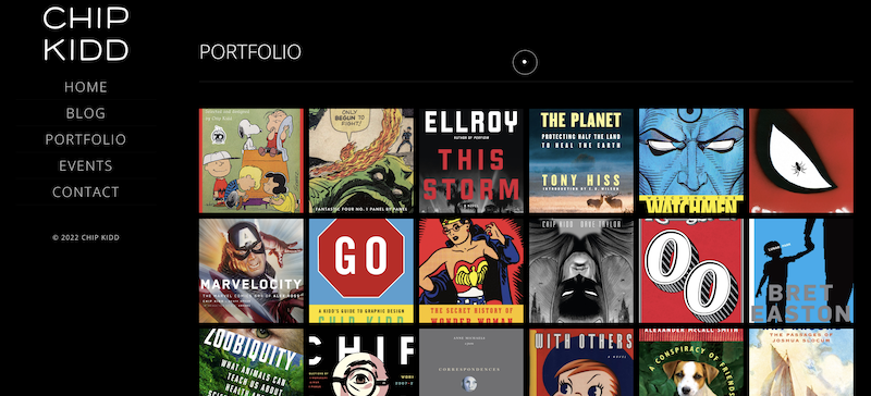
1. Chip Kidd
Famous for his T-Rex design on the Jurassic Park cover, Chip Kidd doesn’t need to introduce himself on his website, choosing to let his works speak for themselves. Kidd’s portfolio page showcases the range of colors, designs and styles he has incorporated into his book covers over the years. His website is easy to interact with and avoids any glamorous features, allowing users to take in the breadth of his work uninterrupted.
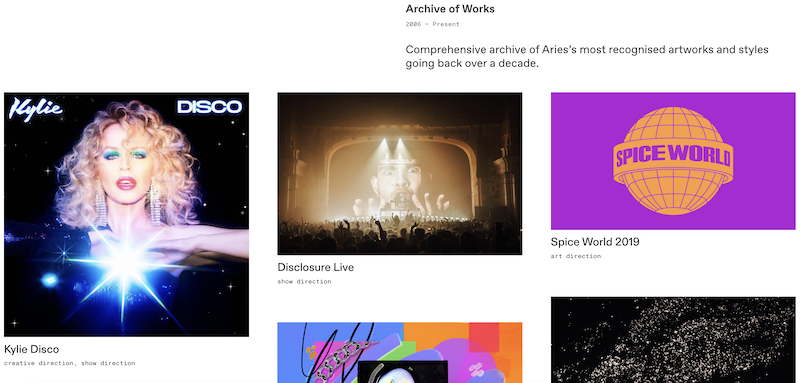
2. Aries Moross
As a creative director and founder of Studio Moross, Aries Moross has developed a diverse portfolio. Their work archive consists of a colorful collection of paintings, digital art and other projects, with short descriptions giving readers some context for each case study. While the page includes work as far back as 2007, the projects are spaced out accordingly to prevent the page from feeling overcrowded.
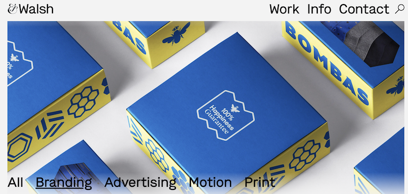
3. &Walsh
Founded by Jessica Walsh, New York-based &Walsh organizes its expansive portfolio into a group of tabs that are easy to navigate. Website visitors can easily find specific types of work, whether it be advertising campaigns or print projects. When users click on an image, they also can read more information about the client, case study and the roles different &Walsh members took on for each project.
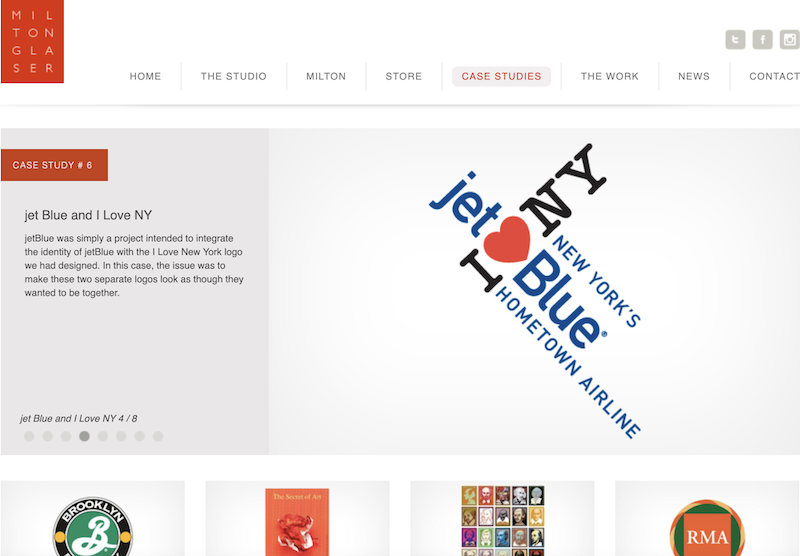
4. Milton Glaser
Milton Glaser might be best known for designing the “I ‘heart’ NY” t-shirt, but he doesn’t rely on name recognition alone to spread his brand. He has maintained a professional portfolio that demonstrates his strong foothold within the industry with only 12 examples. Each case study includes a description to keep readers informed, as well as accompanying photos that run on autoplay. The result is a clean design that still manages to capture Glaser’s decorated career.
5. Anderson Newton Design
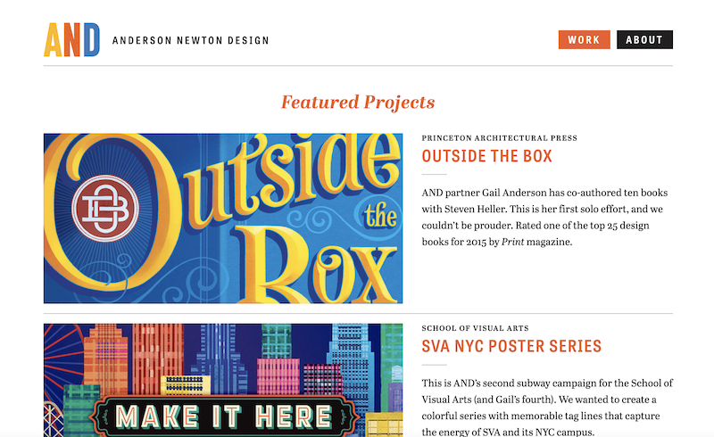
Founded by Gail Anderson and Joe Newton, Anderson Newton Design shows that a simple layout can go a long way in organizing a collection of works. The company’s portfolio page highlights three featured projects at the top, with additional projects below. Users can sort through these projects by selecting a category at the bottom left, singling out relevant case studies. This basic visual feature makes the page very user-friendly.

6. Pentagram
Pentagram is a multidisciplinary design agency that works with 22 partners across Europe and the U.S. Despite accumulating a host of clients, Pentagram keeps its portfolio accessible by allowing users to group projects by the type of client or the type of work. Each case study comes with a detailed description, high-definition images and videos, giving users plenty of context while engaging them with attractive visuals.

7. All Time Design
All Time Design is a graphic design service that demonstrates its abilities through a well-constructed portfolio. A slate of tabs near the top of the company’s works page enables users to home in on the type of projects they’re curious about. Even though All Time Design doesn’t include written descriptions for projects, some of their case studies tell visual narratives by depicting their designs in action via motion videos.
8. Happy Cog
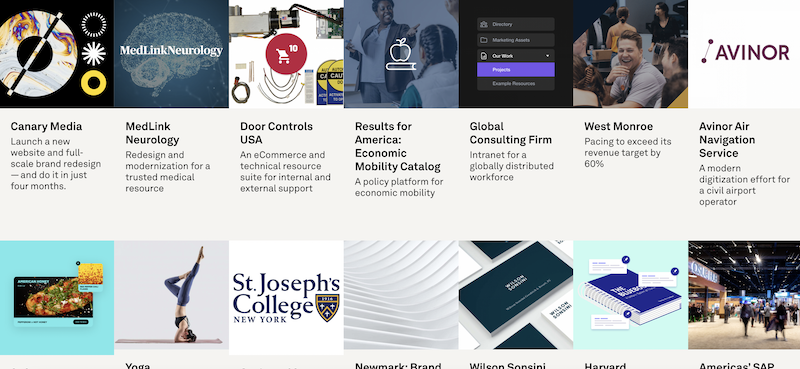
Happy Cog is another design agency that breaks down its in-depth portfolio into digestible visuals. The company presents its numerous case studies in rows, with each project being introduced with a bold name for the client and regular font giving a quick overview. In addition to photos, each case study is accompanied by detailed descriptions explaining the problems of each client and how Happy Cog delivered solutions.
9. Lauren Hom
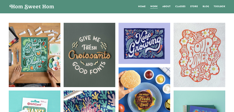
Lauren Hom’s website conveys a very unique personality, which shines through in her collection of works. Hom’s portfolio page contains projects that not only cover a range of industries, but also glow with a spectrum of bright colors. Hom mixes her graphic design skills with her culinary interests as well, choosing projects that meet at the intersection of food and art. This is a picture-perfect example of a portfolio that enhances a designer’s personality and vice versa.
10. Maria Marie
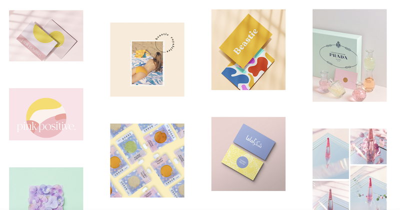
Marioly, founder of Maria Marie, expresses a distinct personality and aura through lighter colors that keep her site easy on the eyes. The agency’s portfolio goes for quality over quantity, displaying images that match the gentle color palette of the website. As a result, Marioly reinforces the brand of Maria Marie, keeping the agency’s portfolio focused and consistent with the site’s written and visual messaging.
11. Shawna X
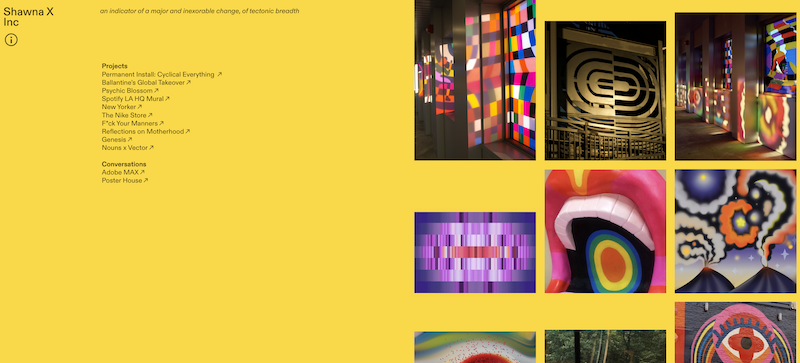
Shawna X communicates a bold and vibrant personality through a website with a mustard-yellow background, and her portfolio matches this energy. Each case study comes with a short description up top, but the larger images and videos draw users’ attention to the rich aesthetics of her projects. Shawna X’s portfolio only includes 10 case studies, confirming that a small group of powerful projects is all that’s needed to captivate site visitors.
12. Lance Wyman
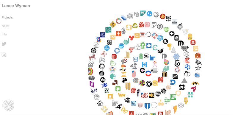
Lance Wyman’s site depicts a clear specialization in logo design, and his portfolio page adds a fun touch to his experience. Wyman’s collection of logos reveals itself in a spiral pattern, starting at the center before rippling out into wider circles. Wyman may not include much context for each logo design, but the basic yet eye-popping layout of his portfolio page leaves viewers wanting to get to know the person behind the website.
13. MetaDesign
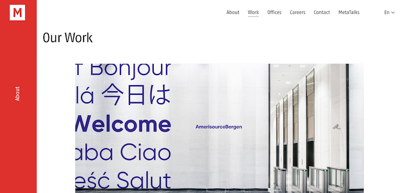
MetaDesign is an agency that presents its international portfolio in a standard format of rows of images. Users can click on an image to read more about the projects, including the challenge each client brought to MetaDesign and how the agency developed customized solutions. For some of its branding and UX design projects, MetaDesign also provides pictures of the final design in action on mobile or desktop devices.
14. House Industries
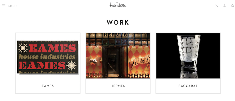
House Industries is a design agency that dabbles in various creative disciplines, especially typography. The portfolio page remains unnoticeable with a plain white background, placing the spotlight on the case studies. Each case study comes with a short description of the fonts employed, as well as examples of the fonts and images of the final products. This site opts for a cleaner layout, enabling the case studies to bring the portfolio page to life.

15. Pavlov Visuals
Pavlov Visuals is a creative firm run by Ryan Dean Sprague. The agency breaks up its portfolio into two tabs, showcasing work done in the areas of illustration and merchandise design. While Sprague has compiled a collection of professional projects, he also sprinkles personal projects into his portfolio. As a result, Sprague demonstrates his skill in diverse styles while instilling more character into his work archive.


