Back in 2018, the ride-sharing app Uber was looking for a fresh start. Embroiled in controversy, they unveiled a new logo on Adweek in an apparent attempt to frame themselves as a more approachable brand.
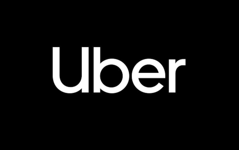
The new logo — a collaborative effort between the brand consultancy Wolff Olins, Uber’s brand experience team, and Jeremy Mickel, founder of MCKL, a type foundry and design studio — replaced a backwards “C” symbol at least one imaginative critic charged resembled an “asshole.” On a black background, the word Uber was spelled out with a capital “U” followed by white lowercase letters. The soft curves of the typeface broke from the brutalist, all-capitalized logo of Uber’s past and paid homage to the geometric san serif fonts used in traffic signs.
The logo was being called on to do some heavy lifting. Guiding the redesign were three tenets gleaned from audience research: “embrace black”; “invest in a wordmark, not a symbol”; and “bring back the U.” These undergird a nine-element design system reflecting the ride-sharing giant’s transition from its publicly maligned past to a friendlier future, one in which the company would refocus its concern on the welfare of riders and drivers.
“They were like, ‘Oh, we’ve got to do a new logo. First of all, we have to change our image. Second of all, we’re really suffering in terms of trust.’”
“There was a lot of bad feeling about them taking advantage of their drivers,” Caroline Jerome, chief creative officer and partner of the New York-based branding and marketing agency TBGA, explained to me. “When everything went into the — a bad word is coming to my mind — they were like, ‘Oh, we’ve got to do a new logo. First of all, we have to change our image. Second of all, we’re really suffering in terms of trust.’”
Jerome calls logos “the basic visual unit[s] of brand[s],” and says they are integral to establishing a company’s identity — or reinventing it after reputational damage. In Uber’s case, the wordmark became the anchor of a broader public relations strategy as they prepared to go public. The “U” shape served as the compositional blueprint for advertising materials and “safety blue” was added to the app’s color palette to project the company’s evolving identity.
Whether the rebrand has led to a genuine shift in Uber’s public perception is open to debate, but designers like Roy Kim at Google applaud the logo design as a step in the right direction.
More generally, the case speaks to an important question: When is the right time for a new logo? Whether poised for a public exit, trying to signal a new stage of maturity or seeking to squelch the fire of a public relations fiasco, companies often refresh their logos during times of transition. When done right — and justified by a company’s corresponding actions — a logo can be the bridge to a new identity.
Here Jerome offers five actionable tips for companies poised to make that step.
5 Tips for Revamping Your Logo
- Consider a wordmark.
- Use scalable vector graphics to create a crisp, adaptable design.
- Make sure the logo is appropriate to the brand.
- Start with a dynamic, digital-first mentality.
- Use consistency to convey trust (but understand what consistency means).
Consider a Wordmark
Like Uber, many tech companies are moving to wordmarks (also called logotypes) to define themselves. Unlike a brand mark — the Twitter bird, for instance — a wordmark uses a freestanding company name or product name to serves as a visual symbol. Lettermarks, which use a company’s acronym as the symbol, such as the British Broadcasting Corporation’s “BBC” logo, are also gaining ground.
“Having the actual name of the brand in a logotype is extremely helpful for conveying information that, hopefully, is singeing that brand on your retina and then your brain,” Jerome said.
“A classic example of a [lettermark] that is memorable would be the IBM logo, which they haven’t changed for a long time, that was designed, of course, by one of the great designers of the twentieth century, Paul Rand,” she added.
A typographical emblem has several advantages over a brand mark, according to a Design Crowd blog, including retaining the ability to be registered as intellectual property and allowing flexibility in adjusting “font heights, line weight and kerning [the space between letters].”
“Having the actual name of the brand in a logotype is extremely helpful for conveying information that, hopefully, is singeing that brand on your retina and then your brain.”
It also minimizes the risk for brand confusion.
“When IBM services pivoted from mechanical punch cards to computers, CEO Thomas Watson asked ‘Do you think it’s possible that IBM could look like the kind of company it really is?’” Jerome said. “Prior to Rand’s involvement, IBM was applying a combination of a globe logo and a Beton Bold block letter logotype without much consistency.” Rand customized the letters by drawing simple, modernist letterforms, which, in 1972, evolved into today’s well-known striated logo.
The logo has endured over time, Jerome said, not only for its craft, but because it is well positioned for the digital age in which logos live on small screens, alongside many others.
“We used to live in a primarily print world, so you might apply a logo drawing to the side of an airplane for corporate identity, or the side of a van, and then of course letterhead. Now we have to look at it on on different devices. And we have to look at it in digital campaigns ads and make sure that whatever detail is involved in the logo, we can see it, and it’s reading.”
Use Scalable Vector Graphics to Create a Crisp, Adaptable Design
While there are no hard and fast rules to logo design, keeping the shape of a mark simple and monolithic is often effective. A discrete form is easier to scale to different sizes and tends to perform well across digital assets, without the need to tamper with the pictorial or typographical elements.
“If it’s a good logo, I’m not building the assets from scratch. I can put it in different places and it naturally fits,” Jerome said.
As part of his work for companies, such as IBM, ABC, UPS and Westinghouse, Rand developed a test for this.
“When something looks like you’re looking at it through a screen, that’s amateur hour.”
“He said, if you can blur your eyes, so that you can’t really see the mark but you can still distinguish what it is, that’s the sign of a strong logo,” Jerome told me. “That still applies in the digital realm.”
To ensure a logo appears at unpixelated and high resolution wherever it surfaces, Jerome recommends designing it as a vector graphic, which defines lines and curves on a Cartesian plane. Unlike raster graphics such as JPEGs or PNGs (also called bitmap graphics), which are based on photographic pixels, vector graphics are easy to render at any size without losing resolution. Points determine the direction of the vector path; and properties such as color, shape, text, curves, filter effects and stroke thickness can be built into the path.
A scalable vector graphic (SVG) image can be created inside drawing software such as Adobe Illustrator and animated or embedded with audio effects. Ultimately, the sharpness of a logo speaks to a brand’s credibility and SVG graphics help ensure it.
“When something looks like you’re looking at it through a screen, that’s amateur hour. And brand consistency equals client trust,” Jerome said.
Make Sure the Logo Is Appropriate to the Brand
Lately, brands have taken more liberties in straying from the orthodoxy of logo style guidelines.
To celebrate holidays like Bastille Day, or birthdays of influential artists and thinkers like Keith Haring and Maria Montessori, Google has created more than 4,000 doodles — small embellishments to their homepage logo. It’s a tradition that began when founders Larry Page and Sergey Brin commemorated their 1998 trip to the Burning Man festival with a stick figure cleverly installed behind Google’s second “o.”
The Whitney Museum of American Art’s logo, meanwhile, has a responsive typographical design, which grows and shrinks as users scroll the website or adjust the size of a browser window. And in recognition of Pride Month, many companies have eschewed the color palettes of their style guidelines in favor of rainbow-colored logos that are intended to express support for the LGBTQ community.
“Prior to the last seven to 10 years, you didn’t want to violate the style guidelines in any way,” Jerome said. “Don’t stretch it, don’t replace the font. There are still those rules, but we have more flexibility when we’re creating assets in the digital space. If you’re smart, and you’ve got a great design, you can have a little fun there.”
Yet, the decision to stray from the rules — and when to do it — should reflect the values of a brand.
Jerome said some of TGBA’s more stylistically conservative clients, such as Level Legal and Raytheon Technologies, might never embellish their mark out of the desire “to be stalwart and recommendable at all times.”
“Digitization allows us to be more experimental,” she said. “But it has to be appropriate for the brand.”
Start With a Dynamic, Digital-First Mentality
In recent years, as websites have become the primary destination for many customers to engage with marketing messages and products, color stories and animation have taken center stage as topics of discussion during preliminary creative meetings. A logo is no longer seen as a static entity, but part of an integrated system that, when well-conceived, tells a unified story.
“With the digital form, this mashup between brand, headline, copy, supporting copy — they all hit at the same time,” Jerome said. “And with such speed, they all have to be working together and considering each other. It’s almost a new form.”
The dynamism of that form can manifest differently depending on where a logo surfaces. When a user opens the Uber app from a mobile phone, for instance, the action triggers an animated sequence with the logo’s letterforms morphing into parallel lines — a sort of invitation to the open road.
“With the digital form, this mashup between brand, headline, copy, supporting copy — they all hit at the same time . . . It’s almost a new form.”
TikTok’s seemingly out-of-focus logo, resembling an eighth note, reflects a similar dynamism in its use of color, according to Jerome. Slightly out-of-sync color overlays have a semi-transparent quality that would be nearly impossible to produce in print, especially over a black background, and suggest the form of its content — video created by users.
“How do you build a brand that embraces the diversity of the community that TikTok wants to speak to?” she asked, rhetorically. “How do you reference the movement that’s inherent in TikTok? Rather than blurry, I would say there’s a movement, a dynamic quality to the logo.”

Use a Consistency to Convey Trust (but Understand What Consistency Means)
At its core, a logo is about establishing trust — and that goes back to a company’s culture and the quality of the products and services it delivers to its customers.
When Google created new logos for Google Workspace, it was widely criticized in the design media for what some saw as blasphemy: “replacing icons that are familiar, recognizable, and in Gmail’s case iconic, if you will, with little rainbow blobs that everyone will now struggle to tell apart in their tabs,” as Devin Coldeway, writing for TechCrunch, put it.
But Jerome sees Google’s new logos differently — an attempt to deliver a consistent, uniform look — one that is direct, friendly, and rooted in elemental primary and secondary colors — across applications. Whether you’re using Gmail, Calendar, Drive or Meet, you’re reminded you’re using Google, and the idea, Jerome told me, is you will have more trust in a known entity than a unknown entity.
Whether or not that strategy will work, may depend more on Google’s actions than its new logo.
“You can’t have a good logo and expect that to define your personality,” Jerome said. “It’s been said that would be like buying a hat and expecting that would say who you are.”
“You have to think about design at a very high level because you don’t have a handshake to gloss over the imperfections that you might have online.”
Nevertheless, the decision seems to stem from a desire to make customers feel secure. To return to the sartorial metaphor: “In all these different costumes, people aren’t going to trust you; they're not going to know who you are,” Jerome said. “You have to think about design at a very high level because you don’t have a handshake to gloss over the imperfections that you might have online. So the logo becomes the most common parlance for your corporate identity.”
It’s worth noting that people don’t like when brands try on new looks. In 2006, Kodak changed their iconic mark — a red-and-yellow symbol that can be read as a large “K” or a camera shutter — to a simple red wordmark with a modern font. The idea was to signal a transition away from a photographic medium developed in another era; to say, “Hey, we’re relevant. We’re not stuck in the past because the past is gone,” Jerome said.
It didn’t work out so well. In 2016, Kodak brought back the earlier logo, designed by Peter Oestrich and adopted in 1971, with a slight twist: reorienting the word “Kodak” vertically rather than horizontally, and updating the font. Customers’ trust, it turns out, was rooted in the consistency of a logo people had come to recognize and associate with Kodak across the emblem’s 35 years as the standard.
The lesson seems to be this: be consistent, but understand what that means. For Kodak, a logo that had long been the standard was what people had come to trust. Google is banking on their new rainbow-colored theme, consistent across their design system, to do the same.