Violin plots are a statistical method of plotting numeric data that combine a boxplot with a kernel density plot. In the violin plot, we can find the same information as in the boxplots:
- Median: A white dot on the violin plot.
- Interquartile range: The black bar in the center of a violin plot.
- The lower/upper adjacent values: The black lines stretched from the bar defined as
first quartile — 1.5 IQRandthird quartile + 1.5 IQR, respectively. These values can be used in a simple outlier detection technique, Tukey’s fences. Points outside this range are considered outliers using Tukey’s rule.
A key advantage of the violin plot over the boxplot is its ability to show the full distribution of data. This is of interest, especially when dealing with multimodal data, i.e., a distribution with more than one peak.
What Is a Violin Plot?
A violin plot depicts numerical data by combining both boxplots and kernel density plots. It shows the entire distribution of data, which can be useful when working with multimodal data.
How to Implement a Violin Plot in Python
In this article, we’ll use the following Python libraries
seaborn    0.9.0
numpy      1.17.2
pandas     0.25.1
matplotlib 3.1.1
We start by defining the number of random observations we’ll draw from certain distributions, as well as setting the seed for reproducibility of the results.
N = 10 ** 4
np.random.seed(42)
Then, we define a function plotting the following:
- A histogram with a kernel density estimate (KDE).
- A boxplot.
- A violin plot.
We will use this function for inspecting the randomly created samples.
def plot_comparison(x, title):
    fig, ax = plt.subplots(3, 1, sharex=True)
    sns.histplot(x, kde=True, ax=ax[0])
    ax[0].set_title('Histogram + KDE')
    sns.boxplot(x, ax=ax[1])
    ax[1].set_title('Boxplot')
    sns.violinplot(x, ax=ax[2])
    ax[2].set_title('Violin plot')
    fig.suptitle(title, fontsize=16)
    plt.show()
Standard Normal Distribution in Violin Plots
We start with the most basic distribution, standard normal. First we’ll draw 10,000 numbers at random and plot the results.
sample_gaussian = np.random.normal(size=N)
plot_comparison(sample_gaussian, 'Standard Normal Distribution')
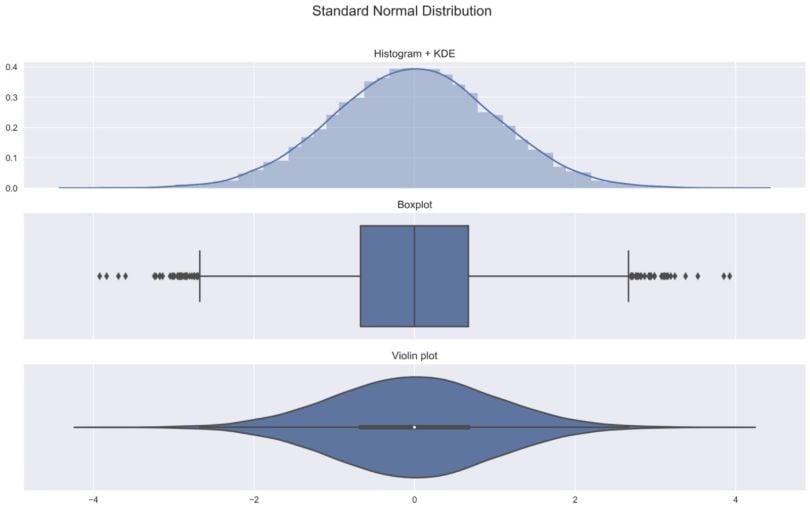
Some of the observations we can make:
- The symmetric bell shape of the histogram confirms the normality of the distribution.
- In the histogram, we see the symmetric shape of the distribution.
- We can see the previously mentioned metrics — median, IQR, Tukey’s fences — in both the box plot as well as the violin plot
- The kernel density plot used for creating the violin plot is the same as the one added on top of the histogram. Wider sections of the violin plot represent a higher probability of observations taking a given value; the thinner sections correspond to a lower probability.
I believe that showing these three plots together provides a good idea of what a violin plot is and what information it contains.
Log-Normal Distribution in Violin Plots
In the second example, we consider the log-normal distribution, which is more skewed than the normal distribution.
sample_lognormal = np.random.lognormal(size=N)
plot_comparison(sample_lognormal, 'Log-normal Distribution')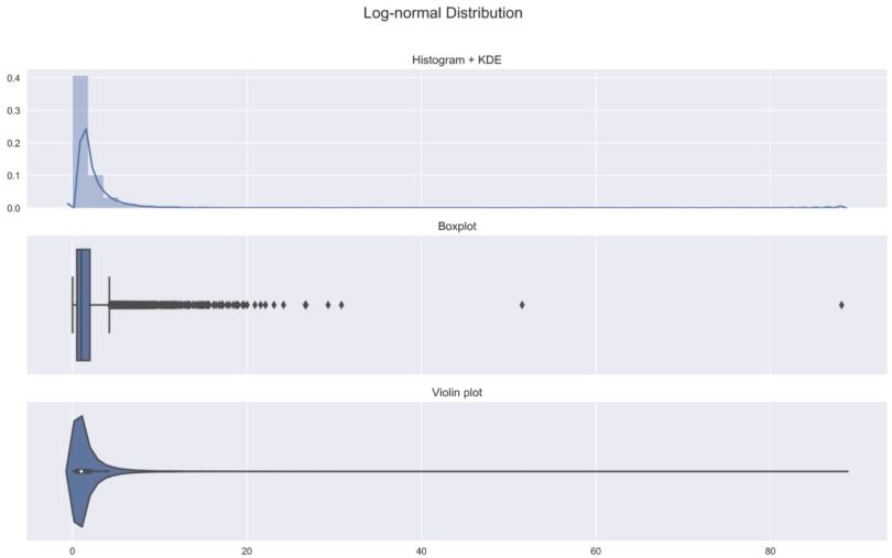
As a note, violin plots can reveal skew more effectively than boxplots.
Bimodal Distribution in Violin Plots
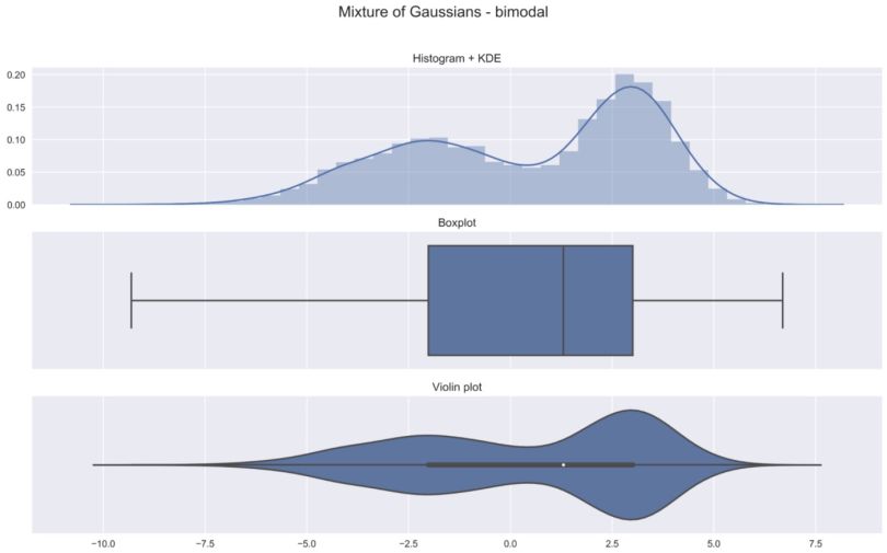
In the previous two examples, we’ve already seen that the violin plots contain more information than the box plot. This is even more apparent when we consider a multimodal distribution. In this example, we create a bimodal distribution as a mixture of two Gaussian distributions.
Without a density plot, the presence of two peaks in the distribution would be difficult to detect.
Violin Plots Advanced Usage
Violin plots are often used to compare the distribution of a given variable across some categories. We present a few of the possibilities below. To do so, we load the tips dataset from seaborn.
tips = sns.load_dataset("tips")In the first example, we look at the distribution of the tips per gender. Additionally, we change the structure of the violin plot to display the quartiles only. Some other possibilities include point for showing all the observations or box for drawing a small box plot inside the violin plot.
ax = sns.violinplot(x="sex", y="tip", inner='quartile', data=tips)
ax.set_title('Distribution of tips', fontsize=16);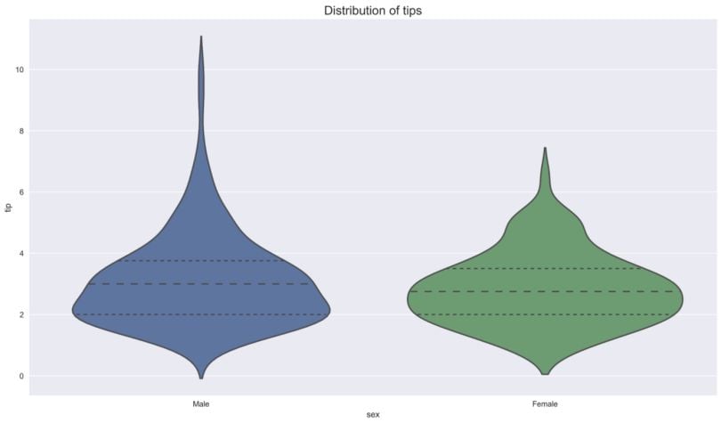
We see that the overall shape and distribution of the tips are similar for both genders — the quartiles are very close to each other— but there are more outliers in the case of males.
In the second example, we investigate the distribution of the total bill amount per day. Additionally, we’ll split by gender. Immediately we see that the largest difference in the shape of the distribution between genders happens on Fridays.
ax = sns.violinplot(x="day", y="total_bill", hue="sex", data=tips)
ax.set_title('Distribution of total bill amount per day', fontsize=16);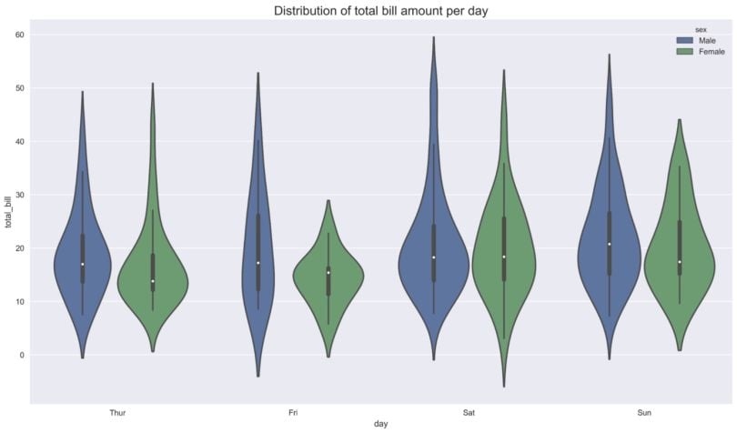
In the last example, we investigate the same thing as in the previous case, however, we set split=True. By doing so, instead of eight violins, we end up with four. Each side of the violin corresponds to a different gender.
ax = sns.violinplot(x="day", y="total_bill", hue="sex", split=True, data=tips)
ax.set_title('Distribution of total bill amount per day', fontsize=16);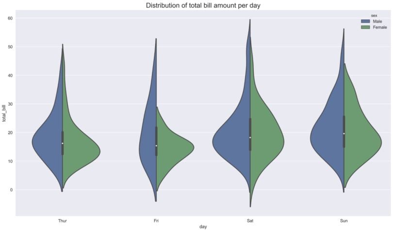
This article covered what violin plots are, how to interpret them, and how they compare to boxplots. One last remark worth making is that the boxplots don’t adapt as long as the quartiles stay the same. We can modify the data in a way that the quartiles do not change, but the shape of the distribution differs dramatically. This shows that while boxplots summarize quartiles, they can miss meaningful differences in distribution shape that violin plots reveal.
Frequently Asked Questions
What is a violin plot?
A violin plot is a data visualization that combines a boxplot with a kernel density plot to show the full distribution of numeric data.
How does a violin plot differ from a boxplot?
While a boxplot summarizes data using quartiles and median, a violin plot also displays the data’s probability density, making it easier to spot multimodal patterns.
What do the shapes in a violin plot represent?
Wider sections of the violin indicate a higher concentration of data points at that value, while narrower sections show lower concentration.


