In this article, I’ll discuss what neumorphism is, how to get started on creating basic neumorphic elements and the limitations of this design trend.
What Is Neumorphism?
Neumorphism combines minimalism while giving a sense of three-dimensions in the form of buttons and other elements. Neumorphic elements sit right on top of the background surface and are usually a raised shape made from a very similar material to the background. The color of the element is either the same or subtly different from the background surface.
For an example of neumorphic design, check out this Dribbble shot by Andrew Mamontov:
What Is Neumorphism?
Neumorphism can be thought of as a modern-day iteration of the skeuomorphism design style, a type of interface that resembles real buttons and interactive elements. Skeuomorphism design was implemented in early models of computers and smartphones — think buttons made to look glossy and raised — though it became less popular as minimalist and flat design styles entered the design mainstream. While skeuomorphism dwindled, Alexander Plyuto designed an interface in 2019 that showed how modern applications would look if skeuomorphism were still alive and well.
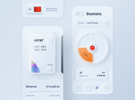
Plyuto’s Dribbble shot illustrating a contemporary take on skeuomorphism went viral, so much so that the concept became coined as neumorphism (a portmanteau of “neo” and “skeuomorphism”) in the comment section of an article by UI designer Michal Malewicz.
Neumorphism marries skeuomorphism and material design by implementing a minimalist approach while giving a sense of three-dimensions in the form of buttons, dials and important items on-screen.
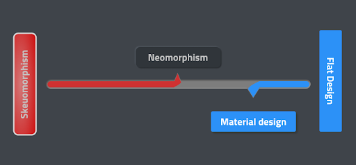
But to get the full picture of what neumorphism actually is, we need to first go into more detail on skeuomorphism, flat design and material design.
What Is Skeuomorphism?
Skeuomorphism is a term used to define an interface that mimics real-world items. It had a huge impact on the early days of computing because it made interfaces more familiar and intuitive for users.
Skeuomorphism also served as a bridge between the physical and the digital world. The buttons were purposefully made to look like real-life buttons. However, with the popularity of smartphones, people became accustomed to the graphical user interface. Skeuomorphism played less of a role in UI design as time progressed. The three-dimensional elements became unnecessary and made the UI look cluttered. This led to the rise of flat design.
What Is Flat Design?
Flat designs moved away from the three-dimensional elements of skeuomorphism, avoiding gradients, shadows and textures to focus on user experience (UX) with the use of simple flat elements and flat solid colors.
Apart from flat design’s aesthetics, the main benefit is its implementation. It is far easier to scale flat design elements and make them responsive over different screen sizes.
However, flat design is limiting at times and may make designs too minimal and less intuitive. Therefore, an improved and evolved form of flat design came to the fore: material design. Material design makes the use of animations and gravity; it has a sense of physics. In other words, material design uses skeuomorphic principles subtly by implementing shadows and z-index to give a sense of elements being on top of each other.
Neumorphism vs. Material Design
Both material and the neumorphic design make use of the concept of elements being on top of each other. However, there is a major difference in how the two design approaches implement that idea. The image below demonstrates how the elements sit on top of each other in neumorphic and material design.
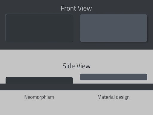
Material elements float on the background surface, which is achieved with the help of one shadow that gives an effect of flotation. The element and the background surface are seemingly separated.
As for neumorphic elements, they sit right on top of the background surface. They’re usually a raised shape made from a very similar material to the background. The color of the element is either the same or subtly different from the background surface.

How Can I Create a Neumorphic Effect?
I used two shadows: a negative and a positive drop-shadow on a slightly off-black background. This effect does not work on a completely black or white background since it uses dark as well as light shadows.
I used the same color for the background as well as the element. The only thing that defines its shape is its shadows. I used two drop shadows, one on the top left and one on the bottom right each of different color values. In this example, the light is coming from the top left corner. Hence, I used a light shade of gray for the shadow on the top left and a darker shade of gray for the shadow on the bottom right of the element.
Here’s a CSS code for using multiple box-shadows.
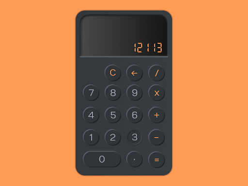
{box-shadow: 4px 4px 5px #191B1E, -4px -4px 5px #5F6772;}I used the same concept to multiple elements to create a layout for a neumorphic calculator. You can check out the file on Figma.
What Are the Limitations of Neumorphic Design?
While neumorphic design is aesthetically pleasing, it certainly has a lot of limitations.
The subtle differences in the color value make it look minimal and aesthetically pleasing but having a low contrast ratio presents an accessibility issue. While it’s possible to achieve different states of buttons such as active, pressed and hovered with the use of different types of shadows, you might not be considering users who are blind or who have low vision. Moreover, it’s a major challenge to achieve a visual hierarchy by visually differentiating elements based on their levels of importance without compromising accessibility. Neumorphism might compromise UX for aesthetically pleasing UI if not done correctly.
With that being said, designers have been coming up with new design ideas that expand on the concept of neumorphism every day. I’m excited to see how this trend will change over time.
Frequently Asked Questions
What is neumorphism?
Neumorphism, a portmanteau of "neo" and "skeuomorphism", is a UI design style that combines skeuomorphic and flat design. It can be applied to interactive interface items like buttons and dials to give them a three-dimensional, realistic effect but with a minimalist focus.
What is the neumorphism effect?
Neumorphism often utilizes a monochromatic color palette with subtle lighting and shadows to achieve its visual effect. By doing so, on-screen items can look as if they are blended with the background and slightly popping out or dented in, making it resemble a realistic surface.
What are the advantages of neumorphism?
Neumorphic design can make interfaces look and feel more natural, creating an increased sense of depth and immersion for users. Neumorphism can also be more visually gentle, as there is no major contrast between on-screen items.


