

CSS (cascading style sheets) works in conjunction with HTML and is directly responsible for dictating color, background, text color, font, positioning and additional features to the web browser. CSS is a key component of web development.
CSS Definition
CSS, or cascading style sheets, is a styling language used to control the visual presentation of a webspage. It uses a rule-based approach, where the developers select HTML elements and assign style properties such as color, font or spacing.
What is CSS?
Unlike other front-end and back-end languages, CSS contains no instructions on how the site should function or make decisions. Rather, it is a stylesheet language that is typically added to a website’s directory by developers as a separate file, and works with JavaScript and HTML to determine the site’s front-end appearance.
CSS is directly responsible for dictating how background color, font styling, layouts, borders, shadowing and more will appear on the page, making it an essential tool for any website project. Because of its unique application, many developers do not consider CSS a programming language.
HTML vs. CSS: What’s the Difference?
Although HTML and CSS are closely related, CSS determines style whereas HTML determines content and structure.
CSS and HTML often work together, focusing on different areas to create the webpage a user sees. These differing foci result because CSS is a stylesheet language, whereas HTML is a markup language. So, HTML structures web pages with elements like headers, paragraphs and lists, while CSS contains the style information for those structures.
While neither HTML or CSS is more complex than the other in terms of syntax, a major difference is that HTML can contain CSS within its code and files, but CSS cannot contain HTML. Both HTML and CSS are mutually containing, however, meaning CSS and HTML share tag names with each other.
CSS Syntax and Selectors
CSS follows a straightforward syntax that includes a sector followed by a set of curly brackets containing one or more property-value pairs. For example, the rule p { color: red; } tells the web browser to render all paragraph text in red. The selector p targets the element, which in this case is all paragraph text, while color;red;is the property and desired value.
The most basic type of selector is an element selector, which targets all instances of a specific HTML tag. For example, using h2 as a selector will affect every level-two heading on the page. Beyond element sectors, assigned classes and IDs, set on the HTML or Javascript layer can be used as selectors for more precise targeting.
A class selector begins with a period and applies styles to any HTML element that shares the same class name. For example, .body-text { color: red; } changes the text color to red only if it has the body-text class applied. Class selectors are ideal for styling multiple elements consistently.
ID selectors in CSS start with a hash symbol and are used to target a single element on a page. For example, #nav-bar { background-color: red } applies a red background color only to the navigation bar if it contains the nav-bar id. Because IDs must be unique and cannot be reused, they’re best reserved for styling elements that only appear once in a page, such as the main navigation bar of footer.
Element Grouping
CSS also allows for more advanced targeting through grouping, nesting and combinators. Grouping makes it easy to apply the same style to multiple selectors at once. For example, writing h1, h2, h3 { font-weight: bold }; ensures all three heading levels display in bold without repeating the style rule for each one.
Understanding CSS Cascade and Specificity
One of the most important (and sometimes confusing) aspects of CSS is how it decides which styles to apply when there are multiple rules targeting the same element. The decision-making process is dictated by what’s known as “cascade” (sometimes called specificity).
What is Cascade in CSS?
In CSS, The term “cascade” refers to how the browser chooses which rule to apply when more than one rule could affect the same element. CSS stylesheets can come from several sources, including the browser’s default stylesheets, external stylesheets and inline styles directly written on HTML elements. When they all compete, the browser follows a set of rules that consider origin, order of appearance in code and specificity. The cascade ensures that styles are applied in a logical and consistent manner.
How Does Specificity Work?
Specificity determines how strong a CSS rule is based on how precisely it targets an element. The more specific a rule is, the more likely it is to win in a conflict. For example, an ID selector like #main-header has more weight than a class selector .header, which in turn is more specific than a plain element like h1.
Take the following CSS code as an example.
h1 {
color: blue;
}

.title {
color: red;
}

#main-title {
color: green;
}
Here there are multiple CSS rules targeting the same element. Even through all three rules attempt to set text color, the ID selector #main-title { color: green; } will take priority and the heading will appear green.
!important and When to Use It
Sometimes, a developer may use !important to force a style to override all others, regardless of the cascade or specificity. For example, p { color: red !important; } tells the browser to apply that rule no matter what other rules might also apply to the paragraph text.
While !important can be helpful in rare cases, it should be used sparingly. Overusing it can make your CSS harder to manage, as it bypasses the natural flow of the cascade and specificity rules. Instead of relying on !important, it’s generally better to refine your selectors and improve your CSS structure.
Responsive Design With CSS
Responsive web design means the CSS uses flexible layouts, images and other techniques to style the page automatically for various screen sizes.
Modern web pages are viewable on multiple devices with variously sized screens and layouts. Additionally, most common laptop and desktop computers allow windows that software and browsers launch to be reshaped into various sizes. This resizing posed a challenge for CSS developers and caused errors in layout and font placement until the development of responsive web design.
Instead of using fixed-width parameters, in responsive web design, CSS uses X- and Y-coordinates on a grid along with mathematical percentages to determine where assets should be placed based on the current size of the window or another reference point, such as a printer. CSS2, an evolution of CSS, incorporated media queries to allow developers to specify triggers for certain styles to take effect. For example, it can present a printer-friendly version of the page when requested. CSS3 took this a step further by introducing query capabilities to respond to the dimensions of a viewport or a device, the portrait or landscape orientation of the device and the screen resolution.
Grid and Flex Boxes
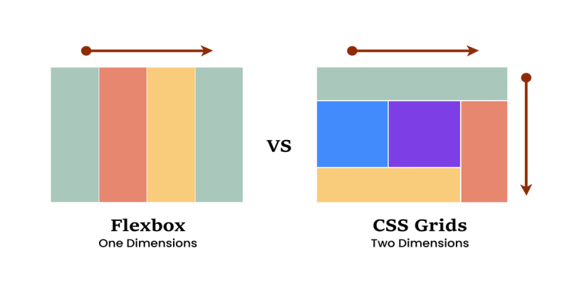
To make layouts fluid and adaptable, CSS offers powerful tools like Grid and Flexbox. These layout systems allow elements to be aligned and distributed dynamically, adjusting to available screen space without breaking the design. CSS Grid is particularly useful for two-dimensional layouts, arranging content in rows and columns, and is ideal for more complex page structures. Flexbox is better suited for one-dimensional layouts, such as aligning navigation items in a header or stacking elements vertically on mobile.
Both systems replace the older, more rigid box model, eliminating the need for hacks or floats that used to dominate responsive layout techniques. When combined with media queries, Grid and Flexbox give developers granular control over how content flows and resizes across devices, helping to ensure a consistent user experience from smartphones to widescreen monitors.
Media Queries
Media queries enable developers to apply different CSS rules based on device or viewport characteristics, such as screen width, height, resolution or orientation. For example, a media query can detect when a screen is narrower than a certain pixel amount and automatically reduce the font size or stack columns vertically instead of horizontally. This allows web content to adapt to the constraints and strengths of each device without requiring separate websites or codebases.
Mobile-First vs. Desktop-First Strategies
At the heart of responsive web design, there are two common approaches developers must consider when building a web app or website: mobile-first or desktop-first.
- A mobile-first approach begins by designing a website for smaller screens first, typically smartphones, and then uses media queries to progressively style for larger displays. This strategy aligns with modern user behavior, as more people access the web primarily through mobile devices.
- A desktop-first approach starts with the full-feature desktop layout and uses media queries to remove or simplify elements for smaller screens. While effective, it can lead to bloated pages on mobile if not managed properly.
Developers often chose between these two strategies based on audiences, projects goals and performance considerations.
Frequently Asked Questions
What is CSS used for?
CSS is used to control the visual styling of a web page, including elements like layout, color, fonts, spacing and responsiveness across different screen sizes.
How does CSS work with HTML and JavaScript?
CSS styles the elements defined by HTML, while JavaScript adds interactivity. Together, they build the structure, appearance and behavior of modern web pages.
What are CSS selectors and how do they work?
Selectors target HTML elements and apply styling rules. Common types include element selectors, class selectors and ID selectors.
When should I use !important in CSS?
Use !important sparingly to force a style to override others. Overuse can make CSS harder to maintain and should be avoided in favor of more specific selectors.


