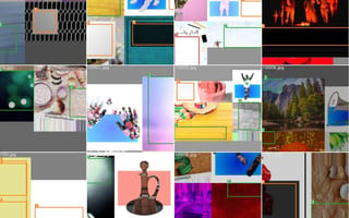
We’ve all seen clumsy-looking websites where the art and copy fail to mesh. The text hides an important piece of an image, the visual styles clash or the composition just seems imbalanced.
But Salesforce appears to be on the cusp of an automated remedy. In a study of 20,000 copyright-free images gathered from Unsplash, its UX research and design team found proprietary object-detection software could isolate and categorize subtle differences in media, vector graphics and formatted text.
This research could have broad application for the industry, said Sönke Rohde, a vice president who leads the team, particularly for companies and internal departments that do not have in-house graphic or UX designers.
“We can start amplifying the creative process,” Rohde said. “Instead of manually creating a set of design variations to run a multivariate test, or to do full-on personalization, you can leverage so-called generative design variations to transform the process.”
The authors of an internally published report, “Copyspace: Where to Write on Images,” suggest object-detection models could be combined with the deep-learning capabilities of Salesforce’s generative design system Einstein Designer to help companies render personalized email banners, hero pages and calls-to-action. Moreover, these assets could be customized to reflect brand identities, business goals and the expectations of particular users.
“A very common design treatment is to position content on top of an image,” Rhode said. “You might have a headline — you usually have a button with a call to action. And to automate the creation of these, you have to find the best place, or the best places, to put the content.”
* * *
This story is the first in Built In’s “Designer’s Playbook” series, which examines the most important emerging trends and skills for design and UX professionals in 2021. You can read the second story, about creating more accessible user interfaces, here.
A scene from a Tom & Jerry cartoon annotated by the Salesforce Design R&D team illustrates, in brief, how the technology works. When Tom grows outraged and throws a pair of billiard balls at Jerry’s face, the intrepid mouse hits them back with a baseball bat, lodging them squarely in the cat’s eye sockets. The scene ends with Tom getting knocked into a cold drink machine, where he is compacted and spit out in the shape of a soda bottle. Remember the lighthearted frivolity of cartoons of yore?
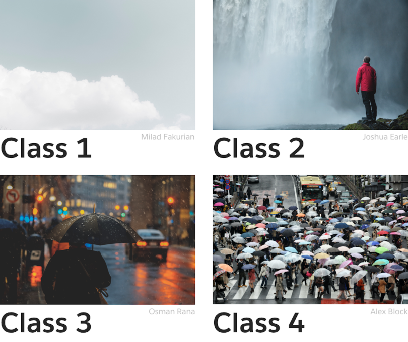
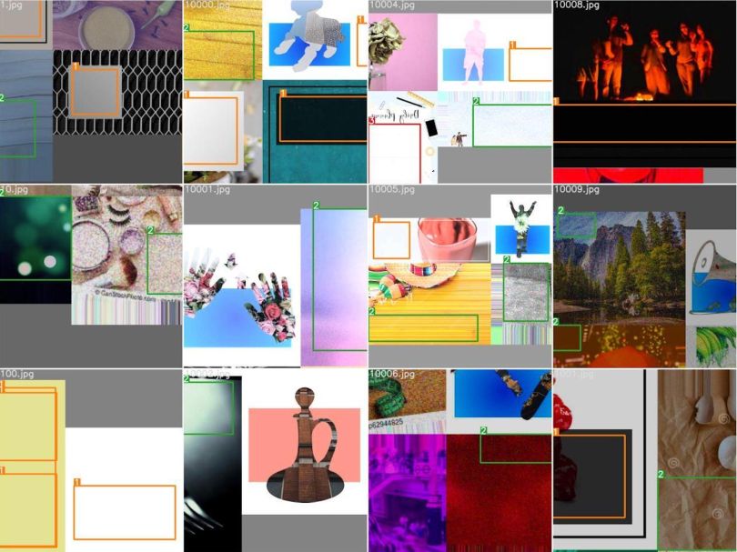
It’s cheeky, if macabre, cartoon fun, but it’s also a glimpse of where the “best places” for television credits might be. As the cartoon unfolds, bounding boxes in green and magenta appear in the negative, or latent, space. These boxes are categorized into four classes based on the difficulty the software has identifying them as optimal places to add words. It’s a more difficult task than simple foreground-background separation.
“So instead of the object, we’re looking for the non-object. And that’s really what the paper was about,” Jessica Lundin, a principal data scientist on the UX R&D team and the paper’s lead author, said.
Close inspection shows that simple, monochrome surfaces — like the cartoon’s black gutter — are relatively easy for the software to detect as prime linguistic real estate. More richly layered spaces, as well as those close to Tom and Jerry, are more difficult to isolate.
The Promise and Limitations of Copy-Space Detection
Deep-learning models, including regression-based Yolo (You Only Look Once) and the region-proposal network Faster R-CNN, are at the core of the project. Over time, these models learn to predict where copy is most appropriately placed.
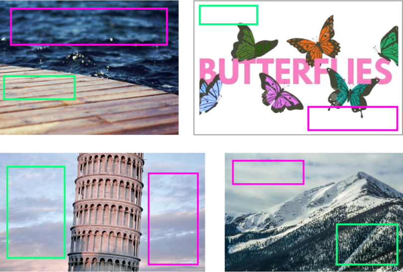
First, however, they must be trained. To impose placeholders where copy would look best, Lundin worked with the UX R&D team to annotate images collected from Unsplash. As shown in the figure above, rectangular bounding boxes placed in compositionally desirable locations are used to train the software.
“The model, of course, is just doing what it’s told, but it’s essentially learning, ‘Where is the low-energy space on the image?’” Lundin told me.
“The model, of course, is just doing what it’s told, but it’s essentially learning, ‘Where is the low-energy space on the image?’”
Of the five models tested, Yolo version 5 had the highest mAP (mean average precision) score. Put simply, it was able to reliably predict copy locations for images with 407 layers at a resolution of 640 x 640 pixels.
Still, there is more work to be done.
“One issue we have applying these object-detection models to copy space is that if there isn’t a well-defined object — there is no cat or baseball that you can tidily draw a line around — our models often would come up with a perfectly plausible copy space solution, but it didn’t match the annotation,” Lundin said.
In other words, the model found latent space — the green bounding boxes — just not the space the researchers wanted it to find — the pink bounding boxes. With more time and training data, the system’s precision is likely to improve.
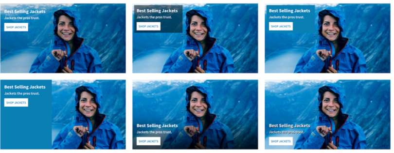
Another issue, as seen in this grid of rain jacket ads, is that copy within a bounding box can be presented in myriad ways. The size and relative position of headers, body text and buttons is important to user engagement, Lundin said, and still needs to be tested and refined within the design framework.
“This paper was really like, ‘Can we do it?’ And the answer was, ‘Yes, even with very few images, we were able to do a pretty good job.’ But to finish this as a product, there are more things that need to be done. Like, exact placement of the text within that copy space, for example.”
A Custom Interface for Everyone
To understand the significance of the study and its potential implications, you need to consider Salesforce’s broader plans for Einstein Designer, an AI-powered generative design tool that uses deep-learning UX and predictive personalization to create customized interfaces.
The project, which received honorable mention in Fast Company’s 2020 Innovation by Design Awards, involves a cross-functional collaboration of data scientists, full-stack engineers and designers. As Rohde writes of its lofty ambitions: “Imagine a custom UI for every person who visits a website. Wait — what?”
In practice, he told me, that means design aspects like color, font styles and sizes and typographic hierarchies can be optimized for particular industries. A Salesforce data visualization shows, for example, that software companies prefer the color blue, Big Pharma favors bright, assertive colors and auto manufacturers gravitate toward images with low color saturation.
“What the research has been showing is that people have different interests. Some people, on aggregate, like to see the price of a product. Other people are interested in features. Others want to have a specific product shot.”
Similar aesthetic preferences can be found among brands, and — as this delightfully geeky video from the eyeglass brand Warby Parker illustrates — individuals with discriminating tastes. The big idea, Rohde said, is that, by automating assets, companies can personalize product pages and digital storefronts to optimize engagement.
“What the research has been showing is that people have different interests,” Rohde said. “Some people, on aggregate, like to see the price of a product. Other people are interested in features. Others want to have a specific product shot.”
Typically, a designer might manually create a set of three or four mock-ups and run them through multivariate testing to determine the best choice. Time and resource constraints limit available options.
“But with generative design,” Rohde said, “you can generate dozens of different permutations that all emphasize different aspects of a product, and then leverage your personalization engine to find out what is the best match between the consumer and presentation layer.”
As companies expand into new verticals and broaden their audiences, he added, the potential benefits of personalized interfaces only become greater. But designers don’t have the time to create unique mock-ups for every situation they encounter. And that’s assuming a designer is the one creating the assets, not, say, a digital merchandiser or marketing specialist trying to fast-track a layout for a quickly moving campaign.
“Design is one of the few aspects of the Internet that is not really personalized yet,” Rohde said. “Every website you see might have different content, but the look and feel is the same for every user.”
At least, that’s how it’s been historically.
The Ethics of Generative Design
Salesforce has been testing copy-space detection software internally and with select clients who use its e-commerce platform, Commerce Cloud. That list includes brands like Kellogg’s, Louis Vuitton, Ralph Lauren, Yeti and Adidas, though those companies are not necessarily part of testing, Rohde said. While he declined to share specific outcome data, he said the experimental results have been encouraging.
“At the beginning, we didn’t know if personalization of design would actually have an impact on business KPIs,” he said. Now Rohde is more convinced. In early pilots, “the personalization of design led to positive results for the KPIs our customers are looking for,” he said.
“When you look at website design, there are a lot of template technologies being applied. I think we will produce more interesting results, because we will find the best design for the actual size and target resolution of the content.”
One might wonder whether copy-space detection systems could threaten the jobs of designers who create web interfaces and advertisements. But Rohde insisted that’s not the case.
“We work very closely with our office of ethical and humane use to make sure we are doing something that is actually helping our customers,” he said. “The goal is to start automating the more tedious parts of the process and help elevate the roles of professional people so that designers can focus on higher-level tasks.”
Assuming that’s true — and there are reasons to proceed with caution — another consideration is whether machine-generated designs run the risk of looking sterile or too on-the-nose, lacking the personality and playfulness of human designs.
But that may be less of an issue than you’d imagine. In fact, for an industry growing cozy in its reliance on stock imagery and templates, personalized layouts generated from deep-learning systems may be an overdue wake-up call.
“When you look at website design, there are a lot of template technologies being applied,” Rohde said. “I think we will produce more interesting results, because we will find the best design for the actual size and target resolution of the content.”
“If it’s not expensive to generate 10 unique variations,” he continued, “you don’t have to compromise on finding a scalable solution.”

