
When Congress authorized $284 billion to reopen the Paycheck Protection Program (PPP) in January, small businesses and self-employed individuals rushed to apply.
But many applicants ran into questions about eligibility, loan forgiveness and usage requirements not easily answered in public forums like the U.S. Small Business Administration’s (SBA) website.
Further complicating the application process, a separate SBA relief program — the Economic Injury Disaster Loan (EIDL) — was announced in April as part of a $484 billion COVID-19 relief package. Together, the programs comprise a dense jungle of atomized information that is hard to sift through — at least without reliable guidance and an extraordinary amount of patience.
Intuit, a company that built its brand on distilling financial data and tax law, recognized an opportunity to close the information gap. In April, it launched Aid Assist, a compliance-driven financial tool to help small businesses and self-employed people navigate the requirements contained in hundreds of pages of the Coronavirus Aid, Relief, and Economic Security (CARES) Act.
Designed and built in weeks, the program offers a view of how well-conceived information architecture, coupled with automation, can convert lengthy, obtuse documents into a digestible format. The tool helps users determine their eligibility, estimate loan amounts and obtain funds. In a sense, it is a design framework that builds itself.
People confuse [information architecture] with design systems. It’s really much broader than that.”
Clarence Huang, a software engineer at Intuit, said the notable achievement of Aid Assist is not so much the interface components themselves, or the asset libraries that describe them, but how the page displays relate to one another. The automated system predicts when users are confident, confused or fatigued and renders screens calibrated to reflect those mental states.
To borrow a phrase from Radiohead’s Thom Yorke: “Everything in its right place.”
“Two years ago, before [information architecture] became a thing, everyone just said, ‘Oh, it’s Twitter Bootstrap,’” Huang told me, referencing a popular front-end UI toolkit. “People confuse it with design systems. It’s really much broader than that. It’s a cross-cutting concern in software development that touches on product, engineering and UX design. And I think the more we, as an industry, know about it, the better it makes us.”
A Generative Design Framework
To develop the framework for a complex build with 400 unique screens, the design team began with three core goals:
Aid Assist’s Core Design Goals
- Reduce cognitive load. Users needed to understand the requirements of the CARES Act and how it could benefit them.
- Build a shared mental model with the user. That model would determine the navigational architecture of the app, as well as the decisions that guide users down particular paths.
- Reduce action bias. For instance, a user might receive guidance on whether a PPP loan or EIDL is preferable based on their financial profile. However, it may be that the best option is not to pursue either loan.
Huang said these goals are integrated in a generative design process that determines the screen sequence and interactions for each user. Think: machine learning tasked with creating personalized flowcharts. These pathways vary depending on factors like monthly payroll, the number of employees at a company and loan-disbursement plans.
“We, the designers, didn’t really design the product page by page, but we designed a framework. And that framework has basically all of those two components — PPP and EIDL — built into it. So the computer uses that framework as sort of a factory to stamp out the screens,” Huang explained.
While the phrase “information architecture” can sound more elevated than what it typically describes — a site map — in this case it aptly describes an intelligent design framework Huang calls “a skeleton for the house.”
“The algorithms, like the factory, sort of put on the walls and the roof and the stucco,” he added. “Then it stamps out many, many houses after that, based on that same framework. And that framework has certain things built into it, which we learn by user testing.”
Here’s what the design team found:
Lessons from Aid Assist User Testing
- People are more likely to complete tasks if you present one question, and one question alone, per screen.
- When giving people helpful information, it’s better to progressively disclose that information instead of giving it to them all at once.
- After five or six questions, people begin to experience decision fatigue, and you need to give them affirmation. Aid Assist does this through automatically inserted interstitial screens that let users know they’re on the right track.
- When users toggle between screens, it’s a signal they’re confused, and it’s time to offer additional guidance.
Progress Bars Are Gold, Even When They’re Only Estimates
Arguably, the most illuminating finding from the design team’s user testing was that a progress bar was critical to user engagement and task-completion rates. However, in an adaptive system where nearly every applicant follows a slightly different user flow, estimating a user’s progress proved difficult.
Some small businesses have fewer than 10 employees. Some have nearly 500. Nonprofits, veterans organizations, tribal businesses and food and hospitality companies have distinct eligibility criteria that map different flowcharts.
“This is actually a really tricky one, because you can think of the flow in something like Aid Assist as a decision tree. And you don’t actually know upfront how long a user is going to take to go through that tree. But that’s not good, because we have to give users a sense of progress,” Huang said.
Users interpret [the progress bar] moving as a sign of us doing work for them. That’s so profound and weird.”
The solution the team arrived at — a predictive algorithm that approximates an applicant’s progress — is not entirely linear, nor strictly accurate on a percentage basis. But that doesn’t really matter, Huang said. Most users just want assurance someone, or some machine, is backstage mining the data.
“With one of the users we tested, I asked, ‘Why do you even like [the progress bar]?’” Huang said. “They’re like, ‘Oh, you guys are working hard for me.’ So, users interpret [the bar] moving as a sign of us doing work for them. That’s so profound and weird.”
Interstitial Screens Boost Task Completion Rates
Intuit’s findings add to mounting evidence that it is not minimizing clicks that makes navigation effective, but whether the user is given the right breadcrumbs to successfully complete a task.
“Through some of these longer flows, [users’] cognitive load is actually building up. And when we tested this, actually adding interstitial screens gave them an immediate outcome that made their cognitive load drop,” Huang said.
By now, the once-revered three-click rule has been widely debunked, and complex documents like the CARES Act illustrate its failure to accommodate complicated use cases — like tax law or medication management. But what’s especially striking about Intuit’s user research is how thoroughly it refutes conventional wisdom about limiting the time it takes users to reach their end goals.
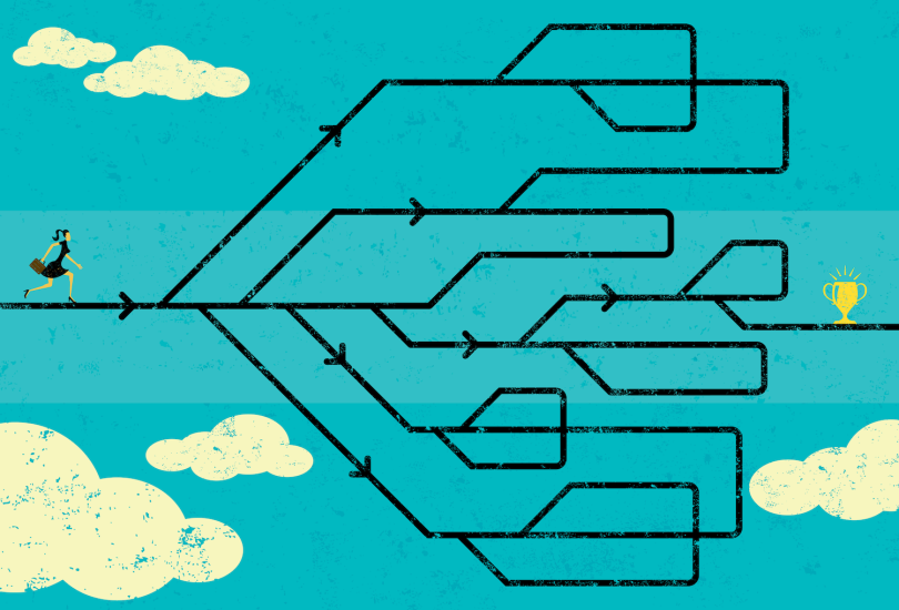
A lot of these compliance-driven experiences can be visualized as a graph or a tree. But you can’t show that to the user, because it’s just incomprehensible.”
In at least one test flow, the addition of interstitial screens led to a “double-digit” increase in end-to-end conversion, according to Huang. What emerged was a sawtooth pattern: User engagement would wane over several question screens until a well-timed congratulatory message gave them a confidence boost and rekindled their motivation.
“A lot of these compliance-driven experiences can be visualized as a graph or a tree,” Huang said. “But you can’t show that to the user, because it’s just incomprehensible.”
Instead, he told me, you “flatten out” the data and present it in a linear fashion. The algorithm functions as a supportive coach, giving users a push when they need it. That doesn’t result in the shortest distance between two points, but it’s the route users are most likely to take.