

Although developers spend most of their working hours staring at code on screen, the fonts that all that code is rendered in might not be top of mind. But fonts are important. A good font can make itself invisible so you never even stop to think about it, making your job easier or even more pleasant; a bad font can strain your eyes and slow you down.
As in architecture, form follows function — the fonts we see in the world are designed to meet specific objectives. Fonts in marketing and advertising, for example, are designed to be attention catching and interesting.
“There are fonts that are optimized for display or digital flair,” said Stephen Nixon, a font designer and developer who operates Arrow Type design studio. “You might use that for a poster or an advertisement or beer packaging — something where you’re trying to not necessarily be the most readable thing ... but to be the most surprising thing.”
Coding fonts are different. They are workhorse fonts, optimized to be easily legible, with characters that are easy to tell apart from one another. They’re also designed to reduce eye strain for developers who spend all day reading and writing code.
What Makes Coding Fonts So Different, Anyway?
Nixon studied typography at the TypeMedia program in the Netherlands, and has worked mostly on fonts intended for developers to use when coding. He recently designed and published a font called Recursive, for programmers and user interfaces.
Nixon said a distinct feature of fonts used for coding is that they’re usually fixed in width. That means each individual letter, number and symbol — collectively known as “glyphs” in typography — take up exactly the same amount of space. That’s different from traditional typesetting for print and digital text on computers, which generally have “natural” widths for each glyph.
“So the ‘i’ is a little bit narrow, and the ‘l’ is kind of narrow, whereas the ‘w’ and ‘m’ are wider,” Nixon said. “And that’s kind of informed by history and convention and culture.”
“So much about code is inventing things to make them readable and to understand the structure and hierarchy of code.”
Fonts used for coding are fixed width, or monospaced, in part as a holdover from early user interface technology, he said. Although computer monitors have long since been freed from the restriction of only displaying fixed-width fonts, fixed-width is still the convention for coding, partly because it makes code appear more orderly.
“So much about code is inventing things to make them readable and to understand the structure and hierarchy of code,” Nixon said. “So if all of the letters take up the same amount of space on the screen, then if something’s four letters long, it’s always going to be the same width as any other four-letter thing. Things just tend to line up more often.”
Standardizing a font’s width is just one design decision, but it leads to a cascade of other effects, Nixon said. The design of each glyph is affected, because glyphs that are naturally wide, like the letter “m,” have to be carefully designed so they fit within the standard width but remain legible at any font size.
It also has an effect on punctuation, which in fixed-width coding fonts appears larger to use up space within the standard width. Larger punctuation actually makes it easier for developers to see important glyphs such as semicolons and periods, which have logical implications in many programming languages.
“Depending on what you’re coding, that could crash your program if you mess up a piece of punctuation,” Nixon said.
How to Design a Font
PragmataPro, a font created specifically for coding in 2010, has an enthusiastic following among certain circles of developers, mathematicians and scientists.
It was created and is maintained by Fabrizio Schiavi, who stumbled into the field of typography while working as a web designer in the 1990s. Unsatisfied with the limited font choices developers had for writing code, Schiavi decided to design a font for his own use.
The fixed-width fonts available for developers back then were limited to Monaco, Courier and Letter Gothic. All of these were widely used fonts, but Schiavi didn’t find any of them ideal for coding. Both Courier and Monaco were too wide, which forced developers to use small text sizes to prevent excessive horizontal scrolling. Courier is also a serif font — it has little feet on the ends of most letters — which made it look “redundant” while coding. Schiavi personally used Letter Gothic for programming, but he found that its rendering on screen resulted in “showy imperfections.”
Schiavi said the process of designing a font falls into two main steps. The first part is developing a design that works well for all types of glyphs. In addition to letters and numbers, there are other ASCII symbols that need to be included, each designed so the style matches the look of the other glyphs and is legible.
PragmataPro started out as a monospaced font, but now it’s a modular-spaced font, Schiavi said — mostly fixed-width, with some glyphs taking up more than one standard space. That’s because he has continued to add glyphs over the years, including support for other languages and special characters, with a current total of almost 40,000 glyphs. Some symbols, such as “Long Rightwards Squiggle Arrow,” just can’t be condensed into one standard width.
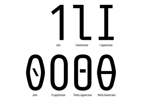
The design of each glyph also can’t stand on its own — it needs to be evaluated in relation to all the other glyphs in the font. Otherwise, different glyphs might be accidentally designed so similarly that they’re difficult to tell apart, such as the number “1,” lowercase “l” and uppercase “I.”
The second step for designing a font is going through all the font sizes between 9pt and 60pt and adjusting each glyph so its style and legibility remains the same.
“Every detail in PragmataPro was designed to improve readability at small sizes,” Schiavi said in an email with Built In. “I spent a lot of time looking for the perfect shape for every curve. An ‘ugly’ curve can actually improve readability.”
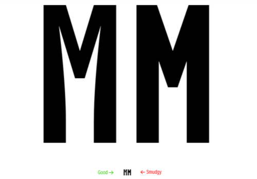
He gave the example of the capital letter “M,” whose center has a tendency to look “smudgy” at small font sizes, and thus easy to confuse with the letter “H.” PragmataPro’s version was designed with the white space curving away from the center instead of consisting of straight lines, improving legibility at small font sizes.
Legibility and readability are slightly different. Coding fonts are actually more concerned with legibility, while fonts used for general reading prize readability.
“Readability is more about the recognition of word shape, and being easy to forget that a font is even there and just reading the thing,” Nixon said. “Coding fonts have to prioritize legibility — the ability to recognize any character as being that character.”
That’s because, in coding, developers see a lot of words that aren’t common in general reading. Fitting into expected word shapes therefore doesn’t really matter, but being able to easily and accurately read the code is important.
PragmataPro Was Designed Collectively
Although font design is often a solo endeavor, Schiavi has enjoyed the opportunities he’s had to collaborate with others while working on PragmataPro. Users of the font and other font designers gave him feedback, and introduced him to techniques that made the design process better.
In addition to developers, he’s heard back from professionals from other fields who have used the font, such as mathematicians, linguists and chemical engineers.
“I suppose that mathematical support is the common factor,” Schiavi said, adding that PragmataPro supports thousands of mathematical and alphanumeric symbols, including all the arrows in the Unicode standard.
“In my case, I can say without a doubt that I designed PragmataPro with them, something rare and precious in the type design world,” he said.
When Schiavi was first creating Pragmata, the earlier iteration of PragmataPro, back in the early 2000s, he felt alone working as a designer of coding fonts. But during the last few years many other type designers have entered the space, often building off PragmataPro’s innovative design solutions for coding.
“I feel like I’m an Old Wild West pioneer sometimes,” Schiavi said.


