

Collaboration tools are designed to improve communication and creative idea exchange — goals few would argue with. However, when these tools exclude users who are blind or have low vision, they fail to live up to their stated purpose.
The product team at Mattermost understands this well. The software firm, whose clients include the U.S. Department of Defense, AIG and Nasdaq, recently updated its open-source messaging platform across devices to make the interface more efficient and intuitive for users with visual impairments.
Aligned with the broad standards of the Web Content Accessibility Guidelines (WCAG) and compliant with revised Section 508 of the Rehabilitation Act of 1973 — which contains standards that are mandatory across U.S. federal agencies — the changes include keyboard enhancements, regional navigation shortcuts, smart search fields and shape-based iconography.
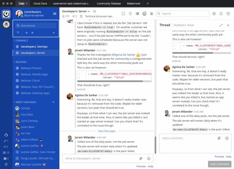
At a glance, Mattermost’s interface looks a lot like Slack’s. Various channels live in a left-hand rail, a list of active conversations dominates the center of the page and a right-hand column features subthreads where users can entertain more idiosyncratic conversations.
There are important differences between the platforms, however, the primary one being that Mattermost’s clients tend to operate in highly secure environments, some hosting their sites on air-gapped networks that don’t touch the internet.
Another difference is the user base. Mattermost targets DevOps teams who use the tool to coordinate their workflows. It’s not like Slack, where basically everyone on the payroll is obliged to use the software.
If the customers are prioritizing accessibility, the vendors will prioritize accessibility and build those requirements into the software.”
Eric Sethna, a product manager at the company, said Mattermost’s clients have demanded inclusive, accessible tools, in part because they have to. Many operate in the public sector, or are financial organizations beholden to regulatory bodies that require strict compliance with software accessibility mandates.
This has triggered an upstream effect, he told me, motivating software vendors to make their interfaces more accessible. Like the Americans with Disabilities Act of 1990 and the Leadership in Energy and Environmental Design (LEED) certification system, which led to sweeping changes in the built environment, the regulations have prompted changes in design expectations that are reverberating across the digital food chain.
Here, Sethna and Mattermost CEO and cofounder Ian Tien reveal how the product team made the platform more accessible to users with visual impairments, while also helping a subset of power users work faster and more efficiently.
* * *
This story is the second in Built In’s “Designer’s Playbook” series, which examines the most important emerging trends and skills for design and UX professionals in 2021. You can read the first story — on AI-generated interfaces — here.
Tips for Interface Accessibility
- Start at the component level: Designing an interface accessible to users with visual impairments is easier when you start at the component level and build the application from the ground up. You can save money and time by designing modular elements that reappear throughout the application.
- Minimize keystrokes: While building the regional keyboard navigator, Mattermost experimented with the number of regions and cycling order to reduce the keystrokes needed for the most common user interactions, like reading and posting messages.
- Minimize reliance on color: Mattermost added shape-based cues — like an octagonal stop sign or round green light — to guide users who have difficulty distinguishing certain colors.
- Conduct interviews and user tests with screen-reader users: The earlier you include people with accessibility needs in interviews and user testing, the easier it will be to support specialized use cases as your product grows.
Emphasize Regional Keyboard Navigation
One of Mattermost’s accessibility upgrades focused on reducing reliance on the mouse. A regional navigational system lets users enter keyboard shortcuts to browse the screen, input commands and locate important information quickly.
“So, if I press the F6 key, for example, I can cycle through different areas of the app,” Sethna explained.
The navigation system works by a predictable counting system. The first time a user enters F6, they are sent to the most recent message in the channel. When the user presses F6 a second time, they are sent to the message composer, where they can immediately type a message. Continuing the sequence, the keyboard cue allows users to access functionalities in every area of the page.
“So that order of first, second, third, fourth on those F6 keys is never changing. And that predictability is really important,” Sethna said. “You can imagine using this with a screen reader. There are a lot of things to process as you’re going through these different areas. So the fewer things to process, the fewer decisions to make, the faster and more efficient it is to use.”

Use Machine Learning to Auto-Populate Search Fields
Machine learning has been integral to user-experience improvements. Not only are auto-populated search results ranked by the frequency of the user’s visits to particular channels, but if a user wishes to explore a new or rarely visited channel, it’s relatively easy.
The keyboard shortcut Ctrl K toggles among channels. A user can enter Ctrl K, type several characters of the channel they wish to visit and select from a list of auto-populated options.
You want to try to have as few keystrokes as possible.”
Because the site is screen-reader compatible, when a user presses the arrow key to sift through search options, they are read back the results. Search terms can quickly be changed, if the results don’t reveal what the user is after.
“We’ve done a lot of optimizations around trying to require minimal input from the user to find what they’re looking for,” Sethna said. “You want to try to have as few keystrokes as possible.”
Apply Aria-labels to Improve Screen-reader Accessibility
Screen readers rely on text. For people that use them, hard-coded text labels for interactive features and landmark elements become especially important for distilling content and contextual cues.
Mattermost’s development team applied aria-labels to provide text alternatives for buttons and widgets without accompanying text. Outlined in a 2017 publication of WC3 specifications, aria-labels let developers alter the way HTML elements are translated to users as attributes.
While screen readers are programmed to announce the role of common interface elements, such as buttons, aria-labels allow for greater specificity of detail. VoiceOver on Mac OS X, Windows JAWS and other common screen readers will read the labels as descriptions of elements and their intended functions. This lets the user know not only that they are encountering a button, for instance, but precisely what the button will do — like open a menu or send an email.
Some site functions on Mattermost’s conversational interface appear beside text cues. The relationship is clear and there is no need for an additional label. But for input fields and menus without accompanying text, the labels provided a user-friendly alternative.
“When you think about all the different elements on the screen that can be interacted with, we want to make sure all of those can also be accessed without any reliance on actually seeing the screen itself,” Sethna said.
Prioritize the Most Important Information
Though text labels are important, you can quickly go down the path of logorrhea — prompting a screen reader to say a lot, while conveying little meaningful information. Sethna shared the example of a typical message in a chat stream and its associated attributes: the user profile, time stamp, message contents, reactions, file attachments, et cetera.
When narrated ad nauseum, these details get tiresome. So how do you convey the important information efficiently?
Surfacing the right information at the right time and not overloading is really important.”
Sethna said concatenation — the way things are ordered in a series — is key. A team of four developers and two QA engineers spent three months testing the platform with screen-reader users to find out how they actually responded to narrated text and interactive elements in context. What was important? What could be left out?
“With a time stamp, you could say it was 10:01 a.m., on this day of the week, on this date of the year. But that may not be as important as just understanding it’s 10:01 a.m. Because the user knows the message was recent in the channel,” he explained.
On the other side of the spectrum is message status.
“If the screen reader doesn’t pick up on those various states — read, unread, mentioned — then it’s kind of useless to someone who’s visually impaired, because they need to connect what they’re hearing to the urgency of what is presented on the screen,” Sethna said. “Surfacing the right information at the right time and not overloading is really important.”
Conduct Extensive User Research and Testing
Broad standards like WCAG and the Voluntary Product Accessibility Template (VPAT) — a vendor-created document federal agency officials use to assess compliance with Section 508 standards — provided a loose roadmap for the project, but they only go so far.
Sethna told me Mattermost recruited users with visual impairments from customer organizations. Those users helped the product team understand expected behavior, based on their experiences with other apps. User testing and interviews, as well as insights the team gathered from its open-source code base, helped the team validate the designs.
“The guidelines are a good place to start,” Sethna said. “But the highest priority when we're designing these experiences is really the user experience.”
Specific improvements often bubbled up from support tickets. GitHub shows several requests the team fielded during a beta launch to improve the iOS mobile app for VoiceOver users: “add aria-labels to navbar buttons” and “channel drawer button is missing accessibility label.”
The guidelines are a good place to start. But the highest priority when we’re designing these experiences is really the user experience.”
“So there was feedback and iteration,” Tien said. “You have to make sure that the specs actually match what the user needs to run their accessibility tools.”
Though he declined to share specific numbers, Tien acknowledged the three-month project required a sizable investment. In addition to staffing a six-person team working primarily on accessibility improvements, all new releases and features are QA-checked for keyboard and screen-reader accessibility — an ongoing maintenance cost.
He believes the investment is important, however, for reasons that go beyond business compliance requirements.
“There’s not a cookie-cutter way for making sure the software works for the scenarios [end users] care about,” he said.


