

For data scientists, a key part of interpreting machine learning models is understanding which factors impact predictions. In order to effectively use machine learning in their decision-making processes, companies need to know which factors are most important.
For example, if a company wants to predict the likelihood of customer churn, it might also want to know what exactly drives a customer to leave a company. In this example, the model might indicate that customers who purchase products that rarely go on sale are much more likely to stop purchasing. Armed with this knowledge, a company can make smarter pricing decisions in the future. At a high level, these insights can help companies keep customers for longer and maintain profits.
Fortunately, Python offers a number of packages that can help explain the features used in machine learning models. Partial dependence plots are one useful way to visualize the relationship between a feature and the model prediction. We can interpret these plots as the average model prediction as a function of the input feature. Random forests, also a machine learning algorithm, enable users to pull scores that quantify how important various features are in determining a model prediction. Because the model explainability is built into the Python package in a straightforward way, many companies make extensive use of random forests. For more black-box models like deep neural nets, methods like Local Interpretable Model-Agnostic Explanations (LIME) and Shapley Additive Explanation (SHAP) are useful. These methods are typically used with machine learning models whose predictions are difficult to explain.
When data scientists have a good understanding of these techniques, they can approach the issue of model explainability from different angles. Partial dependence plots are a great way to easily visualize feature/prediction relationships. Random forests are useful for ranking different features in terms of how important they are in determining an outcome. LIME and SHAP determine feature importance in complex models where direct interpretation of model predictions is not feasible such as deep learning models with hundreds or thousands of features that have complex nonlinear relationships to the output. Understanding each of these methods can help data scientists approach model explainability for a variable of machine learning models whether they are simple or complex.
We will discuss how to apply these methods and interpret the predictions for a classification model. Specifically, we will consider the task of model explainability for a logistic regression model, random forests model and, finally, a deep neural network. We will be working with the fictitious Telco churn data, which is available here.
Model Explainability Techniques in Python
- Partial dependence plots.
- Random forests.
- Local Interpretable Model-Agnostic Explanations (LIME)
- Shapley Additive Explanation (SHAP)
Reading Telco Data Into a Pandas Data Frame
To start, let’s read our Telco churn data into a Pandas data frame. First, let’s import the Pandas library:
import pandas as pd Let’s use the Pandas read_csv() method to read our data into a data frame:
df = pd.read_csv("telco_churn.csv")Let’s display the first five rows of data:
print(df.head())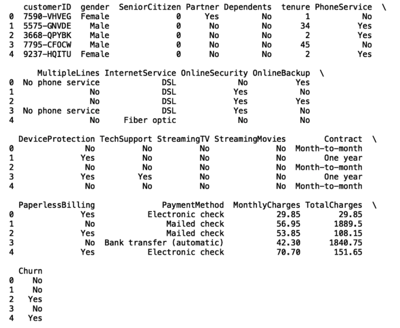
Data Preparation for Model Building
Each of the models we will build will take gender, tenure, MonthlyCharges, PaperlessBilling, Contract, PaymentMethod, Partner, Dependents and DeviceProtection as inputs. Our prediction target will be churn. First, we need to prepare our categorical inputs for training by converting them into machine readable scores.
Let’s look at the example of converting gender into categorical codes. First, we use the Pandas astype method to create a new column called gender_cat with a category type:
df['gender_cat'] = df['gender'].astype('category')Next, we pull the categorical codes using the Pandas cat.codes attribute:
df['gender_cat'] = df['gender_cat'].cat.codesWe then repeat this process for the remaining categorical features:
df['PaperlessBilling_cat'] = df['PaperlessBilling'].astype('category')
df['PaperlessBilling_cat'] = df['PaperlessBilling_cat'].cat.codes


df['Contract_cat'] = df['Contract'].astype('category')
df['Contract_cat'] = df['Contract_cat'].cat.codes


df['PaymentMethod_cat'] = df['PaymentMethod'].astype('category')
df['PaymentMethod_cat'] = df['PaymentMethod_cat'].cat.codes


df['Partner_cat'] = df['Partner'].astype('category')
df['Partner_cat'] = df['Partner_cat'].cat.codes


df['Dependents_cat'] = df['Dependents'].astype('category')
df['Dependents_cat'] = df['Dependents_cat'].cat.codes


df['DeviceProtection_cat'] = df['DeviceProtection'].astype('category')
df['DeviceProtection_cat'] = df['DeviceProtection_cat'].cat.codes
Let's also create a new column that maps the Yes/No values in the churn column to binary integers (zeros and ones). In the churn_score column, when churn is yes, the churn_label is one and when churn is no, the churn_label is zero:
import numpy as np
df['churn_score'] = np.where(df['churn']=='Yes', 1, 0)
Next, let’s store our inputs in a variable called X and our output in a variable called y:
X = df[[ 'tenure', 'MonthlyCharges', 'gender_cat',
'PaperlessBilling_cat',
        'Contract_cat','PaymentMethod_cat', 'Partner_cat',
'Dependents_cat', 'DeviceProtection_cat' ]]
y = df['churn_score']
Next, let’s split the data for training and testing using the train_test_spliit method from the model_selection module in scikit-learn:
from sklearn.model_selection import train_test_split

X_train, X_test, y_train, y_test = train_test_split(X, y,
test_size=0.33, random_state=42)
Next, let’s import the LogisticRegression model from scikit-learn and fit the model to our training data:
lr_model = LogisticRegression()
lr_model.fit(X_train, y_train)
Let’s generate predictions:
y_pred = lr_model.predict(X_test)And, to see how our model performs, we’ll generate a confusion matrix:
from sklearn.metrics import confusion_matrix
conmat = confusion_matrix(y_test, y_pred)

val = np.mat(conmat)
classnames = list(set(y_train))
df_cm = pd.DataFrame(
        val, index=classnames, columns=classnames,
    )
df_cm = df_cm.astype('float') / df_cm.sum(axis=1)[:, np.newaxis]


import matplotlib.pyplot as plt
import seaborn as sns

plt.figure()
heatmap = sns.heatmap(df_cm, annot=True, cmap="Blues")
heatmap.yaxis.set_ticklabels(heatmap.yaxis.get_ticklabels(), rotation=0, ha='right')
heatmap.xaxis.set_ticklabels(heatmap.xaxis.get_ticklabels(), rotation=45, ha='right')
plt.ylabel('True label')
plt.xlabel('Predicted label')
plt.title('Churn Logistic Regression Model Results')
plt.show()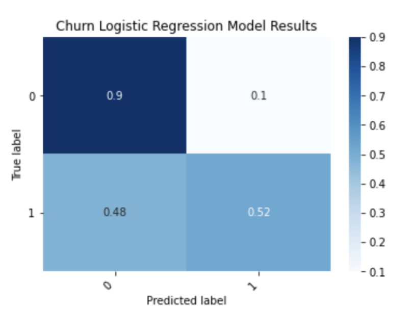
We can see that the logistic regression model does an excellent job at predicting customers who will stay with the company, finding 90 percent of true negatives. It also does a decent job predicting the customers who will leave, discovering 52 percent of true positives.
Partial Dependence Plots
Now, let’s use partial dependence plots to explain this model.
from sklearn.inspection import plot_partial_dependence
features = [0, 1, (1, 0)]
plot_partial_dependence(lr_model, X_train, features, target=1) 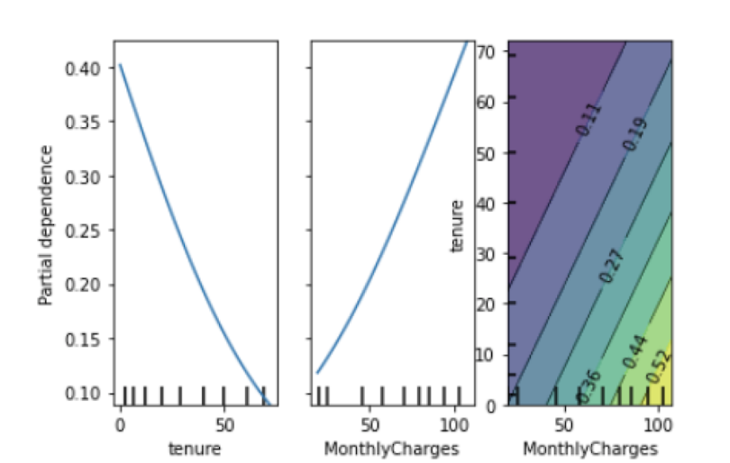
We see that, as tenure increases, the probability of a customer leaving decreases. This pattern makes sense because customers who have a longer tenure are probably less likely to leave.
Further, the probability of a customer leaving increases as monthly charges do, which is also intuitive. We can also see the density map of tenure versus monthly charges. The light green/yellow color indicates a higher density. We see from this that a significant number of customers who have high monthly chargers are also relatively newer customers. In this example, the company could use this insight to target newer customers who have high monthly charges with deals and discounts in an effort to keep them from leaving.
Random Forest Feature Importance
Next, we will build a random forest model and display the feature importance plot for it. Let’s import the random forest package from the ensemble module in Scikit-learn, build our model on our training data, and generate a confusion matrix from predictions made on the test set:
conmat = confusion_matrix(y_test, y_pred_rf)
val = np.mat(conmat)
classnames = list(set(y_train))
df_cm_rf = pd.DataFrame(
val, index=classnames, columns=classnames,
)
df_cm_rf = df_cm_rf.astype('float') / df_cm.sum(axis=1)[:, np.newaxis]
import matplotlib.pyplot as plt
import seaborn as sns
plt.figure()
heatmap = sns.heatmap(df_cm, annot=True, cmap="Blues")
heatmap.yaxis.set_ticklabels(heatmap.yaxis.get_ticklabels(), rotation=0, ha='right')
heatmap.xaxis.set_ticklabels(heatmap.xaxis.get_ticklabels(), rotation=45, ha='right')
plt.ylabel('True label')
plt.xlabel('Predicted label')
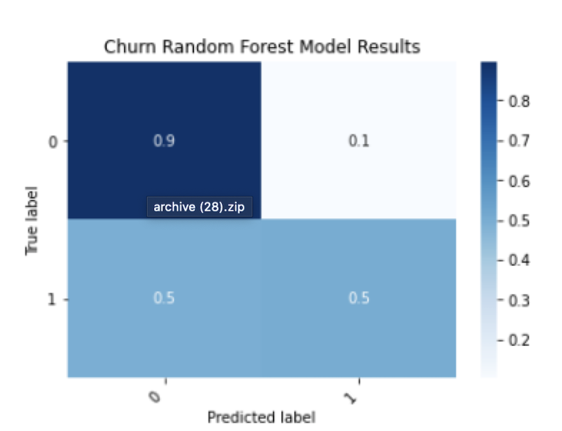
plt.title('Churn Random Forest Model Results')
plt.show()
We can then display a bar chart with the feature importance values:
features = ['tenure', 'MonthlyCharges', 'gender_cat',
'PaperlessBilling_cat',
        'Contract_cat','PaymentMethod_cat', 'Partner_cat',
'Dependents_cat', 'DeviceProtection_cat' ]

print(rf_model.feature_importances_)
feature_df = pd.DataFrame({'Importance':rf_model.feature_importances_,
'Features': features })

sns.set()
plt.bar(feature_df['Features'], feature_df['Importance'])
plt.xticks(rotation=90)
plt.title('Random Forest Model Feature Importance')
plt.show()
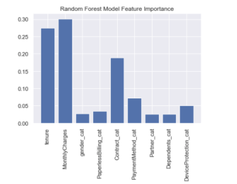
Here we see that the most important factors that drive a customer to leave are tenure, monthly charges and contract type.
Using feature importance from random forest in conjunction with partial dependence plots is a powerful technique. You not only know which factors are most important, but you also know the relationship these factors have with the outcome. Let’s take tenure as an example. From the random forest feature importance, we see tenure is the most important feature. From the partial dependence plots we see that there is a negative linear relationship between tenure and the probability of a customer leaving. This means that the longer the customer is with the company, the less likely they are to leave.
LIME and SHAP for Neural Network Models
When dealing with more complicated black-box models like deep neural networks, we need to turn to alternative methods for model explainability. This is because, unlike the coefficients available from a logistic regression model or the built in feature importance for tree-based models like random forests, complex models like neural networks don’t offer any direct interpretation of feature importance. LIME and SHAP are the most common methods for explaining complex models.
Let’s build an artificial neural network classification model. To start with model building, let’s import the sequential and dense methods from Keras:
from tensorflow.keras.models import Sequential
from tensorflow.keras.layers import Dense
Next, let’s initialize the sequential method:
model = Sequential()Let’s add two layers with eight nodes to our model object. We need to specify an input shape using the number of input features. In the second layer, we specify an activation function, which represents the process of a neuron firing. Here, we use the rectified linear unit (ReLu) activation function:
model.add(Dense(8, input_shape = (len(features),)))
model.add(Dense(8, activation='relu'))
We then add our output layer with one node and compile our model:
model.add(Dense(1, activation='sigmoid'))
model.compile(optimizer='adam', loss='binary_crossentropy',
metrics=['accuracy'])
Once our model is compiled, we fit our model to our training data:
model.fit(X_train, y_train, epochs = 1)We can then make predictions on our test data:
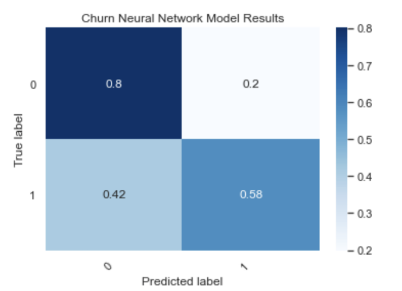
y_pred = [round(float(x)) for x in model.predict(X_test)]And generate a confusion matrix:
conmat = confusion_matrix(y_test, y_pred_nn)

val = np.mat(conmat)
classnames = list(set(y_train))

df_cm_nn = pd.DataFrame(
        val, index=classnames, columns=classnames,
    )
df_cm_nn = df_cm_nn.astype('float') / df_cm_nn.sum(axis=1)[:, np.newaxis]


plt.figure()
heatmap = sns.heatmap(df_cm_nn, annot=True, cmap="Blues")
heatmap.yaxis.set_ticklabels(heatmap.yaxis.get_ticklabels(),
rotation=0, ha='right')
heatmap.xaxis.set_ticklabels(heatmap.xaxis.get_ticklabels(),
rotation=45, ha='right')
plt.ylabel('True label')
plt.xlabel('Predicted label')
plt.title('Churn Neural Network Model Results')
plt.show()
Now, let’s use SHAP to explain our neural network model:
import shap

f = lambda x: model.predict(x)
med = X_train.median().values.reshape((1,X_train.shape[1]))

explainer = shap.Explainer(f, med)
shap_values = explainer(X_test.iloc[0:1000,:])

shap.plots.beeswarm(shap_values)
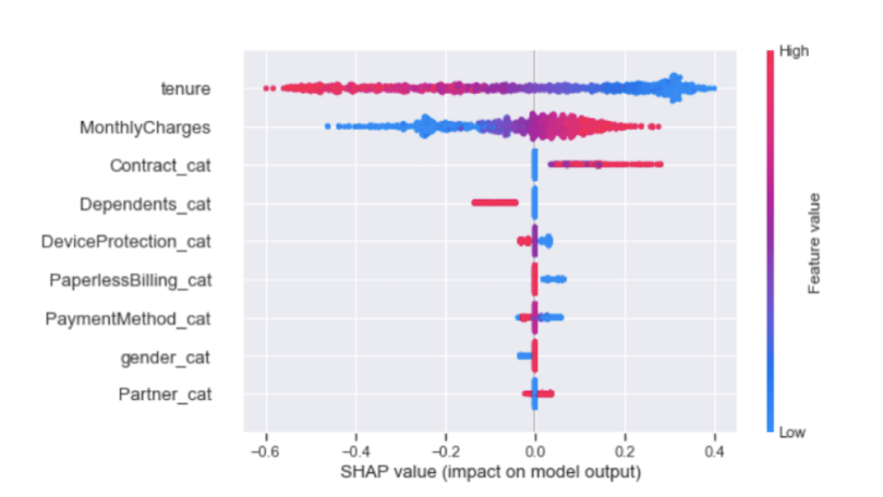
As we saw from the random forest model, tenure, MonthlyCharges and Contract are the three dominant features that explain the outcome.
LIME is another option for visualizing feature importance for complex models. LIME is typically faster to compute than SHAP, so if results need to be generated quickly, LIME is the better option. In practice, though, SHAP will be more accurate with feature explanation than LIME because it is more mathematically rigorous. For this reason, SHAP is more computationally intensive and is a good option if you have sufficient time and computational resources.
Let’s use LIME to explain our neural network predictions:
import lime
from lime import lime_tabular

explainer = lime_tabular.LimeTabularExplainer(training_data=np.array(X_train),feat
ure_names=X_train.columns,class_names=['Yes', 'No'],
    mode='classification')

exp = explainer.explain_instance(data_row=X_test.iloc[1],
predict_fn=model.predict, labels=(0,))

exp.show_in_notebook(show_table=True)
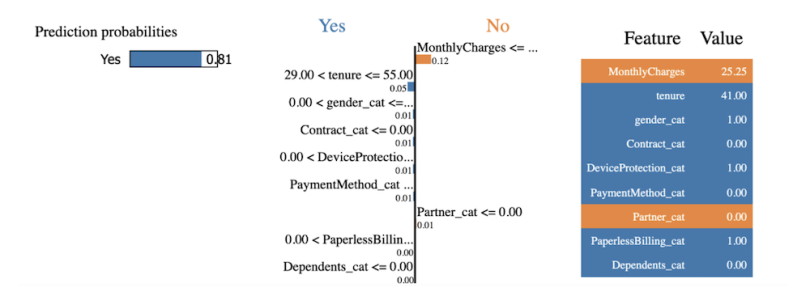
We see that monthly charges and tenure have the highest impact, as we expected. The code from this post is available on GitHub.
Explaining Models
Depending on the problem at hand, one or a combination of these methods may be a good option for explaining model predictions. If you’re dealing with relatively few input features and small data set, working with logistic regression and partial dependence plots should suffice. If you are dealing with a moderate number of input features and a moderately sized data set, random forests is a good option as it will most likely outperform logistic regression and neural networks. If you’re working with multiple gigabytes of data with millions of rows and thousands of input features, neural networks will be a better choice. From there, depending on the computational resources available, you can work with LIME or SHAP to explain the neural network predictions. If time is limited LIME is the better, although less accurate, option. If you have sufficient time and resources, SHAP is the better choice.
Although we looked at the simple example of customer retention with a relatively small and clean data set, there are a variety of types of data that can largely influence which method is appropriate. For example, for a small problem, such as predicting the success of a product given a small set of product characteristics as input, logistic regression and partial dependence plots should suffice. When dealing with more standard industry problems like customer retention or even predicting credit default, the number of features are usually moderate (somewhere in the low hundreds) and the size of the data is also moderate, so tree-based models like random forests and their feature importance are more appropriate.
Further, many problems in healthcare such as predicting hospital readmission using EHR data, involve training models on several hundred (sometimes thousands) of input features. In this case, neural networks explained by LIME or SHAP are more appropriate. Knowing when to work with a specific model and explainability method given the type of data is an invaluable skill for data scientists across industries.


