Anna Ferreira was on vacation in Tokyo peering down at her mobile phone. The number of iOS badges notifying her of unread messages on Twist, one of two communication apps the remote software company Doist makes, was quickly ticking upward: 10, 15, 20.
“And that really bothered me because I wasn’t working,” said Ferreira, who is head of design at Doist. “That information wasn’t relevant to me. I didn’t want to see it.”
Not only was she on a well-deserved vacation, but the time-zone difference between Japan and Europe, where many of her remote colleagues were based, meant the badge icon was counting late into the evening, confronting her with a reminder of her suspended work obligations whenever she fished her phone from her pocket to snap a picture.
For Ferreira, who had gone on vacation in part to disconnect, enough was enough. She went into the settings on her iPhone and turned off badge notifications on nearly all her apps — including her email.
She also recognized an opportunity to help Twist users. Though Twist’s in-app settings already let users turn off sounds and vibrations signalling new push notifications, they did not allow for granular control over badge notifications. The app’s 2021 redesign amended that.
What Are Push Notifications?
Launched in 2017, Twist positions itself on its website as an alternative to communication tools like Slack and Microsoft Teams for those “burned out by real-time, all-the-time communication.” Broadly speaking, the notification design of the work messaging tool aims to alleviate some of the stress and cognitive overload users feel when bombarded with clicks, dings and hisses. It does this not only through interface elements, but subtle and overt messaging that discourages users from, say, direct messaging colleagues about minor bugs or style guide edits, or sharing unsolicited cat pictures to a 150-person, all-staff thread.
“We try not to disturb the users,” Ferreira said.
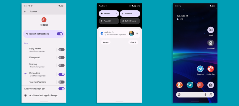
To illustrate this in broad strokes, she showed me, over Zoom, a presentation of Twist’s Android 12 behavior on a Google Pixel phone. Not only do the in-app settings let users switch on or off notifications for reminders, shares, file uploads and other updates independently — they also allow users to turn off the “notification dot.” In the latest update of iOS 15, apps like Slack, ClassDojo, Voice Record and Starbucks allow similar fine-grained control over badges, banners and sounds, but offering them inside the app gives even more control to users.
Even if users do allow the badges, they are designed to be minimally intrusive. Dismissing a new notification from the swipe-down panel on the home screen of an Android device will make them disappear, even if the application remains opened. Plus, the badges are blue and unnumbered, avoiding the troubling physiologic associations that can be conveyed by red, the color of blood, or numbers signifying a growing list of unfinished tasks.
Twist is hardly alone in its approach. Product and UX teams at messaging companies such as Doist, Samelogic, Intercom and Puppet are starting to recognize the psychological and business risks of egregious notifications and revolt against them. And from these efforts, some strategies for making push notifications less intrusive and stress-inducing are starting to emerge.
How to Make Push Notifications Less Intrusive
- Don’t create a “notification hellscape.” Social media sites can be a dangerous model.
- Context is everything. Make notifications timely, relevant and immediately actionable.
- Rank notifications by urgency. Users will tolerate important notifications.
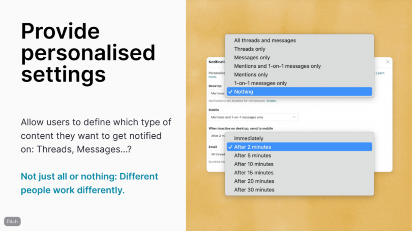
- Give users fine-grained in-app setting controls. “Mute,” “focus” and “do not disturb” functions go a long way.
- Send as few notifications as possible.
- Ask for consent. Then let users configure their preferences.
- Consider color and sound sensitivities. Shrill sounds and bright colors, like red, induce stress.
- Educate users about the risks of over-communicating. Are you sure you want to DM your colleague right now?
- Revolt against dark patterns. They may work, but your reputation will suffer.
Don’t Create a ‘Notification Hellscape’
A study of 36 office workers led by Gloria Mark, a professor of informatics at the University of California, found that when an external driver — such as a notification — distracted employees from work, it took an average of 32 minutes for them to get back on task. Yet the authors also discovered people tended to self-interrupt “to return to a central working sphere on the computer or on paper,” suggesting “a potential positive aspect of self-interruption.” When people took voluntary breaks, it took them even longer — 34 minutes — to get back on task. The breaks, however, seemed to help workers recharge.
Interestingly, though, Mark’s research suggests that although we’ve become culturally accustomed to rapid attention shifts, they may not be good for us. In an earlier study of German university students she and her colleagues published in the journal Proceedings of the SIGCHI Conference on Human Factors in Computing Systems, titled “The Cost of Interrupted Work: More Speed and Stress,” the research team found interruptions didn’t limit workers’ productivity. Instead, workers completed tasks in less time, with no loss in quality.
What suffered due to frequent interruptions, however, was workers’ well-being. They were more stressed, frustrated, and mentally overwhelmed: in a word, they felt burned out.
“[Distractions] create what’s called ‘cognitive load’ because you’re trying to concentrate on what you’re doing and interruptions require you to suddenly switch attention.”
“[Distractions] create what’s called ‘cognitive load’ because you’re trying to concentrate on what you’re doing and interruptions require you to suddenly switch attention,” Mark said. “That’s why people are so exhausted at the end of the day. Stress and mental strain that, in some cases, can lead to health complications.”
Social media sites can be especially intrusive, several sources told me. Click the alarm bell icon on Facebook, for example, and you’ll find on-and-off selections for 17 notification types across three categories (browser-based push notifications, emails or SMS messages), including comments, tags, timeline posts and reactions, friend updates, photo shares, friend requests, people you may know, friends birthdays, voting reminders, marketplace listings — the list goes on.
“You don’t want to make a notification hellscape,” said Emmet Connolly, senior director of product design at Intercom. “And so there’s sort of a natural pushback that’s happening among designers, allowing users to have greater configurability control over these features.”
The danger to companies of too many notifications?
“Deletion. Or worse than that, people might have a negative association with that ‘thirsty’ brand that keeps spamming them,” said Brian Pagán, a human experience designer based in the Netherlands.
Context Is Everything
It’s not that notifications don’t have value. Ferreira says she relies on them to remind herself of doctor’s appointments, work obligations and important social outings. And in addition to her work on Twist, she oversees the design of ToDoist, a Doist consumer app that lets users verbally create time- and location-specific reminders. These function almost like an auxiliary brain to help users remember and fulfill mundane tasks. Out of milk? Ask the app’s voice recognition interface for a reminder, and when you’re driving by a grocery store later that day, it will suggest you stop in and pick up a carton.
Too often, however, companies apply notifications in pestering dark patterns. Without consent, they blast users with announcements about new product features, third-party ads or nudges to sign up for paid accounts — often at the most inopportune times.
“Basically it’s like a salesperson, let’s say your internet service provider, breaking into your house while you’re working, tapping you on the shoulder, and saying, ‘Guess what? I’ve got a new internet service package for you,’” Pagán said. “It takes you completely out of your flow.”
A good rule of thumb is that users prefer timely, actionable notifications relevant to their immediate goals: Messages from colleagues are welcome during working hours, while Netflix might be better off sending notifications in the evening.
“Basically it’s like a salesperson ... breaking into your house while you’re working, tapping you on the shoulder.’”
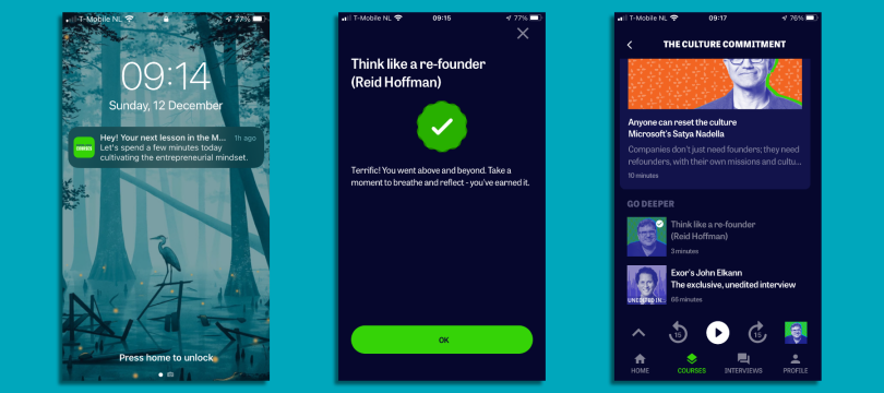
The Courses app developed in connection with LinkedIn Co-Founder Reid Hoffman’s Masters of Scale podcast is a good example of context-based design. Pagán, a consultant on the project, said the app is designed to serve push notifications to users’ when there are pauses in streaks — consecutive days during which users have listened to podcast snippets and completed daily practice exercises. Messages arrive 24 hours after the most recently completed session to motivate users to reach their learning goals.
In other cases, machine learning algorithms serve up notifications based on user’s search and purchase histories, likes, shares, follows, survey answers and so on. The presumption is if notifications are based on personal preferences and surfaced in a timely and personalized way, they will lead to increased engagement.
“Netflix is a consumer company that does push notifications particularly well, where if you’re following a series, they’ll update you when a new episode is live,” Dwayne Samuels, chief executive officer at Samelogic, said. “Same thing with Spotify. If you follow a certain artist, and they notice that you listen to that artist a lot, they let you know when a new album or a new single comes out.”
Rank Push Notifications by Urgency
Sussing the value of a notification to a user does not necessarily require sophisticated telemetry. The design team at the Portland-based company Puppet, which makes automated software to help companies configure cloud and rack servers, devised a matrix to guide design decisions about where notifications appear on the screen, whether they are ephemeral or persistent, and what users have to do to put them to bed.
Puppet’s end users tend to be system administrators and reliability engineers for whom the value of notifications is more or less implicit. “If you’re running an e-commerce business and your servers go down, you have a business problem,” Melissa Casburn, the director of user experience at Puppet, said.
But the model clarifies which notifications are most important to users and can thus be tolerated, even if they’re intrusive. The model has two vectors: The urgency of the message and how quickly action needs to be taken to address it. Items up and to the right, like a wrong password or a server failure, are deemed critical. In such cases, a full-screen takeover that requires the user to pause and take action before proceeding with their work is justified. Less important messages, like an indication that a new user has been added to the network, are kept inconspicuous and easily dismissable.
“So this is where it starts to become more tactical,” Casburn said. “Important messages are not just going to fade away, like a toast notification. We force you to interact with them, because the thing that our customers are really trying to do is to keep their infrastructure, especially their production infrastructure, up and running.”
Give Users Fine-Grained, In-App Setting Controls
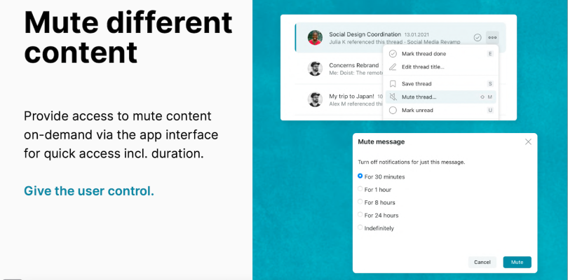
Offering notification settings with fine-grained control over the type of alerts displayed — banners, badges, SMS messages — is one way design teams can make notifications more tolerable to users. What these controls look like, and where they live, varies from one messaging service to the next and is often tied to guidelines developed for Android and iOS devices.
Twist, much like Slack, allows users to mute DMs or threads for an hour, a day or forever. Users can select how often they want to receive notifications and which type (messages, mentions, threads) they wish to see. “Do not disturb” hours let employees define hours when they’re unavailable, and a time-off feature lets users shut off notifications for vacation, illness or parental leave.
Intercom, an in-product customer communication platform, offers similar granular control in its settings, though these are aimed more at B2B customers than end users, and target the appearance and behavior of notifications on the interface.
“So we actually provide a range of options, all the way from just silently adding a little red badge we call the launcher icon in the corner of the screen to a full-screen takeover,” Connolly said. “Whether it’s a subtle little chat bubble pop-up in the window, or a larger-message pop-up, all these things can be controlled and accompanied by sound or not.”
“I want to be able to check into that when I have five or 10 minutes to look at dog pictures. But I can’t have that pinging me all day.”
He told me Intercom’s most recognizable tool, a live chat bubble that appears in the lower right hand corner of a user’s screen, is used by sales, marketing and customer support teams to talk directly to customers. In-app notifications work in conjunction with emails, chats and help center content to guide people through product orientations, offer promotions or help capture sales leads.
“And the joy of something like Intercom,” he continued, “is that people can respond to your notifications, right? They come straight into your inbox of customer conversations, so you can kind of look at these things and see how they’re performing.”
Casburn, who is especially fond of Slack’s notification settings, says she participates in 30 intra-office channels, but that half of them are muted, meaning she doesn’t hear the Morse-code-like double click of new messages or see the typography of muted channels turn bold to denote a change in status. A tool that allows her to “star” high-priority threads helps her scan and identify messages she should attend to first. Taken together, these setting controls help her avoid cognitive overload.
“We have a really lovely channel for dog owners,” she said. “I want to be able to check into that when I have five or 10 minutes to look at dog pictures. But I can’t have that pinging me all day.”
Send as Few Push Notifications as Possible
Interruptions from notifications, and the attention they demand, can be especially taxing on knowledge workers. Cal Newport, writing for the New Yorker, reported that the software company Rescue Time found users “check e-mail or instant-messenger services like Slack once every six minutes.”
Push notifications only add fuel to the fire. That’s why Pagán recommends sending as few as possible. When you do send them, he told me, it’s important to offer the user a way to address them without opening an app.
“For example, a mood-tracking app could send a phone notification asking ‘How are you feeling?’ with up to four options like Great, Good, Meh and Other,” Pagán wrote by email. “If I select Great, Good or Meh, then the app has its answer. But if I select Other, then the app opens and lets me pick from all the available moods.”
Ask for Consent
Always ask potential subscribers if they want to be sent push notifications and state clearly that it’s easy to opt out.
“And if they do want notifications, don’t just bombard them,” Casburn said. “Ask them how they would like notifications to be designed. What times would they prefer them to be shown? Really have a conversation with the user.”
The opt-in notification message, a crucial part of the design, should be sent in a dialog box requiring action. In essence, it’s the first notification your user will receive. Depending on your target audience and their goals, it can be sent immediately after users have landed on a website or once they’ve had time to explore.
Giving users granular setting control over notifications is good practice, but it requires work. When Intercom was a small startup, its core audience was CEOs and customer support reps who spent maybe 10 minutes a day on the tool. Thus, most of the default settings were tightly constrained by design.
“That’s where this idea of opinionated software comes from,” Connolly said. “We thought we’d be abdicating our responsibility by foisting our work upon users who were busy and didn’t want to be futzing with that stuff.”
As the company matured and its user base grew, so did the need to give users more options for configurability. But certain decisions, say, bundling new feature announcements in a clickable list, as Slack does, are probably best offloaded from the user.
“Ask them how they would like notifications to be designed. What times would they prefer them to be shown? Really have a conversation with the user.”
Operating systems are beginning to give such controls to users already. In the latest update of iOS 15, Samuels told me, notifications are grouped by modes (focus, sleeping, work, driving) so they can be delivered in summary at the appropriate time. Apps like Slack, ClassDojo, Voice Record and the Starbucks app, moreover, let iOS users turn on or off badges, banners and sounds selectively, from the phone’s notification’s settings — a sign that consent is increasingly viewed by designers in discrete terms, rather than as a binary all or nothing.
Painted door tests, Samuels said, can help determine the right balance between configurable and fixed states. In these tests, clickable dummy buttons function as trials for possible new features. Users’ level of engagement with these fake options can help determine, first, if it is worth developing certain notification types at all, and second, whether it makes sense to give users fine-grained control. If few users actually turn off notifications for, say, file uploads or sharing when given the option, it may not be worth the additional investment to develop these hyper-specific settings.
Consider Color and Sound Sensitivities
Some in-app messaging services, like Intercom, offer moderated chat services that let users flag concerns about notifications they find obnoxious or distracting. According to Connolly, an Intercom customer who has autism recently used the service’s chat function to notify Robert Dunleavy, a customer support specialist, about a sharp notification sound that was grating to her ears.
The message was gracious: “It’s only a minor thing. But it’d be really cool if it was fixed.”
In response, the engineering team updated the software to include six new sound settings — blip, bop, chirp, clack, hiss and tink — believed to be less arresting.
Doist’s internal research has found certain colors can be just as problematic. In Twist, Doist has done away with red notification badges, which internal research has shown users will click without reading because of the stress they induce. Threads users have replied to or read can be marked as done to remove them from a user’s inbox and provide a sense of relief.
Educate Users About the Risks of Over-Communicating
Designers have only limited control over how phone notifications look, because they’re determined by the operating system and the person’s settings. But even simple, cautionary messages can help train users in good online etiquette.
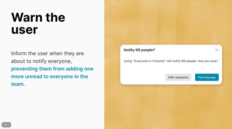
In a reversal of the dark pattern of confirmshaming, in which users are guilted into signing up for services or buying things (i.e., “Are you sure you don’t want to save $100?”), Twist uses warning messages to encourage users to think twice before blasting everyone in a channel with queries best handled by small teams.
“Notify 99 people?” a warning message might read. “Are you sure?”
Twist also nudges employees to send messages inside threads, rather than as group conversations, as research shows most people adjust their phone and desktop settings to receive only DMs, DMs and mentions, or no notifications at all. With messages relegated to threads, users might see their inbox badges light up inside the app, but they’ll be spared seeing them on the phone’s notification panel or home screen — the personal domain Ferreira felt they were invading during her visit to Japan.
Revolt Against Dark Patterns
Turning away from dark notification patterns may ultimately depend on the ethics of individual companies and the revenue-tied metrics behind the products they make. Bad actors that bombard users with notifications do so, Samuels explained, because of some intrinsic value they see in the practice: either new account creation or a percentage of ad revenue they stand to gain. The worst offenders use notifications to lead people away from apps they’re in to create accounts on other platforms or download third-party apps. Then, in a Machivellian bait and switch, users are charged a fee for upgraded ad-free service.
“So it’s all really poor, poor design for the sake of making a dollar, I guess,” Samuels said.
But design practices surrounding push notifications are evolving rapidly. The audio app Clubhouse, Samuels told me, recently gave users more control over notifications after hearing from bombarded users, who in some cases received more than 50 notifications per day. While the default settings remain aggressive, triggering notifications when anyone a user follows starts a room (or speaks in one) or when someone saved in a user’s contacts list joins the app, the in-app settings give users considerable control. Inside their profiles, users can turn off notifications completely or dial back their frequency. Notifications can also be paused for up to a week, and alerts for trending rooms and followers speaking in a room can be shut off, too.
“So it’s all really poor, poor design for the sake of making a dollar, I guess.”
The ultimate risk for companies who don’t give control back to users, Connolly said, is that iOS and Android, or the filtering services of industry watchdogs, will do it for them.
“You can already see countermeasures for these things on behalf of users,” Connolly said. “A great example of this is the priority inbox in Gmail. This is not filtering out spam. This is collecting and secreting away a whole bunch of marketing content and other forms of notifications. So there’s more and more configurability on the recipient side in these systems that allow users to throttle or control the experience in the ongoing battle for attention.”
“And I would say,” he continued, “if you’re a marketer thinking about that, you can expect some kind of priority inbox is going to come to an SMS app near you soon.”

