

You’ve probably noticed: These are stressful times. From 2020 through the present, people continue to report high levels of burnout, exhaustion and fatigue. That carries countless implications, including in product design.
Even in normal times, users probably aren’t greeting a digital product “starting at zero on a stress scale … [where] it’s only our widget that may or may not be stressing them out,” said Katie Swindler, a senior user experience strategist at Allstate. For instance, consider a user dealing with a hacked account, or one trying to use an app while also holding a crying child, she said.
That’s why Swindler targets her new book, Life and Death Design, beyond just designers who architect high-consequence systems. Even if you aren’t designing, say, hospital alerts or emergency stops, there’s a good chance some — perhaps even many — of your users are enduring a similar stress response as those interfacing in weightier circumstances.
6 Lessons From Life-and-Death Design for Every Product
- Make sure important buttons are large and placed where users can always easily reach them.
- Keep button language concise and clear. Consider incorporating action verbs to amplify directness.
- Pick user interface fonts with ample letter spacing and open letters.
- Use a contrast checker to ensure color contrast meets accessibility standards.
- Stress approachable storytelling in your UX writing. For complicated information, keep the tone conversational and provide personalized examples to make concepts more understandable.
- Make complex details more digestible by breaking them down into discrete parts. Consider slide-out panels to expand on concepts and break up information with subheadings and visual elements in content design.
In her book, Swindler dives into the underlying neuroscience of those responses — how stress hormones jolt the startle reflex; compel us into faster, more intuition-based decision-making; and prompt fight-flight-or-freeze reactions. She also asks, what can UX designers do to counteract that panic and return them to calm?
Using that lens, we asked Swindler to walk us through a few projects from her time at Allstate to see how each provides broader takeaways for all UX designers and product managers.
Can UX Calm Panic?
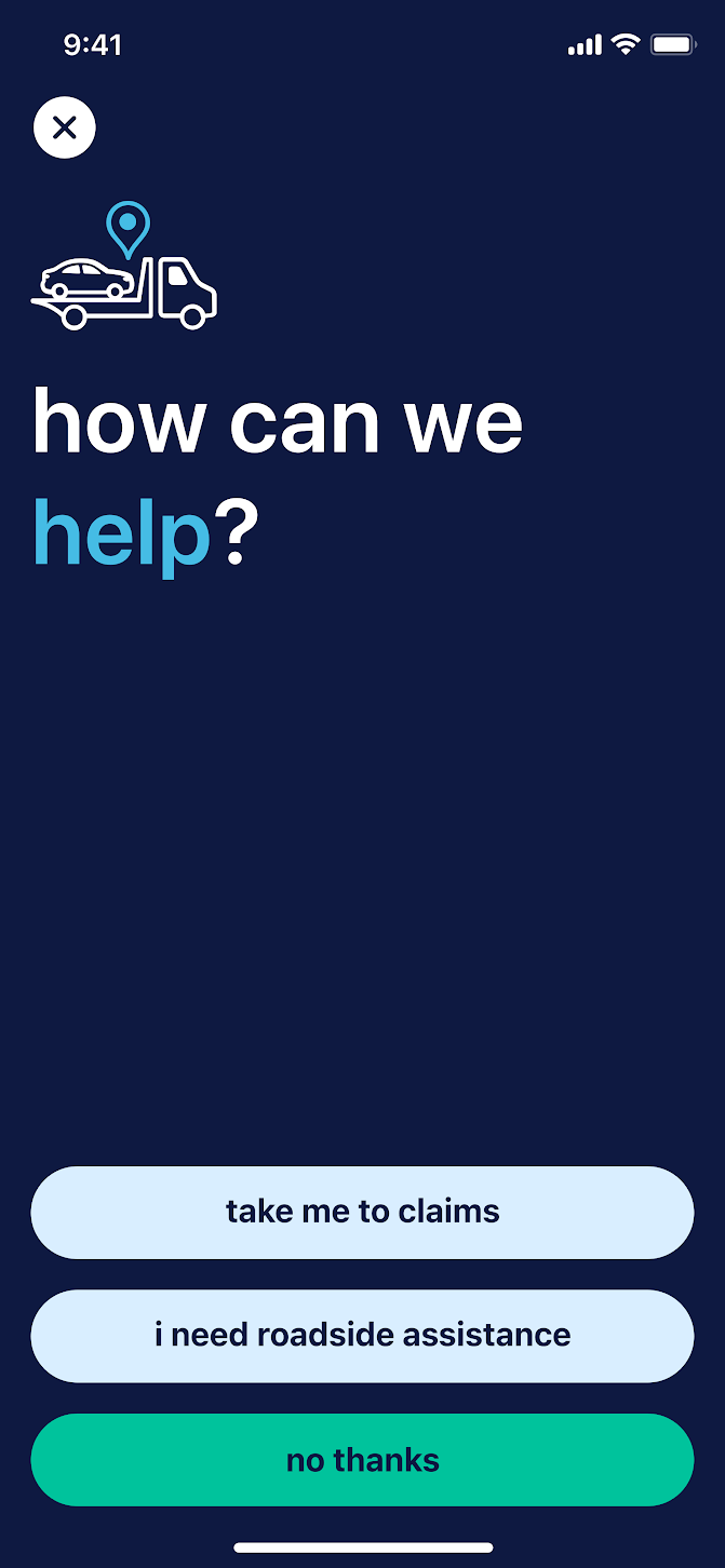
Few experiences are as stressful, or life and death, as an auto collision, and few user journeys are as fraught as navigating emergency requests or roadside assistance in the aftermath of a crash. Swindler consulted on a design that helps users navigate this scary episode: a crash detection feature in Allstate’s mobile app.
When the app detects a crash, it sends users a 911 shortcut. If users decline, it then takes them to the screen below, where they’re given three options: summon roadside help, file a claim or exit out.
There are several intentional decisions represented in this one screen, each of which carries significance beyond just the crash context. Let’s dive in.
Button Size and Placement
In a talk that presaged her book, Swindler describes the iconic red emergency button as “the granddaddy of all life-and-death designs.” It’s visual and universally understood, making it a natural touchstone for other design systems.
It’s impossible, of course, to incorporate the stop button’s physical tactility into flat surface design, but you can make digital buttons similarly easy to see and access — an important factor for users in the midst of fight-or-flight stress, Swindler notes. Notice that all three buttons in Allstate’s crash detection feature are full width. They’re essentially as large as possible without being confusing. “You don’t want it to be so big that your choices fall off the screen,” Swindler said.
Notice the placement, too, at the bottom of the screen, where the thumbs naturally tend to hover. Perhaps the most famous recent example of dropping key UI elements into lower position came last September, when iOS 15 pushed the address bar to the bottom of Safari, but it’s been a developing trend in UX for years. And, when considered with button size, it’s especially important for simplifying navigation for stressed users.
“You can hit it with either thumb, if you’re left- or right-handed, but also, what if you’re in a crash and your hand gets trapped? If you only have a single hand to work with, then it’s especially important that it’s that easy to use,” said Swindler.
Word Choice, Color and Font
Of course, button size and position can only offer a stressed user so much without also incorporating effective language and thoughtful presentation of that language. Concision is important, but so is clarity, Swindler said.
The crash detection feature strikes a balance with a mixture of plain, straightforward language and a focus on action verbs, to make the instruction clear and direct (“take me to claims,” rather than simply “claims”). It’s good usability advice in general, but doubly important in high-stakes or high-stress situations.
Another important factor is font selection. Swindler didn’t personally select the typeface featured in the crash detection feature — Allstate had commissioned it beforehand — but it nonetheless exhibits the kind of UI legibility that’s important to provide users in times of stress. “It works really well in these UI spaces where you want it to be extra legible,” she said.
In Life and Death Design, Swindler references the work of the Readability Group, which studies the characteristics that make typefaces readable and accessible. They’ve noted the importance of generous letter spacing and open letters, which you can see in the crash-feature copy, too. Notice how the “c” in “claims” doesn’t squeeze in on the “l” (and risk reading as “daims”) and how the terminals have clear open space between them (the “c” doesn’t look like an “o”). Small details, of course, but worth considering, especially when trying to assist a user caught in a fight-or-flight response. (Side note: The use of all lowercase on the buttons in the crash detection feature is based on company brand standards, Swindler said.)
Finally, consider color contrast. Contrast between the text and background elements need to be clear, especially in high-alert situations. That doesn’t happen by accident.
Swindler noted that when Allstate’s chief creative officer arrived a few years ago, he brought the UX team into brand-identity evolution discussions, “to make sure there was a really strong emphasis on choosing color palettes that have good contrast ratios, to maintain high legibility throughout the process.”
And, of course, remember to use contrast checkers, especially for high-impact user contexts, to make sure readability is prioritized.
UX Storytelling as Salve
Stressed users, Swindler notes, rely significantly on intuition — when people feel overwhelmed, instinct kicks in. That can be a good thing, particularly if designers can foster intuitive experiences that allow users to focus on what’s most difficult and not have to sweat the small stuff, she adds.
An under-appreciated avenue for building intuition, according to Swindler, is storytelling. “Storytelling is a rich, layered and highly effective method of developing intuition that should be incorporated whenever possible,” she writes.
Relatable Content Design
A case in point for storytelling: Allstate’s gap insurance explainer.
The nuances of supplemental auto insurance aren’t exactly life and death, but they are certainly complicated and consequential. In other words, the kind of thing that might stress out users. The explainer page is broken down into manageable sub-headed chunks and also includes a video, but one passage in particular jumps out for Swindler:
How Does Gap Insurance Work?
Here’s an example of how gap insurance may work: Say you bought a brand-new car for $25,000. You still owe $20,000 on your auto loan when the car is totaled in a covered collision. Your collision coverage would pay your lender up to the totaled car's depreciated value — say it's worth $19,000. If you don’t have gap insurance, you would have to pay $1,000 out of your own pocket to settle your auto loan on the totaled car. If you have gap insurance, your insurer would help pay the $1,000.
A few choices are of note. The explanation is pitched as a specific hypothetical (a brand-new vehicle, totaled), personalized in the second person (the story is happening to “you”) and reinforced with concrete example figures. Plus the tone is kept casual.
That’s a much different approach than something flatly definitional — like, “gap insurance covers the difference between a vehicle’s worth and the driver’s owed amount.” A true assessment, but not so approachable. Content designers can use these approaches to help users develop a more intuitive understanding of the product — especially complex problems.
Snapshot and Exposition
Swindler helped weave this kind of storytelling into one of Allstate’s most ambitious recent UX projects, a multi-product quote tool on the company’s site. The tool allows users to get a bundle quote for multiple insurance products (auto, motorcycle, off-road, term life and renters or home) in one process, rather than having to complete a new flow for each individual product.
The tool is a fine example of several user onboarding best practices — the number of actions per screen is kept low, which can help prevent users from feeling overwhelmed and dropping off, and there are several inline banners to help guide users along. (A question about estimated annual mileage, for instance, includes a banner that reads, “The national average of miles driven annually is 12,000. Please enter the mileage that accurately reflects your usage.”)
At the same time, quoting numerous coverage types inherently leaves the user with a lot of information to consider at the end of the process: the shopping cart page. There, users are shown all the different policy options for each of the different insurances they’ve selected, which might mean dozens of coverage choices to look over.
“Trying to understand just all the different auto coverages and how they work, that's enough complication,” said Swindler, who helped design the shopping cart page. “Now you’re adding, let’s say, home and life on top of it. You’re tripling the amount of information and coverage types and choices that people are making.”
Here’s where UX writing, storytelling and structure work together to ease a potentially overwhelmed user. Let’s look at the collision coverage description and layout.
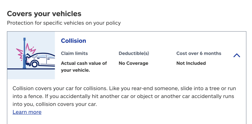
The explanation, pictured at the bottom of the image, is short, straightforward, conversational and refers to the reader directly, as “you.”
From there, the “learn more” link expands into more detail. A slide-out panel (below) walks users through the nuances of the policy in more depth, while still maintaining the personally directed, conversational tone.
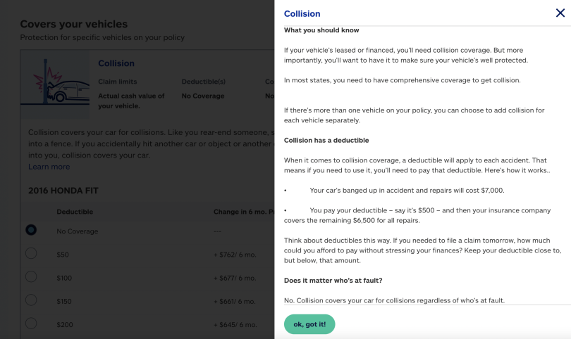
A direct, approachable style and divided structure, together, can help facilitate understanding — and hopefully build the kind of intuition that can be beneficial for stressed users.
“This sort of storytelling really helps people wrap their brains around these really complicated products, because it puts it into their perspective,” said Swindler. “We’re all kind of self-obsessed creatures, and putting things into context of ‘How does this affect me?’ is really the fastest way to get somebody to understand. You put it from their point of view first, then you can widen it.”
And hopefully you calm a frayed nerve or two among your user base in the process.


