

“No, I’m OK with missing out on awesome deals.” That was the rejection-link copy you would’ve had to click to exit a pop-up that New Jersey-based coffee equipment seller Majesty Coffee added to its website during the company’s Labor Day sale last year. If it strikes you as kind of an unnecessary guilt trip, you’re not alone.
The promotion performed about as well as expected in terms of revenue, Nunzio Ross, owner of Majesty Coffee told Built In, but it came at the cost of customer satisfaction. The company’s net promoter score dropped more than 20 percent after the episode — a textbook example of what’s known as confirmshaming and why it should be avoided.
What Is Confirmshaming?
Confirmshaming is “the act of guilting the user into opting into something,” according to Harry Brignull, the U.K.-based UX expert who coined the term. “The option to decline is worded in such a way as to shame the user into compliance.”
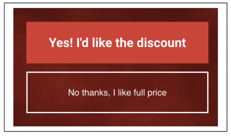
According to researchers at Princeton University and the University of Chicago, the tactic is most often deployed to land email addresses in exchange for discounts. (Some examples they encountered included “No thanks, I hate saving money” and “No thanks, I hate fun and games.”) But you might also spot it in unsubscribe processes or newsletter signups, or anywhere that conversion or retention is the goal.
Confirmshaming is an example of a dark pattern, another term that Brignull originated to describe interface designs that manipulate or coerce users. In the decade-plus since Brignull first identified the issue, dark patterns have grown like an invasive vine — rampant and problematic enough to draw the attention of the Federal Trade Commission (FTC) and prompt a new tip line. Confirmshaming, specifically, has grown widespread enough to spark online roundups of offenders, to shame the shamers.
But even if the FTC were to take stronger action against dark patterns, and if state-level regulations against them were replicated, confirmshaming is a more slippery beast. Unlike most dark patterns, which tend toward deception and deceit — the kind of shadiness that consumer protection often tackles — confirmshaming is brazen. It slaps users right in the face with guilt-charged manipulation. So the responsibility to advocate against the practice will likely continue to fall on UX designers. But what does that look like in practice? And how did we get here in the first place?
The Rise of Confirmshaming
The roots of confirmshaming and other dark patterns are easy to spot. According to UX researchers writing in Communications of the ACM, dark patterns are the culmination of three, long-running trends: deceptive practices in retail, the behavioral economics principle of nudging and the circa-2010 explosion of growth hacking. Those have been identified as antecedents of dark patterns in general, rather than confirmshaming in particular, but it’s easy to see how each factors into the pop-up shame game.
In terms of deception, it’s not uncommon for confirmshaming to also resort to dishonesty, touting “exclusive” content that’s actually available elsewhere, as Nielsen Norman Group senior user experience specialists Kate Moran and Kim Salazar point out. The nudge, meanwhile, is the concept of subtly influencing people to act in their best interests. But it has a negative inverse: sludge, or “nudging for evil,” as economist Richard Thaler described it. Confirmshaming represents precisely that kind of nudging without users’ interests at heart, according to Lior J. Strahilevitz, a University of Chicago legal scholar who’s studied dark patterns. Finally, growth hacking 1.0 focused squarely on near-term growth, with little or no mind paid to brand management — essentially the same gamble made by confirmshaming.
“Confirmshaming is about short-term gains, not about long-term relationships and engagement,” said Liz Dube, director of user experience at web conferencing platform Fuze.
The public became more broadly cognizant of the tactic in 2016, when a Tumblr chronicling confirmshaming reached Hacker News and was covered by outlets like Vice and The Next Web. But the light wasn’t quite disinfectant enough to kill the germ, which continues to, well, pop up with some regularity.
Confirmshaming Persists Because It Works
Why does confirmshaming carry on, despite the bad press? Because it seems to work. In a recent study led by Strahilevitz, a group of users who were exposed to a confirmshaming condition opted into a dubious program at a rate of nearly 20 percent (120 out of 612 respondents), while the control group’s acceptance rate fell below 15 percent (191 out of 1289 respondents).
The study also found that subjects with an education level of a high school diploma or less were more susceptible to mild dark patterns, which include confirmshaming. Strahilevitz’s research also showed, surprisingly, that confirmshaming had no significant effect on subjects’ mood compared to the control. Anecdotal evidence and social media blasts aside, the consumer backlash around confirmshaming may be smaller than probably expected.
That perfect storm of factors confirmed that tactics like confirmshaming seem to be “all upside for firms,” Strahilevitz told the FTC, referencing his research, at a dark patterns workshop in the spring. All upside for firms, but annoyance at best — and danger at worst when it results in financial loss or personal data disclosure — for users.
“We think it’s precisely because social scientists working in-house for tech companies have done studies like ours on their own and seen how effective these dark patterns are, we think that explains the proliferation of dark patterns on various electronic platforms,” he added.
Nick Anderson, a Denver-based designer and UX instructor at General Assembly, said one reason confirmshaming in pop-ups is effective is because it so thoroughly breaks users’ flow. He likened the pop-up experience to someone slapping a post-it note in your face while you’re reading a book. Manipulative copy breaks the design pattern further, making the user notice that interruption even more.
“Confirmshaming is really good at taking you out of that flow,” he said.

How to Push Back Against Confirmshaming
5 Tips to Avoid Confirmshaming
- Gather evidence through user research and testing.
- Don’t confuse snappy with shame-y.
- Prioritize concision and clarity.
- Provide clear opt-out options.
- Say the copy out loud.
Gather Evidence Through User Research and Testing
UX designers shouldn’t take the recent research as an invitation to confirmshame. Indeed, other research and usability studies have unearthed user dissatisfaction and higher unsubscribe rates related to the practice. Even setting aside the fact manipulation is not cool, it might also drive backlash in your user base. So test away.
“We make sure that everything is backed by user research, so we don’t run into these types of problems or have this type of debate,” Satyawan Narinedhat, lead product designer at DailyPay, told Built In.
Documentation is of course key, so you have evidence to point to in the event of backlash.
“[Y]ou can ask whether there is anything about the website they dislike or find annoying. Make sure you record these sessions too, as nothing is more potent than seeing just how frustrated and irritated people get with these kinds of techniques,” wrote user experience consultant Paul Boag in Smashing Magazine, about how to convince others in your company to reject dark patterns.
Don’t Confuse Snappy With ‘Shame-y’
It’s easy to imagine a counterargument that insists confirmshaming is harmless and cheeky, ignoring its capacity for harm — a way to give rote copy some pop. But UX writers should be able to impart some panache without resorting to guilt.
“Snappy does not equal shame-y and vice versa,” said Anna Turkot, director of content and communications at website building platform Duda. “Being clever and sharp has little to do with evoking negative emotions in your customers and has everything to do with your ability to communicate clearly, concisely and in a way that exudes character.”
Something along the lines of “No, thanks, I REALLY hate saving money” as no-button copy for a promotion or sign-up pop-up reads as “condescending and negative,” said Brad Touesnard, founder of SpinupWP, a server control panel for WordPress. “Instead, using ‘Nah, I’m good’ as the opt-out copy is conversational, personal and snappy without feeling insulting.”
That kind of friendly, casual (but still positive) approach also tends to work better with younger generations, said Juliane Trier, a digital designer at Mouseflow.
Prioritize Concision and Clarity
That said, don’t overvalue snappy in the first place. Being direct is more beneficial for user experience than being clever, especially in higher-stakes paths like subscription cancellation processes. It’s also worth asking, does that approach even dovetail with the broader design system and brand guidelines?
“Adopting a snappy tone to induce the user to do something is all well and good if that fits with your brand, but it’s not necessarily a successful approach,” said Amy Wicks, content strategy manager at design consultancy Mad*Pow. “Your tone should be guided by your brand. Be true to your brand, respect your audience and you’ll have more success. ... Being direct and inclusive is a better strategy.”
Narinedhat, of DailyPay, said he might design presentation templates that limit the amount of copy that will fit within a field. That way, when he’s working with marketing or a content writer to finalize promotional copy that will appear in the app, he can make sure it’s direct.
“Users don’t read a lot,” he said. “So we want to make sure we get the point across immediately.”
Provide Clear Opt-Out Options
What’s the best way to handle copy in pop-ups, where so much confirmshaming tends to thrive? After all, even non-shaming pop-ups sometimes employ other shady patterns — sometimes literally shady, like when opt-out buttons and copy are grayed to imply that “no” is not an option.
As Anderson sees it, the ideal design allows the user to exit through three paths: clicking the negative space outside the pop-up, clicking on the “X” (generally placed in the upper-righthand corner) or clicking the “no” button. Having an opt-in button without an opt-out button, even with other exit avenues available, is still potentially off-putting.
“You’re not intentionally making a dark pattern there, but people could get lost,” he said.
“The golden rule is to make the user’s actions as easy as possible,” Anderson added. “If they want to leave that pop-up, we need to make it as easy as possible for them to leave that pop-up. If that means that the pop-up didn’t work, it means the pop up didn’t work. We need to figure out some other way of approaching it.”
Say The Copy Out Loud
Anderson is generally a skeptic when it comes to designers physically inserting themselves into UX research, but he recommends they say potential pop-up copy out loud directly to another person to help gauge its appropriateness.
Or consider expanding the exercise to roleplay a physical retail scenario. “Someone says, ‘Hi, I saw that you have really good shoes in there.’ Then tell them to their face, ‘Hey, do you want to sign up for our newsletter? Or are you boring and you hate deals?’ Would you say that to a human being’s face?” said Anderson. Granted, in-person experiences are not identical to online ones, but if it’s too ill-mannered to do face to face, the same likely goes for the web.
Taking a bird’s-eye view, it essentially boils down to preventing the nudge from becoming sludge.
“Our job is really to create the best user experience. ... And if we define that correctly and work toward that, then we won’t run into situations where we’re being pressured to create these patterns,” Narinedhat said.


