

The Nielson Norman Group is widely touted by designers as one of the leading authorities in user experience design. Co-founded by Donald Norman, the author of The Design of Everyday Things who popularized the term “user experience” in his early days as a fellow at Apple, and Jacob Nielson, who was described in the New York Times as the “guru of web page usability,” the organization has consulted high-profile clients like Google, National Geographic, Sony and eBay.
But if you visit the company’s website, says Tobias Komischke, a UX Fellow at the tech company Infragistics, it looks a bit basic. A far cry from the visual spectacle of, say a geodesic surfing hut on Airbnb or the loud duotone graphic spanning Spotify’s homepage, the banner is a boring landscape photograph of students peering down at their laptops, many of them with open water bottles resting on the tables in front of them.
“It actually looks very non-designed,” Komischke said. “There’s no sense of visual design there. It’s just content. Content is king. And they actually did that deliberately. They wanted to convey what you access on the site. And they didn’t want to have something that just looks nice.”
9 Functional Design Framework Strategies
- Identify your audience and their intentions. This will help you understand the best messaging and navigational flow to serve their needs.
- Make sure your value proposition is obvious at a glance. The landing page should state who you are, what you do and how your software solves a problem.
- Stick to familiar iOS and Android design patterns.
- Build trust. Signal to users that processes are working as they should, for example with an animation that indicates when something is loading.
- Build for forgiveness. Anticipate users’ mistakes and provide tools to undo them.
- Sometimes it’s OK to be redundant. If it helps alleviate users’ concerns.
- Navigation should mirror users’ habits and thought processes. You know how everything fits together — users don’t.
- User testing is core to functional design. Where are users struggling? How can you help them?
- Functional design does not have to be basic.
This, in a nutshell, is the essence of functional design: being as direct and transparent with your audience as possible to convey who you are, what you do and what they can expect to accomplish on your website or app. Analogous to the Bauhaus movement in architecture, functional design as a framework for software design strives for efficiency and frowns on excessive ornamentation. Sites that are well-organized, easy to navigate and clear in their value propositions to users and business groups exemplify the approach.
“You don’t go to Amazon to browse 200 pairs of socks,” he said, citing the software giant as a classic example. “You want to buy the best sock you can find for a good price. They spend a lot of effort removing any hurdles to that overall task, even down to frustration-free packaging.”
Komischke speculates that the framework has gained favor among product teams because its outcomes can be empirically validated with usability testing. Do users make it through your entire onboarding process or only half of it? When do they abandon it? What feature or process stood in their way?
Because of their relative complexity, large, data-rich websites may stand to benefit the most from a functional design approach. A review of the homepages of the top 26 Fortune 500 B2B technology firms conducted by the digital design agency WebEnertia ranked NetApp, Salesforce, Qualcomm, respectively, the top three sites in functionality. According to the report, what these sites share is “a strong sense of narrative to help with information gathering and goal completion.”
So how can you reap those benefits, you ask? To answer that question, Built In spoke to design leaders who have applied a functional design framework in practice. Here are nine strategies they recommend.
Identify Your Audience and Their Intentions
Salesforce has a different user base than GoPuff or Dropbox, and thus, what constitutes “functional design” on its website or apps is going to follow a different set of rules. Audience matters. That’s why, when applying a functional design methodology, Steve Ohanians, CEO and director of digital strategy at WebEnertia, recommends starting by identifying your core users and mapping their needs, goals and pain points.
In a persona mapping exercise for Tealbook, a Toronto-based data procurement foundation that uses artificial intelligence to help clients assess vendors, WebEnertia identified two key personas: project managers who would be using the site daily — for instance, to quickly parse a company’s diversity profiles — and executives making investment decisions. This resulted in a site map with separate login structures, user flows, content displays and calls to action for the two personas — in a sense, two entirely different websites.
Personas can quickly become overspecified, however. For most companies, two to five is plenty.
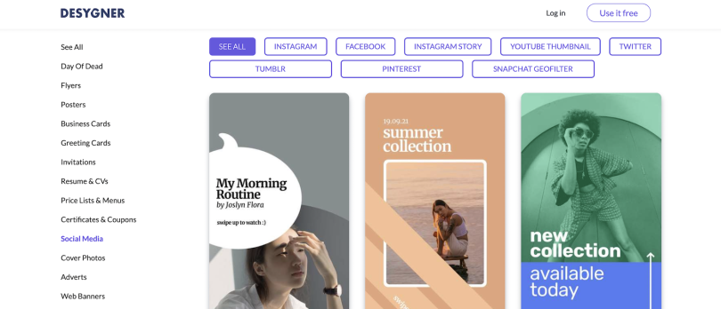
The Australian-based software company Desygner, which offers graphic design templates for logos, newsletters and social media covers, limits its personas to just a few and keeps them deliberately generic. In this way, the company avoids pigeonholing users, who apply the tool variously for design, content dissemination and digital asset management.
“Think of a film adaptation of a book,” Alexandre Goloskok, co-founder and head of app development at Desygner, said. “A lot of the time people do not like the adaptation. It’s not because the visuals aren’t strong or because the actors aren’t right. It’s because people have imagined something very different. And the book leaves more to the imagination. We have to rely on that a little bit, too, because of the vastness of our product.”
Make Sure Your Value Proposition Is Obvious at a Glance
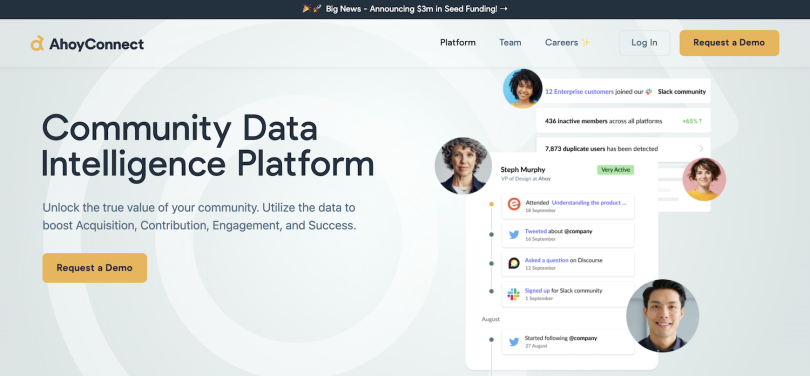
The landing page for the community data intelligence platform AhoyConnect, a relatively young startup, is intentionally straightforward. A prominent value proposition doesn’t attempt to speak to the entire world, but targets the platform’s core users: community managers.
“It’s important to not to overmarketize [the value proposition] and have 15 different buzzwords,” said Tomás Javosky, the founder and CEO. “We say, ‘a community data intelligence platform,’ that’s still, cheesy, maybe, but the value proposition says what we actually do: we utilize community data to boost your acquisition, contribution, engagement and success.”
The landing page is also designed to show how AhoyConnect solves a particular business problem: in this case, the abundance of disparate information community managers are tasked with gathering from online discourse communities like Discord, Slack, Twitter and GitHub. By selecting from one of two infographics, community managers can see two alternative scenarios: one, a seamless pipeline of information automatically filtered to sales, product and customer success teams through AhoyConnect; the second, a rat’s nest of disjointed communication lines and lost data.
“How does the world look like with us? And what does it look like without us?” Javosky said, paraphrasing the message at the heart of the graphic. A 60-to-90-second video can drive home a similar point.
Stick to Familiar iOS and Android Design Patterns
Ohanians, who oversaw the review of homepages of Fortune 500 B2B technology firms, says functional design boils down to user empathy. And one of the most salient ways this is expressed in software design is the use of familiar interface patterns.
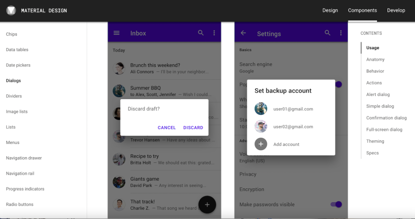
Following Google’s Material Design guidelines for Android devices or Apple’s Human Interface Guidelines for iOS applications is considered good practice, as these are readily understood by users, and provide parameters for, say, where to put a notification, how large it should be, and how long it should appear on the screen (ideally no longer than 2-7 seconds), so that it doesn’t seem overly intrusive.
Google’s component library is broken down into about 30 categories with some fairly esoteric names. A chip, for example, is the capsule-shaped icon that encapsulates someone’s name in the “To” field of an email. A radio button is a circular icon you click to choose an item from a list.
Generally speaking, users understand these established interface elements by their visual appearance and context, not what they’re called. Android users might not know that a circle with a plus sign inside it is called a “floating action button,” for example, but almost all of them understand how it operates because they’ve used it to compose, probably, thousands of emails.
“Google was sort of, I suppose not forcing, but really incentivizing developers to use material design — less now than before — but I think that was very good of them,” Goloskok said. “Because it really makes users feel at home when they go into an app.”
At Desygner, user interaction design decisions are based on several criteria:
-
The user’s platform or operating system: iOS, Android or desktop browser?
-
Users’ familiarity with the pattern. If you’re making a messaging app, you want to mirror patterns people are used to, but if you create an app for entirely novel applications you have more flexibility.
-
The importance of the information being presented. A required request for permission, such as when asking users for consent to use cookies, typically requires a more intrusive interaction than a tooltip or feature suggestion.
-
Length of the expected wait time. If users are expected to wait more than a second or two for a feature to load, a persistent indicator, like a progress bar, should let them know that things are happening.
-
What the user would normally expect.
This last point — appealing to users’ expectations — is especially important. That’s why Desygner, like many companies, treats sign-in and registration on its mobile apps as part of a single process. After entering their email, Goloskok told me, the user is directed either to register for the first time or log in to an existing account. This preempts misunderstandings, such as when a user attempts to enter their email and their email password to access the tool, missing the fact that their Desygner account requires a separate password.
Where Desygner users find and upload images is similarly aligned to their expectations. It used to be that a tab called ‘My Assets’ allowed account holders to upload royalty-free Shutterstock images to use in their designs. The only problem was they had to browse for them in a separate tab. A floating action button, now in development, will connect the two processes through a recognizable icon.
As for the visual design and arrangement of common interface elements, there’s no need to reinvent the wheel.
“A big part of what we try to do is stick to what users know and expect,” Goloskok said. “On the App Store, the first thing you see when you download an app is that little circle that’s getting filled in. We know that and we try to borrow that.”
Build Trust
Let’s say you just recorded a call in Google Meet and want to go back to listen to it. Where is it saved? Is it saved at all? Transparent and timely feedback can help answer these questions, and feedback signals are considered hallmarks of functional design.
In the case of a Meet recording, Ohanians said, several signals are embedded in the process to provide reassurance to users. These appear before the recording takes place, during the recording and after it is complete.
When you initiate a recording from a menu control in the bottom app bar, a card appears with an option to “Start Recording” and this message: “When the recording is finished, it will be saved in the organizer’s “Meet Recordings” folder in Google Drive.” This is the first notification letting the user know where they can find the recording once it’s complete.
Several additional signals — a progress indicator, a disappearing snackbar that says “recording will start soon,” and, eventually, the appearance of a red “recording” button accompanied by a dinging sound — let the user know the recording is proceeding as planned. After the recording ends, another dialog box and snackbar remind the user that the recording will be saved to the Drive. If the user has somehow missed these signals, there’s yet another feedback mechanism: a link to the saved recording sent to their Gmail account.
All this might seem like overkill, but when it comes to the preservation of potentially important and sensitive information, Ohanians says building user trust is key.
“And it’s done with timeliness,” he said. “So having a notification that says, ‘We’re still working on it,’ and having that notification happen if you log out and come back, so it doesn’t feel like the recording is going into a black hole.”
Build for Forgiveness
Users make mistakes all the time. Good design understands this and allows mistakes to be quickly undone, or better yet, prevents them from happening at all.
“Something that we talk about is building for forgiveness,” Ohanians said. “So if someone makes a mistake, how can we build functionality to ensure it’s not irreversible or has a lasting, detrimental impact on what they wanted to do.”
Dustin Max, writing for Smashing Magazine, notes several ways web designers can reconcile users’ mistakes, “from persistent menus and ‘breadcrumbs’ to 404 pages (‘Page Not Found’ pages) that link to the pages the websurfer was likely to have been looking for.” These are all useful tools, Komischke says, but it’s best when designers can anticipate users’ mistakes before they even happen — a practice Infragistics applies in its password login flow.
“Say you enter a password, and then get, like, 16 error messages — not enough special characters, too short, not safe enough. And all this is after the fact,” Komischke said. “What we try to do is intercept these errors before they even occur. And, interestingly, we try to assist users in avoiding strategic errors.”
A checklist of password requirements that are removed from the list or lit in green once they are satisfied helps preempt user frustration, he said. Coding defensively, with automated messages tailored to possible fail states, serves as a second line of defense when user errors do occur.
Sometimes It’s OK to Be Redundant
Functional design tends to be utilitarian, but, ultimately, it’s about meeting the needs of users where they are. Though working templates in Desygner are autosaved to the cloud, some users still operate from the assumption they need to save files manually or they could be lost. To placate those concerns, Desygner includes a save button in the menu as a kind of placebo: it’s functionally redundant, but it makes users feel more at home with the software.
To flag problematic issues — such as when users attempt to print images suspected of color bleed — alerts are sent multiple times. If the error is severe, or could leave users in a foul mood later, it’s best to amp up the messaging.
“A lot of people just go trigger happy and dismiss,” Goloskok said. “We try to solve that by offering a way to see the error again. Either with a tooltip or a question mark they can hover over. Because I suppose the main issue in today’s world is people don’t rethink.”
Navigation Should Mirror Users’ Habits and Thought Processes
Get out of your own head and think like a user. It’s hardly a new insight, but machine learning is changing how the adage applies to interface design.
Buyk, a New York-based service that promises groceries delivered in fifteen minutes, is a good example. The arrangement of food tiles on the company’s iOS and Android apps is optimized according to a user’s previous order habits, and choices are purposefully limited: you won’t find fifteen types of milk to choose from, but you’ll likely find three.
“For us, functionality is aimed at fulfilling the order as fast as possible,” co-founder and CEO Slava Bocharov said. “So the catalog will begin with the items the consumer orders more frequently, And, when they reach the basket, we remind them about the items they purchase most.”
The company’s physical Infrastructure assets are also built around speed. Twenty dark stores located in Manhattan, Bronx, Brooklyn and Queens provide an operational footprint from which couriers can reach customers quickly as they are never more than a few miles away. Out-of-app push notifications let customers know when their deliveries are expected to arrive.
Hunger has little patience. The design understands this.
User Testing Is Core to Functional Design
The real trick to realizing the benefits of functional design, though, according to Komischke, is finding a way to operationalize guiding principles of efficiency, ease of use and transparency in metrics that can be empirically assessed. Usability testing services and analytic instruments, such as UserTesting, Optimizely, FullStory and Mixpanel, can be helpful in this regard by providing a view of how users are interacting with particular features and where they are getting confused or lost.
“Something we found out straightaway is how much value you can get from sitting down and watching users struggle,” Goloskok said. “So we do recordings of people where we tell them, for example, to design a business card that has two sides, with a little flag of your country in the top right corner. We ask them to add some shapes and perform some tasks, and then we see how they approach it, how they struggle. Some people might whisk through it, but others really, really struggle on very simple things.”
Insights from user testing can be quite surprising. Desygner, for instance, was having limited success introducing users to a PDF import function available in its graphic design tool. After watching users largely ignore the feature, the team made a simple change.
“We made it more generic, sort of this banner saying, ‘Did you know you can edit a PDF?’ and that increased usage a lot, because, I suppose, it activated more neurons in people’s heads,” he said.
Functional Design Does Not Have to Be Basic
WebEnertia saw a similar breakthrough in a web portal they created for the teeth aligner company Invisalign — though what they learned from research was somewhat counterintuitive.
Making the site more of a community-friendly platform through knowledge-sharing forums and chat options for dentists and orthodontists, rather than merely a task-oriented fulfillment service, increased the speed with which providers were fulfilling orders and also the time they spent on the site.
“At the end of the day, you’re dealing with people,” Javosky said. “In functional design, you’re often designing a function to delete something, to add something, to save something, to do all that stuff. But there’s people involved and, as human beings, when we enjoy something, we actually root for it.”


