How would you feel if Gmail didn't tell you “Message sent” or if Instagram didn’t show you the signature ♥️ when you double-tap on a post?
Maybe you’d be anxious and unsure. Was that email successfully sent? Did I already like that post?
Our expert is here to tell you about those often overlooked parts, the unsung heroes of UX design: microinteractions. They may be the smallest details of your UX design, but if you don’t pay enough attention to them, they have the power to disrupt the whole carefully designed user experience and user journey.
What Are Microinteractions?
Microinteractions are tiny, subtle actions that users go through to accomplish a task. The term was coined in 2014 by Dan Saffer in his book Microinteractions. Though they may be small, their impact on a user is big.
Understanding Microinteractions in UX Design
Microinteractions are tiny, subtle actions that users go through to accomplish a task. The term was coined in 2014 by Dan Saffer in his book called — you probably guessed it — Microinteractions. Sadly, they’re often overlooked because they’re so ... micro. Though they may be small, their impact is big.
Microinteractions are widely varied — from notifications to microcopy, from animations to finger gestures. You’ve seen some examples above, and here are a few more:
Examples of Microinteractions
- The small hand that appears on your screen when you tap the Raise Hand button on Zoom and Gmeet.
- The small, red message that tells you your username is incorrect or that your password needs to be stronger.
- Tinder’s swipe right gesture and the “It's a match!” animation.
Many, many more examples exist in the digital world. Microinteractions are everywhere. You might not always notice them, but getting them right makes your UX a lot less jagged in the same way a fine dining restaurant creates a smooth, delightful culinary experience through its lighting, table setting, service, and etiquette.
4 Parts of Microinteractions
We can break down microinteractions into four even smaller steps
4 Parts of a Microinteraction
- Trigger
- Rules
- Feedback
- Loops or modes
1. Trigger
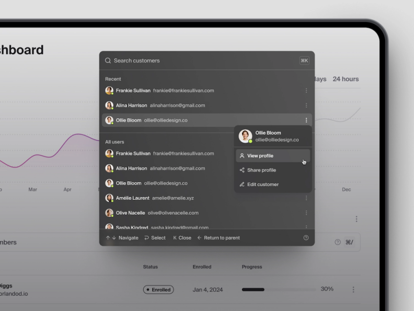
A trigger prompts a microinteraction to start. It can come from the user or the system. Check out the examples below.
User-prompted triggers include clicking a button, filling out a form, pulling down to refresh, or animations like these examples.
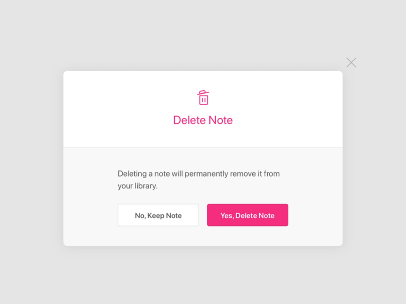
System-prompted triggers include notification badges and chimes, payment gateways, files deleted messages, et cetera.
2. Rules
The rules define what happens after the trigger is performed.
Rules can determine what the system does behind the screen. For example, after a user picks their goals on a lifestyle app, the system proceeds to display only relevant resources.
They also establish what control the user has. For instance, after getting notifications, the user has the control to view it, delete it, or just leave it for later.
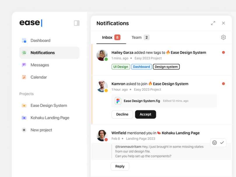
The UX team defines these rules, and they are invisible to the users.
3. Feedback
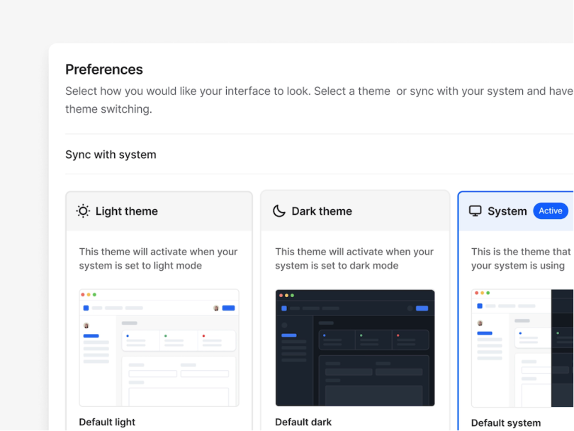
Feedback is the visible part of the process that lets the users know their task is complete. Some examples include the following:
- After clicking, the Subscribe button changes into an Unsubscribe button.
- Showing and hiding a profile section after clicking a toggle.
- Changing dashboard appearance in the settings.
4. Loops or modes
These two factors determine what happens to a microinteraction when the circumstances change — e.g., a change in location, behavior, history, web visit duration, and more.
Loops set the duration of the microinteraction.
For example, the first time you make a payment, you add a payment method and enter your card information. The next time, the flow changes, and you pick from your list of saved cards and enter your CVV only.
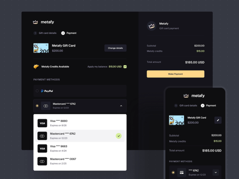
Modes can modify the standard way things work. For example, the suggested items section of an e-commerce platform might normally show office chairs and desks. After you search for lamp products, the website now suggests lamps, too. Another example may be setting your phone to switch to sleep mode at 9 p.m. based on your settings.
Avoid These Mistakes When Designing Microinteractions
Because these are so small, designers can easily make unintentional errors when designing microinteractions. Note the following common mistakes and avoid them wherever you can.
Overdoing the animation
Having a live chat button bounce up and down every time you scroll on the page can quickly exhaust the users. Keep things to a minimum and each animation will be a small, delightful experience.
Creating a drastic, unwanted change
Remember when Instagram users scrunched up their noses when the app moved its New Post button? When users become accustomed to buttons and features in a certain place or doing a certain gesture to accomplish one thing, completely changing them might not be a wise decision.
Not collecting data and feedback
As always, data plays a crucial role in finding out what your users both want and need.
Forgetting the emotional side
Relying on data is great, but never forget that users are human beings with emotions. Try playing around with humor, wordplay, and animation that still follows your brand voice and identity.
Keep It Subtle!
When it comes to microinteractions, keep things subtle yet noticeable. Pay attention to the sequence while designing a microinteraction: trigger, rules, feedback, and loops or modes. Remember, moderation is key! Avoid going overboard with animations, making drastic changes, and disregarding user feedback and data. Strive for a balance that enhances the user experience without overwhelming it.


