

Anscombe’s quartet is a group of four data sets that are nearly identical in simple descriptive statistics, but there are peculiarities that fool the regression model once you plot each data set. As you can see, the data sets have very different distributions so they look completely different from one another when you visualize the data on scatter plots.
What Is Anscombe’s Quartet?
What Is the Purpose of Anscombe’s Quartet in Data Visualization?
Anscombe’s quartet tells us about the importance of visualizing data before applying various algorithms to build models. This suggests the data features must be plotted to see the distribution of the samples that can help you identify the various anomalies present in the data (outliers, diversity of the data, linear separability of the data, etc.). Moreover, the linear regression can only be considered a fit for the data with linear relationships and is incapable of handling any other kind of data set.
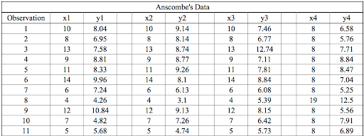
We can define these four plots as follows:
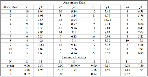
The statistical information for these four data sets are approximately similar. We can compute them as follows:
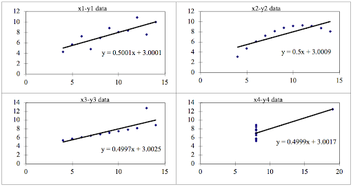
However, when these models are plotted on a scatter plot, each data set generates a different kind of plot that isn’t interpretable by any regression algorithm, as you can see below:
We can describe the four data sets as:
Anscombe’s Quartet Four Datasets
- Data Set 1: fits the linear regression model pretty well.
- Data Set 2: cannot fit the linear regression model because the data is non-linear.
- Data Set 3: shows the outliers involved in the data set, which cannot be handled by the linear regression model.
- Data Set 4: shows the outliers involved in the data set, which also cannot be handled by the linear regression model.
As you can see, Anscombe’s quartet helps us to understand the importance of data visualization and how easy it is to fool a regression algorithm. So, before attempting to interpret and model the data or implement any machine learning algorithm, we first need to visualize the data set in order to help build a well-fit model.


