The Seaborn Pairplot allows us to plot pairwise relationships between variables within a data set. This creates a visualization of the data and summarizes a large amount of data into a single figure to make it easier to understand. This is essential when we are exploring our data set and trying to become familiar with it.

As the saying goes, a picture paints a thousand words.
What Is Seaborn Pairplot?
Seaborn Pairplot is a Python library that allows you to plot pairwise relationships within a data set, making it easier to visualize and understand large data sets.
In this short guide, we will cover how to create a basic pairplot with Seaborn and control its aesthetics, including the figure size and styling.
How to Import Libraries and Data for Seaborn Pairplot
The first step is to import the libraries that we will be working with. In this case, we are going to be using the Seaborn library, which is our data visualization library, and Pandas, which will be used to load our data and store it.
import seaborn as sns
import pandas as pd
To style the Seaborn plots, I have set the style to darkgrid.
# Setting the stying of the Seaborn figure
sns.set_style('darkgrid')
Next, we’ll import the data set. For this tutorial, we’re going to use a subset of a training data set used in a machine learning competition run by Xeek and FORCE 2020 (Bormann et al., 2020). It’s released under a NOLD 2.0 license from the Norwegian Government. You can also download this data from Github.
Don’t worry. If you aren’t familiar with this data set, I’m going to show you how these steps can be applied to almost any other data set.
df = pd.read_csv('Data/Xeek_Well_15-9-15.csv')

# Remove high GR values to aid visualisation
df = df[df['GR']<= 200]
In addition to loading the data, I have also removed Gamma Ray (GR) values that are above 200 API. This allows us to visualize the data from this tutorial without having to worry about extreme values. Ideally, you should always check why these points are reading high before blindly removing them.
How to Create a Seaborn Pairplot
Now that the data has been loaded, we can move onto creating our first pairplot. To get a pairplot for all of the numeric variables within our data set, we simply call upon sns.pairplot and pass in our dataframe — df.
sns.pairplot(df)
Once this runs, we get back a large figure containing many subplots.

If we take a closer look at the produced figure, we can see that all of our variables are shown along the y and x axes. Along the diagonal, we have a histogram showing the distribution of each variable.
Instantly, we have a single figure that can be used to provide a condensed summary of our data set.
Plotting Specific Columns in Seaborn Pairplot
If we only want to show a handful of variables from our dataframe, we first need to create a list of the variables we want to investigate:
cols_to_plot = ['RHOB', 'GR', 'NPHI', 'DTC', 'LITH']
In the example above, I created a new variable cols_to_plot and assigned it to a list containing RHOB, GR, NPHI, DTC and LITH. The first four of these are numeric, and the last is categorical, which we’ll use later.
We can then call upon our pairplot and pass the dataframe with this list:
sns.pairplot(df[cols_to_plot])When we run this, we get back a much smaller figure with only the variables we are interested in.

Changing the Diagonal from Histogram to KDE
Instead of having a histogram along the diagonal, we can swap it out for a kernel density estimate (KDE), which provides us with another way to view the distribution of the data.
To do this, we simply add in the keyword argument: diag_kind is equal to kde:
sns.pairplot(df[cols_to_plot], diag_kind='kde')This returns the following figure:

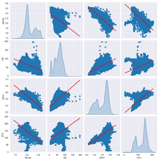
Adding a Regression Line to Scatter Plots
If we want to identify relationships within the scatter plots, we can apply a linear regression line. This is simply done by adding the keyword kind and assigning it to 'reg'.
sns.pairplot(df[cols_to_plot], kind='reg', diag_kind='kde')
When we run this, we will now see we have a partial line appearing on each of the scatter plots.

However, because the line color is the same as the point color, we need to change this to make it more visible.
We can do this by adding the plot_kws keyword to the pairplot function call. This accepts a dictionary, which will contain the property: line_kws. Within this property, we can define the style and setup of the regression line. For this example, we’ll change the color of the line from blue to red:
# Use plot_kws to change regression line colour
sns.pairplot(df[cols_to_plot], kind='reg', diag_kind='kde',
             plot_kws={'line_kws':{'color':'red'}})
When we run the code, we get back a pairplot with a red line, which makes it much easier to see, and therefore understand the relationship between the displayed variables.
How to Color Data by Category
If we have a categorical variable within our dataframe, we can use that to visually enhance the plots and see trends and distributions for each of the categories.
Within this dataset, we have a variable called LITH, which represents different lithologies that have been identified from the well log measurements.
If we are using a reduced feature set from our dataframe, we need to ensure that the cols_to_plot line in our code contains the variable (LITH) that we want to use to color the data with.
Once we have set the columns we want to plot, all we need to do in order to color by category is to add a hue argument, and then we can pass in the 'LITH' column from our list.
sns.pairplot(df[cols_to_plot], hue='LITH')When we run the above code, we get back a pairplot colored by each of the lithologies (categories) contained within the LITH column.

Once we have our final pairplot and all of the points are displayed with their respective lithology, we can begin to make interpretations and make assumptions about our data set.
For instance, when we look at the shale lithology in the data distribution plots located on the diagonal of the figure, it has high gamma ray (GR) values, high acoustic compressional (DTC) values and low bulk density (RHOB) values when compared to other lithologies. We can also see further differences between the shale lithology and the other lithologies when we look at the scatter plots.
From our observations, we could then identify limits for each measurement per lithology, and start applying these to other data sets through nested if-then-else statements. Which in turn, could be used to train a future classification machine learning model.
Now that we have covered the basics of the pairplot, we can take things to the next level and start styling our plot.
How to Style a Seaborn Pairplot
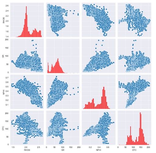
First, we will start by changing the properties of the diagonal histogram. We can change the diagonal styling by using the diag_kws keyword and passing in a dictionary of what we want to change.
In this example, we will change the color of the histogram bars by passing in a color keyword and setting the value to red.
sns.pairplot(df[cols_to_plot], diag_kws={'color':'red'})When we run this, we get back the following plot:
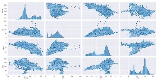
As this is a histogram, we can also change the number of bins being displayed. Again, this is done by passing in a dictionary containing the property we want to change, which in this case is bins.
We will set this to five and run the code.
sns.pairplot(df[cols_to_plot], diag_kws={'color':'red', 'bins':5})This returns this figure with five bins and the data colored in red.

Styling the Scatter Plot Points in the Seaborn Pairplot
If we want to style the scatter plot points, we can do so using the plot_kws keyword, and passing in our dictionary containing color. In this example, we will set them to green.
sns.pairplot(df[cols_to_plot], diag_kws={'color':'red'},
            plot_kws={'color':'green'})

If we want to change the point size, we simply add the s keyword argument into the dictionary. This will reduce the size of the points.

Changing the Seaborn Pairplot Figure Size
Finally, we can control the size of our figure in a very simple way by adding in the keyword argument height. In this example we will set the height to two. When we run this code, we will see we now have a much smaller plot.
sns.pairplot(df[cols_to_plot], height=2)We can also use the aspect keyword argument to control the width. By default, this is set to one, but if we set it to two, it means we are setting the width to twice the size of the height.
Advantages of Seaborn Pairplot
The Seaborn Pairplot is a great data visualization tool that helps us become familiar with our data. We can plot a large amount of data on a single figure and start to gain an understanding of it as well as develop new insights. Having all this data in one view is great, and saves time and effort compared to looking at single plots. It’s an important plot to keep in your data science toolbox!