Have you ever struggled with an updated app? Or referred to the documentation for a new operating system?
You may want to dive into the app straight away. That’s why good design is intuitive to the point where it’s hardly noticeable, allowing you to dive into the app without having to read through pages of documentation. It banks on your past experiences and expectations by modeling everything for your fulfillment. In the best platforms, those interactions are in perfect sync with your thought process and work in tandem with the system. You, as a user, are in a flow state and not all concerned about how the system works.
What Is an Interaction Model?
That invisibility is the hallmark of a good interaction model.
Why Interaction Models Matter
In general, interaction models have a wide variety of use cases across disciplines, each with its own set of beliefs. In the context of interaction design, we can frame it as the underlying structure or framework that governs the behavior of a product or system in concert with the user’s behavior. It provides structure, consistency, direction and feedback with the system. To summarize, it’s the blueprint of actions between users and the system.
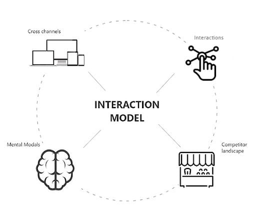
Today’s customers are exposed to more and more digital interactions in their day-to-day life. This has brought the tolerance level for poorly designed products to almost zero. To survive in this experience economy, products have to meet — if not exceed — the expectations of users. With user-centered design, businesses can now focus on users, their context, channels and landscapes to deliver the best possible experience. An interaction model is the starting point for laying the foundation for a great user experience.

Interaction models try to inform the way the product behaves with users. It’s a conceptual model that visualizes the interactions based on the mental model of the users. Governed by the principles of interaction design, a good model must display the following traits:
- Invisibility: An easy learning curve, familiarity with past experiences, prompt feedback and anticipating user actions make a product invisible. Invisibility is achieved when users are in a state of flow using the product. It’s a hallmark of good interaction models.
- Consistency: Consistency creates a feeling of stability and honesty, increasing user satisfaction, ease of use and trust. Surprises and shocks can weaken trust.
- Familiarity principle: The model must have real-world metaphors, affordances and past interactions for it to quickly resonate with users. The more familiar users are with an interaction, the quicker the adoption will be.
- User progression: A good model must adapt with user maturity. The progression from novice to mastery for users requires the system to provide adequate interactions. There must be provisions for basic and expert users.
- Unobtrusive: The model must display adequate maturity when giving alerts and feedback. Rather than intimidating users with constant notifications, the system must be passive, calling less attention to itself.
- Minimalism: Focus on what’s important to users and set aside all other features that don’t help users focus on the task. Design around what is critical and leave the rest. Too many features, ads and attention cravings will backfire.
Defining Interaction Models
Building interaction models require comprehensive insights into users and their contexts, channels and landscapes. These will serve as the guiding stars to help you define an interaction model. It is a collaborative process that starts with whiteboard sessions and workshops before progressing toward more concrete models.

By bringing stakeholders, small and mid-size enterprises and users into the process, we can ensure diversity on all viewpoints and quicker ideations. The interaction model can draw insights from designers’ initial research.
Let’s take a closer look.
Scenario Ideations
From personas, key scenarios and context can be captured and prioritized from personas. They can be based on usage ratio, significance or user context. These scenarios can be further visualized through rough sketches with users in their context.
Conceptual Models
From scenarios, you can easily figure out the connections, hierarchies and interactions to visualize a low fidelity model. They are abstract, diagrammatic representations of entities, structures and relationships that enable us to digest the big picture.
Information Architecture
By giving structure to the elements in conceptual models, information architecture organizes, labels and gives hierarchy to the data. The information is a bit more concrete and provides more details like site maps, hierarchies, categorizations, navigation and metadata.
Screen Layouts
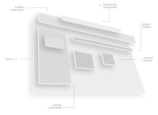
From the information architecture, you get to know the key primary functions, verbs and nouns of your product. Based on this, the foundational structure can be visualized as a starting point. Form factors like mobile, tablet and desktop must also be considered at this stage.

Components
This provides hierarchy and structure to the layouts by organizing contents into meaningful blocks. Components are based on functionality and can have multiple patterns to represent them — headers, footers, headings, content modules, data tables and more.

Patterns
These are the building blocks of the interface. They bring harmony and consistency to the user interface (UI). A typical pattern will have multiple elements that display how data or information is organized. They can be reused across different components to achieve a function.

Advantages of an Interaction Model
The most exciting part of any design is the implementation phase. For a practitioner, the joy of seeing the insights transition to concepts is satisfying. It’s nice to see your hard work finally pay off with the evolution of these frameworks. Interaction models serve as a foray into this process, giving us the foundational structure from which we can start building. Being invisible doesn’t make them inferior, and their immortality is evident across design systems, style guides and interaction libraries.
And for a user, it’s better that they remain unnoticed. As they say, “The most beautiful things are always hidden.”
Frequently Asked Questions
What is an interaction model?
An interaction model guides how a product behaves in tandem with users’ behavior, acting as the guiding blueprint for a product’s operations. The goal of interaction models is to allow users to enter an ideal state of flow.
Why are interaction models important?
Interaction models are intended to make user-product interactions as seamless as possible. They serve as the underlying structure behind a product’s behavior, reducing any friction between the user and the product as much as possible.
What makes a good interaction model?
A high-quality interaction model makes a product feel invisible to the user, delivers a consistent user experience, only prioritizes features the users care about and adapts to users’ increasing mastery of the product.


